Dear WPCentral members,
Let me start off by asking you to excuse me for both my poor English (as it's not my native), and for my bad design implementation. I know that in the right hands someone could implement this in a better, neater way than I did. I know I tried the best I could!
This thread is aimed to address a very common topic among Windows Phone OS users, which is the notification center. I know that many of you don't see the point of having an implementation for such a feature that other OS's have, as the live tiles are supposed to be covering this area. I used to agree with this point of view until recently, the need of a notifications history to keep track of what's going in your life is really important!
You already know that if you never pinned an app on the home screen and missed the push notification message, you would probably never know that about it! More important is that if an app had multiple notifications, a small number would indicate the last notifications without knowing what happened at a glance. This misses one of the foundations that WP was originally based upon.
I saw earlier an implementation for a notification center by swiping to the left on the home screen, the problem in this is that each time you want to see a notification you would need to get to the home screen first, then swipe to get those notifications. This means that you need to back out from anywhere you're at to get to see the notification history, then press the back button to get back.
My implementation uses a different approach, using a charms bar-like implementation already seen in Windows 8, my implementation is taken from there with some little modifications to address even more issues than just a notifications history, including: quick settings, quick share button, closing an app easily and in some cases getting more info at a glance (time, date and remaining battery).
I don't want to make this post any longer, but first off I need you to see this video for Windows 8 charms bar, to get a sense of the animations, and the way things are handled, from settings to the share button and so on. Seeing this video can be helpful for people that aren't familiar with the way Windows 8 Charms Bar operates.
Windows 8 Charm Bar Walkthrough - YouTube
start at 1:50
So, what I did is to implement this vertical charms bar into a horizontal one, which can be accessed by a swipe from the top of the screen.
Please note that I made two designs, I thought that both of them can be good and matches the WP design language. Both designs are shown below:
First design
(Kindly press on any of the pictures to enlarge them for a proper view of each)
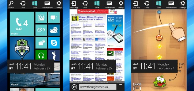
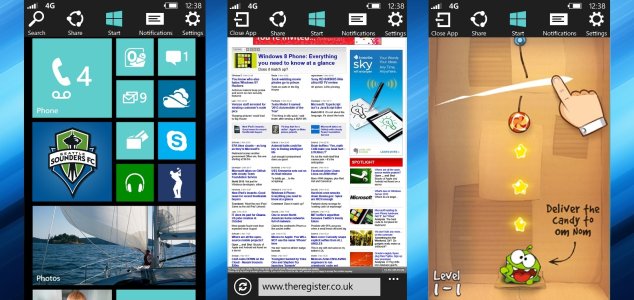
As seen in the image above, the charms bar is accessible from any place you're at, whether you're on the home screen, or within the browser, or even inside of a game. This has an advantage over other OS's implementation as they are not accessible from anywhere. Note that on the home screen, a search button is up there, this search button different than the physical one which takes you to Bing. This one is similar to the one found in Windows 8, where you can search your phone locally, from apps, to files, to even searches within apps themselves. This button is replaced with a "close app" button while the user is within an app, we all know about how frustrating can closing an app be on any WP 8 device. This is not a back button, it simply closes all the layers of an open app, instead of keep pressing the back button to do so. Think IE 10 while opened 10 web pages, it would take you forever to close it.
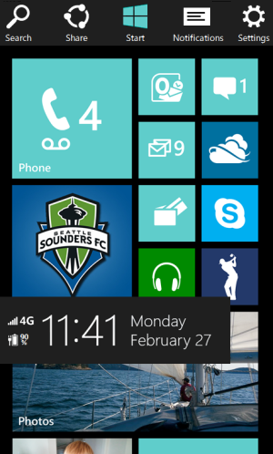
As you can see from the start screen above, a box pops up in the lower half of the screen containing different important info, including the time, date, connectivity and a battery indicator!
Back to the charms bar, the share button is also there, which has a different functionality depending on the page presented to the user, for instance, while on the browser the share button should share the current web page, as you have seen in the youtube video I posted above. Pressing the share button shall bring a drop down box for choosing an app to share this with, you can pick an email, your social services, or any other app. Sadly I didn't have the time to implement this =/.
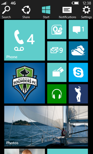
The third button takes you to the start screen, and I know that there is already one on the bottom, but the point of having one up there is when you are busy handling the bars above, sometimes you might need the start button next to your finger tips.
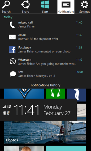
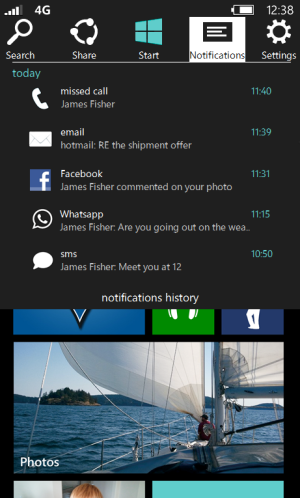
The fourth button is the notifications button. Pressing upon it will bring a drop down box containing the latest notifications, with a button below that takes you to a larger, and more info preview. This is used on the go. Notifications can be swiped to the right to close them.
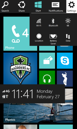

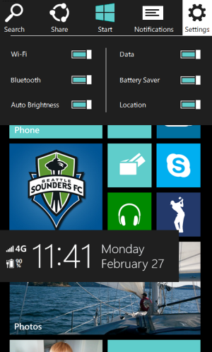
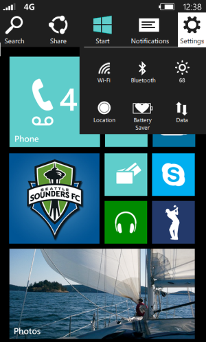
Finally, the quick settings menu shows some quick settings for most needed, on the go toggles. This can save lots and lots of time for any user instead of going back and forth into the settings to get things done. Edit: I made two designs for the settings toggles, let me know what you think of each. The second one when pressing on any of the words such as "Wi-Fi", this shall take you to the Wi-Fi settings page too. (more than just a toggle).
Please note that the charms bar is supposed to fill the black negative space at the top of the screen (above the tiles), think of the push notification toast and how wide it is.
While the charms bar is not activated, network info, wireless and Bluetooth indicators, battery and clock will always be shown (no swype needed) as before.
Second Design
The second design is shown below, the only difference in this one is that there is no box that shows with the swype containing different info, they are presented above of the charms bar as follows:
Thank you everyone for reading, I am really eager to read your comments and thoughts about this concept.
Cheers!
Let me start off by asking you to excuse me for both my poor English (as it's not my native), and for my bad design implementation. I know that in the right hands someone could implement this in a better, neater way than I did. I know I tried the best I could!
This thread is aimed to address a very common topic among Windows Phone OS users, which is the notification center. I know that many of you don't see the point of having an implementation for such a feature that other OS's have, as the live tiles are supposed to be covering this area. I used to agree with this point of view until recently, the need of a notifications history to keep track of what's going in your life is really important!
You already know that if you never pinned an app on the home screen and missed the push notification message, you would probably never know that about it! More important is that if an app had multiple notifications, a small number would indicate the last notifications without knowing what happened at a glance. This misses one of the foundations that WP was originally based upon.
I saw earlier an implementation for a notification center by swiping to the left on the home screen, the problem in this is that each time you want to see a notification you would need to get to the home screen first, then swipe to get those notifications. This means that you need to back out from anywhere you're at to get to see the notification history, then press the back button to get back.
My implementation uses a different approach, using a charms bar-like implementation already seen in Windows 8, my implementation is taken from there with some little modifications to address even more issues than just a notifications history, including: quick settings, quick share button, closing an app easily and in some cases getting more info at a glance (time, date and remaining battery).
I don't want to make this post any longer, but first off I need you to see this video for Windows 8 charms bar, to get a sense of the animations, and the way things are handled, from settings to the share button and so on. Seeing this video can be helpful for people that aren't familiar with the way Windows 8 Charms Bar operates.
Windows 8 Charm Bar Walkthrough - YouTube
start at 1:50
So, what I did is to implement this vertical charms bar into a horizontal one, which can be accessed by a swipe from the top of the screen.
Please note that I made two designs, I thought that both of them can be good and matches the WP design language. Both designs are shown below:
First design
(Kindly press on any of the pictures to enlarge them for a proper view of each)

As seen in the image above, the charms bar is accessible from any place you're at, whether you're on the home screen, or within the browser, or even inside of a game. This has an advantage over other OS's implementation as they are not accessible from anywhere. Note that on the home screen, a search button is up there, this search button different than the physical one which takes you to Bing. This one is similar to the one found in Windows 8, where you can search your phone locally, from apps, to files, to even searches within apps themselves. This button is replaced with a "close app" button while the user is within an app, we all know about how frustrating can closing an app be on any WP 8 device. This is not a back button, it simply closes all the layers of an open app, instead of keep pressing the back button to do so. Think IE 10 while opened 10 web pages, it would take you forever to close it.

As you can see from the start screen above, a box pops up in the lower half of the screen containing different important info, including the time, date, connectivity and a battery indicator!
Back to the charms bar, the share button is also there, which has a different functionality depending on the page presented to the user, for instance, while on the browser the share button should share the current web page, as you have seen in the youtube video I posted above. Pressing the share button shall bring a drop down box for choosing an app to share this with, you can pick an email, your social services, or any other app. Sadly I didn't have the time to implement this =/.
The third button takes you to the start screen, and I know that there is already one on the bottom, but the point of having one up there is when you are busy handling the bars above, sometimes you might need the start button next to your finger tips.

The fourth button is the notifications button. Pressing upon it will bring a drop down box containing the latest notifications, with a button below that takes you to a larger, and more info preview. This is used on the go. Notifications can be swiped to the right to close them.


Finally, the quick settings menu shows some quick settings for most needed, on the go toggles. This can save lots and lots of time for any user instead of going back and forth into the settings to get things done. Edit: I made two designs for the settings toggles, let me know what you think of each. The second one when pressing on any of the words such as "Wi-Fi", this shall take you to the Wi-Fi settings page too. (more than just a toggle).
Please note that the charms bar is supposed to fill the black negative space at the top of the screen (above the tiles), think of the push notification toast and how wide it is.
While the charms bar is not activated, network info, wireless and Bluetooth indicators, battery and clock will always be shown (no swype needed) as before.
Second Design
The second design is shown below, the only difference in this one is that there is no box that shows with the swype containing different info, they are presented above of the charms bar as follows:


Thank you everyone for reading, I am really eager to read your comments and thoughts about this concept.
Cheers!
Last edited:


