Screen blank space at the top

spaulagain

New member
Apr 27, 2012
1,356
0
0
Visit site
negative space = wasted space = an artists view of the world productivity :)

I'm not looking for a pretty picture. I want a tool that makes my life more efficient. Please get rid of the wasted space Microsoft.


No, no, and no.

"White space" is extremely important within user interfaces and design in general. It provides the eye with breathing room for the content and reduces clutter. There is white space throughout Windows Phone intentionally as it allows the eye to separate and read content quicker especially when its a quick glance. This space on the home screen is by design and has been around since day one with WP7. Especially now with the tiles wall to wall, there is less breathing room and therefore that gap is even more important.

Look at the living room of a house, is there furniture consuming every square inch of the floor? No, because your body needs space to navigate through the room. Its the same thing with your eye when navigating content.

This is not about being an artist and painting a pretty picture. The gap is not a design defect and definitely should not be removed. There is even more white space on Windows 8 and Xbox, so get over it.

It amazes me the number of people who still live in yesteryear where every pixel has to be used for content otherwise its "wasted space." This is why UIs and Websites looked so horrible for so long. Now companies are finally getting the hint that white space is a good thing and allows the user to consume the content quicker and easier.
 

Spicymikey

New member
Jan 15, 2013
56
0
0
Visit site
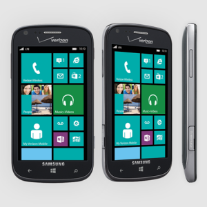
I guess Samsung agrees with me. At least they realize its stupid and might have just nudged the tiles up a tad for the marketing photo.

samsung-ativ-news-hardware.png

Either way, its just opinion, so no sense arguing. I'm a software designer. In software design an efficient use of screen space is critical. Again, these are tools, not a picture to hang on the wall. Although it should be pleasant to look at, the design must lean towards utility and efficiency. If you like wasted space they should make the case bigger too with some designs around the screen area I suppose. it would make it harder to carry but it would be more attractive.

Not trying to convince you you're wrong. Just saying its debatable so don't be so sure of yourself in your stance on the issue and tell others THEY are wrong..
 

spaulagain

New member
Apr 27, 2012
1,356
0
0
Visit site
I guess Samsung agrees with me. At least they realize its stupid and might have just nudged the tiles up a tad for the marketing photo.

View attachment 26973

Either way, its just opinion, so no sense arguing. I'm a software designer. In software design an efficient use of screen space is critical. Again, these are tools, not a picture to hang on the wall. Although it should be pleasant to look at, the design must lean towards utility and efficiency. If you like wasted space they should make the case bigger too with some designs around the screen area I suppose. it would make it harder to carry but it would be more attractive.

Not trying to convince you you're wrong. Just saying its debatable so don't be so sure of yourself in your stance on the issue and tell others THEY are wrong..


You said it was a mistake that needs fixed (by Microsoft). Which it is not, its a design decision. As for that image from Samsung, Nokia does the same thing on most of their ads. Most likely because the OS was edited into the picture and they are trying to show off the size of the screen, so they push up the content to fill it more. In fact, Nokia even excludes the clock sometimes.

I'm a UI designer and understand that the software is not about being artsy. It's about being effective, and white space is part of being effective as I explained above.

In this case, it is not a mistake. And people like it just as much as you dislike it. While design has patterns and rules in efforts to improve usability, there are always subjective elements. Even if these design decisions were made with good usability intentions, someone, somewhere is not going to like it.

iPhone uses chrome effects on their entire UI. Its not bad design, in fact their UI is very good, but I don't like it, especially compared to a "Metro" UI. That doesn't make their UI design a mistake or an error.

As the Metro UI uses typography to define sections of content, white space is even more important. So its going to be a common practice in all of Windows 8 and Windows Phone 8 to have what you call "wasted space."
 

Spicymikey

New member
Jan 15, 2013
56
0
0
Visit site
Much better sir. Spare us the attitude that you know best next time. There's just no right answer other than the one that sells more phones. Given the fact that Nokia is hanging on by a thread and Samsung is the #` smartphone maker in the world, it will interesting to see what they do with the OS in one of their phones. The new Samsung ATIV Odyssey should be out in a few weeks. Will they go with a resolution or code modification that allows for 7 full tiles to display after pressing the home button? We'll see if that is the case or the photo was just for the marketing photo
 

clindhartsen

New member
Feb 28, 2011
80
0
0
Visit site
The only other piece I would add is that while you may not be looking for a "picture to hang on the wall," Windows Phone has made it more clear than not that it has a heavy hand on design and a unique user interface.

If you look across all of the hubs, as well as the layouts they create for apps which developers may or may not adhere to, they commonly utilize white space in amounts you likely won't see on any other platform. That space on top of the phone has been present since the first images of Windows Phone 7 Series came out, and as a previous commentator said, it's likely there to leave room for notifications to appear. If you were looking for a "high information density" phone, there are two other platforms that are wide open for this. The point that Windows Phone has pushed a lower, but more responsible information density is an interesting point to be made. If you look at most of what they've said since day one, the phone was supposed to be about reduction and rethinking what content needs to be presented for the user to get what they need. When you compare screens from Android, Windows Phone, and iPhone, this can be clearly evident.

Either way, I hope the space is left. It helps in letting the status indicators and time be easily read by the eye, vs. being competed with large tiles of color or imagery being bumped up right against them.
 

Spicymikey

New member
Jan 15, 2013
56
0
0
Visit site
Personally I love the new Win8 OS. I've had an iPhone for 5 years and love this new way of doing things. Thought the iPhone was always a flawed design and find all this refreshing. Also, I'm a Microsoft Certified partner with a Silver Software Developers Competency. Have about 3000 customers around the country using my software. I am NOT a Windows basher or Apple head :) I'm rooting for this new OS to finally take off and was just responding to SINIME's post about the 920 cutting off the last tile. It's actually a separate issue and different from the original posters complaint about the wasted space at the top of his HTC. If I had an HTC I'd find it less annoying with the open area at the top since these phones still display a full 7 tiles. So this thread really has two points being discussed and they've melded together to create a third discussion in some ways.

Regardless, I still think it would be best to reduce that space at the top. This is not a desktop PC. it's a small screen device. Space is valuable. They can't try to make this exactly like the desktop version. Some things need to be tweaked. I'd like to think I'm right and in time Microsoft will reduce that unused space at the top like they finally got rid of the wasted space along the right between Win7 and 8.
 

uselessrobot

New member
Nov 14, 2012
552
0
0
Visit site
Trust me, designers at Microsoft have spent a lot of time considering that spacing.

Many people have the habit of just cramming everything together, but from a usability standpoint this is a mistake. With everything jammed together you spend more time hunting for desired content. Actually, this is the problem I have with iOS. When you've bombarded with icons you spend a lot longer hunting for the ones you want. Sure, it's not a problem for the stuff used often, but it becomes a problem for infrequently used apps or when you've got screen after screen of icons. This is one of the reasons I like the resizable tiles so much, because the sizing gives certain tiles instant visual hierarchy.

With Windows Phone that space is an instant visual cue that you're at the top of the page; you'll notice that the gap at the bottom is the same size. Secondly, it gives time and system icons enough breathing room that they don't feel like an afterthought.

The Lumia 920 only fits 6.5 tiles because of the display's aspect ratio. It's ratio is actually identical to the lower standard of 800x480. But HTC and Samsung came along with their 1280x720 displays. So with 48 fewer pixels to work with everything is scaled down slightly, hence the ability to fit 7 rows. I wish Microsoft had enforced a single standard, preferable the Lumia 920's dimensions because the ratio matches the lower res phones. But I'm guessing HTC and Samsung were bound by manufacturing resources; all of Samsung's higher end displays are 1280x720.
 

Spicymikey

New member
Jan 15, 2013
56
0
0
Visit site
Well the design is evolving constantly as is everything else. We'll see where they go with it. I'm just a straight, level, and plumb, kind of guy. The inability to end with a full tile at the bottom on my 920 (like you can with the HTC) bugs me. I'm weird I know :) Maybe I'll get an HTC or Samsung next time. Thanks for your thoughts.
 

soaringthor

New member
Nov 24, 2012
64
0
0
Visit site
Well the design is evolving constantly as is everything else. We'll see where they go with it. I'm just a straight, level, and plumb, kind of guy. The inability to end with a full tile at the bottom on my 920 (like you can with the HTC) bugs me. I'm weird I know :) Maybe I'll get an HTC or Samsung next time. Thanks for your thoughts.
You are aware that this isn't a result of blank space at the top of the screen - the 920 and 8X behave the same in that regard. It's a question of aspect ratio (clicky - exactly at midpage). You'll be fine buying a Nokia as soon as they release a 720p screen. :)
 

Spicymikey

New member
Jan 15, 2013
56
0
0
Visit site
yes I'm aware. Wasn't at the beginning of all this the other day, but since then was educated on the fact that the screen resolution is different with the HTC vs Nokia. So it's really a Nokia issue more than a Microsoft issue. I realize that now but am still just suggesting that the space at the top isn't really necessary for function so maybe another option for Nokia would be to allow the user to optionally collapse that space if Microsoft and their API's would allow such a setting. With that removed it fits perfectly on the screen as depicted in this Samsung promo shot. In that photo there is no space. I assume they just nudged up the screen to make it more esthetically appealing for the photo OR maybe they have been able to modify the behavior of the top of the tile list.

samsung-ativ-news-hardware.png
 

b_wilson

New member
Jan 25, 2013
9
0
0
Visit site
It bugs me too (Lumia 920). I have medium sized live tile in that bottom position (weather.com) and the temperature is always hidden and I need to swipe up to view it. Not a big deal, but not the functionality I'd like from a live tile I pin to the start screen. I may or may not move it up.

Here's my take though. On the Lumia with the blank space, it PERFECTLY centers the colored tiles with the rest of the phone body. Maybe that's what they were going for. A slight added benefit is that with partial tiles off the bottom, someone picking up the phone for the first time would think "hmm, there's something down there" and then swipe down.
 

Spicymikey

New member
Jan 15, 2013
56
0
0
Visit site
Glad you agree. We seem to be a minority. :(

I've tried to place half-tiles at the bottom that have info typically near the top of the tile so I can see the live tile data without having to scroll up. Sort of gives me extra functionality I wanted.

I've heard these same theories about how it helps offer a visual cue to the need to scroll down for more info if you are a new user. Personally, I hope that's not the reason because that's ridiculous. Just as bad as the idea they did it so as not to overlap the top tile when a notification comes in. Anyone who owns the phone knows damn well to scroll down for more info. As far as toasts, well just let it overlap for a few seconds. Or better yet, push all the tiles down while the message is displayed and then snap it back when it clears. Really no good reason to intentionally waste over 5% of the screen except for some misguided GUI guidelines (my opinion) that belong in the pile with the Win7 gutter idea.
 

tavisdunn

New member
Jan 24, 2013
14
0
0
Visit site
Considering i'm never really on the homescreen for any measure of time before going into a app, it doesn't really bug me. I suppose if i left the phone on all day on my desk with the homescreen active, it would bug me........i guess.
 

Spicymikey

New member
Jan 15, 2013
56
0
0
Visit site
I agree. Im sure everyone does. It's not a huge issue. No ones losing sleep over it. But like the gutter, it's a questionable UI design and I'd argue should be changed.

FYI: I have a wireless charging stand in my office. The phone sits upright and facing me a good portion of the day. Everything I want visibility too is on my top live tiles. When I get a toast, etc., I wake the screen and view what I want. That's my personal usage behavior.
 

wpn00b

New member
Jan 9, 2013
542
0
0
Visit site
That space has been present in both Windows Phone 7 and 8 and is nothing new. If nothing else, the extra whitespace is nice to make the screen a little more comfortable than your typical Android or iPhone would be in demanding that space to fill. This even translates up to Windows 8, and if you think about the XBOX there is plenty of space around those tiles as well. It's part of the design.

Just found this thread but I agree with this. I had started to reply to someone else but just pasted it below since I found clindhartsen and Sam Sabri said it pretty well. I like to hear myself talk so posting my contribution below:

I personally feel that this is a design decision. The Metro UI seems to be all about clean balance with asymmetry. Look at how the text overlaps in any of the Hubs or in most any app for that matter. Everything is lined up to the far left with the "white space" or gap on the right. The small dark space "balances" the large organized tile space. I'm thinking that they went so far as to auto-hide the signal bars and battery icon just to preserve this aesthetic. Maybe I'm wrong, but this look + feel is what drew me to Windows Phone in the first place. As for the Lumia vs the 8X and why one has it more prominently than the other, well, aren't the screen sizes different? One is 4.5 vs 4.3 I thought.
 

wpn00b

New member
Jan 9, 2013
542
0
0
Visit site
negative space = wasted space = an artists view of the world <> productivity :)

I'm not looking for a pretty picture. I want a tool that makes my life more efficient. Please get rid of the wasted space Microsoft.

I agree that what Microsoft does well is make tools for getting actual work done, but the company is clearly evolving to be more relevant artistically as well. They have a renewed Blackberry on the way and an asleep-at-the-wheel Apple to compete with, not to even mention Android. They need a pretty face as well as all that functionality to attract users which attracts developers.

Also, imagine working on an IRL desktop/table and having all of your tools, books, etc laid out in front of you with no extra room to move them around and get comfortable. In order to reach your laptop, you'd have to rest your arms on your book and to reach the pen and paper, you have to reach across your coffee. Or possibly worse, the opposite way around (I hate those little drops of coffee on my worksheets!) A little elbow-room is a good thing in real life as well as in on-screen design.
 

Spicymikey

New member
Jan 15, 2013
56
0
0
Visit site
Let's not even start talking about this metro design on the desktop and business environment. As far as desktops are concerned this Windows 8 UI is a disaster. My company develops Windows business productivity software. Of all my customers I've spoken too so far who have upgraded to Win8 on their PC's they hate it. Some have reverted back to WIn7. The decision to get rid of the start button is killing the productivity. The emphasis on "space" and touchscreen doesn't resonate with someone trying to get a job done fast and efficiently.

I've said this before, I'm not a Microsoft hater. I have been developing Windows based software for over 20 years. They make money inspite of themselves not because of it. The genius and marketing of Bill Gates is long gone and they operate on momentum. Just about what happened to Apple in the 90's when Job's was fired and what will happen to them again now that he's dead.

As I've acknowledged already, this dead space on the top is minor/ Compared to all the much larger strategic and tactical mistakes Microsoft has made and continues to make, this is nothing. But the bulk of their business is in the enterprise, server, and business world. if they try to push this design on that crowd, they are going to get hurt IMO
 

theefman

Active member
Nov 14, 2008
3,979
5
38
Visit site
There's always someone who claims to work for a company that develops Windows software, have "customers" who have upgraded to Windows 8 and "lost productivity" and how Windows 8 is a disaster after they upgraded. Frankly any individual who blindly upgrades to a new OS without testing sounds like someone who shouldn't be doing it in the first place. And its hard to believe a business would do this at all so I'm calling BS on all these stories from "IT people" who claim Windows 8 is so bad their customers can't work as productively as before. Especially when it takes just 1 click to hit the desktop tile and be in the familiar Windows environment or they can simply rearrange the start screen to have their programs front and center.
 

spaulagain

New member
Apr 27, 2012
1,356
0
0
Visit site
Let's not even start talking about this metro design on the desktop and business environment. As far as desktops are concerned this Windows 8 UI is a disaster. My company develops Windows business productivity software. Of all my customers I've spoken too so far who have upgraded to Win8 on their PC's they hate it. Some have reverted back to WIn7. The decision to get rid of the start button is killing the productivity. The emphasis on "space" and touchscreen doesn't resonate with someone trying to get a job done fast and efficiently.

I've said this before, I'm not a Microsoft hater. I have been developing Windows based software for over 20 years. They make money inspite of themselves not because of it. The genius and marketing of Bill Gates is long gone and they operate on momentum. Just about what happened to Apple in the 90's when Job's was fired and what will happen to them again now that he's dead.

As I've acknowledged already, this dead space on the top is minor/ Compared to all the much larger strategic and tactical mistakes Microsoft has made and continues to make, this is nothing. But the bulk of their business is in the enterprise, server, and business world. if they try to push this design on that crowd, they are going to get hurt IMO

Lol, I've been using Windows 8 for over 6 months and I love it. I'm and designer and web developer and find using Windows 8 to be much faster than 7. The classic Start Menu was a cluster**** UI. Users either pinned their apps to the Desktop or pinned them to the Task Bar. Having to navigate through trees of program folders was a joke. That is why Microsoft went with the Start Screen. I can organize my apps based on their intended use and the app targets are larger, easier targets to click. Plus they are only a click away, instead of 3-4. Windows 8 is still a fully functioning desktop OS. All they did was make the Start Menu full screen and easier to use. When you click the start screen, you are focused on a finding an app, not multitasking. So don't try to come up with some multitasking excuse against for it.

My Dad is a software architect and has been programming for 20+ years, all in MS focused languages. He's been a .NET developer since it started over 10 years ago. Guess what, he loves Windows 8.

Microsoft sees that the future of computing is drastically changing. Touch and gesture are here and rising. While the keyboard and mouse will never go away, they will eventually no longer be the majority.

Yes, enterprise is a huge part of Microsoft's business, but you know who works at enterprises? CONSUMERS. And just like they have with Apple products, consumers will drive the demand of enterprise. Consumers will get used to the new UI, love it, then demand it in the work place. Or they will BYOD. We already have several people at my company including myself, getting a Surface Pro to use at work.

Microsoft did the research, they know what they are doing. Its the people stuck in yesteryear that dragged MS products in the mud for so many years and allowed Apple to get the edge.
 
Last edited:

Spicymikey

New member
Jan 15, 2013
56
0
0
Visit site
The majority of the world is not people working for Fortune 500 companies my friend. They are small businesses with 5, 10, 20 employees. Those are who we cater too. They are buying computers over the internet from Dell or they have a computer tech they hire locally to manage their small setup of 1 server and 5 or 6 pc's. Nothing BS about that. That's the real world. Believe it or not, but these people buying new computers because their pc just broke are not enjoying this new "pretty" design. it's made for a touch screen experience. Not enough business software available for the metro side so you spend most of your time back on the desktop side. Unfortunately the start button was removed in Microsoft's wisdom. It's creating a cottage industry from companies like StarDock.com and others who are making good money hacking into Win8 to add the start button back. You can call it BS, but I just call them like I see them. Not anyone's punk ****** or troll.
 

Members online

Forum statistics

Threads
323,298
Messages
2,243,591
Members
428,055
Latest member
DrPendragon