Screen blank space at the top

nunyazz

New member
Nov 20, 2012
259
0
0
Visit site
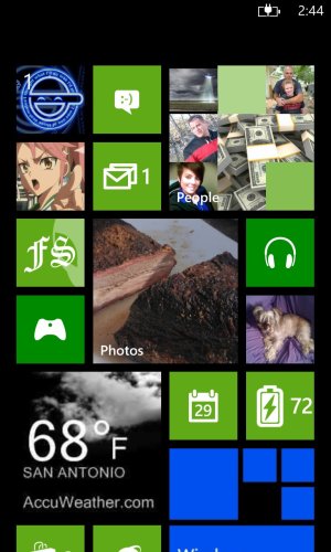
I understand that the resolution has changed on the 8X and that some apps have not updated their apps for the new format, but why is the homescreen defaulting to have the gap at the top of the screen?
Press the Windows(home) button and it defaults to this:
temporary-6-1.jpg


Instead of this:
temporary-5-1.jpg


Doesn't make sense to me.
 

ut_jd

New member
Nov 12, 2012
54
0
0
Visit site
Also, they use the top area for the notifications as they come through. I'm with you though, I wish it would line up right against the clock.
 

Coffee

New member
Jul 26, 2011
449
2
0
Visit site
Just saying it wouldn't matter however it was displayed, someone would find fault in it. It's just not a big deal.
 

Spicymikey

New member
Jan 15, 2013
56
0
0
Visit site
I agree. It's a terrible use of screen space and screen design. Noticed it the moment I purchased my 920. Thought there might be some setting to change but now realize there isn't. There really is no argument to support doing it this way.

BTW, I actually think its a bug. It's not coming from Windows. The HTC doesn't do this. The idea of wasting this space at the top of the screen all the time, so occasional toasts don't overlap, seems silly. I'm hoping Nokia fixes this in an upcoming patch.
 

Workbook89

New member
Nov 18, 2012
16
0
0
Visit site
I agree. It's a terrible use of screen space and screen design. Noticed it the moment I purchased my 920. Thought there might be some setting to change but now realize there isn't. There really is no argument to support doing it this way.

BTW, I actually think its a bug. It's not coming from Windows. The HTC doesn't do this. The idea of wasting this space at the top of the screen all the time, so occasional toasts don't overlap, seems silly. I'm hoping Nokia fixes this in an upcoming patch.

I can confirm that the HTC 8X does exactly the same thing. As suggested earlier, it is likely "reserved" space for incoming notifications (i.e. SMS/texts, etc.).

I too find myself lining it up just under the clock...
 

Spicymikey

New member
Jan 15, 2013
56
0
0
Visit site
Thanks for correcting my bad info. I admit I was going by the screenshots on the marketing material. All the Nokia's show the home screen as it appears after pressing the windows button. All the HTC's show the screen as we would want/expect it to appear. I don't own an HTC and was assuming something I shouldn't.

Regardless of who's doing it, it's a bad idea. So Microsoft still hasn't learned how to manage screen real estate yet. Realized wasting all that space on the right to simply display an arrow was bad, but now are wasting space at the top.

Oh well, still no regrets moving from my iPhone of 5 years. I love this OS and the 920
 

SaucePolicy

New member
Dec 4, 2012
83
0
0
Visit site
That's how it's supposed to be. It''s that way so you can fit 3 large and 1 small tile or 7 small tiles vertically . If it lined up with the clock it would add an extra 1/4th of a tile which gets cut off. I think that would be more annoying.
 

Spicymikey

New member
Jan 15, 2013
56
0
0
Visit site
No that's the problem. Maybe it works like that on your phone. What do you own? But on my Lumia 920 it only shows 6.5 1/4 sized tiles (like the OP showed in his screen shot).

Messes wiith my OCD and I have to nudge the screen up to make it display the full 7 after I press the windows button :(
 

Spicymikey

New member
Jan 15, 2013
56
0
0
Visit site
Here's a screenshot of my phone. This is how it looks after pressing the windows/home button. Notice that you only see 6 1/2 tiles. If you move it all up to just under the clock it fits 7 tiles perfectly. Yes an incoming message overlays the top tiles momentarily, but that can't be a good enough reason to waste all that space.

View attachment 26892

Workbook said its the same on the HTC. I'll have to take his word for it but all the literature, the OPs original screenshot, and sinime's screenshot seem to suggest that the HTC does not have this problem. I agree the HTC shows the wasted space at the top, but they must have been smart enough to design the screen format to ensure 7 full tiles displayed INCLUDING the space at the top. Nokia, on the other hand, was not so smart I guess
 

absonj

New member
Jan 3, 2013
99
0
0
Visit site
I have the HTC 8X and when I push home, I get that blank section, but it shows solid tiles, no cut at the bottom (I have 1 row quarter, 2 rows half and 1 row full) showing a full tile at the bottom. If I move it up to be right below the clock, then the top tiles from the next screen are cut off.

I don't think its a big deal. God knows how much wasted screen space was on my TB!
 

SaucePolicy

New member
Dec 4, 2012
83
0
0
Visit site
Sorry I thought we were all talking about the 8X since this is the 8X sub-forum. That's what I have and it fits 7 small tiles after pressing home. Maybe us 8X owners get 7 tiles but you guys get all the sweet Nokia apps. :smile:
 

Spicymikey

New member
Jan 15, 2013
56
0
0
Visit site
Big deal? No, definitely not. But its a mistake for sure. And you're right, a little crossover posting going on with me and sinime talking about the 920. Sorry bout that :)
 

clindhartsen

New member
Feb 28, 2011
80
0
0
Visit site
That space has been present in both Windows Phone 7 and 8 and is nothing new. If nothing else, the extra whitespace is nice to make the screen a little more comfortable than your typical Android or iPhone would be in demanding that space to fill. This even translates up to Windows 8, and if you think about the XBOX there is plenty of space around those tiles as well. It's part of the design.
 
Last edited:

Sam Sabri

New member
Oct 12, 2010
270
0
0
Visit site
That space has been present in both Windows Phone 7 and 8 and is nothing new. If nothing else, the extra whitespace is nice to make the screen a little more comfortable than your typical Android or iPhone would be in demanding that space to fill. This even translates up to Windows 8, and if you think about the XBOX there is plenty of space around those tiles as well. It's part of the design.

and Chris laying the law down.

People, negative space is your friend. Embrace it. Love it. Be it.
 

Spicymikey

New member
Jan 15, 2013
56
0
0
Visit site
negative space = wasted space = an artists view of the world <> productivity :)

I'm not looking for a pretty picture. I want a tool that makes my life more efficient. Please get rid of the wasted space Microsoft.
 

soaringthor

New member
Nov 24, 2012
64
0
0
Visit site
Also, to clarify, the 8X and the Lumia 920 have different aspect ratios. Both have the black space at the top - this is by design. The Windows 8 Start screen does the same thing: as it scrolls left to right, there's empty space at the far left so that icons aren't scrunched up against the edge of the screen. I like it.
The reason that the 920 shows a partial tile at the bottom of the screen and the 8X does not is simply the aspect ratios of the screens.
Thus: the reason WP8 has that blank area at the top isn't because it prevents cutoff tiles at the bottom, it's simply aesthetic design language.
Now... the arrow & blank space on the right edge of the screen in WP7.x devices... that's one that never made sense to me.
 

soaringthor

New member
Nov 24, 2012
64
0
0
Visit site
negative space = wasted space = an artists view of the world <> productivity :)

I'm not looking for a pretty picture. I want a tool that makes my life more efficient. Please get rid of the wasted space Microsoft.

1/4 tile <> more efficient either...

There are design reasons that space is there. For example... part of the "Metro" design language is that space in the top for notifications and status. When I go into the Me hub and swipe over, that top space fills with "looking for notifications...". Email: "Email is up-to-date". Messaging: "Signed in (available)". It would bug me more if the start screen wasn't consistent with the rest of the OS than if I was missing out on 1/4 tile. That's part of the greatness of the Windows Phone design language... everything (I guess there's always an exception to the rule) feels like it fits in the OS. And I fill like that space at the top is part of the start screen "fitting in" with the rest of the OS.
 

Members online

No members online now.

Forum statistics

Threads
323,239
Messages
2,243,502
Members
428,046
Latest member
Nathanboro12