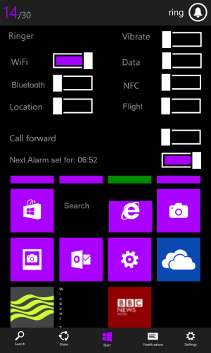
Charms Bar concept for WP8

linking1990

New member
Jan 20, 2012
156
0
0
Visit site
Great idea, but tbh the UI can be improved on. Stick more to the Modern (Metro) UI. Consistency is key.

I tried my best to keep this up with the way Windows 8 is. I already said that I am not a designer nor this is an original idea, it's more of an implementation of an existent thing found on another MS product. The one screen to rule them all thing can be done using little steps to unify the look of the different OS's running on different devices (PCs and mobiles).
My design isn't anywhere near perfect, I just wanted to notify others about how this could be really useful to the WP users.
 

peachy001

New member
Nov 3, 2012
1,354
0
0
Visit site
Hi linking, thanks for your thoughts.

I picked volume as it already does something already and avoids the conflicts you may get on a web page for example. A long press on one side may bring up the copy and paste or jump to a link.

I may try and mock up my idea once I get home. Fingers crossed I remember how to us MS paint.
 

linking1990

New member
Jan 20, 2012
156
0
0
Visit site
Hi linking, thanks for your thoughts.

I picked volume as it already does something already and avoids the conflicts you may get on a web page for example. A long press on one side may bring up the copy and paste or jump to a link.

I may try and mock up my idea once I get home. Fingers crossed I remember how to us MS paint.

I am really eager to see that mock up of yours! I really want a movement from MS towards the benefit of the end user by fixing these little things that some of them can be really frustrating at times (toggling Wi-Fi on and off, closing an app, etc..). If this get's any traction ever, something good can come out of it, I hope at least.

Funny to mention the MS paint thing, I used it to do these mock ups completely :p.

BTW, I edited my earlier post, let me know about what you think of that one.
 

peachy001

New member
Nov 3, 2012
1,354
0
0
Visit site
Well you have ruined my girlfriend's evening with your expectation, looks like I will have to do it now.

Regarding Paint, I was hoping nobody would think I was taking the Mickey out of yours. I liked your pictures and was gonna ask what you used. MS Paint is all I have.
 

deansmilk

New member
Feb 1, 2012
87
0
0
Visit site
I like this a lot. I think if MS were to add a charm bar similar to yours it would be really useful. Especially for settings (wifi and data toggles). I like it!

I would also like to say that I don't like the connectivity or battery info in the second design. It takes away from the clean look of the first design.

Also, sorry if I missed it. How would you access the charms bar? Is it a simple swipe gesture or by using the physical windows button? A mixture of both or is the charms bar always there? Another thing, what about the lock screen? I think the physical Windows button could play a roll in this by accessing the charms bar while on the lock screen? Again, I like the idea of the charms bar. Oh and I think having a charms bar would be better off hidden too ( swipe or physical button to access).
 
Last edited:

linking1990

New member
Jan 20, 2012
156
0
0
Visit site
I like this a lot. I think if MS were to add a charm bar similar to yours it would be really useful. Especially for settings (wifi and data toggles). I like it!

I would like to say that I don't like the connectivity or battery info in the second design. It takes away from the clean look of the first design.

Thanks a lot for sharing your thoughts, really appreciate it :). And for me personally, I prefer the first one better, I think it sustains the cleaner look as you said, and also it doesn't take as much space as the first one (for the charms bar alone), this wouldn't increase the negative black space that is there on the top of the charms bar.
 

linking1990

New member
Jan 20, 2012
156
0
0
Visit site
I like this a lot. I think if MS were to add a charm bar similar to yours it would be really useful. Especially for settings (wifi and data toggles). I like it!

I would also like to say that I don't like the connectivity or battery info in the second design. It takes away from the clean look of the first design.

Also, sorry if I missed it. How would you access the charms bar? Is it a simple swipe gesture or by using the physical windows button? A mixture of both or is the charms bar always there? Another thing, what about the lock screen? I think the physical Windows button could play a roll in this by accessing the charms bar while on the lock screen? Again, I like the idea of the charms bar. Oh and I think having a charms bar would be better off hidden too ( swipe or physical button to access).

For the edited part, yea of course, the charms bar is always hidden, and a swipe from the top of the screen shall pull them down (please watch the video I posted to see how it works with Windows 8 if you weren't familiar with it).
 

deansmilk

New member
Feb 1, 2012
87
0
0
Visit site
For the edited part, yea of course, the charms bar is always hidden, and a swipe from the top of the screen shall pull them down (please watch the video I posted to see how it works with Windows 8 if you weren't familiar with it).

Oh nice, ok. Thanks for clarifying that for me. I am on Win 8 now by the way ; ).
 

peachy001

New member
Nov 3, 2012
1,354
0
0
Visit site
This is my first attempt, so go easy.

I have trieds to include the things that I think would be most useful. Same as Linking, I had thought of using the wording as a direct link to the specific location.

I also borrowed the charms idea but added this at the bottom.


1st go.PNG


My next ideas are to add more into the above screen, such as notifications and running apps, with the option to close them. I reckon there is room.
 
Last edited:

linking1990

New member
Jan 20, 2012
156
0
0
Visit site
This is my first attempt, so go easy.

I have trieds to include the things that I think would be most useful. Same as Linking, I had thought of using the wording as a direct link to the specific location.

I also borrowed the charms idea but added this at the bottom.


View attachment 26292


My next ideas are to add more into the above scree, such as notifications and running apps, with the option to close them. I reckon there is room.


I am really happy that you were able to pull this off, I know that if each one of us did a small effort in trying to improve the OS he loves then its going to happen eventually.
I like the idea that you brought to the table, to use something that already exists on WP 8 machines, but I still can't see MS implementing this using volume controls, they are finding a hard time explaining some of the things they use in their OS, they even placed the right arrow at the bottom of the tiles so users are not confused and can find the app list!

don't you think that this can be grouped better and better understood for users using the charms bar only? esp people that use Windows 8 already and have a clue about how it works.

Nevertheless, I really find any of these implementations made it to WP, eventually it's us that get the best benifit out of everything. P.S: I am not sorry for your girlfriend =P. This totally worths it!
 

h4ck3d

New member
Oct 24, 2012
16
0
0
Visit site
I really Like the first design, Its very elegant and clean.

And i dont think a drop down menu from the top would be a bad thing, granted I know iOS and Andriod do it that way, BUT Its what everyone is already used to if there coming from another Mobile OS, its kinda become a natural movment at this point. Though I am still in favor with something to the left side of the screen.

BUT, If MS would go with something like the first example, It Still would be a way different experience from what you see from iOS and Andriod. Something like the charms seems so much more....Simple and would flow a lot better, and with something like the above exampe, it would almost seem that you could squeeze more options and menu's in. Plus I like that close app feature that you put in there.

Either way nice designs!
 

tositem

New member
Jan 3, 2013
38
0
0
Visit site
Like this idea so much! Ehm... What about a long press on search button? So it has another function rather than bring up the Bing search...
 

Noahma

New member
Dec 25, 2012
613
0
0
Visit site
I like the OP's second design with a slight change. In windows 8 to close an open app you do a slow pull, then faster to drag it to the bottom of the screen. Lets combine the OP's first and second idea, a quick swipe from the top will show your battery level, signal strength 4g/lte and wifi status, dragging a bit further would then bring the charms bar down. or the charms bar takes the left of the screen when swiping in. Closing apps can be left to the long press on the back button and then flicking the app down to close. Replacing existing functionality should be avoided, and using the volume rocker could be considered difficult for new users to figure out without having to read an instruction paper. Most would look at it and think there was one function to a physical button, and would never figure out long presses on these buttons.
 

Reflexx

New member
Dec 30, 2010
4,484
4
0
Visit site
I love what I'm seeing here.

It would be pretty great to have more consistency when moving from Windows 8 and Windows Phone and back. So these ideas are definitely the foundation for something awesome.

I imagine (hope) that something similar is already in the works with Microsoft. WP8 and W8 working well together is going to be big for their future.
 

Coreldan

New member
Oct 2, 2012
2,514
0
0
Visit site
Actually I really liek the idea! After using my Surface, I find myself trying to use many of the same swipe commands on my L920 and it makes me wonder why WP8 and W8 have been designed so differently.

It doesnt have to be the same charms as on W8 (although sorta no reason why not), but those "swipes from the outside" should definitely be utilized IMO. For example that notification center and some quick settings.
 

narv

New member
Nov 24, 2012
307
0
0
Visit site
Sorry if this was mentioned already as I didn't read all the posts.. But I read somewhere an idea someone had for swiping in a left menu for notification center.. Since you have start and swipe right and get the "all apps" page.

[notications] [start] [all apps]

that sort of format.. I really liked that idea and perhaps doing something like that and merging it with some of the stuff you pointed out there.. swipe right and you get a menu of popular settings and notifications... I like the concept of the buttons at the top and then instead of a series of drop down menus of sorts, change the page below.. I think that would be cool..

though I really do like the concept are you showed here.. I hope MS sees them.
 

Members online

Forum statistics

Threads
323,257
Messages
2,243,532
Members
428,052
Latest member
ayven