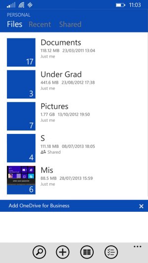
Do you like the new OneDrive UI (v4.4.0.0)

Silviu Bogusevschi

New member
Oct 27, 2013
1,126
0
0
Visit site
It's because it's not in line with the Modern UI. They moved settings into the Hamburger menu for no good reason as it was perfectly fine where it was, the same place as the other system apps which is in the three dots menu. They moved the search button for no good reason as well, it was fine where it was on the app bar.

They also changed from the text based pivots to a hamburger menu and icons for the pivots, totally against the Modern UI guidelines that they set out for other developers. They are also using a non standard UI, text based pivots are in the SDK and the, now current, fugly UI isn't.

The Facebook app has the same hamburger button and its design is very similar to OneDrive now, yet I didn't read so much rant about Facebook app design.
 

a5cent

New member
Nov 3, 2011
6,622
0
0
Visit site
The Facebook app has the same hamburger button and its design is very similar to OneDrive now, yet I didn't read so much rant about Facebook app design.


Again, it's not really about the hamburger button. It's about all the ways in which this app deviates from the metro design language. I think the hamburger button is the least important of those.

Given that W8 has provided us with a very recent example of how people react to jarring UI discrepancies, and that we know many people consider WP's design consistency one of its primary advantages, is it so hard to acknowledge, that this could be a serious issue, even if you personally don't think it's a big deal?

I think the majority of people react to design, consciously or unconsciously. I think deliberate design and conforming to guidelines is a very important component of what makes a UI easily learnable, particularly for non-geeks. I think it's one of the reasons WP does extremely well with first time smartphone owners, as you need only discover a few basic principles, after which you understand the entire UI. I think it's one of the things that helps the iPhone maintain it's perception of being high-end.

Keep this up, and before long, people will also start calling WP messy, just like Android (which is currently improving in leaps and bounds). I don't think that is hard to imagine. That doesn't mean I think metro is the be-all-end-all of UI design. I actually think it offers many opportunities for improvement. I just think such evolution should occur in a managed and consistent way, where all 1st party apps are used to set an example of what MS considers best practice.

Things like this obviously aren't the end of the world, but they do come at a cost. I don't think it's a good idea to ignore that.
 

anon(5445874)

New member
Dec 6, 2012
673
0
0
Visit site
What's with all this madness? The new app is better. It's not backwards. It's still pretty much like the old one but with new features. It actually works a lot better too. Odds are if someone's complaining about the look of the app, they don't really use it much.
 

blue1k

New member
Sep 8, 2013
672
0
0
Visit site
Ya what's with all the ********? The app is much richer than before and offers a lot more logical and usable interface.

Now only if they remembered One Note...
 

a5cent

New member
Nov 3, 2011
6,622
0
0
Visit site
Nobody is complaining about the app becoming more functional. Everybody agrees that is a good thing and we're all happy for it.

Unfortunately, this issue can't be discussed if one side refuses to acknowledge that it even exists or just thinks people who dislike the new design are mad/crazy. I don't think that's helpful. Even if you don't understand the issue yourself, the fact that it garnered over 2300 votes on uservoice in just a few hours suggests it's not a small number of people that feel there is a problem. The fact that many people view it as an erosion of one of WP's core strengths should also be taken seriously. No product manager worth their salt ignores that. Instead, you acknowledge that there is a problem, determine exactly what it is, and then consciously decide if it can/must be addressed.

I suspect this issue is larger than any single app. I think it asks the question where MS is headed with metro design. Are these just exceptions born of necessity, or did MS fire too many people from QA who's job it was to ensure UI consistency? Is this developer sloppiness, or is MS deliberately moving away from metro? Are these exceptions, or the new norm for first party apps? Has MS moved to a policy where every team decides for themselves what an app should look like, or does MS still care about teams adhering to a consistent design language? If I'm developing a new app for WP, what design guidelines should I now be following (as MS says or as MS does)? I think those are fair questions to ask at this point, and it shouldn't be hard for anyone to imagine how some answers could disappoint many WP users.
 

Michael Alan Goff

New member
Jan 15, 2012
1,073
0
0
Visit site
Nobody is complaining about the app becoming more functional. Everybody agrees that is a good thing and we're all happy for it.

Unfortunately, this issue can't be discussed if one side refuses to acknowledge that it even exists or just thinks people who dislike the new design are mad/crazy. I don't think that's helpful. Even if you don't understand the issue yourself, the fact that it garnered over 2300 votes on uservoice in just a few hours suggests it's not a small number of people that feel there is a problem. The fact that many people view it as an erosion of one of WP's core strengths should also be taken seriously. No product manager worth their salt ignores that. Instead, you acknowledge that there is a problem, determine exactly what it is, and then consciously decide if it can/must be addressed.

I suspect this issue is larger than any single app. I think it asks the question where MS is headed with metro design. Are these just exceptions born of necessity, or did MS fire too many people from QA who's job it was to ensure UI consistency? Is this developer sloppiness, or is MS deliberately moving away from metro? Are these exceptions, or the new norm for first party apps? Has MS moved to a policy where every team decides for themselves what an app should look like, or does MS still care about teams adhering to a consistent design language? If I'm developing a new app for WP, what design guidelines should I now be following (as MS says or as MS does)? I think those are fair questions to ask at this point, and it shouldn't be hard for anyone to imagine how some answers could disappoint many WP users.

2300 votes could mean that 767 people voted for it. I'm not saying it isn't an issue at all, just that it might not be as large as the people here seem to think it is. Also, it can't be discussed if one side refuses to acknowledge the concept that they might be overreacting.
 

a5cent

New member
Nov 3, 2011
6,622
0
0
Visit site
2300 votes could mean that 767 people voted for it. I'm not saying it isn't an issue at all, just that it might not be as large as the people here seem to think it is. Also, it can't be discussed if one side refuses to acknowledge the concept that they might be overreacting.

I disagree that such a discussion requires the acknowledgement of an overreaction. What constitutes an overreaction is utterly subjective anyway, as is the question of what constitutes good UI design. If both sides agree an issue exists, then we can at least have a discussion about how serious the issue really is. That discussion can't occur if one side doesn't even acknowledge its existence (you do, so no problem there).

You are right of course. It could be just 767 people. It could also be over 2300 people. Both are equally unlikely and it's probably not that important. The fact remains the issue garnered an unusually large number of votes in a very short time. How relevant that is, is up for debate. If I were a product manager at MS, I'd say it should at least be taken seriously, even if my own design sensibilities weren't offended.
 
Last edited:

anon(5789608)

New member
Apr 10, 2013
136
0
0
Visit site
hamburger button and now a back button too

wtf?? back button on top? WHY?

qYOlrIS.jpg
 

anon(5445874)

New member
Dec 6, 2012
673
0
0
Visit site
Why is this a problem?
More importantly, why is there a post about something other than OneDrive in a OneDrive thread?

Anyway, i'm really loving this new OneDrive app. It works wonderfully. So what if they added a hamburger button on the top, It's really only there to quickly access some things. Otherwise, you can swipe and navigate exactly how the old one did. More options is always better.
 

a5cent

New member
Nov 3, 2011
6,622
0
0
Visit site
More importantly, why is there a post about something other than OneDrive in a OneDrive thread?.

I think because it's making the same point the OP is. I'd say it's relevant because it fails in a similar manner, so it offers an alternative way of explaining the issue.

Why is this a problem?


IMHO "problem" is overstating it. However, I'd also say the onus is on you to explain why it is good and beneficial, and why it's not just useless, screen real estate wasting UI clutter.


Minimalism, simplicity and a focus on content rather than chrome and navigational elements is an approach to UI design that metro introduced, which the entire IT industry is now replicating (IMHO for good reason). I don't know this app, but it looks like this isn't honoring that rule.


If you think we're just nitpicking, ask yourself what you'd think, if every single WP app took this approach? Wouldn't it start feeling ridiculous and awkward at some point, considering we have a dedicated back button? If you agree with that assessment, then why make an exception here? Why not just call it out for what it is? Not really a problem per se... just out of place, useless, redundant, and a little bit stupid.
 

DoctorSaline

New member
Jul 9, 2014
425
0
0
Visit site
I think this is because of the new cross platform approach of Microsoft. They probably code it for iOS then bring it over to android and windows. It is good to know that cross platform apps can have similar features/functionality even in windows if the developers so desire. On another hand, if Microsoft's own subsidiaries can't commit to design guidelines outlined by windows platform then how in world do they expect developers to develop universal apps for different screen sizes of Microsoft(Windows 10 and onwards) ecosystem? This is just setting a wrong precedent.
 

Yazen

Banned
Nov 12, 2012
633
0
0
Visit site
Not sure why people are voting for this new design change. It sucks. It is as if OneDrive developers cannot be bothered to have to maintain two different app designs!

I can already buy an Android, why would I want a pale imitation.. Android 5.0 looking better and better .. If this is the future of Windows Phone I am jumping ship. Not a mindless ******
 

anon(5789608)

New member
Apr 10, 2013
136
0
0
Visit site
Why is this a problem?

why? because lumia have a capacitive back buton

and this

Interactions and usability with Windows Phone
Back and close buttons

"There should be no Back or Close buttons at all within your app UI. Windows Phone provides a physical Back button on every device so that you can keep your app’s navigation clean and simple"


from Microsoft Dev Center
Interactions and usability with Windows Phone
 

Michael Alan Goff

New member
Jan 15, 2012
1,073
0
0
Visit site
I disagree that such a discussion requires the acknowledgement of an overreaction. What constitutes an overreaction is utterly subjective anyway, as is the question of what constitutes good UI design. If both sides agree an issue exists, then we can at least have a discussion about how serious the issue really is. That discussion can't occur if one side doesn't even acknowledge its existence (you do, so no problem there).

You are right of course. It could be just 767 people. It could also be over 2300 people. Both are equally unlikely and it's probably not that important. The fact remains the issue garnered an unusually large number of votes in a very short time. How relevant that is, is up for debate. If I were a product manager at MS, I'd say it should at least be taken seriously, even if my own design sensibilities weren't offended.

Do you know what else garnered a lot of votes?

https://wpdev.uservoice.com/forums/...-blink-or-other-open-rendering-engine-and-sta
https://wpdev.uservoice.com/forums/...estions/6509607-auto-update-older-ie-versions

Why am I bringing this up? If you have to go by the "logic of the masses", you've already lost. Also, you're trying to frame the discussion in a way that only benefits your side. To you, it can only be a discussion if there's no possibility of somebody saying it isn't a real issue. That isn't the way a discussion works.
 

Michael Alan Goff

New member
Jan 15, 2012
1,073
0
0
Visit site
Not sure why people are voting for this new design change. It sucks. It is as if OneDrive developers cannot be bothered to have to maintain two different app designs!

I can already buy an Android, why would I want a pale imitation.. Android 5.0 looking better and better .. If this is the future of Windows Phone I am jumping ship. Not a mindless ******

If these small changes are enough to make it "a pale imitation", you were likely going to leave anyway. Seriously, a hamburger menu and a lack of obnoxiously large headers doesn't change that WP is better (in my opinion) than Android.
 

Members online

Forum statistics

Threads
323,126
Messages
2,243,304
Members
428,031
Latest member
quicktravo