Do you like the new OneDrive UI (v4.4.0.0)

envio

New member
Jun 20, 2012
320
0
0
Visit site
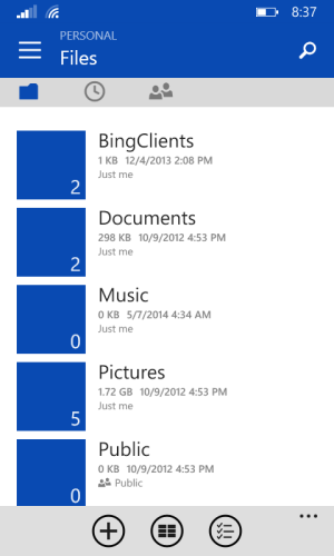
OneDrive for WP8.1 has been updated to v4.4 bringing with it a new UI layout and one that has effectively killed off the Metro UI. Gone is the elegant, clean, fluid pivot menu and in comes the Android-style hamburger amongst other things. It looks like Microsoft has abandoned its own principals with a tier 1 product. The UI layout comes with a big blue bar, hamburger, mini-icons, smaller menu names and the oddly placed search function. What does the community think of this new direction?

I personally don't like it and it's strong enough for me to put up a uservoice suggestion to revert it back the way it was. Revert the pivot menu UI for WP ? Customer Feedback for Microsoft

This update is a big nod to Android and not in a good way. The design looks lazy and ill-thought out. The modern UI has been sacrificed but I'm not sure why. What does everyone think, am I alone here, are Microsoft heading in the right direction?
 

colinkiama

New member
Oct 13, 2013
2,842
0
0
Visit site
Let Microsoft update this. The only thing android like is the hamburger button. Let's wait a few updates at least. The only reason they changed to this design was so it was easy to change to different accounts(business and personal)
 

envio

New member
Jun 20, 2012
320
0
0
Visit site
My fear is that if we say nothing and just accept this as it is, then the likelihood is that other teams will go that way too until its virtually too late to stop the rot. I felt I needed to speak up for the modern UI.
 

shann123

New member
May 21, 2014
47
0
0
Visit site
I'm going to have to agree with envio. The new UI looks like an Android port. I might expect and accept that from a Android-first third-party developer but the MS team should really try to make MS products shine in Windows Phone.
 

fgaudet

New member
Mar 9, 2013
166
0
0
Visit site
Really, going up in arms and calling out MS on yet another trivial detail? There is just no pleasing this crowd.

MS goes left, everyone screams, outrages, calls treason, riots, etc.
MS goes right, ditto.
MS goes forward, double ditto.
MS does nothing, you guessed it : triple ditto.

FFS people, relax. Modern UI is great and lovely, but it may not be the absolute best solution for every, single, thing.

This new update is faster and more functional, I like it.

First world problems FTL.
 

Michael Alan Goff

New member
Jan 15, 2012
1,073
0
0
Visit site
I don't see how this "sacrifices the Modern UI". So it has a hamburger menu. Seriously, is the menu the only thing that makes a UI good to you?

And would you be willing to make sure it isn't easily discoverable (as the hamburger menu has become) just for your ideological purity?
 

Waylon Payne

New member
Oct 12, 2014
65
0
0
Visit site
I'm fine with it, actually like it. Just wish they added functionality to multiselect from different folders concurrently (for mail attachment purposes). Otherwise its cool.
 

nallWhite

New member
Apr 29, 2014
163
0
0
Visit site
I don't see how this "sacrifices the Modern UI". So it has a hamburger menu. Seriously, is the menu the only thing that makes a UI good to you?

And would you be willing to make sure it isn't easily discoverable (as the hamburger menu has become) just for your ideological purity?

Windroid here we come
 

twint7787

New member
Nov 19, 2011
230
0
0
Visit site
Really, going up in arms and calling out MS on yet another trivial detail? There is just no pleasing this crowd.

MS goes left, everyone screams, outrages, calls treason, riots, etc.
MS goes right, ditto.
MS goes forward, double ditto.
MS does nothing, you guessed it : triple ditto.

FFS people, relax. Modern UI is great and lovely, but it may not be the absolute best solution for every, single, thing.

This new update is faster and more functional, I like it.

First world problems FTL.

The only good thing about this update is the performance.
Let me ask you a question. If all apps on windows phone were to look like this, why would you not buy an Android phone?
Design is important. If you don't care about it that's fine, but this is a big deal. This app looks SOOOO much like an Android app. It doesn't belong on the platform in its current state.
I also agree that some apps need more functional modern design, but all MS did here was use the design that Android currently uses. I just can't see how this helps to distinguish Windows phone. Why not evolve your own unique UI?
However, I know it was done because they want a more seamless experience across devices, but doesn't it worry you that they choose Android design over your own?
If they make their IOS app look like this then idk what to say...
 

Gwenddoleu

New member
Jan 13, 2013
114
0
0
Visit site
Personally I don't like at all the hamburger. Same in Xbox Smartglass :-( Really not user-friendly, especially on >5inch screens.
 

Michael Alan Goff

New member
Jan 15, 2012
1,073
0
0
Visit site
The only good thing about this update is the performance.
Let me ask you a question. If all apps on windows phone were to look like this, why would you not buy an Android phone?
Design is important. If you don't care about it that's fine, but this is a big deal. This app looks SOOOO much like an Android app. It doesn't belong on the platform in its current state.
I also agree that some apps need more functional modern design, but all MS did here was use the design that Android currently uses. I just can't see how this helps to distinguish Windows phone. Why not evolve your own unique UI?
However, I know it was done because they want a more seamless experience across devices, but doesn't it worry you that they choose Android design over your own?
If they make their IOS app look like this then idk what to say...

Material Design is just a tweaked Metro UI. :|
 

jordanzhninja

New member
May 4, 2014
177
0
0
Visit site
Yes the new app is great, and metro is going in the right direction.
I personally want to see more colour in apps, instead of this bland white text on a black background thing most apps have got going on.

Oh, and the huge headers that some apps still have (thankfully xbox music got rid of it) need to be eliminated
 

Kram Sacul

New member
Mar 4, 2013
750
0
0
Visit site
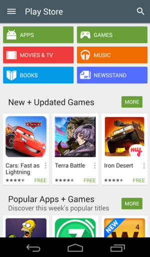
It's lazy Android-user friendly designed garbage. Big fugly hamburger button in the worst possible place, slide out menu, clunky use of icons. This isn't Metro/Modern.

playstore.pngwp_ss_20141028_0001.png

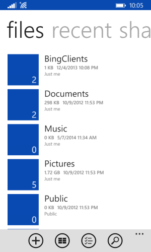
This is Metro/Modern.
wp_ss_20141027_0001.png

If you can't see the difference or think this is a step in the right direction then follow this link. It will lead you to what you're looking for.
 

Members online

Forum statistics

Threads
322,736
Messages
2,242,598
Members
427,978
Latest member
Duouser3