- Mar 2, 2015
- 706
- 0
- 16
Hi,
I switched to build 10149 couple of days ago and what annoys me the most is the new photo app? It is so sluggish, ugly and hard to navigate, typically example how it looks like when the mobile apps UI design gone wrong! I understand idea behind the universal apps and intention to looks similar across various devices but in this case it simply doesn't works... The old photo app is incomparable better solution in every segment, the best interface is no interface, simply swipe right to access folders and favorites is replaced with this ugly and hard to reach hamburger!? WTF!? To make it even worse it doesn't display all albums only, camera roll, screenshots and saved photos and there is no favorites photos all.
The situation is even worse when you attempt to find certain photo and attach it/send it/or something else from app no matter is it native or 3rd party?! There is no way to switch to albums view and access backgrounds album for example, instead you are forced to browse through couple of hundred of photos sorted by date which is insane and incredibly annoying!! The only app capable to access albums/folder is the WhatsApp and Outlook if you chose to attach photo through file manage instead of photo app.
Just hope this is not the final concept and they'll make it more 'mobile friendly' or at least offer old photo app through store as an alternative to those who prefer swiping over hamburger and albums over collections...
last but not the least, sorry 4 my English, it is not even my 52nd but a third language so apologies once again, just hope that whole point isn't 'lost in translation'...
P.S. Here are the couple of screenshots:
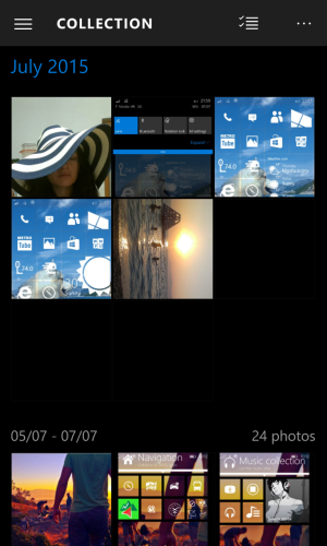
Default collection view with lot of wasted space...
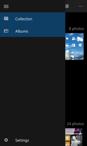
No pivot, only hard to reach hamburger..
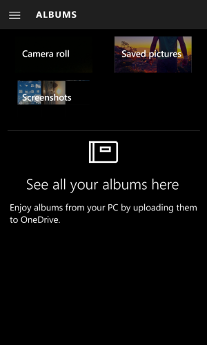
Album view is currently totally useless and looks horrible..
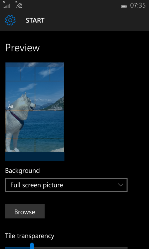
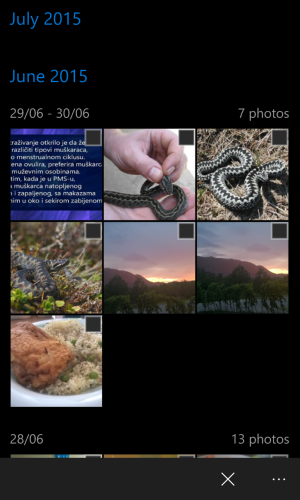
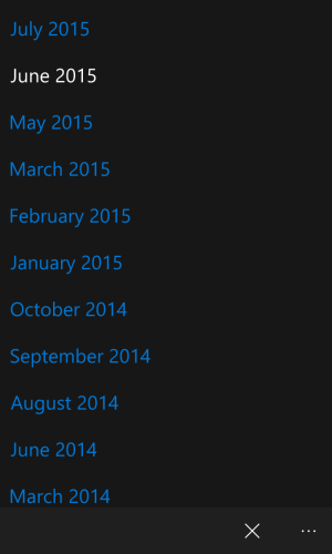
Simple task as changing start background is painful experience as there is no way to access, for example wallpapers album/folder directly...
That's all folks for now
I switched to build 10149 couple of days ago and what annoys me the most is the new photo app? It is so sluggish, ugly and hard to navigate, typically example how it looks like when the mobile apps UI design gone wrong! I understand idea behind the universal apps and intention to looks similar across various devices but in this case it simply doesn't works... The old photo app is incomparable better solution in every segment, the best interface is no interface, simply swipe right to access folders and favorites is replaced with this ugly and hard to reach hamburger!? WTF!? To make it even worse it doesn't display all albums only, camera roll, screenshots and saved photos and there is no favorites photos all.
The situation is even worse when you attempt to find certain photo and attach it/send it/or something else from app no matter is it native or 3rd party?! There is no way to switch to albums view and access backgrounds album for example, instead you are forced to browse through couple of hundred of photos sorted by date which is insane and incredibly annoying!! The only app capable to access albums/folder is the WhatsApp and Outlook if you chose to attach photo through file manage instead of photo app.
Just hope this is not the final concept and they'll make it more 'mobile friendly' or at least offer old photo app through store as an alternative to those who prefer swiping over hamburger and albums over collections...
last but not the least, sorry 4 my English, it is not even my 52nd but a third language so apologies once again, just hope that whole point isn't 'lost in translation'...
P.S. Here are the couple of screenshots:

Default collection view with lot of wasted space...

No pivot, only hard to reach hamburger..

Album view is currently totally useless and looks horrible..


Simple task as changing start background is painful experience as there is no way to access, for example wallpapers album/folder directly...
That's all folks
Last edited:


