- Jun 7, 2014
- 18
- 0
- 0
I came up with the idea of designing a unified UI for Windows 10 Desktop/Tablet/Phone because I wanted all applications to have a similar appearance, no matter which platform they are on.
This idea is actually pretty much inspired by Microsoft itself and partially looks very similar to what we have in the Technical Previews.
Please note that this concept would need quite some polish to be implemented into Windows, but I did this using PowerPoint so please don't judge me :winktongue: Because of this there are also sometimes missing icons, or different colours, but as I said, it WOULD need polish.
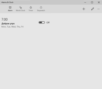
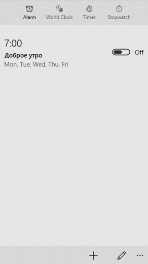
My original idea was to have a clear separation between navigational items (to be found on the left) and contextual items (to be found on the right). The other idea was to make a UI that works on phones, tablets and laptops, in landscape and portrait, equally well. Developers would have to code the UI only once, as the scaling and adapting (e. g. make icons bigger when using touch input, smaller with mouse) is done by the OS.
To ensure easy use with one finger, you can just swipe left or right to change between the pages. The contextual items will adjust accordingly.
Here are the pictures:
On desktop:
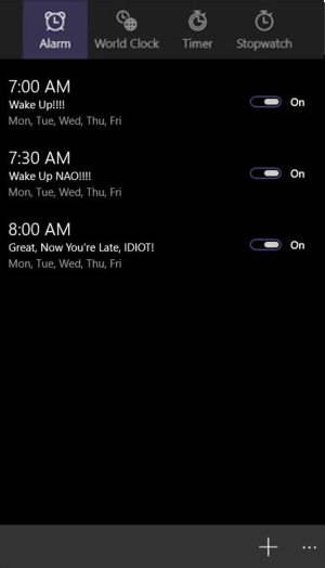
Desktop, dark theme:

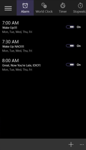
Phone:
Phone, dark theme:
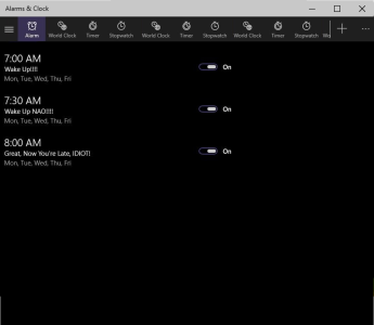
Desktop, when there are A LOT of navigational items; in this case, a hamburger is displayed containing ALL nav items:
Phone, when there are more than four nav items:
If you have any questions, ask right away!!!
If you have (constructive) feedback, give me everything. Let me know what you think!!!
This idea is actually pretty much inspired by Microsoft itself and partially looks very similar to what we have in the Technical Previews.
Please note that this concept would need quite some polish to be implemented into Windows, but I did this using PowerPoint so please don't judge me :winktongue:
My original idea was to have a clear separation between navigational items (to be found on the left) and contextual items (to be found on the right). The other idea was to make a UI that works on phones, tablets and laptops, in landscape and portrait, equally well. Developers would have to code the UI only once, as the scaling and adapting (e. g. make icons bigger when using touch input, smaller with mouse) is done by the OS.
To ensure easy use with one finger, you can just swipe left or right to change between the pages. The contextual items will adjust accordingly.
Here are the pictures:
On desktop:

Desktop, dark theme:

Phone:

Phone, dark theme:

Desktop, when there are A LOT of navigational items; in this case, a hamburger is displayed containing ALL nav items:

Phone, when there are more than four nav items:

If you have any questions, ask right away!!!
If you have (constructive) feedback, give me everything. Let me know what you think!!!

