- May 28, 2014
- 112
- 0
- 0
Hi everyone!
Windows 10 introduced a completely new Task view. A huge improvement over the 8.1 task view(the annoying bar on the left). And while it is almost perfect....why not make it perfect? I know, RTM is close to this may be too much of a change for it, but Windows 10 will be improved upon launch too, so it worths a try.
Since Insider program started, the internet was flooded with feedback for the upcoming Windows version. Being a MS enthusiast myself, I naturally started having some ideas for improvement too. BUT, what i saw on the internet was a lot of ideas with gimmick features or impossible or useless, a lot of good ideas too AND a huge amount of incomplete ideas (because always is easier to improve someone else's work than to come with a perfect idea from the beginning). And this is might be the case for me too. Even if i usually overthink one of my idea if it is complex enough, i decided to post it here too.
So thats the reason i post it here, to see if it need any more adjustments before i fire it up on the uservoice. And at the same time, to gather a bunch of other enthusiasts to support the idea on the uservoice too.
Before we start, please keep in mind that the following mock-ups are a representation. While I DID tried to follow Microsoft rules of design and iconography to make the idea as close to the reality as i could, i didnt want to spend weeks on a certain icon for example, for just a mock-up either. If needed, please see the pictures on another tab to watch them bigger. So lets begin:
----------------------------------------------------------------------------------------------------------------------------------------
Windows 10 PC/Laptop/Tablet(8"+)
1.App showing and buttons/functions

One of the good things about windows 8.1 was the ability to use 2 snapped apps as a single one, from the app management point of view. I think that should be brought back somehow.
How it works: If 2 app are snapped in tabled mode, they will show merged in the task view. Also, via the black separator between them, the apps can be managed as a single app: drag up/down the "single app" from the black separator to lock/close both apps at the same time; tap on it to open both apps;
-------------------------------------------------------------------------------------------------------------------------------------
Windows 10 Mobile/ Tablet(8"-)
What would be Windows 10 without consistency? So here it is the Mobile design, but with some small changes to respect the form factor. I will talk only about the different things from the PC version.
1. App showing and navigating

2. More apps
-------------------------------------------------------------------------------------------------------------------------------------
Bottom line, I hope you enjoy my idea of improving the task view in windows 10. if its too late for pc RTM maybe in the rumored fall update, and to bring it on the same page with phone launch. Tell me if you didnt understand something from this big blog post and i will try to polish my english, also feel free to leave a comment, maybe some suggestions too. And once i feel it is the time, i will post this suggestion on the uservoice page and will send a link here to get your votes. Thanks.
And PS: I would also suggest to move the task view on the phone from Hold back arrow to Hold home button, and to spread this hold of windows key for task view on keyboards and tablets with capacitive keys too. But more on that on my next suggestion coming soon. More are coming, stay tuned
Windows 10 introduced a completely new Task view. A huge improvement over the 8.1 task view(the annoying bar on the left). And while it is almost perfect....why not make it perfect? I know, RTM is close to this may be too much of a change for it, but Windows 10 will be improved upon launch too, so it worths a try.
Since Insider program started, the internet was flooded with feedback for the upcoming Windows version. Being a MS enthusiast myself, I naturally started having some ideas for improvement too. BUT, what i saw on the internet was a lot of ideas with gimmick features or impossible or useless, a lot of good ideas too AND a huge amount of incomplete ideas (because always is easier to improve someone else's work than to come with a perfect idea from the beginning). And this is might be the case for me too. Even if i usually overthink one of my idea if it is complex enough, i decided to post it here too.
So thats the reason i post it here, to see if it need any more adjustments before i fire it up on the uservoice. And at the same time, to gather a bunch of other enthusiasts to support the idea on the uservoice too.
Before we start, please keep in mind that the following mock-ups are a representation. While I DID tried to follow Microsoft rules of design and iconography to make the idea as close to the reality as i could, i didnt want to spend weeks on a certain icon for example, for just a mock-up either. If needed, please see the pictures on another tab to watch them bigger. So lets begin:
----------------------------------------------------------------------------------------------------------------------------------------
Windows 10 PC/Laptop/Tablet(8"+)
1.App showing and buttons/functions

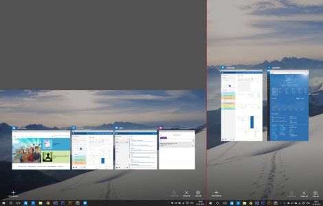
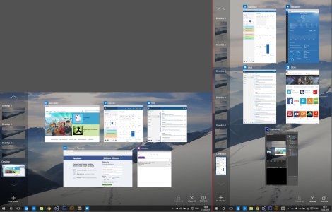
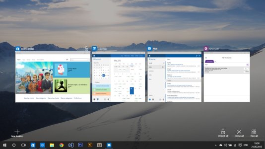
- Horizontal list: Similar to WP design, apps are showing in a horizontal list with apps coming from right to left.
- Buttons: At the bottom we have 4 buttons, 3 right 1 left (w10 philosophy). I will explain each one at a time, but for now, lets exclude "New desktop" which all of you know what it does and "Close all" button which is self explaining.(cant believe such a function is currently missing btw)
- Portrait orientation: On a modern OS, both orientations must be present.
- Resizable distance between apps: The distance between apps should be resizable, allowing as many apps to fit in as possible.As you can see, on portrait the design allows for a minimum of 2 full-screen apps, for a fast app switching and a good productivity level.

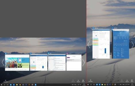
- Surfing through apps: As mentioned before, apps are coming from right to left. Also the list of apps can be scrolled/swiped.
- Closing apps: Apps can be closed either by hitting the X or by dragging them down like on the phone.
- Navigation arrows: For when there are more apps opened, navigation arrows appear. They suggest the user that there are more apps AND they can be clicked/tapped.

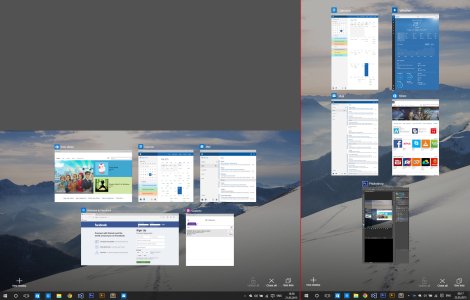
- All apps button: Users get to choose if they want to see the apps in a horizontal list or spawned across the entire screen(as they are currently by default). The button also acts as a toggle, so the next time you open task view it will remember your last selected view mode.


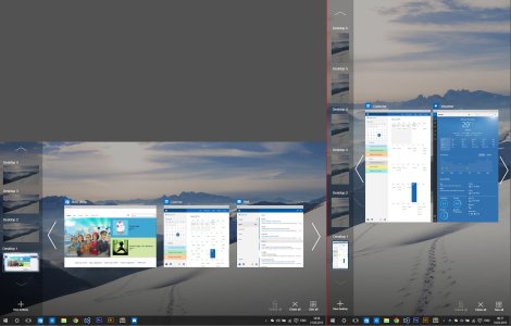
- Desktop list: Now is located on the left edge and is vertically oriented. Also, given the resizable distance between apps, the list is able to push the apps a little to the right, in order to fit in.


- Lock function: This function prevent an app from closure from the task view until the app is unlocked. Both X button/Drag down AND Close all button are ineffective on the locked apps. Also, if an app is locked from the task view, closing it from a X button from the app bar outside the taskview will prompt a system dialog asking for confirmation, thus preventing closure by mistake.
- How to lock: An app can be locked only from the taskview, either by hitting the lock button near the X button or by dragging the app up.
- How to unlock: Either by dragging the app up again / hitting the unlock button (which replaces the X button on a locked app) OR by Unlock all button which, similar to close all, this button unlock all locked apps.

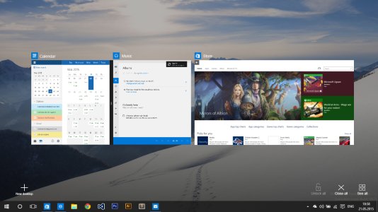
One of the good things about windows 8.1 was the ability to use 2 snapped apps as a single one, from the app management point of view. I think that should be brought back somehow.
How it works: If 2 app are snapped in tabled mode, they will show merged in the task view. Also, via the black separator between them, the apps can be managed as a single app: drag up/down the "single app" from the black separator to lock/close both apps at the same time; tap on it to open both apps;
-------------------------------------------------------------------------------------------------------------------------------------
Windows 10 Mobile/ Tablet(8"-)
What would be Windows 10 without consistency? So here it is the Mobile design, but with some small changes to respect the form factor. I will talk only about the different things from the PC version.
1. App showing and navigating

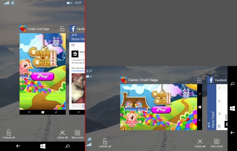
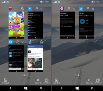
- No desktop button: obvious reasons
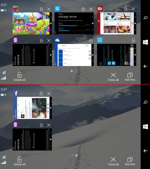
- No arrows for navigating: Mobiles are touch-first devices so no need for "clickable" alternatives, swipes are enough. Also, due to small width of the screens, a piece of the next app is showing to feedback the user that there are more apps, instead of an arrow.
- *everything else works the same. hit X / drag down for close app, etc.*

- *lock function works the same too*
2. More apps


- More app: Due to small screens, showing all apps would be impossible, so the Show all is replaced with Show more, showing only 4 apps at the same time(6 on landscape). Also, if there are more than 4 apps opened, a type of pagination is required, so it is solved with a multiple pages of 4 apps each, and the current page is represented with a round bullet in the middle of the app list. And btw, the "pages" are navigated either by swipes or by tapping the circles.
- No app names: To reduce the screen clutter (with screens already being small), i opted to remove the app names in this viewing mode, and leaving only its logo. This way the screen is cleaner, given that it already displays 4 apps with their icons and lock and close buttons.
-------------------------------------------------------------------------------------------------------------------------------------
Bottom line, I hope you enjoy my idea of improving the task view in windows 10. if its too late for pc RTM maybe in the rumored fall update, and to bring it on the same page with phone launch. Tell me if you didnt understand something from this big blog post and i will try to polish my english, also feel free to leave a comment, maybe some suggestions too. And once i feel it is the time, i will post this suggestion on the uservoice page and will send a link here to get your votes. Thanks.
And PS: I would also suggest to move the task view on the phone from Hold back arrow to Hold home button, and to spread this hold of windows key for task view on keyboards and tablets with capacitive keys too. But more on that on my next suggestion coming soon. More are coming, stay tuned
Last edited:

