- Jul 31, 2014
- 18
- 0
- 0
https://windows.uservoice.com/forum...uggestions/9489249-consistent-design-for-apps
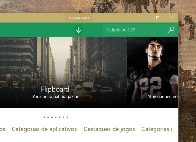
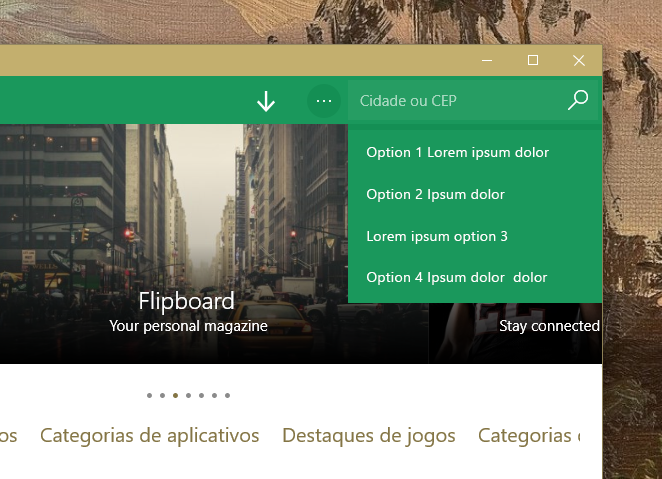
Note that this concept is a personal project, but does not mean that is based solely on opinion. Even if the W10 applications are being redesigned to improve usability and all that, they still get lost in a big point: an inconsistent design. Their own standards application do not keep a pattern even when it comes to menus. Some have the 'back button' on the top bar, while others have it in the new action bar; some have 'search' into the hamburger menu, while others have outside. Not to mention colors, hovers, and the way each one acts with the three-dots button. So I hope that, later on, they are able to standardize everything into something more consistent. And that's what I kind of hope:
P.S.: do not judge me about Groove color, I've run out of ideas to choose one.
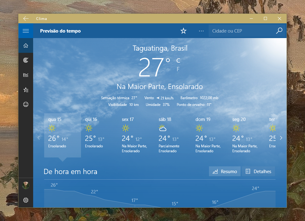
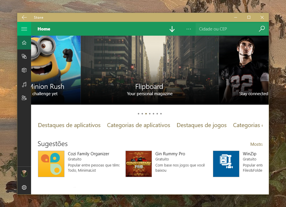

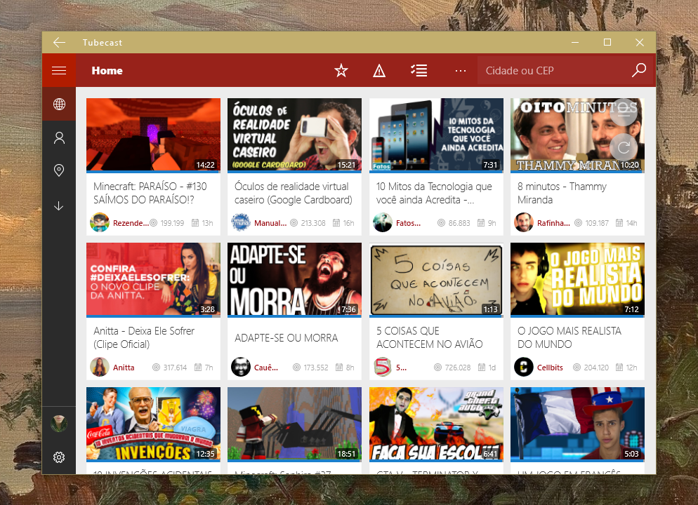
Further, now about hovers and cascading menus. As well as in mobile, the title of the icons need to be accessible to users, but that increase in height with the three-dots button looks more broken than anything. Combining this with the fact that it is a waste to add an extremely empty title bar (only with close, minimize, increase and return), I believe that, at least for 'mouse mode', it would be better to let the titles appear in the title bar, and let the three-dots button being used just for additional options.
I think I just wanted to share my expectations. Any opinion, critic, suggestion, feel free.")
Note that this concept is a personal project, but does not mean that is based solely on opinion. Even if the W10 applications are being redesigned to improve usability and all that, they still get lost in a big point: an inconsistent design. Their own standards application do not keep a pattern even when it comes to menus. Some have the 'back button' on the top bar, while others have it in the new action bar; some have 'search' into the hamburger menu, while others have outside. Not to mention colors, hovers, and the way each one acts with the three-dots button. So I hope that, later on, they are able to standardize everything into something more consistent. And that's what I kind of hope:
P.S.: do not judge me about Groove color, I've run out of ideas to choose one.
Further, now about hovers and cascading menus. As well as in mobile, the title of the icons need to be accessible to users, but that increase in height with the three-dots button looks more broken than anything. Combining this with the fact that it is a waste to add an extremely empty title bar (only with close, minimize, increase and return), I believe that, at least for 'mouse mode', it would be better to let the titles appear in the title bar, and let the three-dots button being used just for additional options.
I think I just wanted to share my expectations. Any opinion, critic, suggestion, feel free.
Last edited:
 Twitter