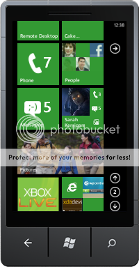
Improvement suggestions

1jaxstate1

New member
Dec 6, 2010
3,249
9
0
Visit site
Than png is exactly what's needed. It would need to follow the theme color and be up towards the -> arrow. Looks weird hanging down at the bottom. But it's a foot in the right direction.
It looks like someone already suggested my notifications idea:
https://windowsphone7community.user...-dead-space-under-arrow-on-start-screen-for-n

They made a mockup too, although I think the icons are too small. They'd have to be bigger than that to be readable.
http://www.sarilouis.com/notifications.png

Anyway, I voted for it. I'm sure MS never looks at that site but hey, why not.
 

thed

New member
Jan 6, 2011
992
3
0
Visit site
I find it to be redundant. Since it gives you the same information the title has on the same page.
It is kind of redundant for things like missed calls and emails. The mockup failed to show the real value of this idea. The real value would be for toast notifications. For example, if I'm running an app and I don't have the live tile pinned to the start, I could easily miss the notifications. Also, some apps could have toasts without the live tile. If you miss it when it arrives and you don't have a live tile, there's no way to know that you even got a notification.

Plus, there really needs to be a way to view all of your recent notifications in one place, and this would be one way to do it.

It would be even nicer if you could select which apps would appear there, but maybe that's asking too much.
 

DontHate707

New member
Jan 3, 2011
347
0
0
Visit site
tiles were made for notifications it would be hard to design them and be innovative. Maybe notifications should just get smaller and go to the left side of the screen then when you click on the icon they pop up on top like they usually do then you click on whatever one you want to like lets say you got three texts you just pick the one from your friends instead of your girlfriend lol . Like just swipe to the left of the tiles and there the icons will be. It should be a screen you can get to at anytime. Like on meego lmao

In term of customization we should be able to choose the size of the tiles and how much and what info pops up if we want. Especially the native ones and for backgrounds we should get whatever color or pic and cool moving ones that go with the whole metro look.
 
Last edited:

starblade876

New member
Jan 14, 2010
306
6
0
grrrinders.com
Here was my idea to handle long home screens:
ca399574.png


My other idea that I posted before was to have a toast notification drop down by long pressing the home button and move the voice command to long pressing the search button. Maybe also add quick on/off options for the radios (bluetooth, wifi, 3G/4G) on the right side, except have them only show up when you touch the top of the screen (like you do to see the battery icon, etc.) to reduce accidental pressing.

The only other suggestion I like that many people seem to want, too, is a semi-transparent tiles option and background image and an RGB color picker for the home screen (tiles and background).
 

1jaxstate1

New member
Dec 6, 2010
3,249
9
0
Visit site
If your away from your phone for a few minutes. Whn you get back to is, do you open your phone and scroll and check every pinned app for notifications?
I guess but with the infinite space you get, there's no reason for not having anything on the front. =)
birdsong gives notifications even when it isn't pinned.

Sent from my Samsung Focus using Board Express
 

sm07

New member
Jul 6, 2011
26
0
0
Visit site
My other idea that I posted before was to have a toast notification drop down by long pressing the home button and move the voice command to long pressing the search button.

Smart. That actually makes more sense - you usually only use voice control when you want to open/find something.

On that note, here's my idea for notifications - missed notifications would go into a notifications center, like Android/WebOS/iOS5. Hold down home to access it from anywhere, or hit the little notification button on the homescreen.

Notifications from the past hour (or ones that were delivered when the phone was locked/idle) would show up with a coloured highlight.

 
Last edited:

1jaxstate1

New member
Dec 6, 2010
3,249
9
0
Visit site
That'll work. After playing around with the new Mango, things are kind of mess. Maybe because it's new and I"m not use to it, but you got to go to the me tile to see notifications from others, the what's new portion to see what you posted. The people hub under the what's new portion to see updates from others, then the messaging tile to see text, fb chat and who's online. It's kind of a messy situation.
Smart. That actually makes more sense - you usually only use voice control when you want to open/find something.

On that note, here's my idea for notifications - missed notifications would go into a notifications center, like Android/WebOS/iOS5. Hold down home to access it from anywhere, or hit the little notification button on the homescreen.

Notifications from the past hour (or ones that were delivered when the phone was locked/idle) would show up with a coloured highlight.

The idea of glance and go isn't working with having to go to so many different places just to check so little.
 

AdeptMaven

New member
Jul 30, 2011
19
0
0
Visit site
That'll work. After playing around with the new Mango, things are kind of mess. Maybe because it's new and I"m not use to it, but you got to go to the me tile to see notifications from others, the what's new portion to see what you posted. The people hub under the what's new portion to see updates from others, then the messaging tile to see text, fb chat and who's online. It's kind of a messy situation.

The idea of glance and go isn't working with having to go to so many different places just to check so little.

So you would aggregate all of those in one area??? if your checking and reading all the notifications of what your friends have posted your doing alot more than glancing. i dont have mango so im uncertain but if you pin the me tile, its live tile displays missed calls and messages no? if not pin the messaging tile, facebook, and a twitter client (not the official one as of yet ;/) and you'll see at a glance that you have x number of messages and new items relating to you on facebook/twitter. or perhaps i misunderstand you.
 

1jaxstate1

New member
Dec 6, 2010
3,249
9
0
Visit site
The Me tile doesn't display x number of messages, only the messaging hub does. It only shows the latest message, and it's very delayed. Calls is displayed on the phone tile, messages [fb chat and SMS/MMS] is displayed on the messages tile.
So you would aggregate all of those in one area??? if your checking and reading all the notifications of what your friends have posted your doing alot more than glancing. i dont have mango so im uncertain but if you pin the me tile, its live tile displays missed calls and messages no? if not pin the messaging tile, facebook, and a twitter client (not the official one as of yet ;/) and you'll see at a glance that you have x number of messages and new items relating to you on facebook/twitter. or perhaps i misunderstand you.
You have several places to look for all your messages. The drop down menu that was photoshopped above would be lovely!
 

knirirr

New member
Jul 30, 2011
1
0
0
Visit site
I saw this link on the blog post and so thought I'd sign up to make a comment.

One of the main problems I have with WP7 is the calendar, which I find very hard to read as there is no good overview of what is happening in a month and on the two available views the lack of any divider between days makes it easier to lose my place. At the very least making the monthly view zoomable would help, but ideally some sort of view similar to that of the Google calendar's web interface would be very useful. There's an app in the marketplace (Super Gcal?) which is much easier to read although not much use when there's not a good signal. There was a very good app in the iOS app store which now goes by the name of Notvetica, which would be ideal. I couldn't resist asking the coders if they'd port it, but they refused.

I have read that Mango will permit syncing more than one Google calendar, which will be very useful indeed. The ability to create an appointment lasting all day or spanning several days is also needed.
 

MadGaffler

New member
Feb 13, 2011
41
1
0
Visit site
add album art to the playlist and artist tiles when they are pinned to start. Currently when you pin a playlist it is just the name of the playlist nothing else and when you pin an artist and Zune doesn't have any pictures for them you just get the accent colored tile with their name. If I have album art why cant I just look at that or if its more than one artist in a playlist why not have the album covers similar to the people tile.
 

1jaxstate1

New member
Dec 6, 2010
3,249
9
0
Visit site
Something else that bugs me about this Twitter integration. If you are in the people hub, looking at your timeline, you can't compose a new tweet. You can only reply to a tweet. So you have to exit out the people hub, go into the Me tile, and post from there. Kinda dumb.
 

Members online

Forum statistics

Threads
323,303
Messages
2,243,602
Members
428,055
Latest member
DrPendragon