Are WP8 Tiles Ugly?

Status
Not open for further replies.

smoledman

Banned
Apr 17, 2012
1,303
0
0
Visit site
One thing I can agree with is that when you have too many tiles which only have the accent color + a white icon they can blend together in a heaping mess. The reason why iOS is so successful is that when you're look at the app drawer, the icons are so distinct from each other that you have no trouble knowing which app is which. That can be a problem on Windows Phone.
 

jmshub

Moderator
Apr 16, 2011
2,667
0
0
Visit site
I love the live tile interface of wp. The grid of static icons with glass texture and rounded corners bores me. I like that crazy amounts of personal data can be gleaned by unlocking the phone and scrolling down thru my home screen. It doesn't need faux glass texture, or anything. It was born to be viewed on a screen, it should be bold and clean and square.

Sent from my SGH-i917 using Board Express
 

poiman

New member
Jul 30, 2012
482
0
0
Visit site
I don't think tiles look very good on WP8, but they are beautiful on W8! I think Microsoft has to give us some background colour options and tiles should have different colours too.
 

bayotte

New member
Jun 25, 2012
18
0
0
Visit site
I personally find no need to belittle the competition. Good competition is never bad for the business. Let's not forget Windows Phones are on the outside looking in as for Apple is on the inside looking out. WP UI is probably the most intuitive and personalized user interface available. If someone is looking to have an UI populated with icons only, it's not as if the market lacks choice. Tiles are what makes WP unique.
 

josepmanel1983

New member
Sep 29, 2011
112
0
0
Visit site
I love my Mozart tiles and I can't wait to upgrade it to WP 7.8 They are one of the key features for my sticking to Windows Phone!

Sent from my 7 Mozart using Board Express
 

GoodThings2Life

New member
Dec 1, 2011
1,037
0
0
Visit site
I'm gonna just leave Apple out of the discussion, because I believe their interface is reminiscent of Windows 3.1 Program Manager.

For Windows Phone Tiles, you need only to look at the diversity of the tiles to realize the original premise of this thread is wrong. If you're simply looking at the Phone tile, sure, I can see that as boring. But if you look at the People tile or the Pictures hub tile, suddenly they're not so drab. They have flair and personality.

Point is, it's up to the app designers to be creative, and they can use the entire space of the tile to look awesome or they can go simple and just have an icon on a square. Honestly I like both depending on the app's purpose. For a game, it's great to have a colorful logo. For e-mail, I like simple. For weather, I like simple but flashy enough to get my attention.

Windows Phone allows that. What does the competition offer? An icon. The same icon that you would have had in 1995.
 

TheNerdlyKnight

New member
Sep 17, 2012
53
0
0
Visit site
Personally I love the Metr...Modern UI appearance of WP7 and what we've seen of WP8 so far. When it comes to variety in the tiles remember that third party apps are not required to be a plain Modern UI tile and can actually be representative of their logo, etc. Look at TunedIn Radio, ESPN, USA Today, and Crackle for examples. Better yet lets look.at this screenshot from WP8 for an example:

wp8-homescreen-tiles-3.png


Bottom line, there should be plenty of variety in the screen appearance thanks to the rules and sizing/layout options to appease everyone.
 

Austinguy23

New member
Sep 24, 2012
18
0
0
Visit site
Yes, the entire OS is bland and the tile colors are utterly hideous. Hot pink? Baby blue? Lime green? Did Toys R Us design this thing? I'd be embarrassed for anyone to see it.

And why did they go with just solid colors?! It's like Microsoft went out of its way to take us back to the 80s. I'm having flashbacks of using an Apple IIe...

Another thing - This is the age of Retina and HD+ displays is it not? Then, someone explain to me why Microsoft insists on not leveraging these powerful displays in the OS elements. No gradients? No texturing? It's just downright lazy and void of any style whatsoever.

I say this as someone who is strongly considering the Lumia 920 due to its incredible hardware, but the OS just doesn't do it justice.
 

brmiller1976

New member
Aug 5, 2011
2,092
0
0
Visit site
I am biased, but I love mondrian design (ala WP tiles).

Minimalism and typography rock. Overwrought skeuomorphism is vomit-inducing. I mean, have you used Apple's podcast app on the iOS 6 platform yet? It's a friggin' reel-to-reel tape player! And the contacts book has a faux-pleather cover. *shudder*
 

brmiller1976

New member
Aug 5, 2011
2,092
0
0
Visit site
Yes, the entire OS is bland and the tile colors are utterly hideous. Hot pink? Baby blue? Lime green? Did Toys R Us design this thing? I'd be embarrassed for anyone to see it.

And why did they go with just solid colors?! It's like Microsoft went out of its way to take us back to the 80s. I'm having flashbacks of using an Apple IIe...

Another thing - This is the age of Retina and HD+ displays is it not? Then, someone explain to me why Microsoft insists on not leveraging these powerful displays in the OS elements. No gradients? No texturing? It's just downright lazy and void of any style whatsoever.

I say this as someone who is strongly considering the Lumia 920 due to its incredible hardware, but the OS just doesn't do it justice.

I get the idea that in the 1990s, you were building web sites filled with animated GIFs, the blink tag, and audio soundtracks that started blasting upon visiting the web site :D

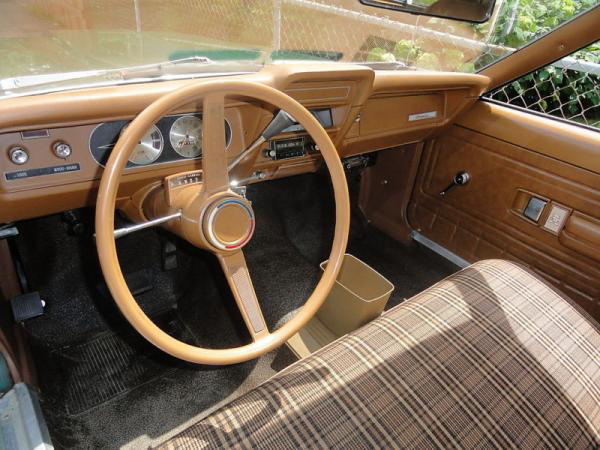
Simple spot color and typography is gorgeous. Gradients, rainbows, fake dew, fake leather, fake wood, fake chrome, and all sorts of other extraneous bling is the technology equivalent of the contact-paper "wood" on the dashboard of a 1978 Gremlin. YUCK
 

Laura Knotek

Retired Moderator
Mar 31, 2012
29,405
24
38
Visit site
I do not think the live tiles are ugly at all. I like them, since they are a useful feature, not just an icon.

It is great to view the live tiles and see pertinent information without needing to open up an app. For example, I can just look at the Accuweather live tile and know the temperature/current condition without opening the Accuweather app. Same thing with sports apps; I see the scores of the games/teams I'm following without needing to open the apps.
 

Laura Knotek

Retired Moderator
Mar 31, 2012
29,405
24
38
Visit site
No one is saying the FUNCTIONALITY of live tiles is bad. We're just saying they're aesthetically lazy and tacky.

I don't get that.

Then again, I'm not an artist. I prefer functionality over aesthetics.

A pretty feature that DOES nothing is a failure in my point of view.

I don't care about pretty looks. I want something that offers functionality.
 

12Danny123

New member
Mar 24, 2012
1,770
0
0
Visit site
I don't get that.

Then again, I'm not an artist. I prefer functionality over aesthetics.

A pretty feature that DOES nothing is a failure in my point of view.

I don't care about pretty looks. I want something that offers functionality.

Agreed. you don't judge on looks. you judge of functionality. and IOS clearly lacks it with their dead icons. Windows phone has tiles, Android has widget and IOS......Icons
 

GoodThings2Life

New member
Dec 1, 2011
1,037
0
0
Visit site
Ugh, it's not an either/or proposition.

You're right. But it's also an opinion, and it's one most of us don't share with you. Beauty is in the eye of the beholder, and we don't have to agree.

I happen to find them both functional and attractive... well, mostly. There ARE some really ugly tiles (the Facebook messaging when pinned, for example), but I happen to like the simple square geometry, solid colors (don't like lime... no problem, there's a bunch of others to pick, and more coming in WP8). Gradients don't impress me, because they don't offer me anything.

The point is, what you call ugly, I call boldly different, and isn't that what Apple always preaches? To think different? Maybe it's time they took their own advice.
 

thirdsun

New member
Sep 21, 2012
29
0
0
Visit site
Personally I love the Metr...Modern UI appearance of WP7 and what we've seen of WP8 so far. When it comes to variety in the tiles remember that third party apps are not required to be a plain Modern UI tile and can actually be representative of their logo, etc. Look at TunedIn Radio, ESPN, USA Today, and Crackle for examples. Better yet lets look.at this screenshot from WP8 for an example:

Click to view quoted image


Bottom line, there should be plenty of variety in the screen appearance thanks to the rules and sizing/layout options to appease everyone.

I'd like to have the tiles reduced even further: I already mentioned this in another thread, but I would prefer it if the app tiles could be restricted to the global accent color to avoid clutter - is that an option in windows phone or does the developer decide how to handle its tiles? (The Lumia 920 will be my first WP device after years of iPhone usage, so I have no experiences with the OS)
 

ImmortalWarrior

New member
Apr 30, 2011
523
0
0
Visit site
I get the idea that in the 1990s, you were building web sites filled with animated GIFs, the blink tag, and audio soundtracks that started blasting upon visiting the web site :D

Simple spot color and typography is gorgeous. Gradients, rainbows, fake dew, fake leather, fake wood, fake chrome, and all sorts of other extraneous bling is the technology equivalent of the contact-paper "wood" on the dashboard of a 1978 Gremlin. YUCK
1972_amc_gremlin_interior.jpg


Somebody at some time thought this was attractive, it wasn't until something better came along that they realized it wasn't.

The same applies to iOS. In 2007, against BB and the old Windows Mobile, it was a big improvement. Now, as designs have improved, it shows it's age.

I'm not saying that it doesn't cater to people, sure it does. We all have preferences and opinions. Personally, I have always disliked Apple's UI design. I find it apt that you referenced rainbows, and chrome, and marquees, and blink etc from the old HTML days because I feel that that is a perfect metaphor for current skeuomorphic Apple designs.
 
Status
Not open for further replies.

Members online

Forum statistics

Threads
323,304
Messages
2,243,604
Members
428,055
Latest member
DrPendragon