A Newer Design: Apps List + Notification Center Concept, Take Two

AgentTheGreat

Member
Aug 3, 2012
193
0
16
Visit site
Hello again.
I came up with a concept design to address the need for some form of notification center in Windows Phone in another thread a while back. I received a lot of positive feedback with numerous suggestions and new ideas, so I decided to re-imagine the concept and try to take advantage of new suggestions as much as possible.
To sum up the suggestions and arguments:

1- Use right-swipe to access the notification center
2- Creating an apps hub would unnecessarily waste space, also the hub wouldn't be easily accessible so it would be better to keep the current list
3- The Me tile already contains a notifications area, so it would be better to use that area for other notifications as well

After spending some time considering the implications of each of those suggestions, me and my friend (WPCentral user iWicca) came to these conclusions:

1- The right-swipe is really intuitive so it is a good idea
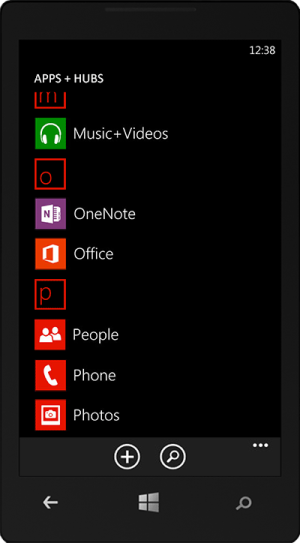
2- The apps list still needs an overhaul (we thought) but the space argument was valid and we figured there was still something we could do to bring some order to the list
3- The Me hub is supposed to be a place for the "social you" and not the "technical you" so integrating all notifications into the Me hub wouldn't go with the rationale behind that hub

So this is the result of (gratefully) incorporating the feedback into the original concept:

Notifications.png Home.png Apps-List.png

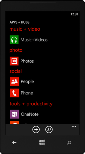
We were wondering why the same category grouping that exists in the Store hasn't been used on the device itself to allow for better navigating the apps list.
So the apps list now features two new capabilities, namely allowing you to switch between name and category grouping and also taking you to the WP Store to install new apps and games:

Apps-List-Menu.png Apps-List---Categories.png

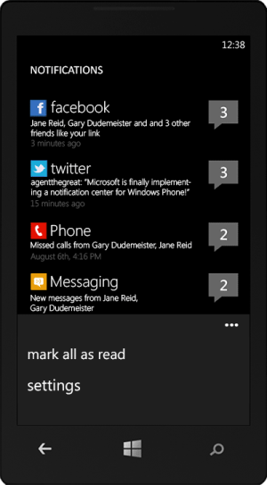
If you are wondering what the menu in the Notifications page does:

Notifications-Menu.png

The settings menu item takes you to a page where you can choose which apps are allowed to show toast notifications. The "mark all as read" practically removes the balloons and resets the notification counters for all apps.

So what do you think? Would be happy to hear your opinion on these new concepts.
Also don't forget to vote for these concepts on Microsoft UserVoice website if you think this is cool:
Changing the app list into a hub, which creates a perfect Notification Center too
 
Last edited:

Winphoner

New member
Nov 19, 2012
30
0
0
Visit site
Re: Apps List + Notification Center concept: Take Two

I really like the idea of a notification center, and the design above looks really good, great job guys! I would prefer a notification center that is simple, and easy to get to/use. I wonder if it would make sense for the Notification Center / Start Screen / Apps+Hubs to form a loop so that you could keep cycling between the 3.
Another add-on thought, in the case where there are unread notifications, perhaps we could have an "s" from the "Notifications" screen title flow over into the start screen header, so that as soon as you're at the start screen, you have a helpful hint about notifications that follows the Windows Phone UI paradigm.
Thought?
 

AaHaa

New member
Oct 15, 2012
200
0
0
Visit site
Re: Apps List + Notification Center concept: Take Two

I love it. It's intuitive, but it still follows Windows Phone's design principles. Very basically speaking, it's just the same as scrolling through your average app:
notifications.jpg
Just swipe left or right and navigate trough the interface!
And on top of that, it's pretty easy to acces the notification center when it's to the left. Just one swipe, just like Android and iOS (but a lot more original, since it's not a drop-down menu).
One question: will the notification center be accessible when you're running an app? Or does the user have to press the menu button first? I don't think it's a very big problem if they had to, but I can imagine some users will complain about it.
 

AgentTheGreat

Member
Aug 3, 2012
193
0
16
Visit site
Re: Apps List + Notification Center concept: Take Two

Having the notification center accessible from virtually everywhere is iOS and Android's thing, and I think users complain about not having it accessible only because they've gotten used to it.
From a functionality stand-point, Android for example doesn't show the user the entire notification when it arrives. That's why if someone likes to know more, he has to pull the shade down.

In WP however, the toast provides enough information so you do know what's going on. And if you are not looking at your phone, that means you are most likely in the home screen and therefore will have easy access to the notification center.
People have been using WP even without a notification center (because Live Tiles partly handle it) so having one that is not accessible from everywhere, I think, is more than enough.
 

Tahiti Bob

New member
Mar 21, 2011
275
0
0
Visit site
Re: Apps List + Notification Center concept: Take Two

I like it, that's sort of how Nokia did it in Meego and it just fits with WP. How would you delete just some notifications rather than all? I think the best way is via the box ticking feature that exists in the messaging hub. Very familiar and easy to use as it already exists in the OS.
 

fastfinger037

New member
Oct 29, 2012
2
0
0
Visit site
Re: Apps List + Notification Center concept: Take Two

I like the concept very much. Having just one tile for all notifications wouldn't be useful really, but this left swipe for notifications is AMAZING! great idea! :)
 

AgentTheGreat

Member
Aug 3, 2012
193
0
16
Visit site
Re: Apps List + Notification Center concept: Take Two

I like it, that's sort of how Nokia did it in Meego and it just fits with WP. How would you delete just some notifications rather than all? I think the best way is via the box ticking feature that exists in the messaging hub. Very familiar and easy to use as it already exists in the OS.

Once you tap on any of the notifications and get the list of notifications for a single app (that I was too lazy to make!) the counter automatically resets. So you just have to view notifications for an app to remove the balloon and reset the counter.
 

Tahiti Bob

New member
Mar 21, 2011
275
0
0
Visit site
Re: Apps List + Notification Center concept: Take Two

Just because you checked a notification doesn't mean you want it gone straightaway, you can keep it there as a reminde (I do that sometimes on my iPad). Hence my suggestion of using box ticking to delete them individually like in the messaging hub ;)
 

AgentTheGreat

Member
Aug 3, 2012
193
0
16
Visit site
Re: Apps List + Notification Center concept: Take Two

Just because you checked a notification doesn't mean you want it gone straightaway, you can keep it there as a reminde (I do that sometimes on my iPad). Hence my suggestion of using box ticking to delete them individually like in the messaging hub ;)

There seems to be a misunderstanding; viewing the notification won't remove it from the archive, rather it just removes the counter (numbers in the balloons) so that you know you have no new notifications from that app. The notifications list would still have the app listed and also shows you the last notification; tapping it would still get you to the archive of all notifications from that particular app.

Basically "mark all as read" and viewing the notifications just remove the numbers, not the notifications themselves.
 

abhibh

New member
Nov 20, 2012
50
0
0
Visit site
Re: Apps List + Notification Center concept: Take Two

Having used a lot of os from BB to WP to iOS. Each has its pros and cons. The one thing that i miss in every phone is the notification LED which BB's have and most HTC's. BB LED notifications are amazing to say the least. It tells you that you have something new.

Now on BB when u get an email u go into email app and even if you don't open email it still shows number of unread email, but from notification area it takes away the action icon next to the email icon stating that you have viewed the email notification, no matter you have read it or not. Once you open the email the notification goes away.

Just my $0.02, but i think notification center is a must have whether you use it or not. And manufacturers should seriously think about LED notifications.
 

AgentTheGreat

Member
Aug 3, 2012
193
0
16
Visit site
Re: Apps List + Notification Center concept: Take Two

Having used a lot of os from BB to WP to iOS. Each has its pros and cons. The one thing that i miss in every phone is the notification LED which BB's have and most HTC's. BB LED notifications are amazing to say the least. It tells you that you have something new.

Now on BB when u get an email u go into email app and even if you don't open email it still shows number of unread email, but from notification area it takes away the action icon next to the email icon stating that you have viewed the email notification, no matter you have read it or not. Once you open the email the notification goes away.

Just my $0.02, but i think notification center is a must have whether you use it or not. And manufacturers should seriously think about LED notifications.

I completely agree with LED notifications. I was thinking maybe the Windows button could have an LED behind it, and go on and off in a "breathing" pattern when you have new notifications! Now wouldn't that be cool?!
 

Tahiti Bob

New member
Mar 21, 2011
275
0
0
Visit site
I think he means having the list on the far left whereas now there's a blank space created by the search button, which looks more elegant.
 

AgentTheGreat

Member
Aug 3, 2012
193
0
16
Visit site
I think he means having the list on the far left whereas now there's a blank space created by the search button, which looks more elegant.

Well if that's what he means I will have to TOTALLY disagree about the "elegance" thing! Practically every list in WP is left aligned, with every button either on the top right or down in a toolbar. This also allows for more space for app names to be properly shown.
 

blehblehbleh

New member
Dec 14, 2011
571
1
0
Visit site
Well if that's what he means I will have to TOTALLY disagree about the "elegance" thing! Practically every list in WP is left aligned, with every button either on the top right or down in a toolbar. This also allows for more space for app names to be properly shown.

Exactly what TahitiBob said. We can definitely disagree on your idea of elegant.
 

AgentTheGreat

Member
Aug 3, 2012
193
0
16
Visit site
Exactly what TahitiBob said. We can definitely disagree on your idea of elegant.

Sure, of course.
Still, I think my defense is based on principle and yours involves personal taste. I don't see what a column of empty space can be useful for; to me it is wasted when the excuse is the Search button that sits lonely up there. It once had a friend, the Back button and that button was there to complement the button in the Home screen (forward and backward). Now, for the exact same reason that the arrow in Home screen is gone (maybe not completely gone but it no longer wastes space) I think the Search button should be relocated.
Not just that, the whole apps page looked like it had nothing to do with the rest of the OS. The new list, I think, mimics every other list in every other hub and screen in WP. I don't think you believe it would be better to move all toolbar buttons to the left of every list in a vertical toolbar in every page of WP.

However, if you think the left margin is too small we can make it a little bigger. But I really don't think the Search button has a place up there.
 

AgentTheGreat

Member
Aug 3, 2012
193
0
16
Visit site
Re: Apps List + Notification Center concept: Take Two

I really like the idea of a notification center, and the design above looks really good, great job guys! I would prefer a notification center that is simple, and easy to get to/use. I wonder if it would make sense for the Notification Center / Start Screen / Apps+Hubs to form a loop so that you could keep cycling between the 3.
Another add-on thought, in the case where there are unread notifications, perhaps we could have an "s" from the "Notifications" screen title flow over into the start screen header, so that as soon as you're at the start screen, you have a helpful hint about notifications that follows the Windows Phone UI paradigm.

The rotation thing, I think, would be a little confusing but it could work . The "Notifications" thing wouldn't because WP has live tiles, and having a tile telling you how many new notifications you have matches the OS better.
Thought?
 
Last edited:

pejmaniran

New member
Nov 27, 2012
1
0
0
Visit site
Well, I think this is what Microsoft should exactly do, unless they come up with a neater idea. But neater than this? Microsoft guys? Come on! :D
 

Members online

Forum statistics

Threads
327,164
Messages
2,249,510
Members
428,607
Latest member
foreverhempgummiesau