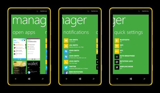
There's been a couple of these posts recently and I felt like giving it a shot now that I'm a bit more familiar with the WP8. The picture should be pretty self-explanatory but the reasoning behind some design choices might not be so I'll explain it anyway.
Key points
a) notification center would work the best if it would be on a transient element accessible from anywhere. While home screen is technically accessible from everywhere, it feels somehow that you're going away from your current task if you have to go there. This might be a bit philosophical point but to me it would be best if the home screen would not be involved.
b) the notifications themselves in the Live Tiles are somewhat controversial as they require user to look through them to see if there's something new in them. Notification centers in my opinion work the best when they are completely empty if there's no notifications and as we know, Live Tiles are always present even if there's no new notifications in them. If I could decide, I'd have only the Live Tiles that have new items visible in my home screen. I can launch apps from the Applist too. Now that would be a notification center already.
c) notifications should be more informative than just a number of new items. Big size Live Tiles are a step in the right direction though.
d) multitasking screen in WP8 SUCKS. It is horribly inefficient at switching between apps. Animations take too long time and you only see two open applications at the time so navigating between them requires way too much scrolling.
The concept - Manager
Now to the concept itself: Instead of multitasking screen, long press of the back button would launch something like a phone manager (in this concept called simply 'manager') that would house both the multitasking cards, notifications and the quick toggle settings. You can ignore the last one if you wish, I put that there just for the fun of it. The entry/exit animation would remain the same, the app just would resize accordingly to the new design.

Open apps
Exactly what it says, all the open apps and their corresponding multitasking cards, four visible instead of two without any scrolling and a single flick can reveal the rest of them (eight open apps is the max. for WP8). No need for title texts, typographical UI of WP8 will make it pretty simple to recognize which app is which. This would already make switching between apps 100% more efficient.
Notifications
All the unread or otherwise unchecked notifications in a single list from newest to the oldest. Simple stuff.
Quick settings
Some people seem to want these, so I put them here for the show. Simple toggle buttons.
Key points
a) notification center would work the best if it would be on a transient element accessible from anywhere. While home screen is technically accessible from everywhere, it feels somehow that you're going away from your current task if you have to go there. This might be a bit philosophical point but to me it would be best if the home screen would not be involved.
b) the notifications themselves in the Live Tiles are somewhat controversial as they require user to look through them to see if there's something new in them. Notification centers in my opinion work the best when they are completely empty if there's no notifications and as we know, Live Tiles are always present even if there's no new notifications in them. If I could decide, I'd have only the Live Tiles that have new items visible in my home screen. I can launch apps from the Applist too. Now that would be a notification center already.
c) notifications should be more informative than just a number of new items. Big size Live Tiles are a step in the right direction though.
d) multitasking screen in WP8 SUCKS. It is horribly inefficient at switching between apps. Animations take too long time and you only see two open applications at the time so navigating between them requires way too much scrolling.
The concept - Manager
Now to the concept itself: Instead of multitasking screen, long press of the back button would launch something like a phone manager (in this concept called simply 'manager') that would house both the multitasking cards, notifications and the quick toggle settings. You can ignore the last one if you wish, I put that there just for the fun of it. The entry/exit animation would remain the same, the app just would resize accordingly to the new design.

Open apps
Exactly what it says, all the open apps and their corresponding multitasking cards, four visible instead of two without any scrolling and a single flick can reveal the rest of them (eight open apps is the max. for WP8). No need for title texts, typographical UI of WP8 will make it pretty simple to recognize which app is which. This would already make switching between apps 100% more efficient.
Notifications
All the unread or otherwise unchecked notifications in a single list from newest to the oldest. Simple stuff.
Quick settings
Some people seem to want these, so I put them here for the show. Simple toggle buttons.


