Microsoft Typography

Atlas635

New member
Feb 6, 2013
2
0
0
Visit site
Hello, I just recently bought a windows phone [Samsung Focus] and one thing that really stuck out was the large text printed across the screen. In music and videos, games, people hub etc. I understand that the OS utilizes text more than graphics, and this is why pages and apps load faster. I appreciate this, but I find that it takes up a lot of real estate on the screen. I'd like to get the perspective of the developers in the community on whether this is good or bad. Do you like the Segoe UI font? do you wish you had more freedom?

On another note, a lot of people have commented on Apple's UI and how its not as appealing anymore or it hasn't evolved, do you think windows might have the same criticisms in the future?
 

rajkumr

New member
Oct 30, 2012
110
0
0
Visit site
The text header on top is a main metro design language component. Though its not a rule and you see it only on apps designed like the built in hubs.
Lots of apps fo away with the header.

Regarding the UI, I think Microsoft has done away with the traditional icon paradigm with the live tiles. No two tiles is gonna look the same, but the power is with the developer to use the live tiles feature to the full extend.

WP8 is still evolving and growing and we may come to see more features and design as it hit the mainstream with full force.

Anyways welcome to the Windows phone world..... Hope you enjoy using it.
 

despertador

New member
Dec 26, 2012
837
0
0
Visit site
The Segoe UI font is amazing, it really makes the apps blend in with the OS. Although it takes a lot of real estate, its visually pleasing and if devs feel like the header takes too much space they can lower the font size. So I'd say that it's good. Also, I don't really think I'll need more freedom with the UI principles.

Maybe those criticisms will later apply to Metro UI, hopefully MS can change things up a bit from time to time to keep it refreshed!
 

a5cent

New member
Nov 3, 2011
6,622
0
0
Visit site
On another note, a lot of people have commented on Apple's UI and how its not as appealing anymore or it hasn't evolved, do you think windows might have the same criticisms in the future?

With barely 3% market share in the U.S., WP is still in a position where it doesn't really matter.... most have yet to experience WP for the first time.

That problem arises only when the masses buy their third phone on contract and realize it isn't much different from their first. Most consumers are blind to innovation that occurres on levels other than the UI, so the UI is what needs to be evolved at least once over that time frame. That is what Apple missed.
 

djSupport

New member
Nov 17, 2012
43
0
0
Visit site
I seriously think nothing of the design aspect needs to change and I hope it never does. If I fancy a change I just rearrange my live tiles... Add more and then change the colour! The look and feel never needs to change, how can you make a list of apps look any different from what it is now? You can't!!!
 

a5cent

New member
Nov 3, 2011
6,622
0
0
Visit site
... how can you make a list of apps look any different from what it is now? You can't!!!

Of course you can. You just need to use your imagination. Live tiles are one example of precisely that... MS found a way to improve on the traditional list of static icons. Note however, that innovation shouldn't be about aesthetics... form must follow function, otherwise it is only design... although design is important, it is not good enough.

MS has a few ideas in the pipeline on how to improve live tiles further still, and we will see at least one UI innovation with every major version of WP.... not everyone is creative enough to come up with good ideas, but resting on your laurels is the best way to sink a product. Never stop innovating!
 

socialcarpet

Banned
Apr 4, 2012
1,893
0
0
Visit site
The typography used in the Windows Phone OS was inspired by Swiss railway signage, which was designed to be a clean and legible as possible. I think it works quite well and it is one of my favorite features of the OS. I like the uniformity personally, and the fact that apps comply with the system UI style. I cringe when I see some of my friends custom Android themes with tacky fonts.
 

Daniel Ratcliffe

New member
Dec 5, 2011
3,061
0
0
Visit site
As a developer, I like the idea behind the Segoe WP font (sorry, I consider it Segoe WP not Segoe UI). It's clean, it draws your attention, and it gives you a clear typographic hierarchy in which to move across the content. As a developer I am trying to utilise this to my fullest.
 

socialcarpet

Banned
Apr 4, 2012
1,893
0
0
Visit site
I think certain applications could do without the uniformity. A little more variety is always nice

I don't know, I feel like Microsoft has given developers enough of a free hand to be creative while still coloring within the lines. The continuity of the UI is important to Windows Phone. The unique style of the UI is a key differentiator.
 

AngryNil

New member
Mar 3, 2012
1,383
0
0
Visit site
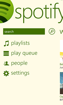
The panoramic app layout does make for some pretty oversized titles. Yes, it somewhat "wastes" space, but the panorama layout isn't really for content-heavy screens. It's a nice menu screen, and Spotify is a great example of iterating upon the base layout:
1_5F00_thumb_5F00_32524ABE.png

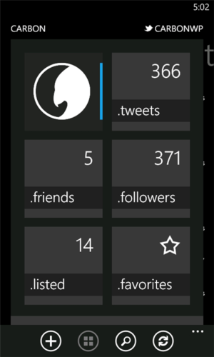
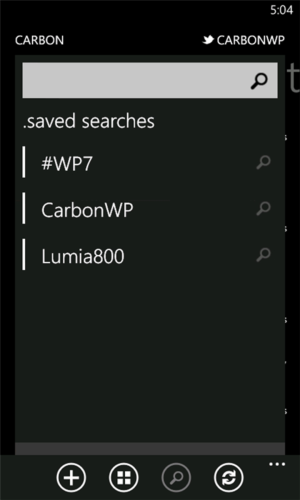
I don't feel Metro is constrained to Segoe WP (Windows Phone's system font - Segoe UI is optimised for desktop Windows), I think it's great when third party apps go with a custom font. As corny as "authentically digital" is, it does speak to the idea of Metro - skeuomorphism isn't necessary in this day and age, and we should be creating interfaces for the medium we are using - in this case, digital. If a design element still serves a real purpose on a flat screen it is viewed on, then it should be fine. Metro doesn't have to mean typography only - lines and shapes still have a place, I'd look to (the sadly pulled) Carbon as an example of this:

ec10dc72-d275-467e-a037-01dc76970334_verge_super_wide.png 251704ba-a768-4916-80d0-a9cb0fa78dfe_verge_super_wide.png


iOS may have a stale design, but it has many beautiful apps. I think Microsoft can iterate on Metro for the OS - it already has in small ways, changing up the home screen and using accent colours more prominently in WP8. The important thing for developers to consider here is that selecting one of two layout templates and following the template religiously will not make for an interesting app on any platform. Templates are a starting point, evolve your app beyond it and make bold design decisions just as Microsoft did when it first brought WP7 to the market.
 

spaulagain

New member
Apr 27, 2012
1,356
0
0
Visit site
Of course you can. You just need to use your imagination. Live tiles are one example of precisely that... MS found a way to improve on the traditional list of static icons. Note however, that innovation shouldn't be about aesthetics... form must follow function, otherwise it is only design... although design is important, it is not good enough.

MS has a few ideas in the pipeline on how to improve live tiles further still, and we will see at least one UI innovation with every major version of WP.... not everyone is creative enough to come up with good ideas, but resting on your laurels is the best way to sink a product. Never stop innovating!


Design includes function, it is not limited to aesthetic. Aesthetic is just an element or tool used in design.

As a product/UI designer, I can tell you any good designer first looks at the function and requirements of the user and then builds around that using good aesthetics to insure that the functionality is clear to the user.


MS has taken a classic Swiss Design approach with their new UI. It focuses on content and using typography to form visual hierarchies rather than gradients and skeumorphic elements. Therefore the large scale text the OP refers to is critical to the design of the interface.
 

Cornbean7077

New member
Oct 23, 2012
34
0
0
Visit site
I personally love the design. Its the main reason I switched from a galaxy s3 to a lumia 900. I got tired of seeing rows of icons, with the occasional widget, and just thought windows phone was one of the most gorgeous UI's I've ever seen :)
 

a5cent

New member
Nov 3, 2011
6,622
0
0
Visit site
Design includes function, it is not limited to aesthetic.

Yes. We are saying the same thing. If a design choice is aimed at optimizing a font's readability, or UI elements are redesigned to focus the users gaze more quickly on what is relevant, then IMO those are perfect examples of form following function. Design is extremely important, as long as it is not done solely for the sake of design itself.
 

Members online

Forum statistics

Threads
323,312
Messages
2,243,619
Members
428,056
Latest member
Carnes