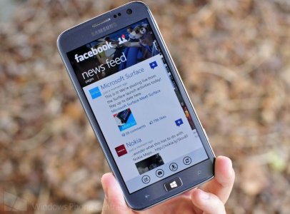
Hi everyone. There are some really beautiful apps on Windows Phone and then there are some really disappointing looking ones. One of the apps that has really irked me is the Facebook app. I'm a dev that focuses largely on attractive UX and proper usage of WP's Modern design language. I'd like to share what I've come up as what I believe to be a good compromise between Facebook's design language (to keep apps consistent between platforms) and Windows Phone's Modern design language (to give it a unique personality on this platform.) Let me know what you guys think.

Scrolling will collapse the AppBar:
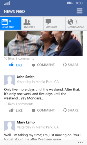
While looking at this, I'd like to provide a few bits of information:
- The page title is the same formatting as (position, capitalization, etc) as system apps like messaging, mail, any pivots, etc to keep a consistent feel with the OS.
- The bar with the four buttons are analogous to iOS' bottom bar in that it switches views but here, the look is drawn from the buttons in the Action Center. Again, this is to give it a WP feel.
- Tapping on one of the four buttons switches to the appropriate view. I've also changed the badges from the red iOS-like ones to a more WP live tile-like ones as seen with the "notifications" button. I prefer it this way, but Facebook can stick with the red round badge for notification count just as easily. With the "news feed" one, a star is shown when there are new stories.
- The main two colors are the standard FB blue, and the FB blue accent that's used in the Windows 8 app and iOS app to keep consistent with Facebook's designs. The grays are a mix of Facebook's and the OS' light theme grays.
- Much less chrome. Modern UI showcases content, not chrome so I've removed excess rectangles and boxes around news feed posts and let the typography and images shine through.
- WP apps usually have a consistent left and right margin. Notice how almost everything lines up the same distance away from the edge of the screen. This is subtle but gives it a clean and polished look.
If you guys really like this, feel free to pass along this screenshot to Facebook or Microsoft. Hopefully, it'll at least spur them to try a little harder on designing their WP app.

Scrolling will collapse the AppBar:

While looking at this, I'd like to provide a few bits of information:
- The page title is the same formatting as (position, capitalization, etc) as system apps like messaging, mail, any pivots, etc to keep a consistent feel with the OS.
- The bar with the four buttons are analogous to iOS' bottom bar in that it switches views but here, the look is drawn from the buttons in the Action Center. Again, this is to give it a WP feel.
- Tapping on one of the four buttons switches to the appropriate view. I've also changed the badges from the red iOS-like ones to a more WP live tile-like ones as seen with the "notifications" button. I prefer it this way, but Facebook can stick with the red round badge for notification count just as easily. With the "news feed" one, a star is shown when there are new stories.
- The main two colors are the standard FB blue, and the FB blue accent that's used in the Windows 8 app and iOS app to keep consistent with Facebook's designs. The grays are a mix of Facebook's and the OS' light theme grays.
- Much less chrome. Modern UI showcases content, not chrome so I've removed excess rectangles and boxes around news feed posts and let the typography and images shine through.
- WP apps usually have a consistent left and right margin. Notice how almost everything lines up the same distance away from the edge of the screen. This is subtle but gives it a clean and polished look.
If you guys really like this, feel free to pass along this screenshot to Facebook or Microsoft. Hopefully, it'll at least spur them to try a little harder on designing their WP app.
Last edited:

