Hexagram Makes Your Lumia More Beautiful

loverusham

New member
Aug 21, 2014
88
0
0
Visit site
C1nunlw.png

Hexagram is a fast and fully customizable wallpaper generator to beautify your Lumia Start Screens and Lock Screens.

Explore the essence of aesthetic geometry with a subtle blend of colors for best effects. The dynamic customization of colors will surprise you every time. The app features 10 color swatches each with 60 colors for complete uniqueness. Along with it a customized palatte for fine refinement and tuning of your designs. You can instantly save your designs to photos hub or set as lock screens.

TfNjgVV.png

Get creative, let your imagination run free and explore the artist inside you with Hexagram !!

Download: Hexagram: Cool Wallpapers

FeTvA8U.png
 

gpobernardo

Active member
Jan 12, 2013
4,339
0
36
Visit site
Nice, but can one overlay, integrate, embed or somehow use a photo (or a set of photos) from the Photo Hub as an element in those hexagrams?
 

loverusham

New member
Aug 21, 2014
88
0
0
Visit site
Yess that feature came to my mind and I ve even experimented it, however it makes the overall image feel to crowded and it loses its simplicity. So I didn't feel the need, however if I get multiple request for that feature I ll be sure to include it in my coming updates.
 

gpobernardo

Active member
Jan 12, 2013
4,339
0
36
Visit site
In my opinion, I think flexibility (but still in a neat interface) would make the app more attractive over simplicity. Having that feature as an on-off thing in the app settings would allow users to choose whether or not they want such an image overlay or integration - it allows them to do more. The image can be on top or behind the hexagrams (making the hexagrams look like windows to a second further-in-the-background image).

Chances are that a lot of users don't realize what they want in addition to what they're already liking in an app until they see it (either in an app update for the same app or in another app) and, if they do realize what they're looking for, most of them won't even contact the developer and just move on to a different app leaving a trail of not-five-star ratings.

Hope these help. :wink:
 

loverusham

New member
Aug 21, 2014
88
0
0
Visit site
I understand exactly what you mean. The update is ready from my side. It will reflect in store globally in 6 to 8 hrs depending on certification process.
 

gpobernardo

Active member
Jan 12, 2013
4,339
0
36
Visit site
Nicely done, but the photos seem to be always aligned to the left. :wink:

Not sure how difficult this will be to implement, but what do you think about having the hexagon borders opaque (instead of translucent) for the photo filter?
 

loverusham

New member
Aug 21, 2014
88
0
0
Visit site
The images are uniformly distributed in dimensions. So if any alignment issue you face is probably cause of the dimensions of the image which vary. As you can see the images I used rendered quite well on my device. About the opaque hexagons, I think I'll wait for a public demand for that. :wink:
 

gpobernardo

Active member
Jan 12, 2013
4,339
0
36
Visit site
I mean, for example, if I've got a landscape photo, I can only see the portion of the photo that fits the portrait orientation of the app starting from the left side of the photo. Some apps start from the center, some apps distort the image to fit the screen. What I can do is to crop the landscape photo I have into a portrait-oriented image of my choosing before loading it in your app.

Please add the crop/resize/relocate option for photos to your next update, hopefully including the opaque hexagons, too! :wink:
 

TechFreak1

Moderator
May 15, 2013
4,611
5
38
Visit site
Just used the app for a few minutes, first of all - the positives:
1) Has a lot of potential
2) Incorporation of the RGB colour pallette was a smart decision
3) The addition of the swatches is pretty good idea

The negatives & feedback
1) You need a mini tutorial, as the UX is too simple - If you are going to appeal to users on mass you need an re-loadable tutorial via settings (ellipsis)

2) The full screen adverts are annoying, may be an iap option to remove them?

3) When clicking on the circle it is not evident in the preview in the right hand bottom corner of the RGB pallette which one you are editing.

4) When you click the second circle, it loads the same RGB pallette location as the first circle

5) The ability to add custom hex codes in the RGB pallette would be brilliant

6) Bring up the swatches pallette, save, hexagon toggle, photo filter from the ellipsis menu or if you want add settings that enable this thus giving the users the option if they want to disable or not - I wouldn't recommend this approach is its unnecessary code and most people wouldn't disable it. I'm sure you could strip off a pixels of the top and bottom off the preview screen to make them fit + nudge it up abit and use the dead space at the top.

7) Constantly tapping the elipsis, then choosing the same photo to adjust the opacity is a no go. It will get old pretty quick - you need a opacity adjustment slider + opacity toggle. Said toggle would reside in the app bar, so if I want to adjust the opacity, I will tap that toggle and to bring up the opacity slider, then tap the image to confirm or the done button.

8) The back stack needs work, for example after choosing a photo I decide that photo won't work, I press back - the app closes - it should go back to the photo hub - the same applies to the swatches pallette, rgb pallette, photo picker etc. Lastly Prompt the user if they want to close the app not close it automatically.

Additional features:
1) Incorporate as a camera lens
2) Add a camera function directly within the app

Questions:
1) When setting the image as lock screen background, the dialogue box says it may update it periodically. Does the app need to periodically update images?

As, your only customising one image or does this form part of feature that you have in mind?

2) How does the swatches pallete work? It appears to be hit and miss.
 

Zachary Boddy

Staff member
Aug 3, 2014
2,384
12
38
www.windowscentral.com
I've played with the app. Here's the feedback email I sent. Sorry for any errors and typos, I'm on my 830.
I've been using your app from my Nokia Lumia 830.
First off, overall I think the app has potential. However, it hasn't quite reached it yet.
I think there should be more options besides two when switching between the different hexagonal patterns.
When you choose a color scheme on one pattern, it should carry over to the other patterns so you can preview how that exact color looks on different patterns.
The RGB spectrum is a great idea, but not implemented correctly from what I see. It almost restricts you to a tiny part of each color you choose (namely the top right) because anything else does some really funky things to the colors.
I can see no discernible difference between the two circles at the bottom, they seem to do the same thing, and changing one changes the other too.
There's a lot of dead space. You could bring the picture closer and provide in-app controls in the leftover dead space.
I can't find a way to alter how opaque the hexagons after the original choosing.
Pictures seem to look washed out (color wise), especially colorful ones. I suggest something akin to the new tiles in Windows 10 Mobile.
There should be a tutorial that can be re-playable via settings, even a simple one.
'Fine tuning' looks unorganized and chaotic, and I'm still not certain what it does.
The back button takes you out of the app from anywhere. This is very frustrating. The app should ask for confirmation before closing and if I am choosing a color and decide I'm actually okay with what I have, I should be able to press back and be done with it.
There should be an option to save drafts. Let's say I like an idea but I want to put it on hold while I explore another concept. Save it as a draft to edit later.
There should be a way to access all the projects you've completed without opening the photos app.
Putting pictures behind the hexagons is great, but there's no way to adjust it. I have to live with whatever part of the picture the app chooses for me.
It might be a good idea to have a few preset color schemes so that new users can experiment and see if they like the look of the hexagons.
The full screen ads are annoying beyond end. If ads are necessary, make them appear at the top with an "X" to close them.
If I think of more I'll contact you. I hope you take my feedback into consideration.
 

loverusham

New member
Aug 21, 2014
88
0
0
Visit site
Thanks TechFreak1 for the detailed opinion.

Coming directly to sections where I can improve:

1) The app has a really real simple layout as you noticed with just three buttons. One for color, one for patterns and one to save so a tutorial simply for three buttons doesn't seem right. It's intutive and takes less than a minute to grasp.
2) In app option coming soon
3) Regarding 3,4,5 I'll give a common solution. As you liked the RGB model there are quite some limitations to it. Not all the colors follow the same wavelength so as we go down the chart the distance keeps on decreasing between colors and its difficult to maintain the simplified 3d layout you see in other designs. As a result the algorithm starts multiplexing colors and you see combinations. For the same reason the first color is set by user and the second is generated by algorithm itself to get the best complementary color 95% of the time
4) Couldn't understand point 6 as the given features are already in ellipsis menu(AppBar).
5) Opacity slider will be bought to ellipsis menu in next update instead of one time adjustment.
6) Back button foloowed wp8 design guidelines of exiting. A confirmation will be put up in coming update.
7) Live Camera filters currently not possible in wp8 but will put Camera function straight from app in next update

Answers:
1) That's a predefined system message. Not controlled by me.
2) Color selections work in the same way as I mentioned.
 

loverusham

New member
Aug 21, 2014
88
0
0
Visit site
Thanks Zachary for the detailed analysis,

Regarding color selection I suggest you see my reply above. More patterns will take time as there aren't many visually appealling figures that leave no space when combined. Hexagons fit perfectly whereas circles leave spaces and others seem dull. So I am looking out from some good geometry. The dead space you see gets actually quite congested in smaller screens. Fine tuning is for manipulating the color in swatches more delicately as the palette gets the current value of swatches. Images need to be in potrait specific dimension. Will auto crop them from center in coming update. Other queries have been mentioned in my above reply.
 

TechFreak1

Moderator
May 15, 2013
4,611
5
38
Visit site
Thanks TechFreak1 for the detailed opinion.

Coming directly to sections where I can improve:

1) The app has a really real simple layout as you noticed with just three buttons. One for color, one for patterns and one to save so a tutorial simply for three buttons doesn't seem right. It's intutive and takes less than a minute to grasp.
2) In app option coming soon
3) Regarding 3,4,5 I'll give a common solution. As you liked the RGB model there are quite some limitations to it. Not all the colors follow the same wavelength so as we go down the chart the distance keeps on decreasing between colors and its difficult to maintain the simplified 3d layout you see in other designs. As a result the algorithm starts multiplexing colors and you see combinations. For the same reason the first color is set by user and the second is generated by algorithm itself to get the best complementary color 95% of the time
4) Couldn't understand point 6 as the given features are already in ellipsis menu(AppBar).
5) Opacity slider will be bought to ellipsis menu in next update instead of one time adjustment.
6) Back button foloowed wp8 design guidelines of exiting. A confirmation will be put up in coming update.
7) Live Camera filters currently not possible in wp8 but will put Camera function straight from app in next update

Answers:
1) That's a predefined system message. Not controlled by me.
2) Color selections work in the same way as I mentioned.

Your welcome, didn't realise this was a Wp8 app.

Thanks for confirming that, the limitations make sense now :).

In regards to point 6, [see the rushed mockups] took me a few minutes in photo editor with two screenshots, I'm sure it will take you less than that :).

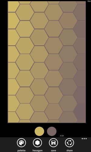
As you can see from the 1st image, a lot of deadspace has been removed from the top (62px) along with a just over half of the pixels (14px) from the original shaved from the bottom.

Hexagram - App Bar 1.jpg

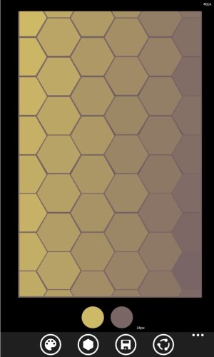
In the second a smaller amount from the top (32px) and just under half (14px) removed from the bottom.

Hexagram - App Bar 2.jpg

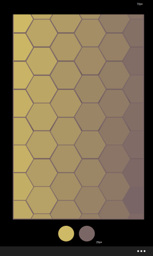
And here is the original:

Hexagram - Original Screenshot.png

I'm aware you want to keep the UX pretty simple, hence why suggested an alternative option - being an toggle in the settings which would enable the placement in the app bar.

You can keep the share option in the ellipsis menu and bring up swatches pallette, save, hexagon toggle, photo filter.

Personally I would arrange them in this order:
  1. Photo Filter
  2. Opacity Toggle
  3. Hexagon Toggle
  4. Swatches Pallette
  5. Save

I hope this helps :).

Edit: PS, It's easier for individuals like us to grasp however not everyone is the same :).
 

Zachary Boddy

Staff member
Aug 3, 2014
2,384
12
38
www.windowscentral.com
Thanks for clarification. I hope you took my thoughts into consideration for a future update.
Is there any chance of an update that will optimize for 8.1? And what about Windows 10 Mobile?
Oh yeah, and I was thinking you should give a more detailed description on the app homepage, and possibly add all the change logs, as this helps make the app seem supported (which it is) and also like it'll continuously get new features.
 

Zachary Boddy

Staff member
Aug 3, 2014
2,384
12
38
www.windowscentral.com
Thanks Zachary for the detailed analysis,

Regarding color selection I suggest you see my reply above. More patterns will take time as there aren't many visually appealling figures that leave no space when combined. Hexagons fit perfectly whereas circles leave spaces and others seem dull. So I am looking out from some good geometry. The dead space you see gets actually quite congested in smaller screens. Fine tuning is for manipulating the color in swatches more delicately as the palette gets the current value of swatches. Images need to be in potrait specific dimension. Will auto crop them from center in coming update. Other queries have been mentioned in my above reply.

About the pictures...as you're running Windows 8 (I'm assuming), you may not know exactly how this works...but in Windows 8.1 you can put a picture behind the Live Tiles, making them 'transparent' and look like the tiles flow over the picture. You can use any picture you want, portrait or landscape, and then adjust it to use the part of the picture you want. Portrait pictures are completely used (I believe) with no room for adjustment but landscape pictures can be adjusted left or right. I'm sorry for the bad explanation.
 

Zachary Boddy

Staff member
Aug 3, 2014
2,384
12
38
www.windowscentral.com
I mean, for example, if I've got a landscape photo, I can only see the portion of the photo that fits the portrait orientation of the app starting from the left side of the photo. Some apps start from the center, some apps distort the image to fit the screen. What I can do is to crop the landscape photo I have into a portrait-oriented image of my choosing before loading it in your app.

Please add the crop/resize/relocate option for photos to your next update, hopefully including the opaque hexagons, too! :wink:

Ah, you explained it a little better than I did. This is what I was talking about in my reply above.
 

Members online

Forum statistics

Threads
323,183
Messages
2,243,403
Members
428,036
Latest member
Tallgeeselll05