BBM for Windows Phone Concept

Choco22

New member
Jun 23, 2012
16
0
0
Visit site
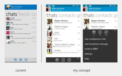
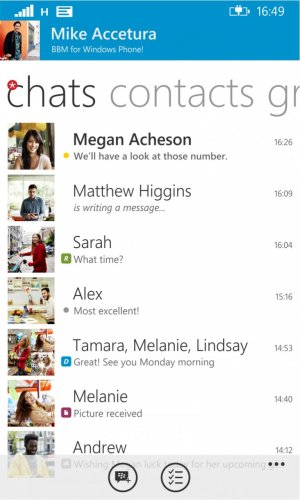
So guys, here is my concept of BBM app for Windows Phone.
Also included is the current UI of the app from BBM Blog website (BBM for Windows Phone Beta Starting Now | Inside BlackBerry) for comparison.

Live tile, toast notification, and notification center:
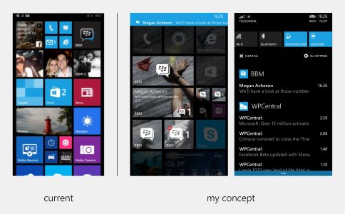
Live Tile and Notification Center.jpg

App UI:
UI.jpg

The goal of this design is to give familiar design for users from BB10/iOS/Android version while still giving native-feeling to Windows Phone OS. To achieve this, I've used the same color scheme from BB10, and also pivot design and Segoe font.

Let me know what you think and which one do you prefer. Constructive comment are also welcomed. Junior designer here ;D
Thank you.
 

Brandon Tobias

New member
May 6, 2014
237
0
0
Visit site
its nice i was gonna do my concept but i got exams its good i would make some changes. i don't like the icon though i have a vision for the icon just don't know how to describe it. but it looks good.

The D, R and yellow dot indicating an unread message should be bigger

the three icons on the bottom should be what Blackberry has which is Multi-person chat, New chat and Broadcast message.

The icons you have there would be specific to the contacts screen where you would want to search and select multiple contacts.

i would remove the bar around the status icons. check the FB Beta app to see what i mean just keep the blue with the white system icons.

also i would do the bottom bar as a semitransparent light grey with either blue icons or black (preferably). you can also try the same blue ad the top bar with but semi transparent with white icons.

if you want other ideas or tips inbox me as im am also getting into UI design as well as i am to busy to do my own stuff
 
Last edited:

Choco22

New member
Jun 23, 2012
16
0
0
Visit site
Sorry for being inactive for so long, I was busy because of my university admission.
Here is what I come up after taking Brandon Tobias suggestions into account.
I think it has so much cleaner UI this way..

App UI_3.jpg

I keep 2 out of 3 icons in the bottom bar because I consider this 2 icons that will be used the most by the user. I think this can help user from being confused because of 3 "new chat" icon. Also because the BB10/Android/iOS version doesn't have the multi-person and broadcast chat icon prominently shown (they should tap the 'more' icon too). However I'm open to suggestions and if I see more demand to put this two shortcuts, I'll consider it.

I planned to keep working on this concept, especially after I dig more into the app's current UI design. If you want to help me, please contact me via BBM PIN: 7C9CAA8B and just shout to me that you have an idea you want me to include. :D
 

Aniket Mhatre

New member
Aug 13, 2013
728
0
0
Visit site
Live tile should be improved and also the notification which we get in notifications centre should be improved. It would be great to see notifications with name
Sent from Lumia 925 India using tapatalk
 

Members online

No members online now.

Forum statistics

Threads
323,197
Messages
2,243,435
Members
428,035
Latest member
jacobss