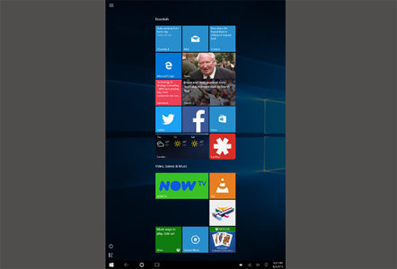
Your Experience with W10 on Tablets?

Roy Khoh

New member
Feb 4, 2015
59
0
0
Visit site
I like tablet mode on windows 10 just fine. To each his own.

I'm with James. I like Windows 10 on a tablet.
Much like when Windows 8 came out, there was a small learning curve with gestures and all. Now it's just a matter of adjusting a few things. Some things (gestures) will come back.

The only item I can add regarding the Windows 10 experience, and someone else mentioned it before, is that a clean install is a much better experience vs. an upgrade.

I couldn't figure out how to do a clean install on my DV8Pro or even a Reset, so I ended up running the upgrade from the previously created USB again. This time, I chose not to keep any existing applications, just my personal files.

Now, apps snap properly every time (I posted before it worked maybe 5% of the time).
The smoothness of swiping apps around appear smoother. There was a slight, hardly noticeable jitter before. Windows Central forums is still a big site for Edge to handle, so no change there, but loading typical sites appear to render quicker now.

More importantly, I can install and use Word and Excel Mobile with Windows 10.
Not sure if 8.1 users can use them.
 

robjared05

New member
May 22, 2013
28
0
0
Visit site

I have to agree. I find W10 enjoyable to use on a PC as installed on a Macbook Pro and a Dell 1820. On a tablet (Lenovo 8") W10 is totally frustrating. The start screen is a total waste of screen real estate unlike the phone which is edge to edge tiles. And speaking of Edge although it looks nice it is much easier on a tablet navigating IE.
Needless to say I rolled back to 8.1 and yes I did breathe a sigh of relief when it booted up to 8.1.
 

Ivan05il

New member
May 3, 2013
284
0
0
Visit site
I will survive the way W10 handles touch, I use it on Surface 3 Pro and Dell Venue 8 Pro atm. But what I really don't understand is why OneDrive is working now the way it is working. Should I now put every file into its own folder to be able to choose what I want offline as I could before? I thought the whole point of cloud storage was that I can have lots of files online and still access them all even if my local storage is limited. What they did to OneDrive is the worst "improvement" ever.
 

Remy_S

New member
Jul 31, 2014
7
0
0
Visit site
I installed it on my Surface Pro a week ago, but I find W10 to be a big dissappointment. Touch was so much better and more natural on W8.1, instead of elegant swipes which were easy and natural to perform on tablets, we now have buttons that are best operated while using a mouse. I can understand adapting desktop mode to be more mouse and keyboard orientated. But the whole point of having a desktop mode and tablet mode is to allow for two different experiences.
Win 8.1 may have received a lot of flak, but I have never heard anyone critisize it's touch friendlyness, that was usually the one aspect that got praised.

Things I dislike and want to have changed:
1. Any visible buttons on startscreen should be 50% bigger
2. Why the f*#ck isn't it possible to autohide the taskbar on the startscreen in tabletmode??!! It has worked on the desktop since Win 95. Seriously, is this a bug, or something they did on purpose?
3. I would prefer horizontal tile scrolling since it utilizes screenspace better, but I can live with the vertical if need be.
4. All apps list needs to be larger (approx 50% larger) to make easier to operate with fingers.

Things I like:
The new screen for active apps, when swiping from the left (although hitting the x's to close them is somewhat to difficult).
Action center, although I would have prefered to have search and power off to be moved here. Perhaps that poses a problem for Cortana use, but I wouldn't know since Cortana isn't available for me.
 

Kirk Davis1

New member
Aug 10, 2015
1
0
0
Visit site
I now have Win 10 on three computers and my ASUS T100T tablet. Overall, performance on the ASUS is better than on the
computers, one being a quad-core only three years old. Everything is smooth, and speed is better than with Win 8.1. Only problem is that I can't eliminate the need to enter the password when coming out of sleep; set the two places within the OS and also deselected the option in netplwiz. Seems like this is a general problem with tablets; MS wants to force us to be secure!! The installation was a cliff-hanger as I only have a 32GB drive with a 32 GB SD card. Zero problems. I also think Edge needs lots of work. it seems a little slow, and you wait too long for a large page loads before being able to proceed. This, however is similar to the waits with Chrome. I was always a fan of the Metrto side of Win 8.1, and did a lot of work there. The Tablet mode gives me the same thing, but it seems to be somewhat faster than with Win 8.1.
 

Chris Turek

New member
Jul 25, 2014
31
0
0
Visit site
The only issue with windows 10 for tablet is that my HP Stream 7 is extremely slow. It got a lot better with the last update (the one that came a week after the public release of windows 10) and is quite a bit more usable but it's still too slow to really comfortably use my tablet anymore. Especially using Spotity, I find that multitasking and switching apps is insanely glitchy and takes so much time to switch. I hope patches continue and the performance increases because it's nowhere near how buttery smooth the performance of windows 8.1 was on it.
 

Dave47

Member
Mar 11, 2014
206
0
16
Visit site
After a few days on my Stream 8, I'm OK with 10 - mostly. What is disturbing is the battery drain. Way worse than 8.1. Seems like it idles at 30% CPU with system and system interrupts taking up most of the 30%. Win 8.1 idled close to 0%. When this gets fixed I'll be a happy(er) camper.
 
Last edited:

brymcho

New member
Aug 14, 2014
5
0
0
Visit site
I rolled back on my SP3. The tablet experience is a bad joke compared to Windows 8.1
Just a few points:
1) tablet mode is cluttered with desktop UI elements. With 8.1 i can do everything with swipes from left and right and have most of the stuff within reach of my thumbs with the perfect size, position and hitbox. If i want to go desktop, i would press the desktop tile...which is missing in Windows 10
2) no charms bar this means:
2.1) no quick peak time, connectivity and battery status
2.2) no share option
2.3) no print option
2.4) no play-to option
2.5) no miracast option ( i know there is an equivalent in info-center)
2.6) no apps specific settings...instead now the app seems to be responsible for settings...for lots of modern UI apps i cannot access setting anymore. As consequence there is no common place for app settings anymore.
3) task view shows all running apps not just modern UI apps. I do not want to see desktop apps in tablet/modern UI mode.
4) task view and managing screen split with left thumb swipe seems to be gone as well. Instead i have the task view filling up the whole screen, not reachable with the thumb. Certainly good for mouse control but such UI design paradigm belong to the desktop.

While I should admit that W10 is good for desktop (better than W8.1) for tablets W10 is almost useless. In additional to above I should add that the charm bar solution with title popup and hamburger menu is just ridicules. I keep my taskbar at top. The hamburger menu appears BELOW taskbar. I somehow managed to fix this with autohide on the taskbar but then I should touch an extremely small (on my tablet) menu with almost invisible options. If I scale all interface to 150-200% I ruined desktop applications usability. Task switching is ruined as well and practically impossible for one handed operation. Its almost constant switching between tablet and desktop modes when title bar disappears suddenly and the only fix is to switch modes and it reappears.

In short - W10 brings me back to old pixel hunting games from my childhood. Everything is a pixel hunting in tablet mode - little close buttons, little hamburger menu with small options.

My frustration is so big sometimes I need to just scream when I'm in hurry and can't tap here or there. I need gestures for tablet mode.
 

TortugaOnline

New member
Jul 16, 2015
16
0
0
Visit site
After a few days of testing Win 10 on a desktop and on my Dell Venue 8 Pro I would say that it is good for desktop, but tablet mode needs some improvement. My biggest issue is the new OneDrive-sync. If you don't sinc it you can't see your folders, if you sync it, you loose space on your HD. This is why I won't install it on my SP3 (which is my work machine) untill they fix it. Now back to the experience in tablet mode on my 8" tablet:

  • Windows 10 has a new and fresh look. That's a good thing. My tablet seems to be a whole new device.
  • Apps: Office mobile apps are just great. They look good and are way better on a small tablet than the desktop versions. Some new apps like maps and the new store are an improvement also. Having said that I have to mention also that Win8 apps that have not been adapted to Win10 are sometimes a bit strange to use. In Win8 you had the charms bar to access app setting. Now that charms bar is gone you have to go to the left corner at the top. This is easy with a mouse but not so easy with your finger... I guess we just have to wait untill developpers update their apps.
  • Edge: Looks great, but there is still a lot of work to be done. No touch gestures, no swipe backwards. And the tabs on top are so tiny (I always complained about that on my girlfriends iPad). It was more touch friendly under W8.1 with big tabs on the bottom (and again: swipe gesture to open them). It is also really anoying to see all those ads on the internet. Also Edge doesn't creat good tiles as IE did under W8. What I really like is to draw over webpages in Edge. I would like to use Edge more often but I still have to use IE for lot of things.
  • I really enjoy the new settings app. Looks quite simple and is touch firendly. Another advantage is the battery use statistics. Looks similar to the phone ones. I like it.
  • Sometimes tablet mode is a bit poor. It only shows everything in fullscreen. There are still things in the OS that aren't adapted to touch use aree simply too small despite full screen. But I guess MS will improve this in the next months or the next year.
  • The actions center is really usefull. So are the toogles and the battery saver mode.
  • Swipe from the left isn't as good as under W8. I mean, it is good to see all open apps. But why just can't you drop them down to close them just as in WP? Hit the X always? That's for mouse users. Improve the tablet mode, MS!

So, I think it is like two steps forward and one step back. If they would improve some things in tablet mode then it will become a really great tablet OS (like Win8.1 was).
 

Rodrigo Mendes

New member
Jul 9, 2013
676
0
0
Visit site
What you think about tablet experience on Windows 10?

I think it's HORRIBLE if compared with Windows 8.1 experience, which is almost perfect for me.

It's confusing, the icons are ridiculous small all the time and the start bar really **** me off! The right side bar is gone too and was perfect on Windows 8! Now we have a fake notification bar with settings, which is WAY worst than old right side bar/menu. Brightness control is pathetic too. Again was perfect on W8.

Why, Microsoft... Why...? Windows 10 for tablet is the most confusing experience that i have in all my life. Looks like a Frankenstein, something made for desktops and somehow adapted for tablets.... It's a HUGE downgrade since Windows 8.1 was a absolutely delightful experience for tablets. Really near to perfection.

Edge. I cannot possible imagine why they put address bar on top in tablet. Horrible idea, now we have the same bad experience than others navigators. Please, where's my good and clean IE11 app??? I need this for YESTERDAY.

Looks like a desktop experience in tablet. It's just bad, don't work at all. It's painfull. Only multitask is better than old edition. The taskbar on the bottom is the most pathetic thing in Windows 10 tablet experience... Just show how wrong Microsoft are when they think about tablet.

It's more confusing than Windows 8 for PC or Desktops. Microsoft is always doing things like that, I just don't understand why. I think they hear public more than they should.

We need a Windows 10.1 ASAP...
 
Last edited:

Stefan Holder

New member
Apr 30, 2013
427
0
0
Visit site
Rolled back to Windows 8.1 on the HP Stream 7 tablet. I never appreciated 8.1 so much on this form factor until I tried Windows 10 on it..I disabled the Windows 10 update and hid it, so I won't bother me about upgrading to 10. All is right now..
 

jaimeastin

New member
Apr 8, 2012
486
0
0
Visit site
Rolled back to Windows 8.1 on the HP Stream 7 tablet. I never appreciated 8.1 so much on this form factor until I tried Windows 10 on it..I disabled the Windows 10 update and hid it, so I won't bother me about upgrading to 10. All is right now..

Amen! Windows 8.1 is amazing for tablets... 10... Lost its class. 8.1 was good on the desktop... 10.. Ok..

I only upgrded my surface pro 3 ans dell venue pro 8... But i will not upgrade any of my other computers to 10.. not get at least... Has a lot of 8.1 features I need back.
 

brad4560

New member
Feb 25, 2012
101
0
0
Visit site
Just went through hoops to get my hp stream 8 up and running after a failed previous build install, and I am very surprised how much I like win10 on it. I've had no issues, and I am getting used to tablet mode, to me it just works.. What I use is front and center.. And the mobile office apps are perfect...
 

WillysJeepMan

Active member
Aug 7, 2008
1,066
0
36
Visit site
Rolled back to Windows 8.1 on the HP Stream 7 tablet. I never appreciated 8.1 so much on this form factor until I tried Windows 10 on it..I disabled the Windows 10 update and hid it, so I won't bother me about upgrading to 10. All is right now..
I just finished upgrading my Acer Aspire Switch 11 to Win10. Although I like the look of Win10, it is not as usable on a hybrid/tablet like this device as 8.1 is. Microsoft definitely overcompensated and went too desktop with 10. I'll give it some time to grow in me, but just as I'm getting to rely on the charms bar they remove it.
 

webkrawler

New member
Dec 6, 2013
75
0
0
Visit site
It's okay. I currently have Windows 10 running on a Irulu W1002 tablet that was shipped with Windows 8.1
I also own a Nokia 2520 Windows RT 8.1.
I was an early adopter of Windows 8. While Windows 8/8.1 experience on a desktop PC wasn't superb, simply adding
a start menu program like StartIsBack fixed that and I could not tell a difference from running Windows 8.1 to Windows 7
because on my desktop PC I stayed primarily in the Windows Desktop.
On a tablet, Windows 10 is "okay" but not the experience on Windows 8.1 The Charms Bar really made the
tablet experience useful, fun and friendly. Now, on Windows 10, I am more in need of having to use a mouse
again because like Windows 7, Windows 10 is really not very touch friendly, tablet mode or not.
Maybe I need to use it more. But, Windows 8.1 was the BOMB on a tablet and Windows 10 seems
like several steps backwards in the wrong direction.
I suppose they either had to tick off the desktop PC uses or tick off the tablet users. Can't please both.
 

JaySeeDoubleYou

New member
Oct 22, 2014
22
0
0
Visit site
I'm using a Nextbook Flexx 11 as a tide-me-over to satisfy my Windows 2-in-1 needs until I can afford to replace it with a real Microsoft Surface. My experience with Windows 10 tablet mode?

I'm happy with it!

I know that there are a lot of people crying over 10's Tablet mode, but I am largely unsympathetic with them.

In a vacuum, just as an aesthetic, I'm completely "agnostic" when it comes to a vertically scrolling vs horizontally scrolling start screen. But in the context of Windows 10 as a whole, especially in light of the intended universality of "one Windows", I think the vertical approach is FAAAAAAAR better. Vertical is better on phone. Vertical is better on the start menu in desktop mode. How incongruous would it be, and jarring to have everything going up down, only to have the start screen go side to side? This is why I'm actually an ARDENT supporter of the vertical scroll.

Hamburger menus? I'm perfectly fine with them. Having my mobile background made up of 99.9% iOS and Android (Android making the majority of that), hamburger style menus feel like home to me. And they will feel like home as well to the droves of people who they hope to lure from Android and iOS too. We can argue for days and days over our personal, read: SUBJECTIVE preferences on hamburger vs swipe (and probably not accomplish ANYTHING objective), but love em or hate em, they are a SMART move on MS' part.

The taskbar? I agree that you should be able to hide and unhide it, and I also wish you could see open apps on it like in desktop. But otherwise, I'm fine with it. I think it's aesthetically pleasing, at least.

Edge not being able to go truly "full-screen" - Granted. I can't defend this one. But a) neither have I found it to be TOO MUCH of a problem, and b) I am confident that they'll fix this in a WaaS update.

The whole OneDrive thing? This is a break for some, and a fix for others. I haven't used much cloud so I'm not super hip to it, but the solution seems obvious - why not make it so users can choose for themselves?

The speed, and reliability, and performance of 10 Tablet? Fine to me - and this is on an underpowered, cheapie Nextbook Flexx. It's still nice and peppy. No complaints on this front at all!

Anyway, so yeah, I'm QUITE pleased with Windows 10 in -BOTH- the desktop and tablet modes (though I will admit that at least for the time being, the desktop experience is still more robust.)

Perhaps the biggest improvement of them all as far as I'm concerned is the now hard line in the sand between desktop mode and tablet mode. The desktop experience is resolutely a desktop experience, and the tablet experience, love it or hate it, is a resolutely tablet experience - but all in one device, and you can switch back and forth whenever you'd like. I didn't hate 8. There were even many things I liked about 8. But I didn't LOVE 8, and perhaps chief on my list of complaints about it was that "8 desktop" was waaaaay too much tablet, "8 tablet" was waaaaaay too much desktop - and there was VIRTUALLY NO DIFFERENCE between "8 desktop" and "8 tablet". It all just felt like a great idea horribly executed. 10, in my mind fixes all of that.

Is 10 perfect? Of course not! Is it rough around the edges? Absolutely! Does it feel a little rushed and cobbled? Sure. Are there many things that need fixed and/or tweaked? Yes. But, with WaaS, that all matters so very much less than it did in previous versions of Windows. And let's ask ourselves honestly, was any of this any different when Windows 8 came out - back before WaaS, back when it mattered so much more? I rest my case.

So, yeah, in conclusion, I'm quite happy with 10 Tablet! I think Microsoft is definitely on the right track here!

Cheers!
 

Members online

Forum statistics

Threads
326,564
Messages
2,248,571
Members
428,514
Latest member
Shiron