Ok, so I left my Lumia 920 to go to the Nexus 5. Because Windows Phones are too simple for me. Their UI is so basic. It once looked nice on a 4 inch 480x800 display, but I've used the iPod Touch, the iPhone, the Zune HD, Samsung Focus, Focus S, Lumia 920, Kindle Fire, HP TouchPad, Nexus 4, Nexus 5, Galaxy S III, etc. The thing is, Apple got a UI full of chrome on a 3.5 inch display, and we never had problems with something not fitting in on the interface. Screens went up in size, and now we got jokes for phones like the Galaxy S4 with it's comically upscaled UI on a 5 inch 1080P HD display. We have the Lumia 1520 which has 3 columns on it's start screen but lacks that extra in a lot of apps like IE where the address bar is the same percentage of the screen but now is huge and adds no extra functionality. Why are we limited to one button and an address bar?
What's wrong with all those leaked screens of settings from 8.1?
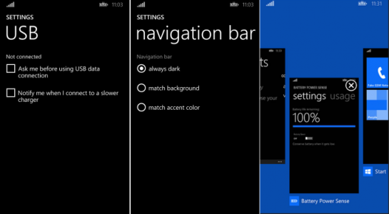
They have no color or flavor to them.
What about how all Windows Phone apps use boring grey or transparent app bars while Windows 8.1 uses vibrant blue app bars?
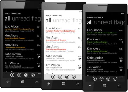
Windows Phone 7 Series had a vision and that vision changed and evolved with the new form factors we have today like the Xbox One or Windows 8.1. We have bigger screens on phones now, full HD displays, and we have bigger batteries and more efficient chips. We have tattoo backgrounds on Windows 8.1 that are animated. Just a much more polished UI. We've had the same UI for years now on Windows Phones. We finally are getting 8.1, which is like our 7.5 Mango that we should've had a long time ago instead of those small updates during 2013.
We really shouldn't be thinking 8.1 for phones is really Windows Phone 9 but they're keeping the version numbers the same from now on. Because we really aren't there yet. Windows 8.1 has much improved app snapping and with this, it is easy to show a concept of where things might go and should definitely go with Windows Phone 9. Or hopefully 8.1. All Windows apps including apps like PC Settings should be remade to also handle phone settings or any type of device settings and then fit the screen it will be running on. That way we can have one Modern UI, one app, that will work on all platforms all the same way but tailored to the screen it will be on. The same kind of live tiles, the same UI consistency.

A new more vibrant start screen for Windows Phone. We could have 3 columns too. I can't show that off though, Windows 8.1 doesn't do that.
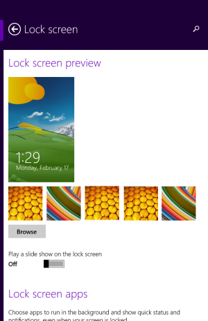
A new phone settings app with a new Modern UI.

Bing will get an overhaul too.

IE with many more buttons and options as opposed to that screw-up we got now.
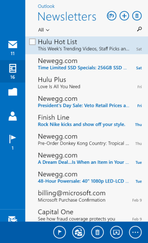
Mail with the app bar popped up.
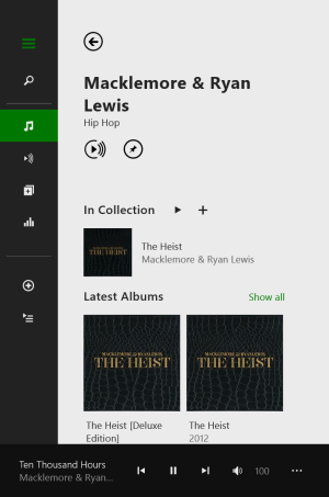
Ok, so Xbox Music isn't very pretty in this but it could work if they enhanced the UI for it at this size.
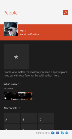
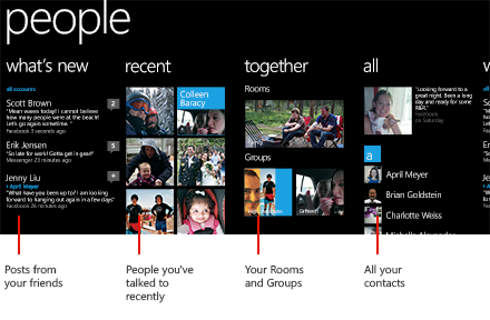
The People app, a lot better now than just black.
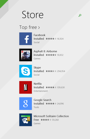
Focus on the background, I think it looks a lot nicer than just black. Everything else is eh the way I took the screenshot.
Ok, so Windows 8.1 lets you make things smaller, so if Windows Phone got that option. Here's some of that.

IE with things smaller.
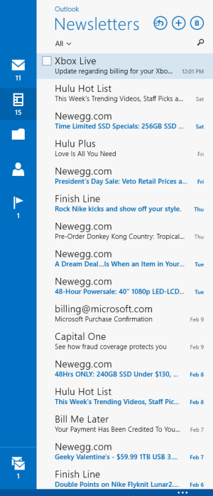
Mail with things smaller.
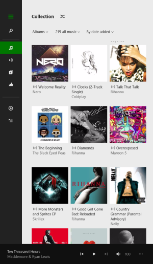
Xbox Music looks a little better this way.
What's wrong with all those leaked screens of settings from 8.1?

They have no color or flavor to them.
What about how all Windows Phone apps use boring grey or transparent app bars while Windows 8.1 uses vibrant blue app bars?

Windows Phone 7 Series had a vision and that vision changed and evolved with the new form factors we have today like the Xbox One or Windows 8.1. We have bigger screens on phones now, full HD displays, and we have bigger batteries and more efficient chips. We have tattoo backgrounds on Windows 8.1 that are animated. Just a much more polished UI. We've had the same UI for years now on Windows Phones. We finally are getting 8.1, which is like our 7.5 Mango that we should've had a long time ago instead of those small updates during 2013.

We really shouldn't be thinking 8.1 for phones is really Windows Phone 9 but they're keeping the version numbers the same from now on. Because we really aren't there yet. Windows 8.1 has much improved app snapping and with this, it is easy to show a concept of where things might go and should definitely go with Windows Phone 9. Or hopefully 8.1. All Windows apps including apps like PC Settings should be remade to also handle phone settings or any type of device settings and then fit the screen it will be running on. That way we can have one Modern UI, one app, that will work on all platforms all the same way but tailored to the screen it will be on. The same kind of live tiles, the same UI consistency.

A new more vibrant start screen for Windows Phone. We could have 3 columns too. I can't show that off though, Windows 8.1 doesn't do that.

A new phone settings app with a new Modern UI.

Bing will get an overhaul too.

IE with many more buttons and options as opposed to that screw-up we got now.

Mail with the app bar popped up.

Ok, so Xbox Music isn't very pretty in this but it could work if they enhanced the UI for it at this size.

The People app, a lot better now than just black.

Focus on the background, I think it looks a lot nicer than just black. Everything else is eh the way I took the screenshot.
Ok, so Windows 8.1 lets you make things smaller, so if Windows Phone got that option. Here's some of that.

IE with things smaller.

Mail with things smaller.

Xbox Music looks a little better this way.


