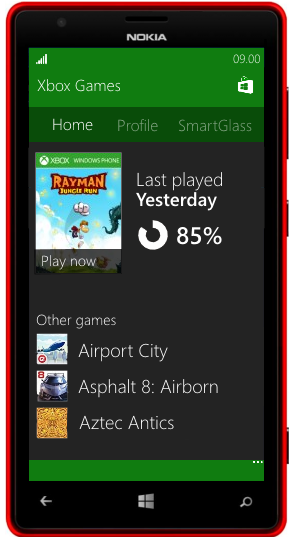
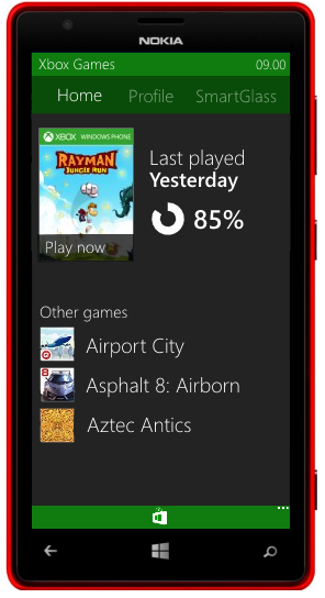
[CONCEPT] More colours in Windows Phone UI
- Thread starter mattss
- Start date
You are using an out of date browser. It may not display this or other websites correctly.
You should upgrade or use an alternative browser.
You should upgrade or use an alternative browser.
TheMightyCraken
New member
TheMightyCraken
New member
cesarg
New member
I don't like the Settings one, if I wanted that I'd get an android. The rest might look nice in our devices.
What would be actually interesting is to, for instance, zoom out and view the icons in a grid so you have access to every setting without scrolling.
What would be actually interesting is to, for instance, zoom out and view the icons in a grid so you have access to every setting without scrolling.
Thanks! I'm lookin for a different solution for settings page, more Modern UI and less AndroidI don't like the Settings one, if I wanted that I'd get an android. The rest might look nice in our devices.
What would be actually interesting is to, for instance, zoom out and view the icons in a grid so you have access to every setting without scrolling.
TheMightyCraken
New member
Maybe loads of people will vote for it on UserVoice and this concept will become realityThank you so much! Sure, I'm really keen on makin them although they will be only concepts
TheMightyCraken
New member
The one on the Left
anon5997296
New member
Don't get offended. But I like WP8 way more than this or 8.1 in terms of UI. And if I wanted this much colour, I'd simply go for Android L. L gets it better than this.
Don't get offended. But I like WP8 way more than this or 8.1 in terms of UI. And if I wanted this much colour, I'd simply go for Android L. L gets it better than this.
Why should I get offended? No problem, man :wink: We all know Microsoft wants to merge Windows and Windows Phone in a single OS, so probably WP is gonna be like the desktop OS, that is much more colorful.
Trevor Wolfe
New member
No problem, man! Thank you for your opinion :wink:I really hate this and am glad you aren't the designer for windows phone. No offense.
The idea has just passed 1200 votes on UserVoice (about 3x in 24 hours) and it is in the first page. Thank you for your support!
Tornado92
New member
Love this concept, I've always love the Windows 8 UI and was a bit disappointed that WP doesn't follow the looks. I've gave 3 vote on uservoice (wish I could give more).
Anyway, here's my idea. You know the alphabet thing that usually put on a list
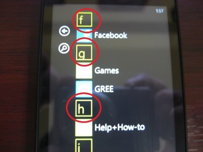
Maybe you could change it more like Windows 8 style, like this :
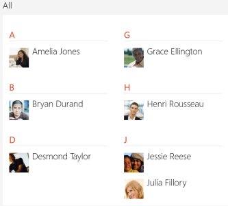
(Also, this is a bit unrelated to this topic but I've also think that you should be able to access the alphabetical jump list in the app list by pinch
Anyway, here's my idea. You know the alphabet thing that usually put on a list

Maybe you could change it more like Windows 8 style, like this :

(Also, this is a bit unrelated to this topic but I've also think that you should be able to access the alphabetical jump list in the app list by pinch
Last edited:
Love this concept, I've always love the Windows 8 UI and was a bit disappointed that WP doesn't follow the looks. I've gave 3 vote on uservoice (wish I could give more).
Anyway, here's my idea. You know the alphabet thing that usually put on a list
View attachment 80123
Maybe you could change it more like Windows 8 style, like this :
View attachment 80124
(Also, this is a bit unrelated to this topic but I've also think that you should be able to access the alphabetical jump list in the app list by pinch
Thanks for your votes!
Yeah, I think this is a good idea! I'm currently working on this feature and I'll upload a picture as soon as possible. The feature to zoom-in or zoom-out by pinch is called "Semantic Zoom".
[video]http://msdn.microsoft.com/en-us/library/windows/apps/hh465319.aspx?videoid=40f74518-2534-42ed-913b-820b4d453e38&from=sharepermalink-link[/video]
Thanks for your feedback! :wink:
Brandon Tobias
New member
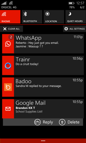


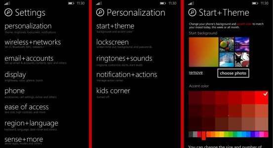
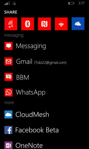
just some of my ideas maybe u can rework some
the nav bar i made it so u can swap buttons for like if you are coming from Samsung and u can maybe add a camera shortcut in the extreme right .
Action Center now have notification tiles ... that show three message previews.
each tile flips if more than 3 messages or notifications come in per app.
notification tiles also expand to show all notifications and allow you to swipe away individual messages leaving only the ones you want to check back.
also a tap on hold gives u more options like reply and delete like in the email app there but it will be app and developer dependent.
also the quick toggels are on / off in my image to get to that setting you tap and hold and poof you in wifi settings etc
Settings - i sorted it and grouped them off as they should have been it also now has search you can add more colour to it if you wish.
SHARE menu now has quick share large persistent tiles for things like NFC , Bluetooth, etc even if they are off as it should be.
apps are gouped by messaging , social and others.
BTW i voted for u ... im kind done with WP UI designs im now thinking of innovative software features.
Ashalinia
New member
I really hate this and am glad you aren't the designer for windows phone. No offense.
You could at least make your criticism constructive by telling us what's wrong with it.
I personally like this idea and the whole black/white menus get a little stale after a while.
Brandon Tobias
New member
You could at least make your criticism constructive by telling us what's wrong with it.
I personally like this idea and the whole black/white menus get a little stale after a while.
lol idk why u even replied to said person these are people to ignore ... he very well knew he could have phrased it better / nicer unnecessarily mean is what i call it.
Similar threads
- Replies
- 0
- Views
- 292
- Replies
- 0
- Views
- 288
- Replies
- 0
- Views
- 450
- Replies
- 0
- Views
- 499
Trending Posts
-
How to fix touchpad disappearing on Windows 11
- Started by Windows Central
- Replies: 0
-
Gears of War voice actor says game in the series could be announced in June
- Started by Windows Central
- Replies: 0
-
It's now easier than ever for Microsoft 365 users to get to work on a Chromebook
- Started by Windows Central
- Replies: 0
Staff online
-
Zachary BoddyWriter
Forum statistics

Windows Central is part of Future plc, an international media group and leading digital publisher. Visit our corporate site.
© Future Publishing Limited Quay House, The Ambury, Bath BA1 1UA. All rights reserved. England and Wales company registration number 2008885.


