[CONCEPT] More colours in Windows Phone UI

mattss

New member
Jun 28, 2014
28
0
0
Visit site
Thank you for your 5000+ votes on UserVoice! (10/26/2014)


IMPORTANT: Can you vote on UserVoice? Thanks!
More colours in Windows Phone UI ?€“ Feature Suggestions for Windows Phone


Hello everybody,
I wanted to show you some of my concepts for a new WP UI.

NEW Internet Explorer (Just some changes)
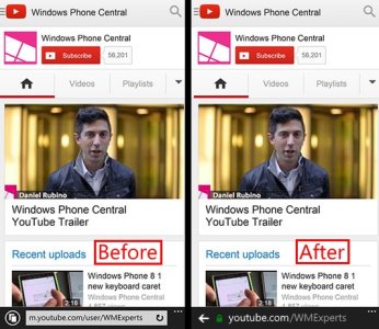
youtube_mobile_website2_wpc.jpg

Photos
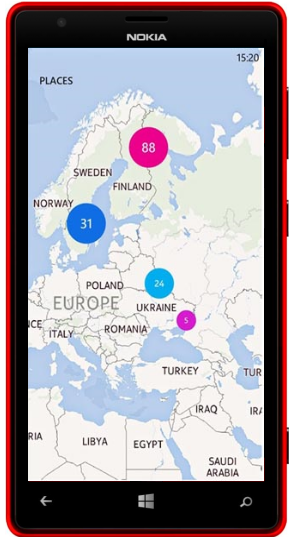
When you tap the map icon, you will see a map like Nokia Storyteller.
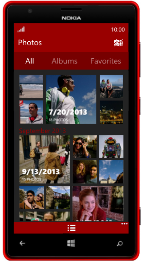
photos all.pngphotos maps.png

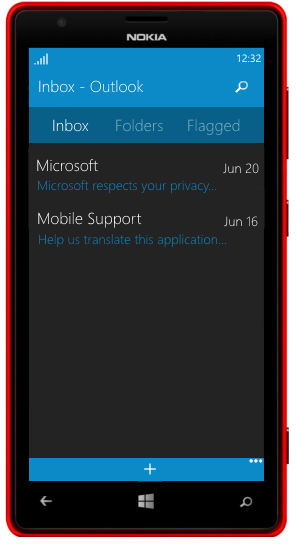
Email client
email.png

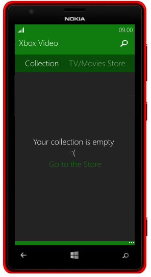
Xbox Video
video.png

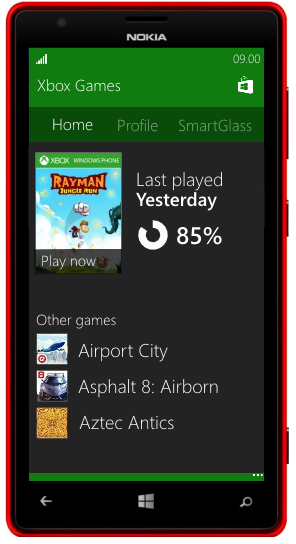
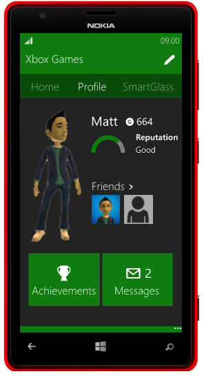
Xbox Games
games-collection.pnggames-profile.png

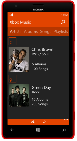
Xbox Music - Now Playing & Xbox Music - Your collection (I don't like them)
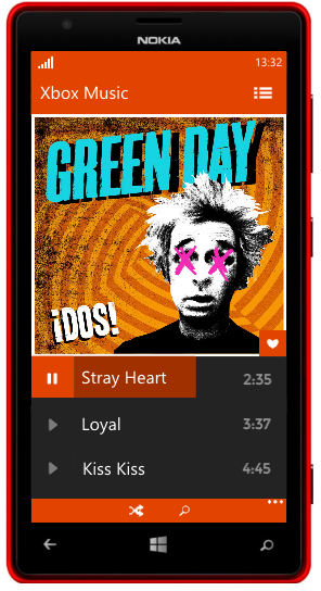
music.pngmusic-artists.png

Settings (I'm working on a different solution)
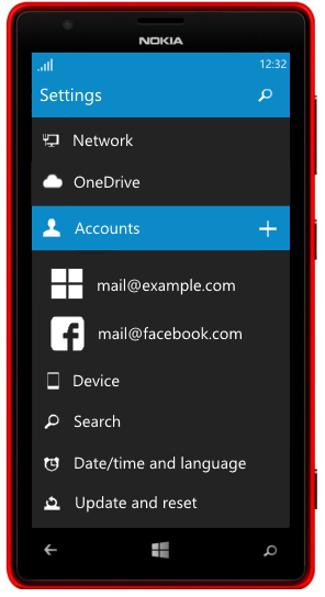
settings2.png

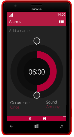
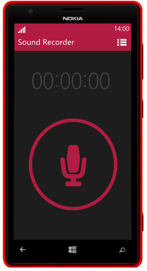
Alarms and Sound Recorder
alarms.pngregistratore.png
 
Last edited:

anon(8776042)

New member
Apr 18, 2014
37
0
0
Visit site
Nice, I like it.
The settings one is a must need, and the alarm app needs an update because is pathetic...
I need to configure the volume, the snooze time, and it could also have flip to snooze...
 

three_thoughts

New member
Nov 23, 2013
113
0
0
Visit site
Very nice. WP needs some colour and I think this is one of the main reasons why the design of windows apps has gone ahead of WP apps.

The Bing apps on WP look good, but the core apps and Music and video especially are lagging behind their windows equivalents
 

nyolc8

New member
Mar 1, 2014
148
0
0
Visit site
Well it looks nice, but it reminds me now the new google design. I think the present looking of the WP is much more unique. But I agree, maybe we could get some more colors on the UI.
 

Enuniq

New member
Apr 17, 2014
11
0
0
Visit site
Frankly, Google completely copied the Metro design. So as for as I'm concerned, it's pretty original... Microsoft should try it
 

travis_valkyrie

New member
Jan 3, 2012
449
0
0
Visit site
Although nice, it's very simplistic. Sorry to sound blunt, but there's little to no variation in this. Just because Facebook had a revamp doesn't mean you have to follow that trend. But with these concepts though, you could do a lot more. Just need to mix it with Modern UI a bit, like use pivot menus or panoramas instead of tapping buttons to reveal side columns.
 

Fade_z

New member
Jun 15, 2013
425
0
0
Visit site
The reason i truely adore this concept is that it does not break the Modern UI concept and looks a lot more vibrant and alive. Like the tiles felt when i first saw them. Hope this get massive exposure
 

Fade_z

New member
Jun 15, 2013
425
0
0
Visit site
Although nice, it's very simplistic. Sorry to sound blunt, but there's little to no variation in this. Just because Facebook had a revamp doesn't mean you have to follow that trend. But with these concepts though, you could do a lot more. Just need to mix it with Modern UI a bit, like use pivot menus or panoramas instead of tapping buttons to reveal side columns.
This is what Modern UI is all about, minimalistic and simplistic. There is no variation now anyway because all the menu's and apps are black background with a white font.
 

mattss

New member
Jun 28, 2014
28
0
0
Visit site
Although nice, it's very simplistic. Sorry to sound blunt, but there's little to no variation in this. Just because Facebook had a revamp doesn't mean you have to follow that trend. But with these concepts though, you could do a lot more. Just need to mix it with Modern UI a bit, like use pivot menus or panoramas instead of tapping buttons to reveal side columns.

Thanks for your feedback! As Fade_z said, I haven't changed the Modern UI, but I just added a bit of colour.
 

travis_valkyrie

New member
Jan 3, 2012
449
0
0
Visit site
This is what Modern UI is all about, minimalistic and simplistic. There is no variation now anyway because all the menu's and apps are black background with a white font.

That's putting it in generalization. The variation I meant is for an app having a 'best fit' UI according to its functionalities. The alarm clock for example, do you really have to have that menu button at the top right? If that is for other functionalities of the alarm app like timer or stopwatch, then wouldn't it be best to just use a pivot UI so users can just swipe through functionalities instead of tapping and tapping. And you already have the options bar at the bottom to reveal more settings.

Point is, they don't have to look the same. Just have a UI that works best with the kind of app.
 

mattss

New member
Jun 28, 2014
28
0
0
Visit site
That's putting it in generalization. The variation I meant is for an app having a 'best fit' UI according to its functionalities. The alarm clock for example, do you really have to have that menu button at the top right? If that is for other functionalities of the alarm app like timer or stopwatch, then wouldn't it be best to just use a pivot UI so users can just swipe through functionalities instead of tapping and tapping. And you already have the options bar at the bottom to reveal more settings.

Point is, they don't have to look the same. Just have a UI that works best with the kind of app.

I understand what you mean. A tabbed/sliding system like the actual one is very useful. The button I put on the right, near the app name (for example: in alarm app) is meant to go/come back to other existing alarms list. It isn't a simple dropdown menu like Android's one, but it's a simple link, instead of sliding left or right. Although a tabbed/sliding navigation is better, I had to put a button because it seemed to be too empty.
 

Jan Tomsic

New member
May 8, 2013
383
0
0
Visit site
This must be a first concept design that actually looks better than original. Usually people just make up some futuristic cr*p. This looks very nice, though it does look somewhat different than WP :)

It does look like you're always getting a toast notification though :D
 

Members online

No members online now.

Forum statistics

Threads
323,197
Messages
2,243,435
Members
428,035
Latest member
jacobss