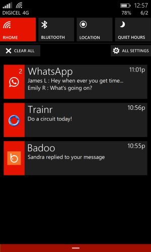
Made some changes to the UI trying to bring in more colour kinda similar to another post here
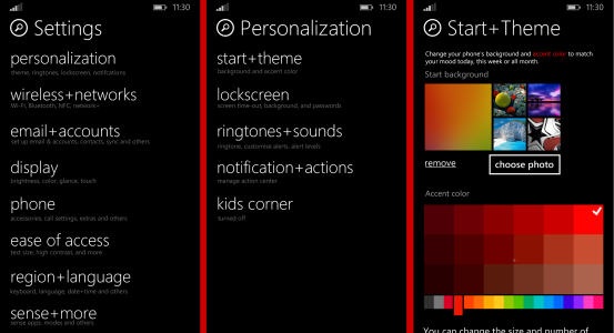
1) new settings with categories organization (still flat back)
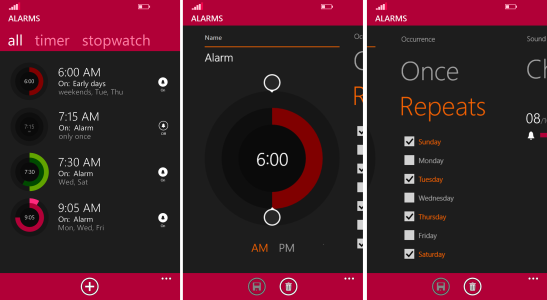
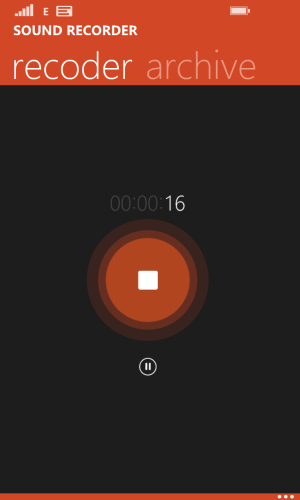
2) recorder and alarms app
3)new notification management
4) still ongoing work ... will fix more apps later
Settings
Settings
Settings needs to be organized either into categories like below or most frequently used.
Personalize
- Start + Theme
- Ringtones + Sounds
- Lock screen
- Notification + actions
- kids? corner
Wireless + Networks
- Airplane mode
- WIFI + WIFI Direct
- Bluetooth
- Cellular + SIM
- NFC
- VPN
- Internet Sharing
- Network+
Email + Accounts
- Add accounts
- Backup
- Sync settings
- Workplace
- Find my phone
Display (usual items under display)
- glance
- touch
- project my screen
- screen rotation
- brightness
Phone
- Accessories
- Call + SMS Filter and settings
- Audio
- Extras + info
- About
- Phone update
Ease of Access (usual stuff under this)
Region + language
- Keyboard
- Speech
- Region
- Language
- Date + time
Sense + More
- Data sense
- Battery sense (formally battery saver)
- Storage sense
- Feedback
- Advertising id
- Quiet hours
- Driving mode
Applications
The setting screen can also in list view or tiled view maybe windows 8 like view tiled view i have to work on
alarm app not my best rough sketch
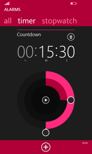
timer
recorder
Action Center modification

1) new settings with categories organization (still flat back)
2) recorder and alarms app
3)new notification management
4) still ongoing work ... will fix more apps later
Settings
Settings
Settings needs to be organized either into categories like below or most frequently used.
Personalize
- Start + Theme
- Ringtones + Sounds
- Lock screen
- Notification + actions
- kids? corner
Wireless + Networks
- Airplane mode
- WIFI + WIFI Direct
- Bluetooth
- Cellular + SIM
- NFC
- VPN
- Internet Sharing
- Network+
Email + Accounts
- Add accounts
- Backup
- Sync settings
- Workplace
- Find my phone
Display (usual items under display)
- glance
- touch
- project my screen
- screen rotation
- brightness
Phone
- Accessories
- Call + SMS Filter and settings
- Audio
- Extras + info
- About
- Phone update
Ease of Access (usual stuff under this)
Region + language
- Keyboard
- Speech
- Region
- Language
- Date + time
Sense + More
- Data sense
- Battery sense (formally battery saver)
- Storage sense
- Feedback
- Advertising id
- Quiet hours
- Driving mode
Applications
The setting screen can also in list view or tiled view maybe windows 8 like view tiled view i have to work on

alarm app not my best rough sketch

timer

recorder

Action Center modification
