nice attempt but the trick is to keep it simple
i agree too much going on and i would not like my toggles at the bottom to easy to hit by mistake.
also i would stick with dark colours or System Accent colours that white on black with app colours is a bit jarring
but i like your attempt you can use my edit and build on it as i do believe you have a good idea going
also i love your location icon better than the one it has now.
I.E expand on what MS has given us
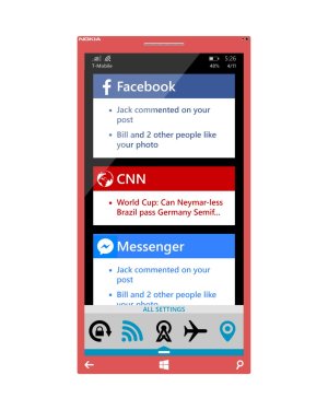
my mock up uses rectangular tiles sort off
it shows
App icon, notification counter, app name and a preview of the messages max of three previews per tile.
as the tile allows for three previews the tile flips to show me like in whats app it shows the first three your got then if you got more messages when it flips it shows the others and so on. if multiple messages from the same contact comes in it shows the last message your received and keep updating as such.
tiles can also be swiped away in both directions left and right.
for apps like email a one finger hold and dragg will expand it further ...


")