Music Control Dropdown Concept

Trevor Wolfe

New member
Dec 3, 2013
185
0
0
Visit site
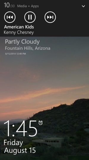
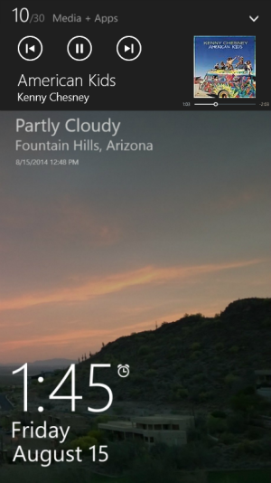
Here is a concept I made for the Music Control Dropdown that matches windows 8.1 desktop music controls and adds a music scrubber. What do you guys think?

NewMusicControls.png
 

Attachments

  • CurrentMusicControls.jpg
    CurrentMusicControls.jpg
    172.5 KB · Views: 14
  • NewMusicControls2.png
    NewMusicControls2.png
    365.7 KB · Views: 15
Last edited:

Llordy

New member
Dec 1, 2013
61
0
0
Visit site
Nice. But it doesn't move far from the current drop down. And not to complaint, but the scrubber is impractical and ridiculously small, IMO

Posted via the WPC App for Android!
 

Entegy

New member
Aug 1, 2014
18
0
0
Visit site
That scrubber is completely impractical. I would rather just see the timecode and hold the skip buttons down to rewind and fast-forward.
 

EspHack

New member
Jun 11, 2013
1,279
0
0
Visit site
it looks cool, but I would rather see the app opening instantly instead of using that little impractical menu to avoid seeing a "loading" screen, not to mention it goes away if you don't use it constantly so you are getting stressed while deciding what song to listen to
 

smartboyamo

New member
Apr 25, 2012
4
0
0
Visit site
love the design of it. Yes i have to agree with others that the scrubber would be too small. maybe the current track duration would be better to put there.
 

Members online

Forum statistics

Threads
323,252
Messages
2,243,526
Members
428,050
Latest member
lolz1234