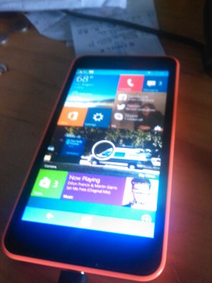
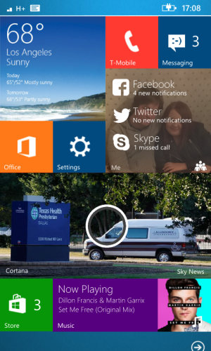
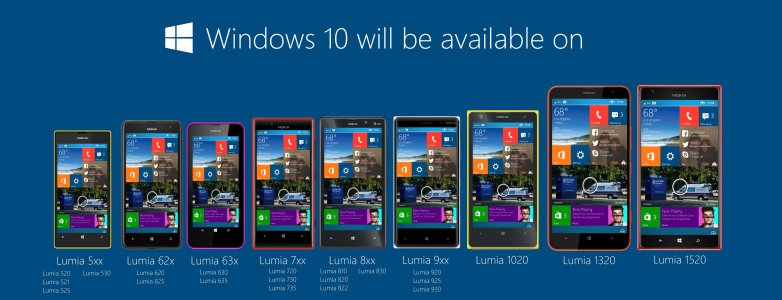
Here's Windows 10 on Windows Phone handsets
- Thread starter Ryan ODonnell
- Start date
You are using an out of date browser. It may not display this or other websites correctly.
You should upgrade or use an alternative browser.
You should upgrade or use an alternative browser.
deejohdumb
New member
Re: Here's what Windows 10 may look like on phones
I think I would really like it if the design looked like that. Really clean and simple but more efficient use of screen real estate. What about transparent tiles, if the tiles are touch each other how would you differentiate one app from the next?
I think I would really like it if the design looked like that. Really clean and simple but more efficient use of screen real estate. What about transparent tiles, if the tiles are touch each other how would you differentiate one app from the next?
BatteryLife
New member
paulxxwall
New member
pedmar007
New member
pedmar007
New member
Re: Here's what Windows 10 may look like on phones
Love the Cortana look and the Me app, simply beautiful. Can anyone tell me that with all the different renders of WP 9/10 that there's always someone with the ability to come up with a totally encompassing UI that completely annihilates what ANDROID and IOS has avl right now!! My god if MS can't see the goldmine that is WP OS then it truly has no future.
Love the Cortana look and the Me app, simply beautiful. Can anyone tell me that with all the different renders of WP 9/10 that there's always someone with the ability to come up with a totally encompassing UI that completely annihilates what ANDROID and IOS has avl right now!! My god if MS can't see the goldmine that is WP OS then it truly has no future.

Last edited:
EC Translating Services
New member
Re: Here's what Windows 10 may look like on phones
Any chance to see 3horX2ver tiles? They'd look gorgeous for metro, calendar, news, fitness apps etc.
But it's really nice.
Any chance to see 3horX2ver tiles? They'd look gorgeous for metro, calendar, news, fitness apps etc.
But it's really nice.
KhawarNadeem
New member
Re: Here's what Windows 10 may look like on phones
YASS @ bigger tiles. I hope this is how they do make it. That "Me" tile is what I really hope is a concept extended to folders. Like I have a folder for all the messengers I use (Skype, WhatsApp, BBM, Viber, FB) and how I wish it gave me notifications like that.
Good job, OP. Some interesting design there.
spaulagain
New member
Re: Here's what Windows 10 may look like on phones
I don't think they'll be removing the space between tiles. That's not what their doing with the rest of Windows, and that would also create long term usability issues.
I don't think they'll be removing the space between tiles. That's not what their doing with the rest of Windows, and that would also create long term usability issues.
sumton
New member
this concept looks better than windows phone 8.1 i do like the wide and large live tiles but im expecting even better design from MS
anon(8921886)
New member
I think it looks absolutely terrible. If this is the new look, I'm not quite sure if I will update.
Stefan Holder
New member
Re: Here's what Windows 10 may look like on phones
That is absolutely gorgeous render.. WowLove the Cortana look and the Me app, simply beautiful. Can anyone tell me that with all the different renders of WP 9/10 that there's always someone with the ability to come up with a totally encompassing UI that completely annihilates what ANDROID and IOS has avl right now!! My god if MS can't see the goldmine that is WP OS then it truly has no future.
View attachment 84392
ronaldme
New member
Sorry but I don't like your design:
1. Why 4 columns? Tiles will look too small on 4" or smaller phones
2. What happened to the space between tiles? there is an space for some reasons, for example, little tiles are easier to "touch". Without the spaces, it is easer to touch the next tile.
3. Each tile with different background color? what about personalization?
4. Well, the top bar is the only thing I liked.
I love the WP8/8.1 home design because it looks great but because there are some guidelines for usability, the space between tiles, the size of the tiles, the columns, etc.
EDIT: Your design with some modifications, but IMO the Cortana tile is too big:


Last edited:
PepperdotNet
New member
Any such rendering needs to also show landscape mode. That's a feature I've been missing since retiring my jailbroken iPhone. A landscape mode might not be effective on all devices bit it should be an available option.
humanhowever
New member
I think the concept looks rather beautiful, however the space in between the tiles could maybe increased a little. Apart from that, it's gorgeous!
Avik Biswas
New member
Re: Here's what Windows 10 may look like on phones
now that is some gorgeous design, a little bit of space and it is perfect. specially interactive tile and bigger tile option is what we missing in wp8.1 (..... and a stopwatch :winktongue .
.
Love the Cortana look and the Me app, simply beautiful. Can anyone tell me that with all the different renders of WP 9/10 that there's always someone with the ability to come up with a totally encompassing UI that completely annihilates what ANDROID and IOS has avl right now!! My god if MS can't see the goldmine that is WP OS then it truly has no future.
View attachment 84392
now that is some gorgeous design, a little bit of space and it is perfect. specially interactive tile and bigger tile option is what we missing in wp8.1 (..... and a stopwatch :winktongue
bijak_riyandi
New member
stephen_az
Banned
Re: Here's what Windows 10 may look like on phones
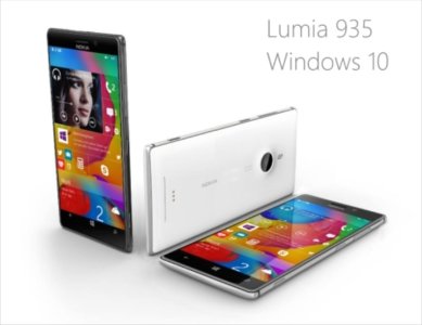
The answer to your question is twofold. First, it is only your opinion that peoples' renderings are encompassing, etc., etc.. Even with this 935 image, you apparently like phones with camera lens bulges - I would never buy a phone that does not lay flat. Point being your idea of ideal and mine do not match but that does not make either right or wrong. That is a fundamental reality that companies need to address in design. Second, people who do such renderings generally have no experience in coding or device development. As such they have no idea of the real complexity of developing devices and OSs. No offense but they are just pretty pictures. Pondering why Microsoft just doesn't "do it xxxxxx way" completely ignores what is really involved.Love the Cortana look and the Me app, simply beautiful. Can anyone tell me that with all the different renders of WP 9/10 that there's always someone with the ability to come up with a totally encompassing UI that completely annihilates what ANDROID and IOS has avl right now!! My god if MS can't see the goldmine that is WP OS then it truly has no future.
View attachment 84392
SwimSwim
New member
Interesting concepts, I like the ideas being tossed around here. There are small things that I don't like about them, but they're interesting nonetheless, and could be brilliant with some nice polish (Which is was MS is there for).
Of course, I think the biggest thing I've learned from this thread is that I had forgotten just how damn gorgeous the Lumia 925 is, and how much I'd love to have a Lumia 935. Exact same specs as the Lumia 930/Icon, but just in the Lumia 925's sexy build. My god, /that/ would be an amazing phone.
Of course, I think the biggest thing I've learned from this thread is that I had forgotten just how damn gorgeous the Lumia 925 is, and how much I'd love to have a Lumia 935. Exact same specs as the Lumia 930/Icon, but just in the Lumia 925's sexy build. My god, /that/ would be an amazing phone.
Similar threads
- Replies
- 12
- Views
- 735
- Replies
- 3
- Views
- 335
- Replies
- 1
- Views
- 264
- Replies
- 0
- Views
- 92
Trending Posts
-
Microsoft's Xbox has taken over the Sony's PlayStation Store 🤯
- Started by Windows Central
- Replies: 7
-
If you've got one of these Fallout Xbox controllers stashed in your vault, it could be worth a lot of caps
- Started by Windows Central
- Replies: 1
-
Kingdom Come: Deliverance 2 FAQ — Release date, trailer, platforms, and other questions answered
- Started by Windows Central
- Replies: 0
-
Elgato's Neo accessories are all about creativity and affordability, looking so good is just a bonus
- Started by Windows Central
- Replies: 0
Forum statistics

Windows Central is part of Future plc, an international media group and leading digital publisher. Visit our corporate site.
© Future Publishing Limited Quay House, The Ambury, Bath BA1 1UA. All rights reserved. England and Wales company registration number 2008885.


