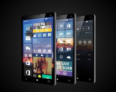
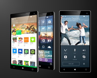
[Concept] Windows Phone 10 Concept! (New Start Screen, Action Center and "Hubs")

btgusto

New member
Jul 16, 2011
185
0
0
Visit site
so with background picture and invisible tiles you've basically created white icons. I truly believe icons will be what MS goes with within next 3 years or give us an option for desktop
 

alexander0311

New member
May 28, 2014
112
0
0
Visit site
The new background option is well, OPTIONAL. An option that I personally prefer when done tastefully (which is subjective).You still have the option to use the 8.0/8.1 style UI in Windows 10 for phones. Shadows under tiles? No thanks. There's nothing flat or modern about that.

@ OP, as for the music hub,which is straight from iOS 7+. Something to consider, how would this work with phones with on-screen Back / Home / Search buttons that are set to auto-hide & unhide with a swipe up?

lol, you just speak out my mind. strange thing :))
 

m3tv

New member
Nov 19, 2013
111
0
0
Visit site
By all means let me know what you think, i'm open to criticism. I personally would love to see my design implemented (obviously) but of course everyone can agree to disagree :)
 

TechFreak1

Moderator
May 15, 2013
4,611
5
38
Visit site
To the OP, maybe use the quote button? :p

As it is hard to tell you who you are replying to lol and as for the concept... decent effort but not really a fan.
There are quite a lot of things which have gone wrong :grin::

1) The search box is far too high up, it should be nearer to the bottom (not exactly at the bottom, perhaps 10 to 15 pixels before the drawer?)
2) It is not evident if speech to text has been omitted or not.

3) All Settings has been replaced by the expand / collapse option in Windows X for Phones.

4) The swipe-up-hubs are far too cramped it wouldn't work in practise on a small device like the 620. It would only work best on a large screen, not a healthy compromise.

5) The biggest flaw of all is the swipe up hubs as with on screen buttons, this does not work at all. Replacing it with side swipe gestures left or right breaks functionality i.e try using that in an app like metro tube, tapatalk it would be fustrating to use as you would inevitable swipe away from current screen when trying to bring up the onscreen buttons or the app bar (try swiping right in an app where it is not persistent, you will get the app bar popping up and down)
 

Brian Farkas

New member
May 29, 2014
14
0
0
Visit site
It does look nice at first glance. But after looking longer, it does not have a consistent design behind it since your pulling from different languages. In addition I think it loses its flexibility as well as would look nearly as good if you start changing the background image. In addition any concept going forward needs to be reflected on phone, tablet, and monitor screen versions as this is what will need to happen.
 

Members online

Forum statistics

Threads
323,245
Messages
2,243,509
Members
428,048
Latest member
vascro