Design of 950 & 950XL and W10M not good?

dakken

New member
Jul 7, 2012
103
0
0
Visit site
I think people here are misguidedly equating looks with quality, saying stuff like it looks cheap, doesnt look like a flagship, doesnt look expensive, looks bland and unispired ugliest phone ive ever seen. So i ask -why? Why does it look cheap? Because its poly? Same materials used in other Nokia flagships. Doesnt look expensive? Why? Because it doesnt use an inexpensive metal like. aluminum as a frame? Doesnt look like a flagship. Why? Because it doesnt have capacitive buttons like the BLU Win HD. lte a midrange phone? Doesnt look expensive. Why? Because it doesnt have an "I" in front of the name? Maybe I-lumia branding would make look expensive? Looks bland and uninspiring? Because its black and white and not colourful like previous lumias? And ugly i just plain dont get. What about this phone makes it ugly? I have no clue to that one.

Posted via the Windows Central App for Android
 

windowshopper23

New member
Aug 30, 2015
22
0
0
Visit site
All of which are incredibly expensive phones. If the Microsoft Flagships are more affordable but have similar performance, that seems like a very good thing.

Posted via the Windows Central App for Android

I'm sorry but while those flagships listed above are $600 + not all flagships are that expensive. The day's of using lower quality materials and skimping on design to lower the price of a phone are over and done with. Companies such as Motorola, OnePlus, Xiaomi, ZTE, Hauwei, just to name a few push out phones with good if not great design, high quality materials, solid build. And are sold for around or under $400. And the have the specs to back it up. Microsoft, with as big a company as it is should have done more here. This almost feels lazy for them. I just don't understand how you can have Surface designers at your disposal and not use them at all here in your mobile flagship.
 

windowshopper23

New member
Aug 30, 2015
22
0
0
Visit site
I think people here are misguidedly equating looks with quality, saying stuff like it looks cheap, doesnt look like a flagship, doesnt look expensive, looks bland and unispired ugliest phone ive ever seen. So i ask -why? Why does it look cheap? Because its poly? Same materials used in other Nokia flagships. Doesnt look expensive? Why? Because it doesnt use an inexpensive metal like. aluminum as a frame? Doesnt look like a flagship. Why? Because it doesnt have capacitive buttons like the BLU Win HD. lte a midrange phone? Doesnt look expensive. Why? Because it doesnt have an "I" in front of the name? Maybe I-lumia branding would make look expensive? Looks bland and uninspiring? Because its black and white and not colourful like previous lumias? And ugly i just plain dont get. What about this phone makes it ugly? I have no clue to that one.

Posted via the Windows Central App for Android
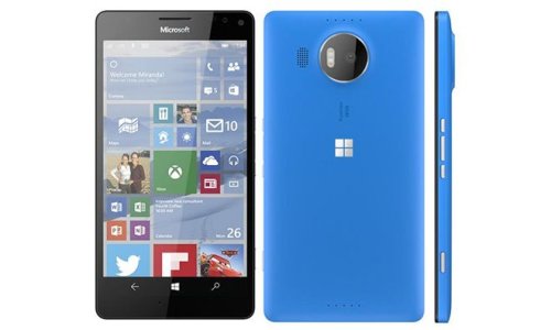
It's a poorly executed design. Plain and simple. The bezel is ridiculous. In a day and age where almost every company has made the attempt to minimize bezel, it looks like Microsoft didn't get the memo. The speaker located near the camera just isn't practical. If anything place it near the bottom and below the device along the charging port. The Windows logo on the back looks tacky, they should have kept it subtle. The only pros of this phone are with the Cityman. I have always liked the 1020 style camera ring which the 830 adopted.

You can't possibly tell me this:

cityman.0.jpg

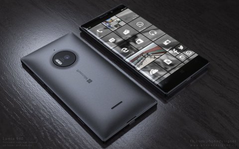
Looks more like a flagship than this:

Lumia-940-concept-Jonas-Daehnert-4.jpg

And that concept it's unrealistic in the slightest. It's a evolution of the 930 and 830 respectively. Following the trends others have gone towards with smaller bezels, curved edges to the display. Thin profile. And more importantly the design language flows better with the Surface line-up of products. Bottom line the 950 has a uninspired design.
 

elindalyne

New member
Aug 1, 2015
352
0
0
Visit site
I mean I get it... The angles in the render aren't the most flattering. It totally appears that you're losing a bunch of screen size on the bottom, but then you look at the current phones on the market and realize the real estate is basically the same. Wait for some real photos and photos at different angles.
 

dakken

New member
Jul 7, 2012
103
0
0
Visit site
It's a poorly executed design. Plain and simple. The bezel is ridiculous. In a day and age where almost every company has made the attempt to minimize bezel, it looks like Microsoft didn't get the memo. The speaker located near the camera just isn't practical. If anything place it near the bottom and below the device along the charging port. The Windows logo on the back looks tacky, they should have kept it subtle. The only pros of this phone are with the Cityman. I have always liked the 1020 style camera ring which the 830 adopted.

You can't possibly tell me this:

View attachment 111329

Looks more like a flagship than this:

View attachment 111330

And that concept it's unrealistic in the slightest. It's a evolution of the 930 and 830 respectively. Following the trends others have gone towards with smaller bezels, curved edges to the display. Thin profile. And more importantly the design language flows better with the Surface line-up of products. Bottom line the 950 has a uninspired design.

You do realise the bezel looks so big is because the the buttons are onscreen.

Posted via the Windows Central App for Android
 

dakken

New member
Jul 7, 2012
103
0
0
Visit site
I seriuosly must be blind because i dont see what any of you peole are talking about,,,i see a phone.

Posted via the Windows Central App for Android
 

Krystianpants

New member
Sep 2, 2014
1,828
0
0
Visit site
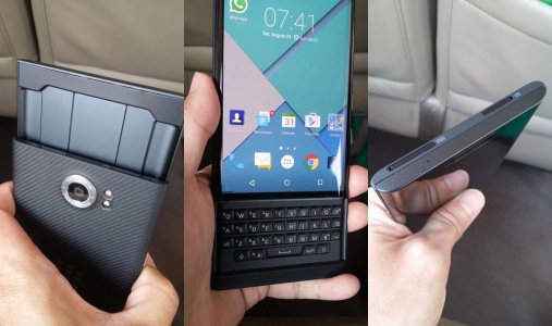
Just out of curiosity,, what exactly about it screams -premium?

Posted via the Windows Central App for Android

While I'm not a fan of physical keyboards. The design alone shows that there was care taken to make sure everything was perfect. The materials look nice and sturdy. The screen design bending at the edges and the minimal bezel at the lower end. It's a bit thick but that's just a trade off for a physical keyboard.
The MS one looks like a construction helmet wrapped around the phone. The render was also done not by a Microsoft employee but by someone who saw it apparently. Now compare it to the leaked images, those images look much worse than what the render would have you believe. But even with the render it does not look great, but only time will tell.

We are about to experience the 2nd coming of the iphone fever. iPhone 6 had some of the best sales ever, yet many have been waiting for the 2 gig version. So my guess is when it's released a rush of people will buy it. By the time October rolls around, most people would have already bought phones so it leaves very little out there for MS. And no one will buy an MS phone as a gift. Parents/siblings/family usually want to get a gift someone will like, and when it comes to phones no one really uses Windows Phone and most of them don't even know about its existence. iPhone is probably the most likely device to be purchased as a gift. So holiday season won't really help MS. It will only be people buying phones for themselves.

Once again they would have to have a pretty gorgeous phone that puts sparkles into peoples' eyes for anyone to want to buy it.
 

dakken

New member
Jul 7, 2012
103
0
0
Visit site
While I'm not a fan of physical keyboards. The design alone shows that there was care taken to make sure everything was perfect. The materials look nice and sturdy. The screen design bending at the edges and the minimal bezel at the lower end. It's a bit thick but that's just a trade off for a physical keyboard.
The MS one looks like a construction helmet wrapped around the phone. The render was also done not by a Microsoft employee but by someone who saw it apparently. Now compare it to the leaked images, those images look much worse than what the render would have you believe. But even with the render it does not look great, but only time will tell.

We are about to experience the 2nd coming of the iphone fever. iPhone 6 had some of the best sales ever, yet many have been waiting for the 2 gig version. So my guess is when it's released a rush of people will buy it. By the time October rolls around, most people would have already bought phones so it leaves very little out there for MS. And no one will buy an MS phone as a gift. Parents/siblings/family usually want to get a gift someone will like, and when it comes to phones no one really uses Windows Phone and most of them don't even know about its existence. iPhone is probably the most likely device to be purchased as a gift. So holiday season won't really help MS. It will only be people buying phones for themselves.

Once again they would have to have a pretty gorgeous phone that puts sparkles into peoples' eyes for anyone to want to buy it.

All that and still didnt answere the question.

Posted via the Windows Central App for Android
 

dakken

New member
Jul 7, 2012
103
0
0
Visit site
It's a poorly executed design. Plain and simple. The bezel is ridiculous. In a day and age where almost every company has made the attempt to minimize bezel, it looks like Microsoft didn't get the memo. The speaker located near the camera just isn't practical. If anything place it near the bottom and below the device along the charging port. The Windows logo on the back looks tacky, they should have kept it subtle. The only pros of this phone are with the Cityman. I have always liked the 1020 style camera ring which the 830 adopted.

You can't possibly tell me this:

View attachment 111329

Looks more like a flagship than this:

View attachment 111330

And that concept it's unrealistic in the slightest. It's a evolution of the 930 and 830 respectively. Following the trends others have gone towards with smaller bezels, curved edges to the display. Thin profile. And more importantly the design language flows better with the Surface line-up of products. Bottom line the 950 has a uninspired design.

They look almost identical with the exception of a few changes.

Posted via the Windows Central App for Android
 

hasasimo

New member
Apr 8, 2012
1,922
0
0
Visit site
My 640 feels no different than the 920 I had in 2012. That was a flagship and I design was.....derided.

And I don't find my 640 XL to be any less of a design than my 1520. In fact the XL design is better than the 1520.

Furthermore these designs are NOKIA DESIGNS not Microsoft so yeah Nokia probably would

These are Nokia BUDGET designs, they have never been flagship designs. Why would that suddenly change? These were created under the styleless auspices of Microsoft.
 

Members online

No members online now.

Forum statistics

Threads
323,183
Messages
2,243,405
Members
428,037
Latest member
Brilliantick99