My Idea For Windows 10 Mobile [Concepts]

Leonel Funes

Windows 10 & Xbox Champion
Mar 4, 2014
426
0
0
Visit site
Great work, now it looks really cool! Another thing I've noticed was that the "Close all" would look much better if it was inserted in a rectangular blurred space, centered under the main app in the multitasking view. Sorry for poor English ��
I can do it centered, but I'm not sure about adding more effects to it...

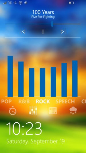
Even better! However, I'm not sure the equalizer is at home on the lock screen. That's usually something you only touch every now and then.
I use the it somewhat often, but it's easier than hunting it down in the settings...

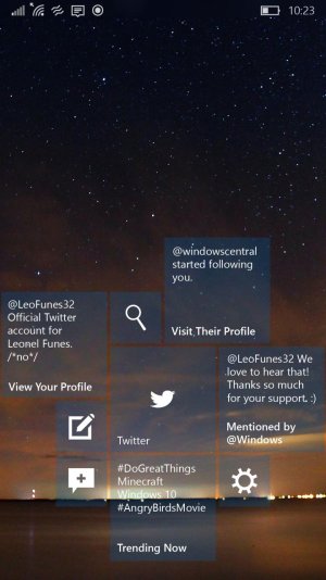
Before I forget, here's what I'm really hoping for:
W10M-Start-McLaren copy.jpg
If this makes it, I'll be the happiest man alive :D

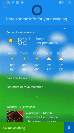
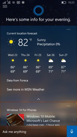
And an updated Cortana:
W10M-Cortana copy.jpg
 
Last edited:

Zachary Boddy

Staff member
Aug 3, 2014
2,384
12
38
www.windowscentral.com
I can do it centered, but I'm not sure about adding more effects to it...


I use the it somewhat often, but it's easier than hunting it down in the settings...

Before I forget, here's what I'm really hoping for:
View attachment 112936
If this makes it, I'll be the happiest man alive :D

And an updated Cortana:
View attachment 112937

Oh and Shut Down should be Power so you can restart instead of straight shutting down if you want. That'd be nice.
Also Live Folders should have thin lines dividing the respective applications inside on the Live Tile (if you made sense of that). And I prefer the Task Manager with the straight background instead of blurred. Just thoughts.
 

Joshwin

New member
Jan 31, 2015
290
0
0
Visit site
I wish you were the graphics designer of W10M. That is one hell of a design. I totally love it. looks so good and unique.
 

Leonel Funes

Windows 10 & Xbox Champion
Mar 4, 2014
426
0
0
Visit site
Great work, now it looks really cool! Another thing I've noticed was that the "Close all" would look much better if it was inserted in a rectangular blurred space, centered under the main app in the multitasking view. Sorry for poor English ��

Oh and Shut Down should be Power so you can restart instead of straight shutting down if you want. That'd be nice.
Also Live Folders should have thin lines dividing the respective applications inside on the Live Tile (if you made sense of that). And I prefer the Task Manager with the straight background instead of blurred. Just thoughts.

These are probably the last ones I'll make. But I did change the background to see what it would look like:
4.8.jpg

6.1.jpg

I wish you were the graphics designer of W10M. That is one hell of a design. I totally love it. looks so good and unique.

Thanks! And I wish that too, but I doubt they'd let me mess with the design. Who knows what they're thinking of for the future...


Also, here's a link to all the concepts I have. Go take a peek at them and give back some feedback!

<removed by moderator>
 
Last edited by a moderator:

Zachary Boddy

Staff member
Aug 3, 2014
2,384
12
38
www.windowscentral.com
These are probably the last ones I'll make. But I did change the background to see what it would look like:
View attachment 112995

View attachment 112997


Thanks! And I wish that too, but I doubt they'd let me mess with the design. Who knows what they're thinking of for the future...


Also, here's a link to all the concepts I have. Go take a peek at them and give back some feedback!

<removed by moderator>

Good work. I can see improvements and such that I would make but I'm just that kind of guy. Never 100% with my software design, haha.
 
Last edited by a moderator:

Leonel Funes

Windows 10 & Xbox Champion
Mar 4, 2014
426
0
0
Visit site
Other renders. Other operating systems, or mobile devices, etc.

I had renders for Android, but they were really half-baked, never finished them. It was a bit more difficult to think of improvements [where to start!]. And I have some old renders for a Windows Phone, I think I finished those...
 

Zachary Boddy

Staff member
Aug 3, 2014
2,384
12
38
www.windowscentral.com
I had renders for Android, but they were really half-baked, never finished them. It was a bit more difficult to think of improvements [where to start!]. And I have some old renders for a Windows Phone, I think I finished those...

Well you're pretty good. I'd love to see some more ideas for Windows 10 Mobile or Android if you ever have the time. I'd be happy to supply ideas to hahaha.
 

Leonel Funes

Windows 10 & Xbox Champion
Mar 4, 2014
426
0
0
Visit site
Well you're pretty good. I'd love to see some more ideas for Windows 10 Mobile or Android if you ever have the time. I'd be happy to supply ideas to hahaha.

I always have time to let my creative side out with concepts and renders... Except that at times I like them so much it's disappointing they're not real...

But I'm definitely open to ideas and suggestions!
 

Leonel Funes

Windows 10 & Xbox Champion
Mar 4, 2014
426
0
0
Visit site
I have some more ideas about the Action Center and Volume Controls. When I have some more time I'll share them with you.

I'm all ears! Can't wait to see what ideas you have I was gonna do just the Start, lock, etc, but I'll do a few for other system apps like messaging and such. Go to the link I provided with the last images I posted to check it out. Or I can post it here if you want...
 

Zachary Boddy

Staff member
Aug 3, 2014
2,384
12
38
www.windowscentral.com
I'm all ears! Can't wait to see what ideas you have I was gonna do just the Start, lock, etc, but I'll do a few for other system apps like messaging and such. Go to the link I provided with the last images I posted to check it out. Or I can post it here if you want...

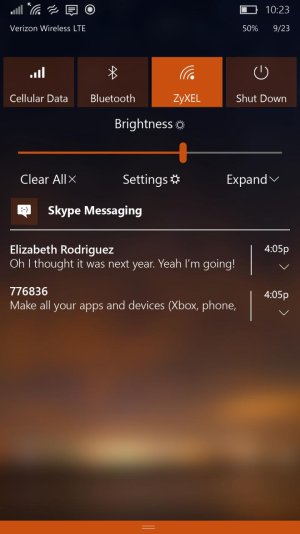
Action Center:
More customization options as such:
Opaque theme (what we have now, when it's black or white)
Aero theme (blurred transparency matching the theme)
Aero accent (blurred transparency matching the accent)

Move All Settings away from a Quick Action below, set between Clear All and Expand/Collapse.
Replace the Brightness toggle with a Brightness slider set underneath the Quick Actions yet above Clear All, All Settings, and Expand/Collapse. It'll have the same design as the volume sliders.
I know you really can't do this in a render it's just a thought: the gestures in the Action Center aren't great. It's too difficult to slide down to Expand and nearly impossible to slide up to Collapse.
Actionable notifications. Allow us to reply to emails, text messages, etc, and more in-depth previews. Media content, more text, etc.
Live download/install bars always at the top of the Action Center.
Center the icons in the Quick Actions. There's no reason for them to be shoved into the upper left corner.
Slide both ways to dismiss. Or possibly slide one way to dismiss and another to open. I'm not sure about that one yet.
Full notification control in Settings for the Action Center.
Oh and you really can't do this in renders either but opening the Action Center isn't smooth enough. Instead of smoothly opening from the top of the screen it jumps and then slides. It's quite ugly.

That's everything I can think of for the Action Center off the top of my head.

I only have one thing to say about the Volume Controls. Well, two. Maybe three.
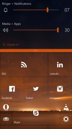
The arrow to expand/collapse the Volume Controls? Put it on the bottom always. I've gone back and forth between leaving it at the top at all times and leaving it at the bottom at all times. If you leave it at the top it stays in one place which is nice. However I think it might look nicer if it stayed at the bottom. All I know for sure is that I don't want it to expand from the top then collapse from the bottom.
We should also be able to swipe up to close the Volume Controls. I'm thinking maybe if you put a colored bar at the bottom like the Action Center so if we swipe up from that we can collapse. We can even have that replace the arrow to expand and collapse, so you just slide down for more Volume Controls and swipe up twice to close.
 

Leonel Funes

Windows 10 & Xbox Champion
Mar 4, 2014
426
0
0
Visit site
Action Center:
More customization options as such:
Opaque theme (what we have now, when it's black or white)
Aero theme (blurred transparency matching the theme)
Aero accent (blurred transparency matching the accent)

Move All Settings away from a Quick Action below, set between Clear All and Expand/Collapse.
Replace the Brightness toggle with a Brightness slider set underneath the Quick Actions yet above Clear All, All Settings, and Expand/Collapse. It'll have the same design as the volume sliders.
I know you really can't do this in a render it's just a thought: the gestures in the Action Center aren't great. It's too difficult to slide down to Expand and nearly impossible to slide up to Collapse.
Actionable notifications. Allow us to reply to emails, text messages, etc, and more in-depth previews. Media content, more text, etc.
Live download/install bars always at the top of the Action Center.
Center the icons in the Quick Actions. There's no reason for them to be shoved into the upper left corner.
Slide both ways to dismiss. Or possibly slide one way to dismiss and another to open. I'm not sure about that one yet.
Full notification control in Settings for the Action Center.
Oh and you really can't do this in renders either but opening the Action Center isn't smooth enough. Instead of smoothly opening from the top of the screen it jumps and then slides. It's quite ugly.

That's everything I can think of for the Action Center off the top of my head.

I only have one thing to say about the Volume Controls. Well, two. Maybe three.
The arrow to expand/collapse the Volume Controls? Put it on the bottom always. I've gone back and forth between leaving it at the top at all times and leaving it at the bottom at all times. If you leave it at the top it stays in one place which is nice. However I think it might look nicer if it stayed at the bottom. All I know for sure is that I don't want it to expand from the top then collapse from the bottom.
We should also be able to swipe up to close the Volume Controls. I'm thinking maybe if you put a colored bar at the bottom like the Action Center so if we swipe up from that we can collapse. We can even have that replace the arrow to expand and collapse, so you just slide down for more Volume Controls and swipe up twice to close.

That's some list! I'll try and see what I can do with this... But those are some genius ideas, especially with the volume control
 

RumoredNow

New member
Nov 12, 2012
18,134
0
0
Visit site
This looks great. It also looks like a lot of work. Even though I'm sure you enjoyed doing it it is still a huge task.

I just hope official looks half this nice. I've only dabbled in the Insider and that was early on. I'm waiting for the big reveal when official goes OTA.

Thanks for all your hard work. It's obvious you love the platform. It shows clearly.
 

Leonel Funes

Windows 10 & Xbox Champion
Mar 4, 2014
426
0
0
Visit site
Action Center:
More customization options as such:
Opaque theme (what we have now, when it's black or white)
Aero theme (blurred transparency matching the theme)
Aero accent (blurred transparency matching the accent)

Move All Settings away from a Quick Action below, set between Clear All and Expand/Collapse.
Replace the Brightness toggle with a Brightness slider set underneath the Quick Actions yet above Clear All, All Settings, and Expand/Collapse. It'll have the same design as the volume sliders.
I know you really can't do this in a render it's just a thought: the gestures in the Action Center aren't great. It's too difficult to slide down to Expand and nearly impossible to slide up to Collapse.
Actionable notifications. Allow us to reply to emails, text messages, etc, and more in-depth previews. Media content, more text, etc.
Live download/install bars always at the top of the Action Center.
Center the icons in the Quick Actions. There's no reason for them to be shoved into the upper left corner.
Slide both ways to dismiss. Or possibly slide one way to dismiss and another to open. I'm not sure about that one yet.
Full notification control in Settings for the Action Center.
Oh and you really can't do this in renders either but opening the Action Center isn't smooth enough. Instead of smoothly opening from the top of the screen it jumps and then slides. It's quite ugly.

That's everything I can think of for the Action Center off the top of my head.

I only have one thing to say about the Volume Controls. Well, two. Maybe three.
The arrow to expand/collapse the Volume Controls? Put it on the bottom always. I've gone back and forth between leaving it at the top at all times and leaving it at the bottom at all times. If you leave it at the top it stays in one place which is nice. However I think it might look nicer if it stayed at the bottom. All I know for sure is that I don't want it to expand from the top then collapse from the bottom.
We should also be able to swipe up to close the Volume Controls. I'm thinking maybe if you put a colored bar at the bottom like the Action Center so if we swipe up from that we can collapse. We can even have that replace the arrow to expand and collapse, so you just slide down for more Volume Controls and swipe up twice to close.

It's been a while since I've made some changes, but here are some edits based on what you suggested:

9.6.jpg
W10M-Start-Vol copy.jpg

I've started to do some edits on the older concepts, including what it would look like with a light/dark theme, and remove blur effects (like "remove background for lockscreen" in W10 TH2 update, where it would show a solid color. Probably best for low-spec devices)
 

Members online

Forum statistics

Threads
323,183
Messages
2,243,406
Members
428,037
Latest member
Brilliantick99