Reimagining windows 10 mobile plz guys chck dis out...!
- Thread starter Praneel D kiD
- Start date
You are using an out of date browser. It may not display this or other websites correctly.
You should upgrade or use an alternative browser.
You should upgrade or use an alternative browser.
to_be_announced
New member
I really like the concept of interactive notifications. To be able to reply to a text right there from the notification would be awesome.
windowshopper23
New member
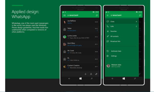
Really enjoy this concept. The current state of WM10 disappoints me. It still looks like a beta OS. This brings over the positives of Android's material design with a splash of iOS. While I think a newer take of the original metro design should still happen, this works, and works very well.
Last edited:
here comes new concept for windows 10 mobile lovers
https://www.behance.net/gallery/32664259/Windows-10-Mobile-Thinking-about-details
https://www.behance.net/gallery/32664259/Windows-10-Mobile-Thinking-about-details
Laurence_Leong
New member
Adeel 360
New member
here comes new concept for windows 10 mobile lovers
https://www.behance.net/gallery/32664259/Windows-10-Mobile-Thinking-about-details
Kram Sacul
New member
here comes new concept for windows 10 mobile lovers
https://www.behance.net/gallery/32664259/Windows-10-Mobile-Thinking-about-details
Do people really want an iOS clone that badly? Might as well just get an iPhone and enjoy MS' apps and the millions of others there. A lot less headaches and less broken promises.
HeyCori
Mod Emeritus
So I'm going to be that dude...
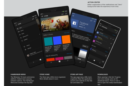
Some of the UI changes are excellent, but not all of it is as great as the creator thinks. For example, the current app page has in-app purchases broken down. Jobs replaced it with a giant purchase button. How is that more useful? Now I have no idea how much the in-app purchases cost, or if there are in-app purchases. Would Jobs give each in-app purchase a giant buy-me button? That would look a bit silly. Maybe he could make in-app text smaller. Then you're right back to "can't please everyone," because someone would call him out for an inconsistent UI.
Jobs complains that the app icons are too big. Okay, then go into the display settings and change the scaling to better suit your needs.
He doesn't like the Spotify UI? Okay, email every third party dev and tell them to change their UI to his liking. That should work out well.
All apps MUST be transparent? That might be a reasonable request for Microsoft designed apps but that's not something devs should be forced to do.
Want to add icons to the Store's hamburger menu? Because I need more icons covering my screen.
And I can already design my Start screen to look like that. Add background image + adjust icon transparency + only use transparent icons. Ta-da!
Again, some of the changes ARE cool and pleasing to the eye. However, this feels more like a dude who took a few minutes to customize his start screen.
Last edited:
peixe2
New member
I just appreciate how cohesive these concepts are, when compared to that crap that Microsoft gave us. I don't really care much about the other details...
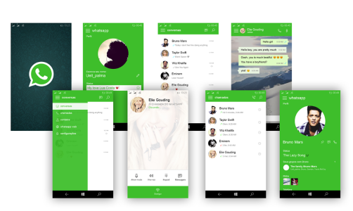
I mean, look at those images of the Settings App. Everything is so well placed. Everything is from the same family. It's so beautiful.
You look at the ones from Microsoft, and every single damn menu looks like their done by different people, just a big mess LOL
I mean, look at those images of the Settings App. Everything is so well placed. Everything is from the same family. It's so beautiful.
You look at the ones from Microsoft, and every single damn menu looks like their done by different people, just a big mess LOL
justforsabbath
New member
That look brilliant, Microsoft should pay heed to it. I still believe that Windows 10 Mobile is amazing after using the insider, needs some UI improvements. Besides that, its only the app gap that is a critical issue now.
Sharon G Samuel
New member
You have done an aweome job my friend!!..if this was the present ui of windows, I'm pretty sure there will be more windows fans than the present!..well done...appreciate your innovate work
I'm a windows fan..but unfortunately because of not much better quality os and ui of current windows, I forced to move to android..I wish microsoft should see your project!
Posted via the Windows Central App for Android
I'm a windows fan..but unfortunately because of not much better quality os and ui of current windows, I forced to move to android..I wish microsoft should see your project!
Posted via the Windows Central App for Android
Pete
Retired Moderator
Praneel didn't create this concept, he only posted the web site that was created by someone else (would have been polite of him to acknowledge the original author and not let people assume that he created the concept...)
Similar threads
- Replies
- 0
- Views
- 2K
- Replies
- 0
- Views
- 1K
- Replies
- 0
- Views
- 357
Trending Posts
-
Microsoft's Xbox has taken over the Sony's PlayStation Store 🤯
- Started by Windows Central
- Replies: 17
-
Could 'Diablo' get a TV show like Fallout? We asked Blizzard.
- Started by Windows Central
- Replies: 0
-
Manor Lords FAQ: Release date, Xbox, Early Access, price, and other questions answered
- Started by Windows Central
- Replies: 0
Forum statistics

Windows Central is part of Future plc, an international media group and leading digital publisher. Visit our corporate site.
© Future Publishing Limited Quay House, The Ambury, Bath BA1 1UA. All rights reserved. England and Wales company registration number 2008885.


