Windows Redstone

Cage Ata

New member
Mar 1, 2014
187
0
0
Visit site
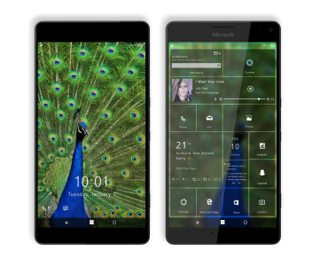
Hey guys! On the side on the Surface M concept, I have also been working on the UI. I'm throwing up a very early draft of what I would like to see from the Redstone update. As always comments and feedback would be greatly appreciated to help build the design together :)

Untitled-2.png

https://www.behance.net/wip/1594593
 

gpobernardo

Active member
Jan 12, 2013
4,339
0
36
Visit site
The UI appears to be clean and sleek - I like it, except for a few things:
- the text are too small (what are the screen dimensions in your render?), there is too much empty space in the tiles;
- blurring of the background image should be adjustable, not all users would want a blurry background image;
- the lock screen image needs to be dimmed a bit, if not have the same blurring option as in the start screen background - notice how it's hard to see the quick notification icons in contrast to that blue green-tailed peacock.
- the battery icon should either have the battery icon that represents the amount and charge OR have the numeral charge value, not both at the same time (redundant) - notice also that it says "100%" but the battery icon is almost empty.

The implementation of interactive live tiles is interesting, but that's a question of hardware/software already, not design.
 

Cage Ata

New member
Mar 1, 2014
187
0
0
Visit site
I also saw his concept and thought it was also very cool indeed! I like the direction he has taken the OS :) I have been working on this before I had the chance to see his work :)
 

indospot

New member
Nov 8, 2014
163
0
0
Visit site
I really like how you made those interactive and Live tiles. The weather tile looks so much better than what we have. With that being said, there's a few things I don't like too.

Changing the top bar (battery, etc) was unnecessary, same with the clock on the lock screen. Don't like Cortana's icon being colored either. Other than these three things, I think it looks really good, but it's too little of a sample, as there are many aspects of the Start screen to be considered. How would Groove Music's tile handle being resized?


Sent from mTalk
 

peixe2

New member
Feb 9, 2016
11
0
0
Visit site
That centered text on the tiles made me think. Actually looks interesting, I don't think I have seen that until now. Good

The only problems is really the lack of guidelines for overal object scale. You need to compare it with real UI screenshots and figure out what's the optimal scale. Because, right now, the text is really bad :winktongue: Not to mention the taskbar, with tiny icons. Just improve on that. You have already a great start. I would like to see what more can you do...

Oh, and when you use a bigger font (like the clock on the lockscreen), use the light version. It looks out of place with that much thickness.
 

Forum statistics

Threads
323,271
Messages
2,243,570
Members
428,054
Latest member
taylormcintire