Fixing the Xbox Music UI
- Thread starter Ebuka Allison
- Start date
You are using an out of date browser. It may not display this or other websites correctly.
You should upgrade or use an alternative browser.
You should upgrade or use an alternative browser.
ven07
New member
ushodax
New member
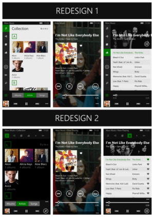
looooooooooooving redesign 1!
big fan oof side options, not up... i prefer 1 button far away than every button far away hahaha
big fan oof side options, not up... i prefer 1 button far away than every button far away hahaha
12Danny123
New member
atharva117
New member
anon(8750879)
New member
Adriaan NL
New member
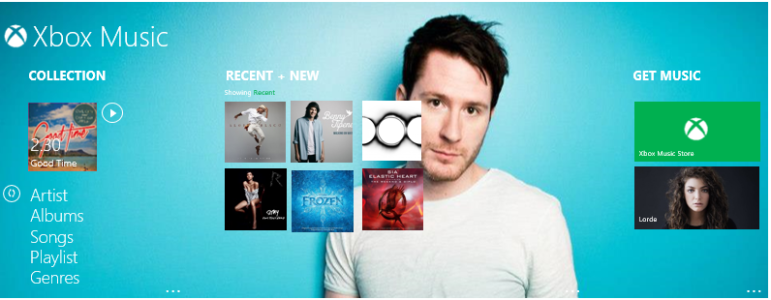
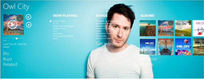
I'm sorry, I have to agree on the hidden slide menus - un-metro and pretty annoying as you always have to pull a menu, it doesn't feel solid. I really like how the old hub/ the concept of the new xbox music app. Danny, yours is pretty close to that, a little more rich, and that's ok. I like your concept, especially the first image with the recent as album covers. I'd remove the capitals with "artists" etc. Furthermore, I like the idea of having an artist page with all the album covers of the artist as well. Nicely put!
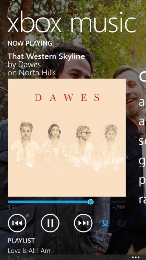
Offtopic, is it me or does the dude from Owl City look like Messi?
Offtopic, is it me or does the dude from Owl City look like Messi?
travis_valkyrie
New member
omgitsnick
New member
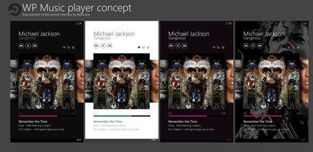
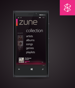
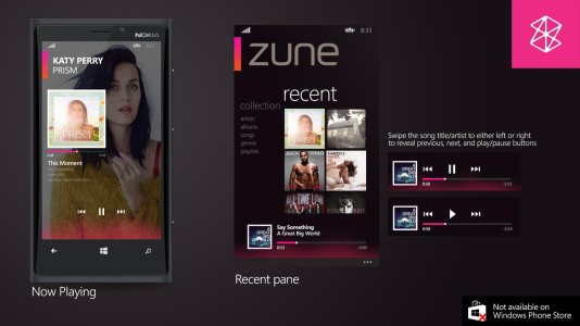
For the first post, most of those look very iOS and Android. The fourth post could use a little bit of tweaking with the artist background, could be darker as it's hard to read texts, otherwise it's a nice panoramic concept. For the eighth post, despite that zune is a dead name, it'd be really nice to have this as an alternative media player, really nice how the collection and recent reflects the zune hd interface.
themadpoet1
New member
OP - Do you work for Xbox Music?
I'm gonna have to say redesign 1 looks sleek. I also like that it more closely resembles the Windows 8.1 music player on the desktop. Widescreen support and the ability to edit album art and artist images would be great within the app.
I'm gonna have to say redesign 1 looks sleek. I also like that it more closely resembles the Windows 8.1 music player on the desktop. Widescreen support and the ability to edit album art and artist images would be great within the app.
Haha I wish. I'd be smacking heads all day. Just concepts I found on the net. The very first posts are from the Windows Phone websites (UK and US)OP - Do you work for Xbox Music?
I'm gonna have to say redesign 1 looks sleek. I also like that it more closely resembles the Windows 8.1 music player on the desktop. Widescreen support and the ability to edit album art and artist images would be great within the app.
anon(8657436)
New member
I'm sorry, I have to agree on the hidden slide menus - un-metro and pretty annoying as you always have to pull a menu, it doesn't feel solid. I really like how the old hub/ the concept of the new xbox music app. Danny, yours is pretty close to that, a little more rich, and that's ok. I like your concept, especially the first image with the recent as album covers. I'd remove the capitals with "artists" etc. Furthermore, I like the idea of having an artist page with all the album covers of the artist as well. Nicely put!
Offtopic, is it me or does the dude from Owl City look like Messi?
It's been a hit comment on YouTube!!! Go home messi you're singing
Ramin Hossein Zad
New member
what about this 
View attachment 65528
Nice concepts btw
i wish we could download themes for xbox music
View attachment 65528
Nice concepts btw
i wish we could download themes for xbox music
travis_valkyrie
New member
what about this
View attachment 65528
Nice concepts btw
i wish we could download themes for xbox music
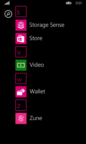
Yeah nice concepts, difference is mine is already actually an app.
Adriaan NL
New member
Can we download it? It looks awesome
Is that a PhotoShop or...
tapehead
New member
omgitsnick
New member
At first I thought the zune concept was a photoshop, but now that he's mentioned that it's an app, looking back at the photos suddenly it looked legit judging by the timing of the songs and how the recent pane actually keeps track of previously played songs. I would also like a copy.
Adriaan NL
New member
tapehead
New member
Similar threads
- Replies
- 0
- Views
- 76
- Replies
- 12
- Views
- 875
- Replies
- 0
- Views
- 83
- Replies
- 0
- Views
- 137
Trending Posts
-
Fallout show creators pretty much confirm what we expected for season two
- Started by Windows Central
- Replies: 0
-
PSA: It doesn't matter if your computer runs on ARM, all of your apps will work on Windows 11
- Started by Windows Central
- Replies: 3
-
Microsoft's Xbox has taken over the Sony's PlayStation Store 🤯
- Started by Windows Central
- Replies: 18
-
Post pictures of your latest purchase
- Started by Laura Knotek
- Replies: 3K
Forum statistics

Windows Central is part of Future plc, an international media group and leading digital publisher. Visit our corporate site.
© Future Publishing Limited Quay House, The Ambury, Bath BA1 1UA. All rights reserved. England and Wales company registration number 2008885.


