How have you managed to get the titles in there?
As I noted at the bottom of my prior post...
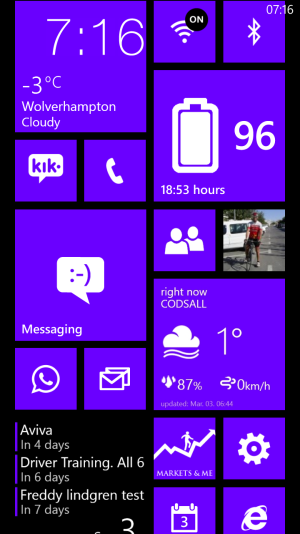
I made the titles with 'Tile Label'
Tile Label | Windows Phone Apps+Games Store (United States)
They insert like any Live Tile. You'll note I used a medium sized Medium Live Tile in order to get larger text. And I had to leave space above the title which appears as black backgound even tho it's really part of the title tile. That required some maneuvering but also provided unexpected interesting layouts. I wanted to move to a grouping format of apps(with a title) for easier locating of apps. I got tired of the shotgun location system. This format is a bit closer to a 'tabbing' system. I do find that I can find my apps quicker.
One word about the title app. Altho it's written in Chinese(?)...it's very intuitive and easy to use. And I chose it b/c it had some title variations not seen in other title apps.
One weakness in this title-app-grouping system is that as you add apps, your layout will likely change and creativity is once again called upon. But I consider that a good thing since I consider the WP8 layout system to be a work-in-progress...always changing as apps come and go etc. And, for me, the addition of 'white space' as a design element is what separates WP8 from any other standard app grid formats. True, the Live Tiles and different sizes add dramatic departures from identical iOS and Android formats...but I think the additional freedom in WP8 and the use of 'white space' is one step further. Even tho I'm up to 4 'screen' lengths, it's still but a flick and a second or so with WP8's fluid scrolling to get to my most remote app grouping.
Bottom line, I think titles are a big aid in organization in lieu of Folders...which might even be a step backwards at this point.
Hope this is helpful.


")


