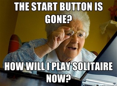
The start menu will come to Windows 8.1!

jordanzhninja

New member
May 4, 2014
177
0
0
Visit site
I've just been watching the Build 2014 keynote, and Terry says that the start menu and Windowed Universal apps are coming to Windows 8.1 as an update at 2 hours and 10 minutes in.

Hopefully this kills the rumour that they are not coming until Windows 9
 

tgp

New member
Dec 1, 2012
4,519
0
0
Visit site
Call me old fashioned, but I prefer the traditional Start menu. I don't like the jolting UI change of the Start screen when clicking the Start button. I also prefer the collapsed menu of the Start menu. I find it much more difficult to find stuff when everything is expanded. I know you can just start typing, but you can do that in Windows 7 as well. And what if you aren't sure of the name of what you're looking for? It's much quicker to search the collapsed Start menu than the expanded Start screen.

spaulagain, I know you're a graphics designer and also a Start screen fan. I'm curious as to what the objective advantages are, technically speaking from a designer's point of view. It probably is better, but I've been using W8 ever since the Consumer Preview was released over 2 years ago, and I still prefer the Start menu. Thanks!
 

link68759

New member
Oct 26, 2011
746
0
0
Visit site
Call me old fashioned, but I prefer the traditional Start menu. I don't like the jolting UI change of the Start screen when clicking the Start button. I also prefer the collapsed menu of the Start menu. I find it much more difficult to find stuff when everything is expanded. I know you can just start typing, but you can do that in Windows 7 as well. And what if you aren't sure of the name of what you're looking for? It's much quicker to search the collapsed Start menu than the expanded Start screen.

spaulagain, I know you're a graphics designer and also a Start screen fan. I'm curious as to what the objective advantages are, technically speaking from a designer's point of view. It probably is better, but I've been using W8 ever since the Consumer Preview was released over 2 years ago, and I still prefer the Start menu. Thanks!

The start menu from XP used screen space efficiently- menus expanded across the screen and it was visually coherent. Unfortunately it was often limited by monitor resolution and if you didn't have pinpoint accuracy with the mouse you easily would collapse menus unintentionally.

Vista/7 attempted to solve these two issues by compacting the menu into a corner of the screen and having folders remember their expanded /collapsed status. This created worse problems than they solved. Since the expanded folders are indented a few pixels, the restricted view space of the 7 menu meant you need to very frequently scroll vertically and horizontally to navigate it; this just does not work. It's a bad system.

8's start screen implementation takes the intelligent use of screen real estate from XP and "flattens" the folders; all icons are positioned equally in a grid but sorted by their folders. The icons are larger and more easily navigated than either 7 or XP's start menu, yes, even with a mouse. The larger the UI elements, the faster one is able to interact with them. This is a core computing design principle 8 has taken to heart. The screen only scrolls in one direction and offers an easy way for the user to simply browse what software is available on the system.

I'm not saying the start screen is perfect, but it certainly is better than any given iteration of the start menu.

The start screen does benefit from a manual pruning of icons to keep it clean, imo- I go in and delete the shortcuts that are effectively spam and I feel should not be in the start screen: Shortcuts to web sites, uninstallers, readmes, etc.
 

spaulagain

New member
Apr 27, 2012
1,356
0
0
Visit site
Call me old fashioned, but I prefer the traditional Start menu. I don't like the jolting UI change of the Start screen when clicking the Start button. I also prefer the collapsed menu of the Start menu. I find it much more difficult to find stuff when everything is expanded. I know you can just start typing, but you can do that in Windows 7 as well. And what if you aren't sure of the name of what you're looking for? It's much quicker to search the collapsed Start menu than the expanded Start screen.

spaulagain, I know you're a graphics designer and also a Start screen fan. I'm curious as to what the objective advantages are, technically speaking from a designer's point of view. It probably is better, but I've been using W8 ever since the Consumer Preview was released over 2 years ago, and I still prefer the Start menu. Thanks!

Depends on how you've used those tools in the past. For me, if I'm desktop, 90% of the apps I use are already pinned to my task bar. At work, we still have Windows 7. And I have maybe 3 programs pinned on the Start Menu, Calculator, Notepad, and Remote Desktop. Other than those 3 programs, I only use the Start Screen for Search, and Power off. The rest of the start menu is useless, and horribly designed IMO. The large scrolling list of app folders, which you then have to expand, and the select one of several icons, such as uninstall, etc. is a horrible and tedious experience both on touch AND mouse.

With the Start Screen, you can pin a bunch of apps, endless really. And you can organize and categorize them into different groups. This makes it much easier for the eye to quickly discern the app you're looking for from all the other apps because you can quickly narrow you're visual focus to just one column of apps. Then find your desired app there. Also, muscle memory becomes very effective on the Start Screen, assuming you don't change it all the time.

On the Start Screen > All Apps view, you have every app shown with its name and icon. Not a bunch of generic subfolders, with confusing and unrecognizable icons. Also, you can organize/sort that app list by,most recently installed, most used, and alphabetically. Something not at all available on the Start Menu, at least not in an intuitive manner.

Also, search on the Start Screen is far more effective and intuitive. You search everything or specify something to search for very easily. And the results show up extremely fast. The results are also very clear as to what is an app, etc.

My biggest complaint, is things like device manager, control panel, etc. should not be hidden as a right mouse button click on the start button. They should all be migrated to the Metro settings panel. And the metro settings section needs to be organized a little bitter. It's a lot better than the old control panel, but still a little confusing.


I think people's main issue with the Start Screen is that it uses the entire screen, rather than part of it. Personally, I think that's silly. When you're using the start screen/menu, are you really trying to multitask at that particular moment? No. So using the entire screen makes that start screen/menu far more efficient and effective to display your apps.

Oh ya, and live tiles on apps like weather, messing, etc are awesome!
 
Last edited:

tgp

New member
Dec 1, 2012
4,519
0
0
Visit site
I think people's main issue with the Start Screen is that it uses the entire screen, rather than part of it. Personally, I think that's silly. When you're using the start screen/menu, are you really trying to multitask at that particular moment? No. So using the entire screen makes that start screen/menu far more efficient and effective to display your apps.

From a pure theoretical standpoint I agree with this, and the rest of your post. However, I don't find it to play out that way in real life. I still think that the collapsed menus are better than having everything expanded. We talk about the icon grids in iOS & Android being a lot for the mind to process (or however you describe it) as opposed to the single column in WP's app tray. To me an expanded menu like the Start screen is the same thing. It fills the entire screen with little icons as opposed to a simplified menu that can be drilled down into.

I work with a couple programs of which I sometimes have 2 versions installed simultaneously, such as Office. If I have both the 2010 & 2013 versions installed, the Start menu shows Microsoft Office. I drill down and find Microsoft Office 2010 & Microsoft Office 2013. I drill further and find Word 2013, Excel 2013, etc. In the Start screen they're all showing (about 10 programs each), taking up a lot of real estate. It's much more difficult to lay my eyes on the precise program I'm looking for. Yes, it's less clicks, but still more difficult overall.

Another gripe with the Start screen is how it displays shortcuts in a search. For example, I use & work in customer support for Dynamics GP. On my computer at work I have 2 versions installed. When I had Windows 7, I could choose my version by Start >> Microsoft Dynamics >> Microsoft Dynamics GP 2010 (or 2013). In the Windows 8 Start screen, if I type GP, they both show. But, they both display "GP". I have no way of knowing which is which. They're exactly the same! I can right click and "Open file location", but how efficient is that? Until lately I didn't use one of the versions very often, so I only kept the most commonly used version pinned to the taskbar. But I got so tired of trying to figure out which one I was looking for when I searched for the lesser used version that I ended up pinning that one too, taking up space I would've rather left available for something else.
 

spaulagain

New member
Apr 27, 2012
1,356
0
0
Visit site
From a pure theoretical standpoint I agree with this, and the rest of your post. However, I don't find it to play out that way in real life. I still think that the collapsed menus are better than having everything expanded. We talk about the icon grids in iOS & Android being a lot for the mind to process (or however you describe it) as opposed to the single column in WP's app tray. To me an expanded menu like the Start screen is the same thing. It fills the entire screen with little icons as opposed to a simplified menu that can be drilled down into.

That's called choice paralysis. While it's a bit of an issue on the "All Apps" view. It's not on the Start Screen, assuming you categorize/group your tiles.

Being able to group the tiles into categories is similar to the folders in the old Start Menu (but better). By grouping them, you're giving your brain/eyes the ability to immediately narrow down your visual search.

For example on my Start Screen, I have categories for "Life", "Information", "Productivity", and "Shopping". These groups include apps like Mail/Social, Weather/IE/IMDB, Visual Studio/Adobe, Ebay/Amazon/Package Tracker respectively.

If I want to open Visual Studio, I go to the Start Screen and immediately I know I'm looking in the "Productivity" category. Which reduces my visual search from 50 apps to maybe 10. 10 apps is very manageable for the eye. Especially for a grid of easily identifiable app icons.

The Start Menu suffered from horrible choice paralysis. Under "All Programs" I usually had a list of 50 folders and applications. And many of the folders were named some arbitrary name, or based on the publisher that made them. There wasn't any organization by type, or apps that were used together the most. I believe you could technically organize differently but it was a very hidden feature that the majority of users never knew about. It was a mess. Which is why I pinned all the apps I used on my Task Bar.
 

link68759

New member
Oct 26, 2011
746
0
0
Visit site
Another gripe with the Start screen is how it displays shortcuts in a search. For example, I use & work in customer support for Dynamics GP. On my computer at work I have 2 versions installed. When I had Windows 7, I could choose my version by Start >> Microsoft Dynamics >> Microsoft Dynamics GP 2010 (or 2013). In the Windows 8 Start screen, if I type GP, they both show. But, they both display "GP". I have no way of knowing which is which. They're exactly the same! I can right click and "Open file location", but how efficient is that? Until lately I didn't use one of the versions very often, so I only kept the most commonly used version pinned to the taskbar. But I got so tired of trying to figure out which one I was looking for when I searched for the lesser used version that I ended up pinning that one too, taking up space I would've rather left available for something else.


Could you not have renamed the shortcuts to include 2010 and 2013 in the name? Also, if I know what you're talking about, you seem to be comparing 7's app list to searching the start screen... 7's search works no differently, fyi. You would have the same problem searching on 7 or 8, and you won't have that problem with the applist on 8.
 

tgp

New member
Dec 1, 2012
4,519
0
0
Visit site
That's called choice paralysis. While it's a bit of an issue on the "All Apps" view. It's not on the Start Screen, assuming you categorize/group your tiles.

It's not a bit of an issue, it's a huge issue.

The Start Menu suffered from horrible choice paralysis. Under "All Programs" I usually had a list of 50 folders and applications. And many of the folders were named some arbitrary name, or based on the publisher that made them. There wasn't any organization by type, or apps that were used together the most. I believe you could technically organize differently but it was a very hidden feature that the majority of users never knew about. It was a mess. Which is why I pinned all the apps I used on my Task Bar.

The Start Menu is alphabetical. And having 50 choices is much better than having the hundreds you'd have if they were expanded.

Could you not have renamed the shortcuts to include 2010 and 2013 in the name? Also, if I know what you're talking about, you seem to be comparing 7's app list to searching the start screen... 7's search works no differently, fyi. You would have the same problem searching on 7 or 8, and you won't have that problem with the applist on 8.

Yes I could rename the shortcuts, but it's a workaround that shouldn't be necessary in the first place. With Windows 7 I didn't search for it; because of the collapsed and alphabetically arranged menu it was very easy to click through and open in. In Windows 8, the Start button is on the bottom left corner. Search results are on the right. A lot of movement of the mouse is necessary to open search results, or you have to move your fingers to the arrow keys and click possibly multiple times to open the desired app. I find that it all takes longer than using Windows 7's traditional Start menu.

In short, I for one will be glad to see the Start menu return. I don't believe that it was removed because it's inefficient. I believe that Microsoft was hoping that the Modern UI & the Windows apps would take off more than they have, and wanted to switch users to the Modern UI.
 

spaulagain

New member
Apr 27, 2012
1,356
0
0
Visit site
It's not a bit of an issue, it's a huge issue.


The Start Menu is alphabetical. And having 50 choices is much better than having the hundreds you'd have if they were expanded.


Yes I could rename the shortcuts, but it's a workaround that shouldn't be necessary in the first place. With Windows 7 I didn't search for it; because of the collapsed and alphabetically arranged menu it was very easy to click through and open in. In Windows 8, the Start button is on the bottom left corner. Search results are on the right. A lot of movement of the mouse is necessary to open search results, or you have to move your fingers to the arrow keys and click possibly multiple times to open the desired app. I find that it all takes longer than using Windows 7's traditional Start menu.

In short, I for one will be glad to see the Start menu return. I don't believe that it was removed because it's inefficient. I believe that Microsoft was hoping that the Modern UI & the Windows apps would take off more than they have, and wanted to switch users to the Modern UI.

Umm, you do realize you don't have to click the search icon to start searching correct? And you can just use the up down arrows to select between search results. So your mouse really never needs to move. In fact you can do an entire search inquiry and select a result without ever touching your mouse.

I find it really hard to believe it takes you longer to use the Start Screen than Menu. I zip through the Start Screen so fast. And more mouse movement is not a big issue. The touch targets on the old Start Menu are barely 25-30px tall. Making navigation a tight tedious dance between click objects. Unless you have your mouse on the super slow setting, having larger more definite touch/click targets is much better.

My argument is that for every 1 "disadvantage" of the Start Screen, there are 5-10 advantages over the Start Menu. The reason people want the Start Menu is because it's what they are used to. Overall, it is a far more inferior UI than the Start Screen. People just can't take the 5 seconds to adapt. Magically though, they're all ok dealing with the cluster**** UI that is Android.
 

tgp

New member
Dec 1, 2012
4,519
0
0
Visit site
Umm, you do realize you don't have to click the search icon to start searching correct? And you can just use the up down arrows to select between search results. So your mouse really never needs to move. In fact you can do an entire search inquiry and select a result without ever touching your mouse.

I find it really hard to believe it takes you longer to use the Start Screen than Menu. I zip through the Start Screen so fast. And more mouse movement is not a big issue. The touch targets on the old Start Menu are barely 25-30px tall. Making navigation a tight tedious dance between click objects. Unless you have your mouse on the super slow setting, having larger more definite touch/click targets is much better.

My argument is that for every 1 "disadvantage" of the Start Screen, there are 5-10 advantages over the Start Menu. The reason people want the Start Menu is because it's what they are used to. Overall, it is a far more inferior UI than the Start Screen. People just can't take the 5 seconds to adapt. Magically though, they're all ok dealing with the cluster**** UI that is Android.

Yes I do know that you don't have to click Search. But after the results appear you either need to click on it or arrow down. I've been using Windows 8 every day for over 2 years; I know how it works! :wink: I just think that the Start screen is a step backwards in efficiency, not to mention the "choice paralysis" you talk about. But then I also find Android more efficient than WP, so something probably is wrong with me. That said, I'll race you.

Why is Microsoft reverting to the Start menu if the Start screen is so much better?
 

spaulagain

New member
Apr 27, 2012
1,356
0
0
Visit site
Yes I do know that you don't have to click Search. But after the results appear you either need to click on it or arrow down. I've been using Windows 8 every day for over 2 years; I know how it works! :wink: I just think that the Start screen is a step backwards in efficiency, not to mention the "choice paralysis" you talk about. But then I also find Android more efficient than WP, so something probably is wrong with me. That said, I'll race you.

Why is Microsoft reverting to the Start menu if the Start screen is so much better?

Because they're listening to their customers.

And they're not reverting to it, they're just providing it as an option for the legacy use cases.

Eeek, Android, it's like a virus it's so bad.
 

sashlon

Member
Apr 5, 2012
119
0
16
Visit site
I love Windows 8+. Its the first pc OS I've ever loved.

I do think its a shame Microsoft are dumbing it down. Bringing back the Start Menu seem like catering to the lowest common denominator to me. Its the kind of thing Apple would do.
 

link68759

New member
Oct 26, 2011
746
0
0
Visit site
It's not a bit of an issue, it's a huge issue.


The Start Menu is alphabetical. And having 50 choices is much better than having the hundreds you'd have if they were expanded.


Yes I could rename the shortcuts, but it's a workaround that shouldn't be necessary in the first place. With Windows 7 I didn't search for it; because of the collapsed and alphabetically arranged menu it was very easy to click through and open in. In Windows 8, the Start button is on the bottom left corner. Search results are on the right. A lot of movement of the mouse is necessary to open search results, or you have to move your fingers to the arrow keys and click possibly multiple times to open the desired app. I find that it all takes longer than using Windows 7's traditional Start menu.

In short, I for one will be glad to see the Start menu return. I don't believe that it was removed because it's inefficient. I believe that Microsoft was hoping that the Modern UI & the Windows apps would take off more than they have, and wanted to switch users to the Modern UI.


I'm seeing a lot of user error here. You're just... Doing it all wrong. It's like Microsoft gave you a new car and you hate it because it's heavier than your old one and harder to push around, meanwhile we are all trying to tell you the key is in the ignition you just have to turn it...
 

Members online

No members online now.

Forum statistics

Threads
323,197
Messages
2,243,433
Members
428,035
Latest member
jacobss