Lumia's cutoff 7th tile unlike the HTC's

Spicymikey

New member
Jan 15, 2013
56
0
0
Visit site
Any ideas on how NOT to have all this wasted space at the top of the home position? Any hacks? It seems the HTC screen is designed to show a full 7 tiles along with that open space at the top. Unfortunately, it also seems the Lumia's (my phone) does not. A bit annoying since the last tile is cutoff as shown in this screenshot. If we could stop wasting all that dead space at the top, we could show all 7 tiles.

wp_ss_20130115_0002.jpg
 

uselessrobot

New member
Nov 14, 2012
552
0
0
Visit site
The Lumia has a screen resolution of 768x1280, whereas the 8X has a narrower (and therefore 'longer') 720x1280.

This... Those tiles are scaling to the narrower resolution, whether it's 768 or 720 pixels. Given that both are the same height, the tiles on the Lumia 920 scale larger meaning you're able to fit fewer tiles vertically. Seems like an insignificant issue to me.

What I think is a bigger problem is that we've got two divergent aspect ratios introduced at the same time. The Lumia 920 is the odd man out compared to the HTC 8X and the Samsung ATIV S. On the other hand, the 920 features the same exact aspect ratio as all lower resolution windows phone, 800x480. So I don't understand why they didn't adopt a single standard for the HD displays.

It's not a huge difference, but still, developers are going to be forced to adopt one or the other.
 

Spicymikey

New member
Jan 15, 2013
56
0
0
Visit site
I agree uslessrobot. Inconsistent. Since the Lumia is cutting off the last half of the tile with their aspect ration design, I would think they are the ones that will need to adjust. Maybe Nokia did it intentionally but I don't like it. Great phone and the only flaw I have to report in the design.

As tebugg suggested, I tend to nudge the screen up by habit after pressing the windows button. Hardly a solution but it satisfies my OCD :)
 

KHROMAsynthetik

New member
Jan 12, 2013
30
0
0
Visit site
Nokia stuck to the standard 9:15 screen ratio that all WP7 handsets had, meaning all previous apps would scale without bordering. Microsoft announced before WP8's release that the OS would support three screen resolutions (480x800, 720x1280 and 768x1280), so Nokia just chose one of Microsoft's supported resolutions, and the one that kept the previous aspect ratio at that. It's down to Microsoft really, but I'm not complaining as I like the dimensions. I find 9:16 a bit long and narrow personally.
 

peropett

New member
Jan 16, 2013
8
0
0
Visit site
Maybe Nokia did it intentionally but I don't like it. Great phone and the only flaw I have to report in the design.
a14
 

spaulagain

New member
Apr 27, 2012
1,356
0
0
Visit site
seriously!?


+1

This has to be the dumbest complaint I've heard. Windows Phone is about cropping and leading the eye to other content with that cropping or "hinting." WP is not about a rigid grid of icons like iOS and Android.

The tiles being cropped at the bottom is actually better as it informs the eye there is more content below. This communicates key functionality on the Start Screen, telling the user to scroll vertically for more content. A very important piece of information considering the other OSes scroll horizontally for more apps/icons.

Nokia did just fine and as others said, followed MS guidelines that are designed for the OS.
 

James8561

New member
Dec 3, 2012
1,282
0
0
Visit site
+1

The tiles being cropped at the bottom is actually better as it informs the eye there is more content below. This communicates key functionality on the Start Screen, telling the user to scroll vertically for more content. A very important piece of information considering the other OSes scroll horizontally for more apps/icons.

Nokia did just fine and as others said, followed MS guidelines that are designed for the OS.

wow never thought of this before. brillian!
 

Spicymikey

New member
Jan 15, 2013
56
0
0
Visit site
Wow, spaulagain sure is confident in his viewpoint to say to someone "This has to be the dumbest complaint I've heard". Hope you're not in sales or any customer facing business. There is no dumb complaints. More important thing is whether they are common or rare and if it hurts sales.

Again, I personally don't like it. I suspect it's going to be a bout 50/50 with the right brained people (like spaulagain) appreciating the aesthetics of the design, and left brained people preferring a more efficient logical design. Neither is wrong in spite of spaulagain's assertions.

Ideally, what they should do is add an option in the Display settings to include or exclude it. Then everyone is happy and no one is stupid :)

The new Samsung marketing photo shows the wasted space removed and a full 7 tiles visible. Either they a) agree the Windows design is bad and found a way to exclude it, or b) the marketing guys realized it looks bad and nudged the tiles up just for the photo.
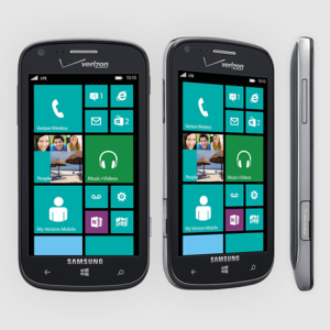
samsung-ativ-news-hardware.png
 

Coreldan

New member
Oct 2, 2012
2,514
0
0
Visit site
I personally like the design, as mention, cos it sorta "hints" there is more content below so it looks less like a static row of boxes or whatnot.

Also, if this allows me to use WP7 apps without borders, it's even more welcome to me.
 

SnailUK

New member
Mar 1, 2012
1,006
1
0
Visit site
Lets also not forget, when running a WP7 app (which are the majority in the marketplace), the HTC/Samsung will have bars at the top/bottom of the screens. So the minute you get into an app, the Nokia will have the better resolution.
 

KHROMAsynthetik

New member
Jan 12, 2013
30
0
0
Visit site
The new Samsung marketing photo shows the wasted space removed and a full 7 tiles visible. Either they a) agree the Windows design is bad and found a way to exclude it, or b) the marketing guys realized it looks bad and nudged the tiles up just for the photo.

View attachment 26989

Personally, I like the small bit of negative space at the top. But then, I loved the 'gutter' down the right of the WP7 homescreen. I was quite disappointed to see WP8 abandon that, but as it allows more tiles to be seen on-screen, I got over it fairly quickly. I think there's only so far you should go with eliminating white space before everything starts to look horribly cramped, however. A design needs at least a little space to breathe, IMO.
 

Spicymikey

New member
Jan 15, 2013
56
0
0
Visit site
The best software is the most configurable software. They should make it a display setting option. Imagine how much less you'd like the OS if there were no customizable settings to tweek. It's really that simple IMO. It's not a matter of right or wrong. Make it configurable Microsoft
 

foxbat121

New member
Nov 14, 2012
837
0
0
Visit site
The best software is the most configurable software. They should make it a display setting option. Imagine how much less you'd like the OS if there were no customizable settings to tweek. It's really that simple IMO. It's not a matter of right or wrong. Make it configurable Microsoft
yeah, because it worked so well for windows mobile in the past...
 

Members online

No members online now.

Forum statistics

Threads
323,249
Messages
2,243,516
Members
428,049
Latest member
velocityxs