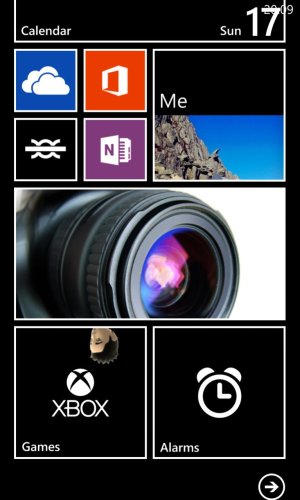
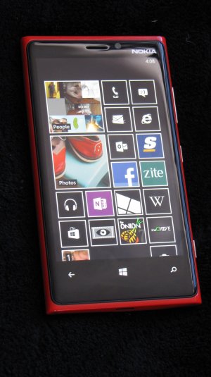
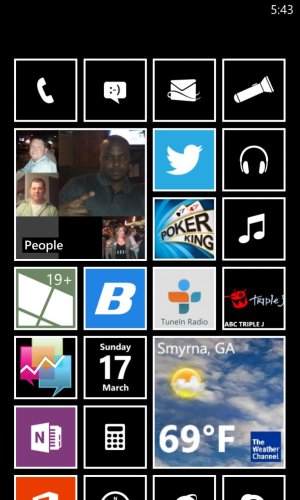
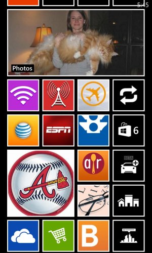
Hi all, I am the PROUD owner of both a Red and Yellow Nokia Lumia 920 and must say going into "Ease of "Access" under "Settings" and turning on the high contrast really makes the home screen look so awesome on both the Red and Yellow Phones! Has anyone gone in and done this? If so what do you think? I really like the black tile theme it presents on both phones, especially my Yellow lumia.
Ease of Access - "High Contrast" makes for a great theme!
- Thread starter BobR1908
- Start date
You are using an out of date browser. It may not display this or other websites correctly.
You should upgrade or use an alternative browser.
You should upgrade or use an alternative browser.
Laura Knotek
Retired Moderator
Could you post a screenshot please?Hi all, I am the PROUD owner of both a Red and Yellow Nokia Lumia 920 and must say going into "Ease of "Access" under "Settings" and turning on the high contrast really makes the home screen look so awesome on both the Red and Yellow Phones! Has anyone gone in and done this? If so what do you think? I really like the black tile theme it presents on both phones, especially my Yellow lumia.
rockstarzzz
New member
Devamps
New member
Wow, bright in tiles? Who needs? Only one who likes it
Here are my screenshots! I agree, it is a good change. However, it does suck away the bright tiles but then when you own a pac-man phone, who needs bright tiles?
View attachment 30707View attachment 30708
ninjaap
New member
ninjaap
New member
wait... this seems to block images to my lockscreen. so amazing weather or hello friends lockscreen features are broken now. 
Laura Knotek
Retired Moderator
That looks really sharp! :smile:Hi Laura, sure here is a screenshot of my red Lumia with the high contrastView attachment 30709
That looks really sharp! :smile:
I think so too, thanks Laura! Looks really awesome on the yellow Lumia as well
Ninjaap - sorry to hear, I do not use those on my lock screen so I have not experienced those issues. I will be keeping it on high contrast for a while - I am liking it and it works for my setup
jaj324
Banned
I like high contrast. I don't like the way it underlines unread mail instead of it being the accent color.
Sent from my PM23300 using Board Express
Sent from my PM23300 using Board Express
Jupast
New member
rockstarzzz
New member
Guys this isn't a theme! It's ease of access - making things more readable, removing colours etc for users who have difficulty viewing certain colours etc. So you can't expect your dynamic lockscreen, accent colours etc. For ease of access - it does exactly what it should do!
Devamps
New member
I understood, and I think that's pretty cool...Guys this isn't a theme! It's ease of access - making things more readable, removing colours etc for users who have difficulty viewing certain colours etc. So you can't expect your dynamic lockscreen, accent colours etc. For ease of access - it does exactly what it should do!
BobR1908, thank`s for sharing!
gsquared
New member
Jupast
New member
Yeah it is a shame about the lock screen issue, but then as mentioned it isn't a theme as such.
It does still use the accent colour choice here and there, like on mine the weather app kept the orange theme choice which i thought looked cool against the black and white.
It does still use the accent colour choice here and there, like on mine the weather app kept the orange theme choice which i thought looked cool against the black and white.
boxa72
New member
I didnt realise thats wot it did n ur right tha Start Screen looks great n tha black tiles would probly save even more battery:winktongue:
Funny you say that, I have been watching my battery since making the change. Hopefully it helps!
smileyh
New member
Similar threads
- Replies
- 0
- Views
- 153
- Replies
- 0
- Views
- 72
- Replies
- 0
- Views
- 6K
- Replies
- 0
- Views
- 451
Trending Posts
-
Remnant 2 'The Forgotten Kingdom' gives us yet another reason to play one of the best games of the past year
- Started by Windows Central
- Replies: 0
-
Forza Horizon 5 celebrates GT racing with 12 new cars and more ways to build custom road races
- Started by Windows Central
- Replies: 0
Forum statistics

Windows Central is part of Future plc, an international media group and leading digital publisher. Visit our corporate site.
© Future Publishing Limited Quay House, The Ambury, Bath BA1 1UA. All rights reserved. England and Wales company registration number 2008885.


