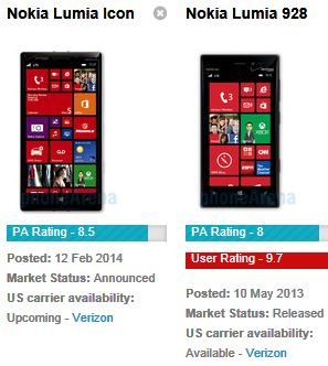
Verizon's "boxy shape" design for the 929.. like it or hate it?

Christopher Senn

New member
Dec 19, 2013
66
0
0
Visit site
The lumia 929 design has a very bland boring design. Like no time was put into it.
I like that they offer it in white. But one absolutely horrible feature is that the back panel is only white while the face of it is black. There is no real effort to please the customer. Want a brand new car design? Slap a bumper sticker on it.

Anyways my two favorite phones are the HTC One and I like the Lumia 925. At least the color back covers bits of the front as well
 

berty6294

New member
Oct 5, 2012
3,336
1
0
Visit site
I'm sorry but to call this design boring is the dumbest thing I've ever heard. Its got a metal "appears to be beveled" edge with a curved back and thin bezel. Much more time put into designing this device than others. Throwing a flamboyant color on something is not hard work.
 

Christopher Senn

New member
Dec 19, 2013
66
0
0
Visit site
I'm sorry but to call this design boring is the dumbest thing I've ever heard. Its got a metal "appears to be beveled" edge with a curved back and thin bezel. Much more time put into designing this device than others. Throwing a flamboyant color on something is not hard work.

apparently throwing on a flamboyant color (white) is hard work for them as it only covers the back side and no effort was put into them matching the rest of the phone. Kind of like a ****** going out to a club in a wifebeater.

But at least it looks like a phone in the lumia line. So its lack of trying is what makes it unique
 

Indistinguishable

Active member
Nov 16, 2012
4,669
1
38
Visit site
apparently throwing on a flamboyant color (white) is hard work for them as it only covers the back side and no effort was put into them matching the rest of the phone. Kind of like a ****** going out to a club in a wifebeater.

But at least it looks like a phone in the lumia line. So its lack of trying is what makes it unique

Uh that's called style...

What forum have I stumbled into where two posters with seemingly naked men in their avatar's are arguing about flamboyant style?
 

afcor

New member
Feb 12, 2014
32
0
0
Visit site
Trolling is fun!

apparently throwing on a flamboyant color (white) is hard work for them as it only covers the back side and no effort was put into them matching the rest of the phone. Kind of like a ****** going out to a club in a wifebeater.

But at least it looks like a phone in the lumia line. So its lack of trying is what makes it unique
 

Zippier

New member
Nov 20, 2013
187
0
0
Visit site

David Fleetwood

New member
Nov 15, 2012
85
0
0
Visit site
View attachment 56807 not girly...

View attachment 56808 definitely not girly...

View attachment 56809 very manly

View attachment 56810 now that's a man's phone...

That is the longest post on an absurdly trivial observation... EVER. No disrespect, but pretty pastels, bright colors, and "cute" little phones appeal to women (aka girls). That's a fact. Lots of your points are valid. But... Really?

Posted via the WPC App for Android!

Again, the fact that such devices exist does not in any way mean that they are widely popular with the stated target demographic. Women represent more than half of the potential customer base for any given phone, and yet none of these 'girly' phone designs have ever made a mass market impact. That says a lot about the supposed appeal to the female demographic that these designs actually have.

And again, for reference, this is the problem: Flowchart: How not to design a "woman’s" tech product | Ars Technica
 

Keith Petrovich

New member
Jan 16, 2014
32
0
0
Visit site
After the official announcement, I love the design of the ICON, it's sleek, smooth, and it's professional. Do have to say it's not manly at all, because my girlfriend and her mom have the 928 in white, it looks just fine. I chose black because the backing is different, but to me, I love the design. Honestly puts an iphone to shame
 

Jonny702

New member
Mar 25, 2013
50
0
0
Visit site
I actually really like the straight line edges of the ICON from what I've seen. I understand the back is also a bit curved. As for the colors, it would be nice but it's not that huge a selling poit for me. When I bought my 920, Black was all they had so black I took, at least Verizon has the option to go black or white. I quite like the look of the phone overall and while varying colors would be cool, there is always the argument that a phone like that also becomes more attractive to those who wish to relieve you of it. I definitely prefer the shape of the phone to my 920 (perhaps only because it's different) but at the end of the day the broad range of amazing specs is what grabs me. I can only hope other carriers see some similar hardware soon as I find the phablets just too darn enormous for me
 

odin09

New member
Jun 30, 2012
563
0
0
Visit site
I love the simple look of my 928 and it still feels great in the hand. The Icon raises the bar and looks like a more premium 928. I still think a red version would look awesome and draw attention in the showroom but I would probably stick with black.
 

bsayegh

New member
Feb 10, 2013
301
0
0
Visit site
I don't really like the design. I don't think it looks bad, I just don't like the way it feels in my hand. That isn't just an issue with the Icon, its a Lumia thing. I have an HTC phone and it has a more curved design. There are no sharp edges and it feels nice to hold. Lumias generally have sharper corners and I notice that while holding it in one hand.

If such a device would come out on AT&T I would jump on it in a heart beat, boxy or not.
 

bsayegh

New member
Feb 10, 2013
301
0
0
Visit site
Why do people worry so much about the color of a phone? I cant imagine having an expensive phone and not having a cover for it. I have had my phone for 2 years with a casemate, and the phone doesn't have a scratch on it. The cover is pretty much destroyed, but the phone is in tact.

My last phone was a Palm Pre and it got murdered. I had a crappy case that broke, so I just left it case-less. It got so scratched up that the screen would operate on its own. It would unlock itself and call people in the middle of the night like it was haunted.

Even if the Icon is only black and white, you can probably find a case for it that is that nifty hot pink/aquamarine gradient color that you have been dying for.
 

Premium1

New member
Aug 11, 2011
452
0
0
Visit site
I like the look. Its a phone and it doesn't need to be "fancy". The icon looks very solid and professinal, and I have no problems with the boxy design
 

user928

New member
Feb 6, 2014
163
0
0
Visit site
In keeping with the original topic of this thread. I like the design of the Nokia Lumia Icon (929). I have had the 928 since October, 2013. It was FREE! I don't use a case or screen protector because I like the design and don't want to cover it up. I do use a leather slip case for protection. I must say that I prefer the Icon design because Nokia has engineered a larger, higher resolution screen into essentially the same footprint as the 928. Now, that is good, no, great design!

icon 928.JPG
 
Last edited:

Members online

Forum statistics

Threads
323,197
Messages
2,243,433
Members
428,035
Latest member
jacobss