After 24 hours: Review and Thoughts on Icon

msdugn

New member
Nov 19, 2012
127
0
0
Visit site
I upgraded from a WP8 HTC 8X and have used the Icon for a full day now. Here are my thoughts. The good, the bad and the simply different.

In short - a great upgrade for me - and I love the phone. But here are my detailed thoughts:

THE GOOD

  • Big, beautiful screen - the view, size and color (especially outdoors) is to die for.
  • Camera - I've been jealous of the 1020 camera (but not the big bump in the chassis). Not anymore. HOLY COW it's a zillion times better than the HTC. I took pictures last night over sushi in a dim restaurant (some with flash, some without). And took a few outdoor, daylight shots (well - what passes as daylight her in Seattle during the winter). Absolutely gorgeous - whether with the Nokia Pro Shot software or the standard WP8 camera app, this was the biggest win for me to upgrade - and it paid off nicely.
  • More Screen Real Estate - beyond looking good, I'm mistyping a lot less. I don't have fat fingers (just normal guy hands), but the extra millimeters on the screen prevent a lot of typos. Even with the increased real estate, I can reach my thumb across the entire width of the screen and tap what I need (I couldn't so this on a friend's 1520).
  • Phone Audio - I noticed much better audio quality during a phone call on the Icon compared to the 8X. I'll bet this is consistent across all Nokias, but it's an improvement nonetheless. Friends have remarked that my voice on their end is improved as well. Good stuff.

THE NOT-SO-GOOD
There really isn't anything 'bad' about this phone

  • Speaker is small and isn't loud - While I'm not a big fan of speakers on the back of a phone, my 8X and Icon shared this design. But the 8X had a wide speaker that was wonderfully loud with little distortion. Nokia's grain-of-rice sized speaker just doesn't pump out much (or great) sound. And for headphones, even though Nokia has their standard sound improvements, I have to say the Beats Audio in the 8X was noticeably better.
  • Ghosting while scrolling - With all the talk about the great screen, I was surprised to see slight ghosting when scrolling. Whether it's web pages, Weave or just the built-in email, I notice a slight loss of fidelity on the letters as they scroll. The moment scrolling stops, all is well. Maybe it's a function of the OLED display or maybe something else. Although it's slight, I notice it.

THE DIFFERENT
These aren't necessarily good or bad, but might be noteworthy for others depending on their tastes

  • Nokia Apps - Coming from a non-Nokia phone, I'm trying to learn which Nokia apps are keepers and which I'll never use. Some of them are quite useful and stunning (Nokia Refocus, HERE Drive, HERE Maps). There are so many, it's tough to wade through them all. I'd love to see a summary of them all with reviews.
  • Headphone Jack is Top Center - I had to adjust from it being on the top right side on my 8X. Not a problem, but seems a little awkward to have the headphone cable poking right out the top center of the Icon.
  • Power Button - It's on the side, below the volume rocker and above the camera button. Again, not a problem. Even though it's spaced nicely between the other buttons, 'fingering' to find the power button without looking is an adjustment I'm having to make.
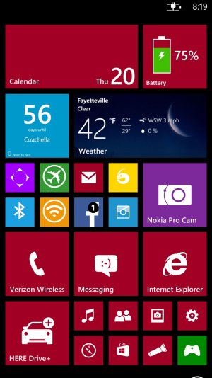
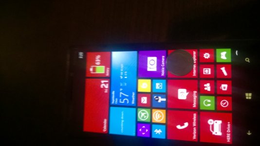
  • Tiny Icons - It's great to have more screen real estate and more width for icons. It really does allow for more creative and functional options than two medium sized tiles allow. But the tiny tiles (smallest size) are really tiny - almost to the point where you feel you need to be careful where you touch for fear of hitting a neighboring icon. It hasn't turned out to be a problem. But I'm adjusting to how small the smallest icon size really is on this screen.
  • 5MP + 16 MP Images - the camera only has two options for capturing photos: "5 MP Only" and "5 MP + 16 MP". This results in two pictures being stored instead of one in the same location. I know the reasons. But it sure would be nice to have an option for "16 MP Only" for those of us who don't care about bandwidth - and would prefer a single large photo over 2 copies of the same picture.
  • 32 GB Built-In Memory - Sure there's no SD card. But coming from a 16 GB HTC where 8GB was already gone after I installed apps and took a few pictures, I'm loving the 32 GB. I finally have my music (~7 GB), all my apps, tons of high-res pictures - all with plenty of room to spare.
  • Pocket Size - It's clearly (and expectedly) bigger than the 8X. Even so, it still fits nicely into guy jeans pockets without any sort of bulge. Not sure it would be as easy for a slight woman in girl's jeans. But for me the additional size is no problem at all.

Will probably add more later as my first impressions continue.
 
Last edited:

Zippier

New member
Nov 20, 2013
187
0
0
Visit site
Well thought out and nice review. Thank you.

I too feel the small tiles are incredibly tiny. Definitely not a horrible thing, just takes some getting used to.
 

JBConforti

New member
Feb 7, 2014
142
0
0
Visit site
These tiny tiles are tiny, but it allows me to pin stuff that I use every once in a while without them taking up to much space. I like it.
 

Edward_g

New member
Dec 16, 2012
166
0
0
Visit site
Nice review. I haven't purchased or seen the Icon yet. I have an 822.
You mentioned the tiny small tiles. What about the other two sizes, are they the same or smaller than what's on my 822?
Thanks
 

JBConforti

New member
Feb 7, 2014
142
0
0
Visit site
Nice review. I haven't purchased or seen the Icon yet. I have an 822.
You mentioned the tiny small tiles. What about the other two sizes, are they the same or smaller than what's on my 822?
Thanks

wp_ss_20140220_0001.jpg

Here is a screenshot of my layout, you can see the difference between the small medium and large.

WP_20140221_15_24_22_Pro.jpg

And heres my screen with a dime on it for size comparison.
 

David Fleetwood

New member
Nov 15, 2012
85
0
0
Visit site
Also coming from an 8X, I can mirror most of these sentiments. I would add that the side power is definitely not ideal, most car mounts grip the sides of a phone, including my nice wireless charging one, so I can't turn my phone on anymore when its in the mount. Probably safer for driving of course, but annoying. The screen is *fantastic* for navigation apps, I can't get over how nice it is for that purpose. Both Navigon and Here Drive look great.

I will say that on this device you really put to rest the 'information density' criticisms of Metro/Modern. I am now finding that I need to diminish the amount of clutter on my screen.

Oh, one other peeve: No indicator light for anything? Not even charging/charged?
 

Loco5150

New member
Oct 9, 2012
879
0
0
Visit site
I have to comment on the tile size thing. I have the Ativ S, before that I had L920> Titan> HTC 7 Pro> Omnia 7.

Anyway the Ativ S received interop unlock about 3-4 months ago. This alloved a tweak that enables the 3rd column of icons. It took me some days to get used to the smaller size, but I guaratee you, after a while using a device with 3 columns, 2 colums feel HUGE.

It feels way yoo big for someone with normal eye sight... I would never go back anymore, and saying this using the Ativ that has smaller screen than the Icon.
 

Kage Maru

New member
Nov 21, 2013
293
0
0
Visit site
[*]Ghosting while scrolling - With all the talk about the great screen, I was surprised to see slight ghosting when scrolling. Whether it's web pages, Weave or just the built-in email, I notice a slight loss of fidelity on the letters as they scroll. The moment scrolling stops, all is well. Maybe it's a function of the OLED display or maybe something else. Although it's slight, I notice it.

Your guess is correct, it's a characteristic of the AMOLED technology. Great rundown though, agreed on many of your points.
 

puttlikezach

New member
Dec 9, 2013
23
0
0
Visit site
My thoughts after 30 hours of use...

I'm coming from Android (HTC One).

Likes:
-Design. I thought the One looked and felt good. Icon is a beauty. I got the White. Can I just say there's a big difference from glossy white poly and matte white poly. It commands attention but doesn't scream. The silver band around the side really gives it some pizzazz but overall it retains a bit of a serious look.
-Screen. Seriously pops. Outside and inside it looks absolutely awesome. Can't wait to watch vids on it.
-Battery life. I've used it all day (texting, voice calls, web surfing, and camera) and as of 9pm I have 62% battery life remaining. HTC One was garbage unless you set the screen to auto which essentially dulls the overall experience.
Speed. The phone flies. This is where WP shows it's muscle. Having used Android over the past 6 years, it really suffered in terms of lag and response time. Not sure if it was gingerbread or whatever came stock on the HTC One but it really showed a lot of improvement. I was really happy with how Android improved. With that said, it's still not even close to the 929. Killer!
Camera. Probably don't need to say too much. Not the first smartphone camera with which I've taken a good picture. Absolutely the first smartphone with which I've taken a good picture and been able to soom in significantly without losing the quality of the picture. LOVE IT. I take pictures of my kids all the time and camera was a huge reason for me to switch. It doesn't disappoint. Stoked about the video and our upcoming trip to Disney!
Apps. Coming from Android, I thought I'd be really missing the app world. Not really. I've found that there are a lot of apps that are actually useful. Nokia seems to have really done a good job. Will I miss some of my Android standards? Sure. Just not as bad as I thought.
Liberation. I no longer feel like Google is stalking me. Was getting a little sick of Google trying to sell me the same freakin' golf club that I looked at a week ago....every single time I open a new webpage.

Dislikes:
-No Double Tap/Glance. I know we've hashed it all out already and it's absolutely not the end of the world for me, but it sure would have been nice.
-IE Browser. Doesn't auto save passwords or auto fill user name fields. There has to be a work around for this, right?
-Gmail. The standard Gmail ap isn't very good (only 30 days of mail). I installed Gmail Pal and so far I'm not very impressed. I can't start typing the name of the person I want to email and have the email address populate. I have to know the entire email address. I also can't access multiple accounts with Gmail Pal. This is lame as I use multiple gmail email accounts. I knew this would be rough as Gmail and Android are so incredibly intuitive and useful. I'd love to switch to Outlook but the tasks seems so daunting.

All in all I'm very pleased. I bought this thing off contract at full price. I did this in case ATT gets some amazing flagship exclusivity in the next 6-12 months or so (the mythical 1820) I'll be ready to bail on Verizon. They're still pathetic with their dedication to WP. The 929 Icon is well worth it and a welcome upgrade over my HTC One. If WP 8.1 proves to be what we think/hope, this phone might achieve canonization for Verizon.
 

falconrap

New member
Nov 14, 2012
358
0
0
Visit site
Password manager is coming with the new IE in WP 8.1. It's a bit of a pain for now, but you should only have to wait a few months to fix it. You could use something like Keeper or Last Pass to keep and launch password protected websites with your login info saved.
 

MikeMcKen

New member
Feb 22, 2014
4
0
0
Visit site
I find the power button concern a valid point coming from a Gnote 2. However, I bought the Incipio feather case and the cut outs for the buttons make it easier to find/avoid.

Am loving the phone and not really missing the .5 inch smaller screen so far. The Icon feels quite snappy quick. I'm not much of a photographer, but i expect to learn more now that I have a super camera.
 

mozman68

New member
Dec 29, 2013
571
0
0
Visit site
A case helped tremendously with the buttons for me on my 1520....more than 6 years on an iPhone, it's hard to get used to the buttons on the side. I went from always holding the phone on the "bottom sides" to grabbing it more on the top or bottom edge where there are no buttons. Double tap to open also has helped me recently.
 

SwimSwim

New member
Feb 1, 2013
1,173
0
0
Visit site
Also coming from an 8X, I can mirror most of these sentiments. I would add that the side power is definitely not ideal, most car mounts grip the sides of a phone, including my nice wireless charging one, so I can't turn my phone on anymore when its in the mount. Probably safer for driving of course, but annoying. The screen is *fantastic* for navigation apps, I can't get over how nice it is for that purpose. Both Navigon and Here Drive look great.

I will say that on this device you really put to rest the 'information density' criticisms of Metro/Modern. I am now finding that I need to diminish the amount of clutter on my screen.

Oh, one other peeve: No indicator light for anything? Not even charging/charged?

Double tsp to wake will likely solve your power button issue. ;)
 

cbreze

Member
Mar 11, 2010
713
0
16
Visit site
@puttlikezach
I'm currently enjoying my HTC ONE and am considering the icon. Loved your mini review and comparisons. You don't mention the speakers tho and as we both know they were a hugely nice feature of the ONE. Is that a let down on the icon? Ive never had a phone with such awesome speakers as the ONE and I hate to lose them. At home I like to use the speaker phone option particularly for some rather longwinded females I talk with. I know there are tradeoffs every time we upgrade. Perhaps the better battery would help offset this. Just wondering your thoughts on the difference in speaker, a downgrade?
 

Sean Stanley

New member
Nov 7, 2013
75
0
0
Visit site
I also moved from an 8X and noted most of the things you did.

Ghosting - Noticed this right off the bat and was like, huh? Glad to hear it's part of the technology.

Power Button - That will take some getting used to. I keep hitting the camera button by mistake. Also I had to be careful putting it in the car holder. There is barely enough room to clip it in so it could be held on the sides without hitting power or camera button.

LED - I didn't really give the "no glance" thing any thought, but I sure miss the free/red LED that lets me know for sure the phone is charging. I'll get over it, but it was nice to know my connection was fine (with cord or on charge plate) was on,

Tiles - it seems all the tiles are smaller than on my 8X, which makes sense to fit 3 columns,. That will just take some getting used to,

Size - this is a big phone. I have big hands and can just manage one had operation. At one point I was disappointed Verizon didn't have the 1520. Now I know that would have been too big, The Icon fits nicely in my jeans/shorts pocket. I use my phone at the Gym (ProGym is an awesome app) and anything bigger would have made workouts awkward. The size has led me to re-think where I place tiles. I've put most of my high touch tiles (mail (I have 3 set-up), message, phone, etc along the right side, so that when holding one handed (right hand) my thumb can easily reach them. Thumbing across to tiles on the left side is slightly awkward. No problem with two hand use, but a bit trick with one hand.

Overall, the Icon is a tank, and I love it,. Reminds me of my Surface 2, so now I feel like I have a Surface Phone, which I always (still) want,
 

IdemanEric

New member
Dec 23, 2013
109
0
0
Visit site
I came from an HTC One also and I so far believe I made the right choice to switch to WP. The complaints that I have are really more of a WP thing than an "Icon" thing. I think the phone looks great and performs great and the screen is one of the best that I have used and the HTC One was no slouch.

The "App Store" issue is really not a problem, however I think the real issue is not the number of apps but rather, the attention to detail and quality that is at issue. Even the Xbox Music app, WP Central and other Microsoft branded and developed apps actually look better and are more carefully constructed on Android, which is just odd. Things just don't seem as "refined" or well thought out. WP apps are kind of "clunky" for lack of a proper term.

There is a ghosting when you scroll that is unnecessary, the phone is probably a bit heavier than it needed to be, and of course double tap and glance hurt but I didn't have them on HTC anyway. GREAT PHONE - BUY IT!
 

Members online

No members online now.

Forum statistics

Threads
323,183
Messages
2,243,405
Members
428,037
Latest member
Brilliantick99