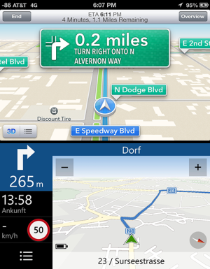
Google Maps on iPhone verses Nokia Drive

hary536

New member
Oct 8, 2011
140
0
0
Visit site
If anyone would like to engage in an actual discussion without acting like a ****, by all means respond. Otherwise get out.

For the record, I'm not talking about the map data, I'm talking about the apps. I saw the ios version of google maps, thought, wow this is slick, and wanted to share that sentiment with people here. Just looking for thoughts, not douchebagery.
You haven't yet explained or compared the two yourself. When you make a general statement, that I like google maps more than Drive, then you are bound to get general replies too.
 

K Raghu

New member
Jan 18, 2013
77
0
0
Visit site
I was using an iPhone the other day with the google maps app, and I gotta say it just feels so much higher in quality than what we have with Nokia's Drive. Everything from the UI to actual features feel genuinely polished in google maps. I'm my opinion, Microsoft shouldn't be letting a struggling company like Nokia be responsible for such a basic and important part of the smartphone experience.

Strange but if you have nokia why are you posting here ? shouldn't you be posting in Apple forum to highlight your experience and making people happier. We don't post in apple forum as we don't care about what happens in their world :)
 

Onager1286

New member
Sep 11, 2012
160
0
0
Visit site
You haven't yet explained or compared the two yourself. When you make a general statement, that I like google maps more than Drive, then you are bound to get general replies too.

I didn't get a general reply, I got an arrogant one. Also, I have compared them, so I'm not sure why you said that...? I think Here Drive is fine, it's worked well for the most part. But the iOS version of google maps felt like it was designed by real UI designers, whereas Here Drive feels like a UI that's been shoehorned in around the underlying code. It's not particularly attractive and lacks a certain flow that is there in google maps for iOS. Again, it's not bad, but it's not AAA design...which is why Microsoft should be the company to handle development of a keystone app like navigation.
 

chandu1382

New member
Apr 1, 2013
9
0
0
Visit site
google maps may be matured but if you switch from satellite view to map view, both are the same. neither google nor nokia can invent new routes/ roads. they show whatever is existing.
In fact, nokia gives u better navigation and also available offline.
The look and feel is subjective. some like coke some like pepsi.
 

a5cent

New member
Nov 3, 2011
6,622
0
0
Visit site
You haven't yet explained or compared the two yourself. When you make a general statement, that I like google maps more than Drive, then you are bound to get general replies too.

You admit to not having read the whole thread and then turn around and accuse him of not having explained or compared apps? Seriously?

Quite a few posts ago, I myself asked him to clarify his position, which he/she since has. Don't play cop without taking the time to know what you're policing. Anyone deserves at least that. You yourself would expect it.
 

a5cent

New member
Nov 3, 2011
6,622
0
0
Visit site
The look and feel is subjective. some like coke some like pepsi.

To a degree, yes, absolutely, but not always. For example, frame rates contribute to the feel of an application and 20 FPS is objectively better than 3 FPS.

Just in terms of design, yes, that is subjective, yet letting 100 random people vote on which of the following two screenshots they find visually more pleasing is unlikely to result in a close race:

Example.png

What do you think?
 

Onager1286

New member
Sep 11, 2012
160
0
0
Visit site
To a degree, yes, absolutely, but not always. For example, frame rates contribute to the feel of an application and 20 FPS is objectively better than 3 FPS.

Just in terms of design, yes, that is subjective, yet letting 100 random people vote on which of the following two screenshots they find visually more pleasing is unlikely to result in a close race:

View attachment 32649

What do you think?
Thank you! This is exactly my point. I'll post a picture of google maps on ios as well for comparison.
 

zero_kbom

New member
Jan 3, 2013
7
0
0
Visit site
I much much much prefer Here Maps/ Drive implementation rather than Google Maps. I think UI wise, both of them practically adheres to each platform's style. So its just a matter of preference.

And yes, I used, heck I own an iPhone 5 and Lumia 920. Used Google Maps and Here Maps extensively.
 

rockstarzzz

New member
Apr 3, 2012
4,887
1
0
Visit site
To a degree, yes, absolutely, but not always. For example, frame rates contribute to the feel of an application and 20 FPS is objectively better than 3 FPS.

Just in terms of design, yes, that is subjective, yet letting 100 random people vote on which of the following two screenshots they find visually more pleasing is unlikely to result in a close race:

View attachment 32649

What do you think?

I would not argue in terms of frame rates as I've never used it that way. However, with these two screenshots what you are forgetting is design minimalism and OS philosophies. With iOS everything once launched as to be shoved on your face like those big distracting signs along my navigation. In a scenario when I'm driving on an unknown route, the last thing I want to do is distract myself and look and try to read all those things surrounding where I'm driving. The WP screenshot is minimal like the whole UI. If shows you a highlighted route so that you can glance to see if you have diverted or are on track and a big green marker pointing your direction. All the extra info has been pushed to one side of screen with a huge arrow and distance telling you that your right turn is after whatever distance. You are going from A to B so as a navigator I don't need to tell you that there are a few left and right streets on your route, may be check out their names while you drive too! That's the job of maps not navigator. If I was interested in POIs and streets around me, I would not be navigating but actually exploring on an augmented reality with HERE City Lens! To each their own?
 

a5cent

New member
Nov 3, 2011
6,622
0
0
Visit site
I think UI wise, both of them practically adheres to each platform's style. So its just a matter of preference.

I disagree that Nokia Drive adheres to the metro style guidelines... anywhere. As far as I can tell, Nokia Drive is actually based on the Symbian navigation app more than it is based on metro. If I have the time, I think I might try and design an alternative that does conform to the metro design language.
 
Sep 25, 2011
710
0
0
Visit site
It boils down to which of these two has your area covered better. Where I live there are no Nokia Maps, but Google Maps are insanely detailed. Also being an iPhone user I can tell you that it's NOT that awesome with Google Maps here. Sure the app itself is fantastic and runs circles around the Apple Maps app, but it is a third party app and therefore limited like any other third party app. Any map related thing on the iPhone will revert to the built in Apple Maps, that's the disadvantage of not having Google Maps built in.
 

a5cent

New member
Nov 3, 2011
6,622
0
0
Visit site
However, with these two screenshots what you are forgetting is design minimalism and OS philosophies.

No, I'm not forgetting that. I'm just not being clear. ;-)

I didn't want to suggest that ND (Nokia Drive) should look more like iOS or Google maps. I likely appreciate the simplistic and minimalistic approach just as much as you do. I'd also be completely against ND receiving more chrome. My point is, that minimalism and design aren't mutually exclusive, yet to my eyes, ND wasn't explicitly designed at all. I'd bet that ND was designed by programmers, not designers. I think a designer could do better. That is all I'm saying.

Despite appreciating simplicity, I also feel that the graphical rendering is sometimes too simple. For example, in night mode at large intersections, all the crossing roads can easily melt into a large and unidentifiable grey blob. This doesn't happen often in U.S. cities, as they tend to follow a geometric layout, but in European cities I see it quite often. All you can do is guess on which of those lanes that blue line actually lies. This is too simple. This is so minimal it compromises functionality.

And then there is the lack of polish. ND lunges from frame to frame at an unseemly 3 FPS. That is one of the issues I'd place in this category. Together with the lack of anti-aliasing.

It boils down to which of these two has your area covered better.

Yes, agree. Yet this thread was made out to be all about the looks, not about functionality.
 

rockstarzzz

New member
Apr 3, 2012
4,887
1
0
Visit site
No, I'm not forgetting that. I'm just not being clear. ;-)

I didn't want to suggest that ND (Nokia Drive) should look more like iOS or Google maps. I likely appreciate the simplistic and minimalistic approach just as much as you do. I'd also be completely against ND receiving more chrome. My point is, that minimalism and design aren't mutually exclusive, yet to my eyes, ND wasn't explicitly designed at all. I'd bet that ND was designed by programmers, not designers. I think a designer could do better. That is all I'm saying.

Despite appreciating simplicity, I also feel that the graphical rendering is sometimes too simple. For example, in night mode at large intersections, all the crossing roads can easily melt into a large and unidentifiable grey blob. This doesn't happen often in U.S. cities, as they tend to follow a geometric layout, but in European cities I see it quite often. All you can do is guess on which of those lanes that blue line actually lies. This is too simple. This is so minimal it compromises functionality.

And then there is the lack of polish. ND lunges from frame to frame at an unseemly 3 FPS. That is one of the issues I'd place in this category. Together with the lack of anti-aliasing.


Yes, agree. Yet this thread was made out to be all about the looks, not about functionality.

But wasn't your original screenshot post talking about designs of the two? and OP mentioned UI along with functionality! - I am not debating functionality at all. I am happy to admit that 5-6 years old OSs are feature-rich, they would be damned if they weren't (BB anyone?) but when it comes to UI/design - if the voting goes up with the purpose of the app and each platform's design language, I would hope it is a close call! For what a navigation app is meant to do, the design is sufficient but functionality can be improved in the OS which is only 2 years old and I hope it doesn't take 4 more years to reach where other OSs have reached. It should be quarter of that time at best!
 

Chris_Kez

Member
Nov 29, 2012
900
0
16
Visit site
I think these apps' design sensibilities also clearly reflect different heritages. Nokia HERE Drive seems to draw a straight line back to traditional freestanding or in-dash navigation units. Conversely, Google Maps was born as a desktop tool for exploration.
 

Huime

New member
Oct 30, 2012
1,019
0
0
Visit site
No, I'm not forgetting that. I'm just not being clear. ;-)

I didn't want to suggest that ND (Nokia Drive) should look more like iOS or Google maps. I likely appreciate the simplistic and minimalistic approach just as much as you do. I'd also be completely against ND receiving more chrome. My point is, that minimalism and design aren't mutually exclusive, yet to my eyes, ND wasn't explicitly designed at all. I'd bet that ND was designed by programmers, not designers. I think a designer could do better. That is all I'm saying.

Despite appreciating simplicity, I also feel that the graphical rendering is sometimes too simple. For example, in night mode at large intersections, all the crossing roads can easily melt into a large and unidentifiable grey blob. This doesn't happen often in U.S. cities, as they tend to follow a geometric layout, but in European cities I see it quite often. All you can do is guess on which of those lanes that blue line actually lies. This is too simple. This is so minimal it compromises functionality.

And then there is the lack of polish. ND lunges from frame to frame at an unseemly 3 FPS. That is one of the issues I'd place in this category. Together with the lack of anti-aliasing.


Yes, agree. Yet this thread was made out to be all about the looks, not about functionality.
the melt together thing was an issue earlier but now they provide supplement highlight at the bottom made problem away. Although if it can auto zoom at that point would be even better. But again we don't know whats criteria did they had for cpu workload.
 

vwarp

New member
Apr 19, 2013
4
0
0
Visit site
Strange but if you have nokia why are you posting here ? shouldn't you be posting in Apple forum to highlight your experience and making people happier. We don't post in apple forum as we don't care about what happens in their world :)

Aren?t you being extreme? I thought this was Mobile Nations. I love seeing what is happening in all forums, have an idea what other platforms are like, because we love mobile tech. I use an iPhone BTW. What?s if we all chat with each other more, we might be able to find ways to better the platforms we prefer together instead of silly comparisons and "mine is better than yours" arguments. The editors on these sites are all pretty good friends..
 

biboyflip

New member
Nov 20, 2012
42
0
0
Visit site
If I had to choose between those two photos, I would pick the one from Here Drive, simple and clear. The other one has too much eye candy and... old? I'd go for offline navigation functionality than eye candy design in a hear beat.
 
Last edited:

Forum statistics

Threads
323,180
Messages
2,243,389
Members
428,035
Latest member
powerupgo