New set of WP8.1 UI concepts

MDak280

New member
Nov 17, 2012
423
0
0
Visit site
Multitask should be long press back, notification center should be long press home, and voice settings should be long press search. Quick settings can go along with the notification center.

I like the concept posted here on how separate voice controls could work. I hope that comes in 8.1. Along with call blocking. And a bunch of other stuff :p
 

Jazmac

New member
Jun 20, 2011
4,995
4
0
Visit site
Multitask should be long press back, notification center should be long press home, and voice settings should be long press search. Quick settings can go along with the notification center.

I like the concept posted here on how separate voice controls could work. I hope that comes in 8.1. Along with call blocking. And a bunch of other stuff :p

Yes, call blocking is a must. All Microsoft need do is open that API. The devs will take care of the rest.
 

AngryNil

New member
Mar 3, 2012
1,383
0
0
Visit site
Wow, this cat if forever angry about something Gaichuke.
I respect Gaichuke as a poster and IIRC, he's made some pretty great posts in past. I strongly disagree with him here. In general, I don't have anything against people who contribute thought and effort.

There is no de-emphasis of anything in my arguments. Remember, it's still as fast as switching between applications. I think it's pretty rude to call my argument baseless or something summoned out from thin air just because you don't understand it.
Um, you're de-emphasizing ease of use in place of your personal preference on how it should visually look and flow. I fully apologise for misunderstanding your argument, I thought you were arguing that introducing a new navigational concept to the user experience would be detrimental (as opposed to the actual visual flow). I usually draw the line between arguing points and arguing people, sorry if you were offended.

I think there's real benefit in the task switcher implementation because there are no visual interruptions between application and notification centre if it's inside the task switcher screen.
If I'm getting you right, you think the visual interruptions of the other implementations make less sense and are hence confusing to the user? I'll have to take issue with this, again. Let's go through all the possibilities I can remember:
  • Swipe down: swipe. Notification centre is an overlay, like the lock screen. Seems understandable.
  • Left of tiles: go to start, swipe. Just like the home screen (tiles and app list). Seems understandable.
  • Double tap start: double tap button, any animation can be used. This is very flexible.
  • Task switcher: long hold button, swipe…
If all users somehow are super familiar with the task switcher, then your argument may make sense. But they aren't. All other implementations are more obvious and more easily accessible. I take your point with reach for the swipe down, but it isn't the only implementation being discussed. (And really, phablet users really just show that one handed use isn't a must. Reach isn't that big of a concern with two hands.)
 

Harry Wild

New member
Oct 9, 2012
295
0
0
Visit site
Windows 8.1 is the big one! It should have upgrades for HD+ screen resolution; 3.0 USB, 4.0 Bluetooth, Quad-Core Processors, 802.11ac. Rumor has it that it is push back again to the mid 2014.
 

a5cent

New member
Nov 3, 2011
6,622
0
0
Visit site
Windows 8.1 is the big one! It should have upgrades for HD+ screen resolution; 3.0 USB, 4.0 Bluetooth, Quad-Core Processors, 802.11ac. Rumor has it that it is push back again to the mid 2014.

Nope. HD+ display resolutions and quad-core processors are expected for GDR3, sometime during Q4.
 

a5cent

New member
Nov 3, 2011
6,622
0
0
Visit site
The zoom effect that occurs after the long press takes the user outside of the application they were using and keeps the original application visible through the whole transition. No visual interruptions. User is now outside the application, it's very obvious for an user now that they are now dealing with information from another applications.

Hey Gaichuke

I also dislike the idea of putting the NC (notification centre) in the task switcher, but for different reasons than AngryNil. I'm against this concept because it would make a false technical statement about the NC. The task switcher shows running user software processes. However, the NC will most definitely be a system process, like the Start Screen or TellMe. System processes (which a user can neither launch nor terminate) aren't displayed in the task switcher. In that sense, showing the NC in the task switcher would make it the "odd man out". Imagine one of those quizzes where you are shown four pictures, high heels, sneakers, boots, and a chocolate bar, and then asked which one of them doesn't fit... that is what this solution feels like to a software engineer.

I realize this is a very technical reason, and that users without the technical background possibly couldn't care less. However, should we ever get the ability to close apps via the task switcher, then many people might find it strange, because they wouldn't be able to close the NC, despite it working for every other app in the list (because it either lacked the "X", or because you wouldn't be able to swipe it away no matter how hard you tried). It's just isn't consistent.

For this reason, I'd much rather see an implementation like MDak280 suggested (long-press start-button = NC, long-press search-button = TellMe). That approach provides instant access (faster than swiping to the NC and selecting it in the task switcher), and still allows you to return to wherever you were with a single press of the hardware back-button. It is also consistent with how WP already works, as all system processes are accessed via the hardware buttons.

I don't think such a solution would be visually any worse than the task switcher based solution, do you?
 
Last edited:

waraukaeru

New member
Jun 16, 2013
15
0
0
Visit site
I really want notification center. Its true that Live Tiles was made to somehow replace notification center but if possible I do not want to clutter my home screen with all apps just for the sake getting a glace at a toast. Oh, another feature that's missing right now is 'hide the keyboard'. ITS HUGE, blocking half the screen and sometimes I cannot select the typing field behind it.

You can hide the keyboard right now. Just tap the back button when it is up.
 

a5cent

New member
Nov 3, 2011
6,622
0
0
Visit site
just can wish all these thing coming too windows phone soon

Hey Rahul, thanks for posting the concept! I hadn't seen that one yet. I think there are quite a few very nice feature-ideas there, but I find the actual UI very poor. Examples:

1)
A lot of things are jarringly un-metro-like. For example, it contains a lot of user interaction points that lack any visual cues of their existence:

  • there is nothing that indicates you can pull down extra/advanced volume controls
  • there is nothing that indicates you can scroll the lock-screen notifications left and right
  • there is nothing that indicates forward and backward navigation in IE occurs by swiping across the app bar. Not only that, but if you were to swipe across the app bar, nothing would actually scroll, which is what most would expect from swiping. Although returning to the previous webpage is also a form of user feedback, it is very unconventional feedback for a swipe.
Not only do these features lack any visual cue as to their existence, but they are all completely foreign to metro (nowhere else are such UI concepts used). This would force many people to read the user's manual... and that for something as important as navigation in IE! These are good examples of unintuitive UI design.

There are tons of these un-metro-like concepts on almost every screen...

2)
I already mentioned that I dislike accessing the notification centre through the task switcher (see post #26).

3)
I like the idea of being able to configure for which apps the notification centre collects notifications, but I think the provided options are completely useless. I would prefer something like this:
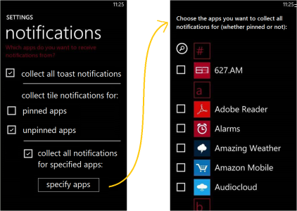
NCC2.png

By default, the checkboxes "collect all toast notifications" and "collect tile notifications for unpinned apps" are checked. Those are the two issues currently causing people to miss notifications, and the main reasons people want a notification centre in the first place! Unfortunately, the original concept doesn't provide us with any means of solving those two issues, which is why I find it pointless (unless you choose the option to collect all notifications, which may not be what you want either). I'm not entirely happy with my design yet either, but at least it tries to solve the problems we've actually got, instead of providing us with an arbitrary list of mutually exclusive options.

Anyway, I could go on and on like this for literally every screen in that concept. My take: many good ideas, very poor UI design (still a very worthwhile post though, thanks again).
 

vish2801

New member
Oct 19, 2012
342
0
0
Visit site
I'm impressed but I want to access NC very fast, I don't think that argument like you don't have to access it fast stands because why can't we get it fast. Such arguments that you don't need this or that are annoying, People want to use OS not they should use it how company thinks. Despite spending money behind surveys, just throw features to users, users will decide whether they will use or not. But everything you posted is awesome, I would love to see we can set background wallpapers, too. Such simple simple customization attracts users. Just see how Lock Screen works beautifully. No other OS can give such best experience of Lock Screen.

Sent from my Nexus 4 using Tapatalk 4 Beta
 

Ridemyscooter86

New member
Dec 20, 2011
257
0
0
Visit site
I think for the notification center, they should either make it a live tile that you pin to your start screen, thus utilizing the whole purpose of a live tile, or what they should do is when you're on the homescreen, you know how you swipe to the left to get the app list, you should swipe to the right instead to get the notifications center. The only problem with both of those would be that you would have to be on your homescreen to see notification... Or they could just copy android and apple and you just swipe down from the top...

One thing I would like to see, although it will probably never happen, is if they made wp work exactly like windows 8, where the homescreen for windows phone ti kept the same, same for the app list, but you should swipe from the right for options, swipe from the left for multitasking, and swipe down from the top to close an app. It would be cool for it to be the same, but I don't know how well that would work on a phone, although BBOS 10 basically works in the same fashion, and it works pretty well...
 

Microsoftjunkie

New member
Jun 19, 2012
1,624
0
0
Visit site
Has anyone thought of double pressing the home button to get Notifications? This can be done from anywhere, and its fairly intuitive. I hate long pressing for voice assistance.
 

a5cent

New member
Nov 3, 2011
6,622
0
0
Visit site
Has anyone thought of double pressing the home button to get Notifications? This can be done from anywhere, and its fairly intuitive. I hate long pressing for voice assistance.

That would make accessing the start screen unbearably slow, because the OS would have to wait a few hundred milliseconds every single time before deciding if that was really a single-tap or just the first half of a double-tap. A few hundred milliseconds doesn't sound like much, but it's far worse than the time spent on a long-press. Think about it...

Anytime a UI must wait to determine what the user actually intends is a major screw up. The single-tap / double-tap paradigm only works when you can interpret the first half of a double-tap in the same way you could interpret a single-tap... like in file explorer, where a single-tap always selects the file/folder which is the correct thing to do even if it turns out to be a double-tap later on.

Long story short... won't work.
 
Last edited:

a5cent

New member
Nov 3, 2011
6,622
0
0
Visit site
I think for the notification center, they should either make it a live tile that you pin to your start screen, thus utilizing the whole purpose of a live tile, or what they should do is when you're on the homescreen... you should swipe to the right instead to get the notifications center.

If the NC turns out to be a normal app, then I obviously wouldn't object to it showing up in the task switcher. Although the task switcher then wouldn't work as a navigational mechanism, as it would only be there after having been launched from the start screen. I'm betting it will be a system app though, in which case it wouldn't manifest itself as a live tile. It could then show up to the left of the start sceen, but that seems to clash with W8, so I'm suspicious of that too.

I wouldn't be surprised if a WP notification centre turns out to be something like a search tool (possibly part of a universal search feature) for notifications with predefined filters. That would also have it's similarities with search on W8.
 

Gaichuke

New member
Jun 14, 2012
288
0
0
Visit site
I don't personally see that big of a semantic problem in there, but then again I'm not a very technical person. To me it would just reassign or modify the purpose of that screen from a simple task switcher to some kind of phone management screen. The possibility of users trying to manipulate NC in similar manner to the rest of the apps could be easily avoided by smart UI design decisions.

Long press of the start screen would be perfect for NC, especially if it would handle the visual transitions in similar manner to the task switcher. I'm worried about that never becoming true because of the new UX pattern that would have to be introduced since TellMe already occupy that space. Why TellMe hasn't been put behind long press of search button feels to me as a conscious choice (even if the reasons behind it is not clear to me) and as of such won't be changed in favor of NC. I would love to see it still.
 

Plekepe

New member
Jun 23, 2013
6
0
0
Visit site
Well I'm waiting for MS to enable large screen support with an extra column of tiles. Can't wait for a Nokia 1080p phablet to come!
 

a5cent

New member
Nov 3, 2011
6,622
0
0
Visit site
I don't personally see that big of a semantic problem in there, but then again I'm not a very technical person. To me it would just reassign or modify the purpose of that screen from a simple task switcher to some kind of phone management screen. The possibility of users trying to manipulate NC in similar manner to the rest of the apps could be easily avoided by smart UI design decisions.

Let me put it this way. How would you feel if Microsoft changed Windows, so the only way you could access the Control Panel was through the Task Manager? Would you find that intuitive? After noticing the Control Panel wasn't accessible in the usual way, would you think to open the Task Manager and look there? Why not? Conceptually, that's very similar to what you are suggesting here.

I'm not saying the task switcher's functionality can't ever be expanded upon, but whatever goes into that screen should at least have a strong relationship to task management.

Redefining the task switcher to be some general kind of phone management screen is certainly possible, but that is exactly how the UI design of any piece of software starts deteriorating. That starts us down the path to a UI loosing expressiveness. Everything becomes more and more generalized to the point where nothing means anything anymore. Given enough time and revisions, a UI will inevitably reach the point where the only way to learn your way around it is by heart. For those with little IT experience that may be acceptable, because that is the only way they learn their way around computer software regardless, but I'm sure you aren't one of those people. I know that sounds a bit dramatic, considering you are suggesting just one change, but it's the precedent I'm opposed to more than anything else. Every bad UI in the world started with just one such change...

If WP needs a general phone management screen, then MS should specifically and deliberately design such a thing. That is far better than mashing this feature into some arbitrary part of the UI where we feel it might fit in.

P.S. Sorry for not getting back to you earlier.
 

Members online

Forum statistics

Threads
323,181
Messages
2,243,392
Members
428,035
Latest member
powerupgo