I like Windows 8 as a concept, though it is not very well polished and implemented, in comparison to Windows Phone and Xbox. Windows 8.1 attempts to right a few wrongs, but IMHO it makes the OS even more inconsistent than it already was.
The problem of the Windows 8 UI is the lack of discoverability of important UI elements, and it shouldn't be hard to fix with a few consistent solutions. However, as a result of a lack of faith in Metro by various app teams, the problem of Windows 8.1 UI is extreme inconsistency, with each team pitching their own solution to the same problem of discoverability.
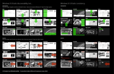
I did a little bit of UI analysis on this issue. This is a technical diagram, so it may take you a bit to comprehend, but bear with me here.

As you can see, while Windows 8 isn't exactly the most consistent, 8.1 takes it to another level. While the implementation of Metro on Windows Phone does not result in this drop of consistency in its transition from 7 to 8 but instead resulted in a few prestigious design awards, we can see that each app team working Windows 8 in Microsoft is trying extremely hard at solving the usage problems of its apps, and are throwing everything and the kitchen sink at the wall, in attempt to right the wrongs, such as:
In comparison, Windows Phone 7/8 has a highly consistent, iconic and understandable navigation layout pattern: Pivot and Panorama, while Windows 8 never had one, i.e. a somewhat of a Panoroma, a navigation bar from top, or Semantic Zoom, though it looks like Semantic Zoom is going into deadpool in 8.1, unfortunately. On Xbox, all apps also have the same panorama layout to ease joypad navigation.
While Windows Phone 7 did backtrack on the search button just like Windows 8, its solution is a lot more elegant: All apps gain a Search button in the app bar all at the same position, with the Search textbox always at the top when the button is tapped. Meanwhile, in Windows 8.1, some apps implemented the search bar at the top right, some apps have a search button at a different position (e.g. Skype, Maps), some apps have a contextual position (e.g. Mail, Xbox Music), while some apps still use the old Search charm but much harder to be accessed as a result of the new Search hero (e.g. Photos).
Due to lack of concretely measurable analytics, it is easy to blame the UI first when the usage numbers do not meet expectations, and then make all sorts of incongruent changes as a result, especially after a drastic UI redesign had just happened. It's a shame that Windows 8 was rushed out of the door without being carefully designed and implemented - it would have been a rather elegant solution.
As users, developers and designers, we should urge Microsoft to create a more consistent solution to the problem it is attempting to fix. We need a clearer navigation layout that works for most apps, so it makes it easier for users to adapt, and easier for devs and designers to create for.
The problem of the Windows 8 UI is the lack of discoverability of important UI elements, and it shouldn't be hard to fix with a few consistent solutions. However, as a result of a lack of faith in Metro by various app teams, the problem of Windows 8.1 UI is extreme inconsistency, with each team pitching their own solution to the same problem of discoverability.
I did a little bit of UI analysis on this issue. This is a technical diagram, so it may take you a bit to comprehend, but bear with me here.

An analysis of the navigation and search touch zones of 12 major apps on Windows 8 vs 8.1. Green indicate areas one can touch or click to navigate. Red indicate areas one can touch or click to search. Arrows indicate the Windows 8 "swipe from edge" gesture.
As you can see, while Windows 8 isn't exactly the most consistent, 8.1 takes it to another level. While the implementation of Metro on Windows Phone does not result in this drop of consistency in its transition from 7 to 8 but instead resulted in a few prestigious design awards, we can see that each app team working Windows 8 in Microsoft is trying extremely hard at solving the usage problems of its apps, and are throwing everything and the kitchen sink at the wall, in attempt to right the wrongs, such as:
- Retreating to the Explorer-like old UI. (e.g. Xbox Music)
- Grafting an obvious search bar of some sort, always at a different spot in a different size.
- Haphazardly add a more obvious navigation bar, sometimes at the top, sometimes at the bottom.
In comparison, Windows Phone 7/8 has a highly consistent, iconic and understandable navigation layout pattern: Pivot and Panorama, while Windows 8 never had one, i.e. a somewhat of a Panoroma, a navigation bar from top, or Semantic Zoom, though it looks like Semantic Zoom is going into deadpool in 8.1, unfortunately. On Xbox, all apps also have the same panorama layout to ease joypad navigation.
While Windows Phone 7 did backtrack on the search button just like Windows 8, its solution is a lot more elegant: All apps gain a Search button in the app bar all at the same position, with the Search textbox always at the top when the button is tapped. Meanwhile, in Windows 8.1, some apps implemented the search bar at the top right, some apps have a search button at a different position (e.g. Skype, Maps), some apps have a contextual position (e.g. Mail, Xbox Music), while some apps still use the old Search charm but much harder to be accessed as a result of the new Search hero (e.g. Photos).
Due to lack of concretely measurable analytics, it is easy to blame the UI first when the usage numbers do not meet expectations, and then make all sorts of incongruent changes as a result, especially after a drastic UI redesign had just happened. It's a shame that Windows 8 was rushed out of the door without being carefully designed and implemented - it would have been a rather elegant solution.
As users, developers and designers, we should urge Microsoft to create a more consistent solution to the problem it is attempting to fix. We need a clearer navigation layout that works for most apps, so it makes it easier for users to adapt, and easier for devs and designers to create for.
Last edited:


