My own Windows Phone 8.1/9 concept ideas

WilliamABradley

New member
Dec 23, 2013
26
0
0
Visit site
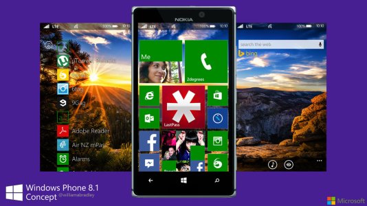
After spending time looking at many Windows Phone 8.1/9 concepts, I thought I might toss my own ideas into it on how I think Metro/Modern UI should be portrayed on Windows Phone.

Here are some of my UI concepts, please be aware that I have no true educated design knowledge or extensive photoshop knowledge so go easy on me if you don't agree with these ideas.

Here is a preview of some of my designs, let me know what you think:
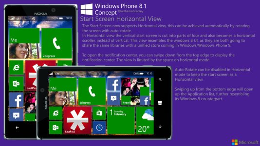
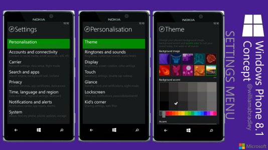
windows_phone_8_1_start_screen_concept_by_williamabradley-d74m3wa.jpgwindows_phone_8_1_horizontal_view_concept_by_williamabradley-d74mfk0.jpgwindows_phone_8_1_settings_menu_concept_by_williamabradley-d74rckp.jpg
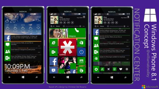
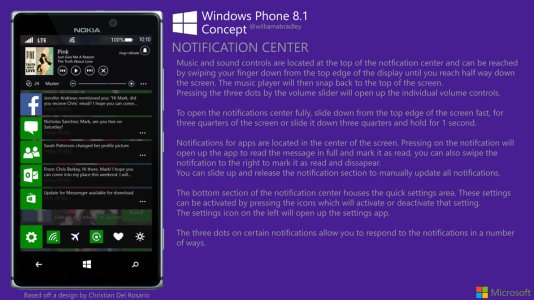
windows_phone_8_1_notification_concept_overview_by_williamabradley-d74m3xu.jpgwindows_phone_8_1_notification_center_concept_by_williamabradley-d74m40z.jpg

You can see my gallery where I will update with more concepts here:
Windows Phone 8.1 Concepts by WilliamABradley on deviantART
 

unstoppablekem

New member
Sep 23, 2011
8,123
0
0
Visit site
First off, welcome to WPCentral!

And these are wonderful concepts, good job! Just I don't see Microsoft adding landscape support on the start screen, as no other main mobile phone, like the S4 or 5S, has a landscape home/start.
 

Ma Rio

New member
Sep 28, 2013
1,291
0
0
Visit site
I would really like the landscape start screen. I'm hoping they implement it. It looks great on Win8, why not WP8 (or WP8.1, 9 or whatever).

And just because iPhone and Android doesnt have it does not mean WP shouldn't have it.
I had it on Symbian, and it was preety decent. I bet it would look even better on WP.
 

SRoshan143

New member
Aug 27, 2013
123
0
0
Visit site
Awesome man. You should definitely contact Microsoft and tell them about your concepts and designs. It's just freaking awesome.
 

lordsnow

New member
Oct 15, 2013
85
0
0
Visit site
The whole concept is really good.
I always wanted horizontal view on Windows Phone but I think Microsoft won't do it soon. Maybe because the tiles on Windows Phone are more "free" than in Windows 8.
 

Garneth

New member
Jul 15, 2013
80
0
0
Visit site
First off, welcome to WPCentral!

And these are wonderful concepts, good job! Just I don't see Microsoft adding landscape support on the start screen, as no other main mobile phone, like the S4 or 5S, has a landscape home/start.

And what better to make Windows Phone stand out than a horizontal start screen? (;
 

ronty

New member
Nov 30, 2013
78
0
0
Visit site
This is a really fantastic concept.I,too want more themes as I'm really bored with the dark & light themes.So,I think this is the best part of this concept.
 

manicottiK

New member
Nov 24, 2011
660
0
0
Visit site
I hate to be the negative guy, so I'll try to address my concerns with these ideas with as much constructive criticism as possible.


I, too, have wanted a landscape Start screen, not so much because I use the phone in landscape much, but for continuity when I back out of an app that's in landscape. I see three issues here.

1. I know that folks want the ability to put a picture behind the tiles, but it just doesn't work in Windows Phone because so little of the background is visible between the tiles. (Windows 8 leaves a lot more of the screen unused, which annoys me because I'd rather have more foreground for tiles than background for pictures.) Worse yet, the background picture actually makes the tiles less usable because my brain has to separate out the foreground and background imagery. (This is more noticeable around the Me and People tiles since they, like the background, have photographic content.) This collision of information is one of things that Metro is supposed to avoid.

2. If Microsoft adds this, they won't do it in exactly this way because of the status bar. By leaving it at the top, you've both changed the number of pixels available for the tiles and left no place for the app bar. The Windows Phone standards call for the app bar to always be next to the Back, Home, and Search buttons and for the system tray (i.e., the status bar) to be at the far end. (Go into email then turn your phone left OR right -- the app bar stays near the capacitive buttons.) If you follow the design standards for those two things, a landscape layout becomes easier, but still not simple.

3. The reason that it's still not simple is that Windows Phone allows more flexibility in tile placement than Windows 8. In Windows Phone, a user can have a tile layout that has no left-to-right straight line by placing a medium tile at the top left, another one half-way down on the right and then continuing downward. On Windows 8, tiles have to be "chunks" of medium tile size (i.e. 4x2 small tiles). You can see this by resizing a wide tile to small in Windows 8 -- the tiles below it don't shift upward to fill the space. This is because Windows 8 enforces a 4x2 (or 4x4) grid so that overflow can move rightward. IF Windows Phone were to get a landscape Start screen, we'd either have to lose the tile placement flexibility that we have now or accept "gaps" when in landscape mode. (I'd be willing to accept those gaps, I think, but I'm not sure how bad they'd be in some user's tile layouts.)

Grouping settings makes sense. There's been a big call for alphabetizing settings, but grouping might be better if done right.

However, the accent color chooser is going to be a problem. From an app development perspective, Windows Phone apps "know" about three special colors: foreground, background, and accent. (Foreground and background are white and black in the dark theme and are reversed in the light theme.) Because apps typically use these colors rather than black and white directly, there needs to be a reasonable amount of contrast among them so that text in any of the three colors looks good placed over any of the other colors. For example, if a user with the dark theme picked a really blue as their accent color, apps showing some important text in the accent color would be hiding it rather than calling attention to it because the dark blue accent-colored text would all but disappear when rendered on the black background.

The buttons in your notification center are way too small for finger use. Below a 5" screen, you cannot accommodate more than five buttons across -- above 5" you can get to 6 buttons. Your four music controls occupy about half of the width of the screen, meaning that you sized them for 8 across -- way too small. Assume 9mm per button with a 2mm gap between buttons to follow the UI guidelines.

The idea of swiping from the top may be a big obstacle. From my critique above, the system tray is located not at the "top" of the screen, but at the side farthest from the capacitive buttons. Thus, it's on the right side if I rotate the phone clockwise. Pivot and panorama apps use the side-to-side swipes to change panels. If your notification center is taking that gesture, existing users are going to have to change the way that they work, which is generally frowned upon.

Overall, my sense is that you're an Android user trying to bring some of the freedom of Android to Windows Phone. (This is my standard observation if someone mentions notification center, quick settings toggles, or file system access. ;) I agree that Microsoft needs to loosen up a bit, but I do not want Windows Phone to become Android-like. Effectively, that's where Microsoft came from with the old Windows Mobile product. It was the branding for a product that began life as Pocket PC, just as Android is somewhat like a Pocket Linux.
 
Last edited:

Ridemyscooter86

New member
Dec 20, 2011
257
0
0
Visit site
pretty good concepts, hope ms uses some of these. One thing I would like them to do is to properly resize content for bigger phones. I have a lumia 1520 and the addition of a 3rd row of tiles for the start screen is great, but the problem I mainly have with wp at the moment is that it just blows everything up on the 1520. Its not that it doesn't look good, its just i wish that if you're in the people hub, for example, that instead of making everyone's name on the list bigger and just scaling up the UI to the screen, they should show more contacts, for example. I also want them to make improvements in IE like swiping right and left for forward and back, like in windows 8.
 

WilliamABradley

New member
Dec 23, 2013
26
0
0
Visit site
Thanks for this feedback it has been very useful me, I might even update and adjust my designs as Windows Phone 8.1 isn't being announced until April. I understand what you mean in relation to some of the things, like the notification center being to small, thats only because I based it off the design by Christian Del Rosario.

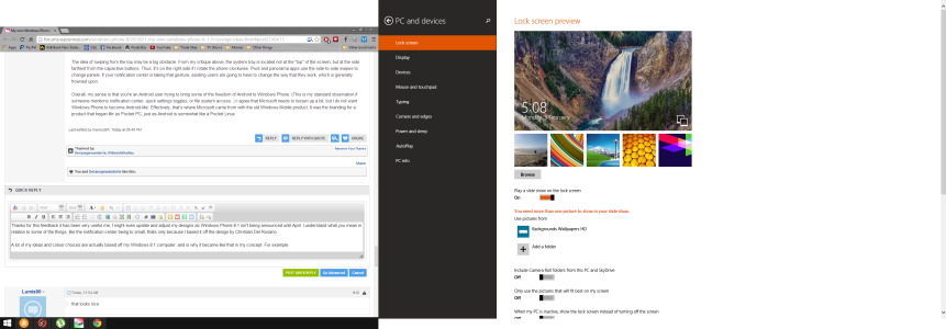
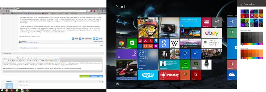
A lot of my ideas and colour choices are actually based off my Windows 8.1 computer, and is why it became like that in my concept. For example, the settings page was actually based of my colour settings and how it was done on Windows 8.1, also the use of the accent colour and background accent colour was basically a straight copy and paste from screen shots, but then recreated in photoshop of course.

Here are some screenshots from my desktop on Windows 8.1 for comparison:
Settings
Screenshot (18).png
Personalisation
Screenshot (19).jpg

Also with the notification center being a slide down from the top instead of from the left (Where I rebalanced the startscreen), this is because swiping from the left would not work in any app and would only be accessible by the start screen, if its at the top of the screen (When an app is at a menu or paused), It would be as simple as opening up the status bar.

Anyway, I am not exactly a professional, I just wanted to express some of my ideas to the community and possibly being viewed by Microsoft to add to their list of ideas for UI enhancements. It isn't hurting anyone to add these.

Also I came from Symbian on my Nokia C3-00:
NokiaC3.jpg
 

mase123987

New member
Mar 1, 2012
3,118
0
0
Visit site
I have never liked notifications being pulled down from the top. It is too far away from the thumb. Would be better as a long press from a capacitive button or a gesture like BB.
 

Zulfigar

New member
Jun 27, 2012
1,676
0
0
Visit site
I have never liked notifications being pulled down from the top. It is too far away from the thumb. Would be better as a long press from a capacitive button or a gesture like BB.
I heard of one concept someone put out there that maybe from the multiple-application (or what ever it is called, where you hold the back button) could hold the notifications and still be accessed anywhere in the OS. That could be a viable option too.
 

cuwe

New member
Sep 14, 2013
193
0
0
Visit site
I heard of one concept someone put out there that maybe from the multiple-application (or what ever it is called, where you hold the back button) could hold the notifications and still be accessed anywhere in the OS. That could be a viable option too.

It's multitasking :D
 

Members online

Forum statistics

Threads
323,197
Messages
2,243,435
Members
428,035
Latest member
jacobss