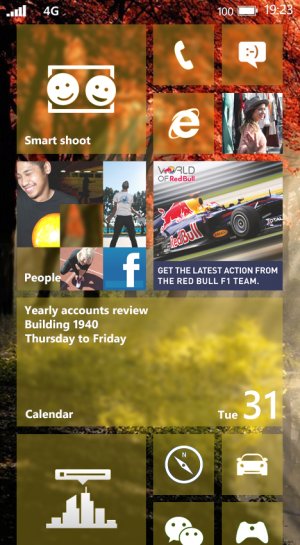
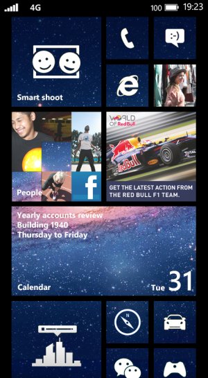
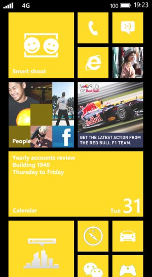
Which style of Windows Phone is your favorite
- Thread starter HuangQiang
- Start date
You are using an out of date browser. It may not display this or other websites correctly.
You should upgrade or use an alternative browser.
You should upgrade or use an alternative browser.
neo158
Active member
Top one and bottom one. It would be nice if all three options are included though.
F3rzz
New member
The second one is exactly how i will first customize my Lumia920, cosmic images are gorgeous, and the tiles looks gorgeous that way  i'm also using a nebula as my Glance Background, it looks awesome :3
a more iOS7-like blur would look better on the first one. the blur applied in your/that mock-up reminds me of the dreadfull windows vista
a more iOS7-like blur would look better on the first one. the blur applied in your/that mock-up reminds me of the dreadfull windows vista
xandros9
Active member
melvintwj
New member
What if...
Imagine the 2nd one being a static background. Say, the tiles are fully transparent. When you scroll, only the tiles move and the background doesn't.
It's like a window into the background instead of having the image as part of the tile itself.
Get what I mean?
Imagine the 2nd one being a static background. Say, the tiles are fully transparent. When you scroll, only the tiles move and the background doesn't.
It's like a window into the background instead of having the image as part of the tile itself.
Get what I mean?
Blakey.
New member
What if...
Imagine the 2nd one being a static background. Say, the tiles are fully transparent. When you scroll, only the tiles move and the background doesn't.
It's like a window into the background instead of having the image as part of the tile itself.
Get what I mean?
Isn't that exactly how it's said to be in WP 8.1?
GSOgymrat
New member
F3rzz
New member
Isn't that exactly how it's said to be in WP 8.1?
it has not been confirmed, but i think is the more likely option.
snowmutt
New member
narv
New member
So using the space image actually makes the skinned tiles look good.. That is the first image I've seen of it that hasn't been overly busy and annoying to me. Gives me a little hope that the feature wont be useless (for me at least). I still like how the actual background image from the 1st one looks and would be how I would ideally like to set my phone to look.
The last one being the current layout, I don't actually mind (though the yellow im not a fan of, I like the green personally) but it definitely isn't as exciting as the other 2 which is why im glad they are doing at least SOMETHING about it.
The last one being the current layout, I don't actually mind (though the yellow im not a fan of, I like the green personally) but it definitely isn't as exciting as the other 2 which is why im glad they are doing at least SOMETHING about it.
poiman
New member
Looking at this makes me realise that there is one and only one way skinned tiles can look good and that is if the chosen picture is blurry.
osoalex
New member
The top one and the bottom one.
The top one with certain parallax effect, if you know what I mean
The top one with certain parallax effect, if you know what I mean
Chris Wayne2
New member
xandros9
Active member
Whats the point of the first one?, you can't see a damn thing!
contrast isnt the best, but its like iOS's new style.
still readable - it'd fit decently with the old Aero theme, but I dont think we'll get to see it.
James8561
New member
Aniket Bhat
New member
Love the first one. It would be awesome to have all of them as an option though.. Having more customization is exactly what WP needs right now.
KllR007
New member
I like first one, but without transparency. And simple background like on WIndows 8, will be great too... And thats my dream customization. I dont need colored tiles, fancy wallpaper etc. I like simplicity of WP, but I also like if other will be in settings. So everyone can find what like.
taymur
New member
What if...
Imagine the 2nd one being a static background. Say, the tiles are fully transparent. When you scroll, only the tiles move and the background doesn't.
It's like a window into the background instead of having the image as part of the tile itself.
Get what I mean?
That's how its suppose to be :S
taymur
New member
I like first one, but without transparency. And simple background like on WIndows 8, will be great too... And thats my dream customization. I dont need colored tiles, fancy wallpaper etc. I like simplicity of WP, but I also like if other will be in settings. So everyone can find what like.
The first option without transparency almost means nothing. You wont be able to see anything of the background, and when you slide to app list, things will start getting weird.
ronty
New member
Me too.I love cosmic images. The 2nd one looks best to me, while the 3rd one looks the worst. However, what I like about the 1st one is that even the background has the wallpaper & is not black(or white).
Similar threads
- Replies
- 0
- Views
- 94
- Replies
- 0
- Views
- 122
- Replies
- 1
- Views
- 170
- Replies
- 0
- Views
- 85
Trending Posts
-
The Fallout Season 1 viewing figures are absolutely INSANE, no wonder Season 2 was confirmed so quickly
- Started by Windows Central
- Replies: 0
-
Fallout show creators pretty much confirm what we expected for season two
- Started by Windows Central
- Replies: 0
-
PSA: It doesn't matter if your computer runs on ARM, all of your apps will work on Windows 11
- Started by Windows Central
- Replies: 3
-
Microsoft's Xbox has taken over the Sony's PlayStation Store 🤯
- Started by Windows Central
- Replies: 18
Forum statistics

Windows Central is part of Future plc, an international media group and leading digital publisher. Visit our corporate site.
© Future Publishing Limited Quay House, The Ambury, Bath BA1 1UA. All rights reserved. England and Wales company registration number 2008885.


