- Jan 20, 2012
- 156
- 0
- 0
Dear fellas,
Modern design language -formerly known by Metro-, was originally found in the Zune app by Microsoft back in 2006.
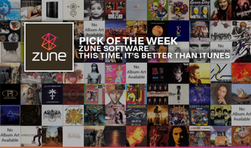
A software that inspired a vision
Metro was a "refresh from the icon-based interfaces of Windows, Android, and iOS." It was found as a try of getting away from any traditional design language: it was meant to have a "better focus on the content of applications, relying more on typography and less on graphics". One of the famous messages it spread with many advertisements was: "Get in, get out and get on with your life".
One of Microsoft's top ads to date.
Under those quotes, and having been a user of this design language for almost 3 years, I can't help but see that Microsoft went astray from the vision it originally had -in Windows Phone at least-, this vision that got me to be a day-one user for a new born OS with all the risks and challenges it may carry along.
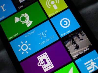
Searching among your tiles for any missed notifications, "get in, don't get out, life can wait"
In the classic battles of engineering decisions, and here I am referring to: simplicity VS functionality, Microsoft was guilty of choosing simple every single time, and this is what this forum post is about.
Although, some may argue that one-upping Cold War mentality in competition is a dead-end as it's an expensive, defensive, and paranoid way of building products, well I might agree to a level, but not in the fast-paced technology world.
Yes, conventional wisdom says that to beat your competitors you need to one-up them. If they have four features, you need five (or 15, or 25). If they're spending x, you need to spend xx, and so on. Yes, this is what technological competition is all about; functionality and usability.
I think that Microsoft's journey so far has been more about "reinventing the wheel"; rather than applying what they learnt through the years about software and user interfaces and build upon that, they choose to rebuild everything from the ground up. Look up any video for Windows Mobile 6.5 (especially if you have used one back in the days), you will find that many of the features it had are still being cooked in a slow pace 5 years later.
"The old Windows Mobile included a mobile version of Office had far more features than the current incarnation. That’s right, in the Windows Mobile days, you could get work done in Office Mobile on your smartphone with more functions than any Office Mobile version today." - Adam Lein, "Will Windows Phone 8.1 see a new version of Office?", Pocketnow.
You can be simple, but yet complicate things at a practical level. Microsoft wanted to focus on the content more, but fell a victim of damaging what presents these contents.

One step forward and two steps back, one forward again.
Am I the only one seeing this? Examples is all I can give to defend my argument (there are so many, but I'll keep the list short):
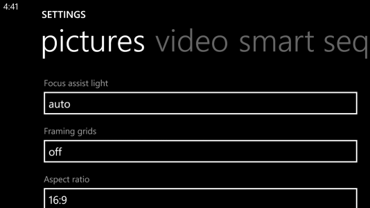
This looks ridiculously stupid on my 1520. Landscape in WP still is a no-go.
If you notice the pattern in all of these examples and many others, you would notice instantly that they barely know better from their experience (or others even) in the space, they are then forced to apply some things -still not entirely convinced even when they do-, never apply them properly, or chose a different way of doing things (in the sake of being different alone), then eventually, they get there but always a little too late.
Microsoft needs to sit down, put a better plan, and hire a new decision engineering team, which is involved in engineering "a framework that unifies a number of best practices for organizational decision making. It is based on the recognition that decision making could be improved if a more structured approach were used." It's about balance between everything, you just can't let simple win everytime, some sacrifices are due to happen, and better sooner than later, for you to be a leader.
Mind you that the strategy I mentioned earlier, of "one-up"ing your competitor isn't a long term one, but it's necessary when you're behind.
I know that Windows 7 at it's start had widgets (gadgets), and I knew that when they removed them, it has to comeback one day. I am with the people claiming of never losing any feature, except if it was utterly stupid. Microsoft is the best software company in the world, and they have the finest engineering teams of all, if any came up with a function, never lose it in your iterations, but rather improve and build upon it.
By this logic, I know that interactive tiles is going to happen sooner or later, but I don't know when. I like the current changes Microsoft is doing, and I hope it extends to when they apply their true vision and what people still don't know they want or even need.
"الشاطر الذي يتعلم من أخطاء غيره"
A saying in my country in Arabic: "Him who is the smartest is the one to get it from others experiences"
Interactive tiles is the new gadget "replacer", it's the next logical step in improving the tile interface, coupled with tiles grouping and quick access methods like Semantic Zoom, and some more tweaking to how the tiles display info, this could mean they are a real leader -as it should be-, not a follower in the UX department.
Many people, including me, saw that an interactive tile concept is due to happen sometime, I made a forum post for a concept that included "interactive" tiles here: Windows Phone 9 concept - linking1990
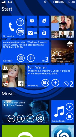
Although many people accused me of ruining Metro's simplicity with this concept, I think there is no other way to move forward. Although the concept of Microsoft's research team is executed differently, but it has the same vision to say the least.
Do you, the respected reader, agree with me? Am I to harsh on Microsoft? Please let me know in your valued comments, I am really interested in knowing what everyone thinks.
Modern design language -formerly known by Metro-, was originally found in the Zune app by Microsoft back in 2006.

A software that inspired a vision
Metro was a "refresh from the icon-based interfaces of Windows, Android, and iOS." It was found as a try of getting away from any traditional design language: it was meant to have a "better focus on the content of applications, relying more on typography and less on graphics". One of the famous messages it spread with many advertisements was: "Get in, get out and get on with your life".
Under those quotes, and having been a user of this design language for almost 3 years, I can't help but see that Microsoft went astray from the vision it originally had -in Windows Phone at least-, this vision that got me to be a day-one user for a new born OS with all the risks and challenges it may carry along.

Searching among your tiles for any missed notifications, "get in, don't get out, life can wait"
In the classic battles of engineering decisions, and here I am referring to: simplicity VS functionality, Microsoft was guilty of choosing simple every single time, and this is what this forum post is about.
"All other things being equal, the simplest solution is probably the best." - Ockham’s razor.
Although, some may argue that one-upping Cold War mentality in competition is a dead-end as it's an expensive, defensive, and paranoid way of building products, well I might agree to a level, but not in the fast-paced technology world.
Yes, conventional wisdom says that to beat your competitors you need to one-up them. If they have four features, you need five (or 15, or 25). If they're spending x, you need to spend xx, and so on. Yes, this is what technological competition is all about; functionality and usability.
"Simplicity: It's complicated!" - The Internet
If you look up designers opinions of "Metro" through out the Internet, you would see that many considered it the future to be, but almost all of them felt like it could have been something more: some thought it had too much wasted spaces, others argued that it doesn't represent some content properly, some thought that it doesn't work all the time and needed to expand for different content-based scenarios, but almost every review I read included many compliments and hoped for a lot more.
I think that Microsoft's journey so far has been more about "reinventing the wheel"; rather than applying what they learnt through the years about software and user interfaces and build upon that, they choose to rebuild everything from the ground up. Look up any video for Windows Mobile 6.5 (especially if you have used one back in the days), you will find that many of the features it had are still being cooked in a slow pace 5 years later.
"The old Windows Mobile included a mobile version of Office had far more features than the current incarnation. That’s right, in the Windows Mobile days, you could get work done in Office Mobile on your smartphone with more functions than any Office Mobile version today." - Adam Lein, "Will Windows Phone 8.1 see a new version of Office?", Pocketnow.
You can be simple, but yet complicate things at a practical level. Microsoft wanted to focus on the content more, but fell a victim of damaging what presents these contents.

One step forward and two steps back, one forward again.
Am I the only one seeing this? Examples is all I can give to defend my argument (there are so many, but I'll keep the list short):
- Windows Mobile had a far more customizable interface, Microsoft recently discovered that this is what you need in baby-steps (still no color picker in your theme settings), and now they are claiming to have the most personal OS of all, while still having only black and white backgrounds through out the system. Well, even though I like it, I promise that it won't work for everyone. You just can't force everyone to like and accept your limited offers.
- All other OS's had a notification center, Microsoft complicated things by arguing that your tiles is the notification center, even if it may work to a certain level, it never replaced the need for a true notification center, so they are back with one now. This notification center should have included more functionality, things like a toggle for data and actionable notifications (like Android and iOS), they shipped it without, and I promise that it will happen later on.
- Many basic missing features, ones that they can add/added from the start without much trouble, but chose not to for it to be "simple": knowing a call duration, having Wifi always on, stopping music when you want to not show in the system, proper volume controls, no tiles limit of 30 min updating cycle, forward button in IE, search in IE (search was there, removed, than back in), no apps memory limitations, no background tasks limitations, no limit to 30 seconds ringtones at max, and complicating your way of having any, being able to change ringtones in the beginning (only from a list), no limitations regarding notifications sounds, limitation of brightness settings, swiping to close apps, they chose the simple and "Metroish" way of having an X, but then they added swiping to close them later, the multi-tasking panel has no "close" all button, having a battery percentage always showing, better landscape viewing, AND SO MUCH MORE. These clearly show how you can be so complicated at trying to be simple.

This looks ridiculously stupid on my 1520. Landscape in WP still is a no-go.
If you notice the pattern in all of these examples and many others, you would notice instantly that they barely know better from their experience (or others even) in the space, they are then forced to apply some things -still not entirely convinced even when they do-, never apply them properly, or chose a different way of doing things (in the sake of being different alone), then eventually, they get there but always a little too late.
Microsoft needs to sit down, put a better plan, and hire a new decision engineering team, which is involved in engineering "a framework that unifies a number of best practices for organizational decision making. It is based on the recognition that decision making could be improved if a more structured approach were used." It's about balance between everything, you just can't let simple win everytime, some sacrifices are due to happen, and better sooner than later, for you to be a leader.
Mind you that the strategy I mentioned earlier, of "one-up"ing your competitor isn't a long term one, but it's necessary when you're behind.
Microsoft, please make interactive tiles happen soon enough!
I know that Windows 7 at it's start had widgets (gadgets), and I knew that when they removed them, it has to comeback one day. I am with the people claiming of never losing any feature, except if it was utterly stupid. Microsoft is the best software company in the world, and they have the finest engineering teams of all, if any came up with a function, never lose it in your iterations, but rather improve and build upon it.
By this logic, I know that interactive tiles is going to happen sooner or later, but I don't know when. I like the current changes Microsoft is doing, and I hope it extends to when they apply their true vision and what people still don't know they want or even need.
"الشاطر الذي يتعلم من أخطاء غيره"
A saying in my country in Arabic: "Him who is the smartest is the one to get it from others experiences"
Interactive tiles is the new gadget "replacer", it's the next logical step in improving the tile interface, coupled with tiles grouping and quick access methods like Semantic Zoom, and some more tweaking to how the tiles display info, this could mean they are a real leader -as it should be-, not a follower in the UX department.
Many people, including me, saw that an interactive tile concept is due to happen sometime, I made a forum post for a concept that included "interactive" tiles here: Windows Phone 9 concept - linking1990

Although many people accused me of ruining Metro's simplicity with this concept, I think there is no other way to move forward. Although the concept of Microsoft's research team is executed differently, but it has the same vision to say the least.
Do you, the respected reader, agree with me? Am I to harsh on Microsoft? Please let me know in your valued comments, I am really interested in knowing what everyone thinks.

