(Official) New Windows Central Design Thread - Bug Fixes / Issues / Problems

James Falconer

New member
Nov 1, 2012
1,891
0
0
Visit site
Howdy all,

I really appreciate all of the early feedback we've received so far on our new design here at Windows Central. Awesome.

What I'd like to do (for our sanity) is get all of the issues, problems, and concerns going in ONE SPOT. It's the best way for our tech team to review and translate into actual fixes for you, our awesome WPC members.

So, with that in mind, report any issues or concerns you're having right in this thread. DO post screenshots, device specs, and browser specs... basically, the more info you can give us, the better.

THANK YOU in advance!
 
Last edited:

Jas00555

Retired Ambassador
Jun 8, 2013
2,413
0
0
Visit site
I went to the website and the brightness from the purple burned my retina. I will be sure to bill you all for the surgery.

Surface Pro 3
Metro IE 11
4GB RAM
 

b_wilson

New member
Jan 25, 2013
9
0
0
Visit site
Dislike the new layout...not that a new layout wasn't needed....it just shouldn't be this one.

Thin white text on purple is uncomfortable to read.

Pushing the image to a dark/semi-covered background puts a lot more work on the reader. I need to stop and read each article heading to understand the content, when before I could glance at the article image to catch if it was relevant to me or not. Honestly I feel my brain working 3x as hard now. (Makes me sound lazy). I have the same gripe about theverge.com. At least text on theverge is bolder and easier to read.

I don't like to click and drag to scroll through the articles. It's like using the modern Win8 interface with a mouse. Works great on touch...not great with mouse. Give me an arrow button or something.

Disconcerting that I don't know how many articles are tucked away in the scrolling header. Also, when I get to the end, I need to scroll BACK to get to the first..rather than a wrap-around carousel. But unless pictures are more visible, a wrap around design would get me lost in a sea of text.

Thanks for taking feedback. Love what you all do!
 

Guzzler3

New member
May 4, 2012
1,398
0
0
Visit site
I don't like to click and drag to scroll through the articles. It's like using the modern Win8 interface with a mouse. Works great on touch...not great with mouse. Give me an arrow button or something.
Me Too!!!

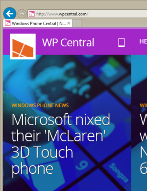
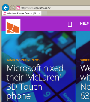
Also, when you mouse over the "WP Central" it disappears.
WP1.png
Before mouse over
WP2.png
After mouse over

W8.1u1 Pro, IE 11.0.9600.17207 (Easylist, EasyPrivacy tracking protection enabled)
 

trwrt

New member
Nov 19, 2012
141
0
0
Visit site
The "newest posts" link on the Forums drop-down takes me to a page that says "sorry, no matches". I have to then click on "today's posts" to see anything.
 

LuvMeSomeWP

New member
Apr 4, 2014
65
0
0
Visit site
I have serious beef with the new design elements introduced so far. Did you guys fire the designers? Because it looks like it was designed by someone who hates WindowsPhone and pulled a fast one on you guys. Seriously, looking at AndroidCentral, Crackberry and iMore - WPCentral definitely got the shortend of the fugly stick.

  1. Terrible colour combinations. That red and purply magenta thing is not working together, nor with the blue-ish scroller beneath it.
  2. The scroller looks like someone had fun in photoshop with the hue and saturation sliders. It's hard to read, and frankly an insult to good aesthetics.
  3. The scroller may make sense for someone on a touchscreen, swiping left and right to scroll. On a desktop with a mouse? Can you say carpal tunnel awkwardness? If you really want to have a horizontal scroller, and what appears to be a LONG one at that, put arrow controls on the ends for us *cough* old-school traditional mouse users. Yes, we still exist.
  4. That top header bar is fat. On a smaller screen, that sure wastes a lot of space. Makes it easier to touch for touch users I suppose.
  5. The placement of the ads. Especially the one right after the scroller. Sure I get you guys need ads. But they could be more tastefully placed. Feels like I've reached some shady site with a blurb of content that my search result was looking for, but the rest of the page is covered in ads...

I get you guys are trying to make a cohesive branding/umbrella design for all your sites, and appreciate the difficulty in making a design that appeals to everyone. I do like some of the changes, and agree an update to the design is needed. Hopefully Daniel pushing for user choosable WP colours comes through as that's a great idea, although the default colours and layout should be more aesthetically pleasing right off the bat.

It's just starting, but hoping for great improvements as the changes keep coming!
 
Nov 20, 2012
2,997
0
0
Visit site
I use the app 95% of the time so the changes dont bother me. The only thing I will say is that I do hope the color scheme changes a bit. I do like the way imore did their site. So perhaps something a little more similar but at the same time unique for wpc


Good work guys

Though I know you guys use Vbulletin software for all mobile nation sites, it would be awesome if you guys would use something modern like xenforo or ip board. Part of the reason I use the app the most is because Vbulletin makes the site feel meh

Overall love the design. Love when websites experiment and evolve their look!
 

Lumia Jack

New member
Nov 18, 2013
31
0
0
Visit site
I don't like the new design, the whole bar on top looks cobbled together and just looks like it doesn't belong with the rest of the site's layout.

I also have an issue on my 1520 when trying to view the site. My phone keeps being redirected to the mobile site m.wpcentral.com even though I have my settings set to force Desktop sites. There doesn't seem to be any links on the mobile site to force it back to desktop mode either. I hope you guys add one or fix the issue that's making the site ignore our phone's request for the desktop version. I personally find the mobile site is very unpleasant and unnecessary to use on my 1520.
 

AlastorX50

New member
Apr 23, 2014
124
0
0
Visit site
Like in my previous post

I really don't like it, WPCentral should go with a Modern UI, Androidcentral with the Material Design *cough* modern ui *cough*, iMore with the new Yosemite UI and Crackberry should stay the same as it.... well looks like the Blackberry OS, no change in design.

Edit: You might want to use this guy to design the website jay machalani
 
Last edited:

randomscandinavian

New member
Dec 1, 2012
186
0
0
Visit site
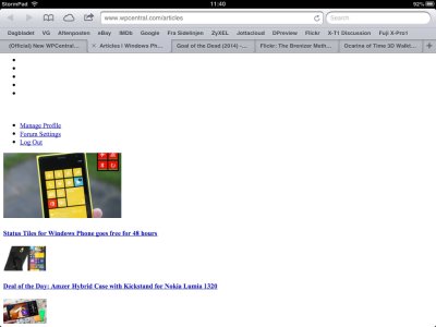
This is what the news page currently looks like in Safari on my iPad 2 with iOS6. The entire main site is like this with no CSS.. This started around a week ago, or maybe a little less. The forum looks fine, except for things like the word SHOP written on top of my face in the top corner. And the reply button above this thread doesn't work.

image.jpg
 

Guzzler3

New member
May 4, 2012
1,398
0
0
Visit site
General slowness lately on the main pages and forums. With IE 11, and Firefox 31. Also back button refresh with IE 11, horribly and some times stalls. I have to leave the site then come back
 

James Falconer

New member
Nov 1, 2012
1,891
0
0
Visit site
This is what the news page currently looks like in Safari on my iPad 2 with iOS6. The entire main site is like this with no CSS.. This started around a week ago, or maybe a little less. The forum looks fine, except for things like the word SHOP written on top of my face in the top corner. And the reply button above this thread doesn't work.

View attachment 73441

How long has this been going on for you!? Is it still an issue?

​Can you try clearing your cache, cookies, etc. and let me know if that helps resolve the problem?
 

Members online

Forum statistics

Threads
323,183
Messages
2,243,404
Members
428,036
Latest member
Tallgeeselll05