Hi! I didn't find any other thread for this, so I must assume that it does not happen to anyone else :grincry:
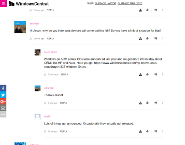
The comments in articles and editorials are almost flat: there seems to be only two-level hierarchy, comments and responses to them. It's bugging me with FireFox (with and without Ghostery) when it's not clear at all who is responding to what. Quick check with Chrome shows the same. Here is a small sample from https://www.windowscentral.com/windows-10-mobile-beta-test-almost-over-enter-windows-arm - I can't believe all (including Jason) are responding to Jason :wink:

In Android Central comments seem to behave well with 5 levels (could be more though). In (android) app the comments are even better: when the space for indentation runs out, > >> appear as visual aids.
The comments in articles and editorials are almost flat: there seems to be only two-level hierarchy, comments and responses to them. It's bugging me with FireFox (with and without Ghostery) when it's not clear at all who is responding to what. Quick check with Chrome shows the same. Here is a small sample from https://www.windowscentral.com/windows-10-mobile-beta-test-almost-over-enter-windows-arm - I can't believe all (including Jason) are responding to Jason :wink:

In Android Central comments seem to behave well with 5 levels (could be more though). In (android) app the comments are even better: when the space for indentation runs out, > >> appear as visual aids.


