- May 7, 2013
- 685
- 0
- 0
First of all this is not an insult to the people behind this website. I am sure you are working hard to improve it over time. I love all the news that comes from this website. But I can't help but notice that I am starting to avoid this website more and more due bad performance and bad design. I prefer using the app on my phone. I hope you do something with this feedback as I'm sure many people would agree with me. Down below my two biggest gripes with this website.
Performance
The site takes too long to load and it doesn't scroll smoothly. Before you ask, yes I do have fast hardware, all the latest software and I did already reset all IE11 settings and delete cache etc. Also updated mouse drivers and video drivers to latest versions. It is certainly the site that is not very well optimized.
Design
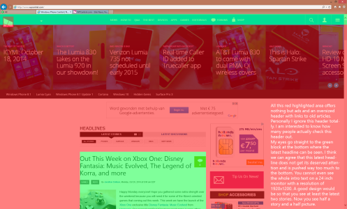
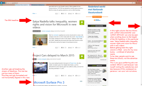
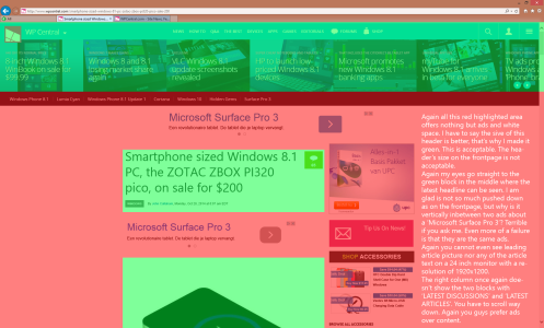
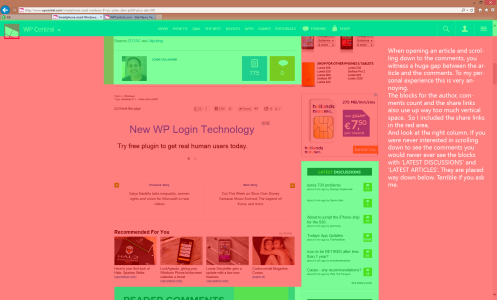
I will show you a series of 4 screenshots with descriptions in them that explain my biggest gripes.
All the red space is the space I totally ignore when scanning this website. All the green space is useful to me and my eyes go there. As you can see, there is too much red, and not enough green space.
Frontpage:
Further down the frontage:
Opening an article:
Further down the article:
Thank you for hearing me out.
Performance
The site takes too long to load and it doesn't scroll smoothly. Before you ask, yes I do have fast hardware, all the latest software and I did already reset all IE11 settings and delete cache etc. Also updated mouse drivers and video drivers to latest versions. It is certainly the site that is not very well optimized.
Design
I will show you a series of 4 screenshots with descriptions in them that explain my biggest gripes.
All the red space is the space I totally ignore when scanning this website. All the green space is useful to me and my eyes go there. As you can see, there is too much red, and not enough green space.
Frontpage:

Further down the frontage:

Opening an article:

Further down the article:

Thank you for hearing me out.

