- Aug 3, 2014
- 2,419
- 16
- 38
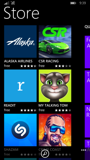
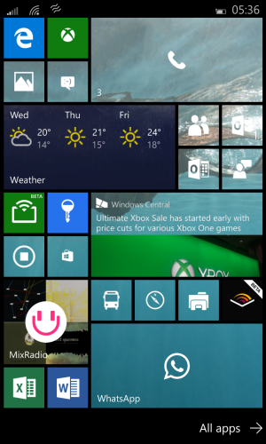
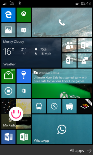
Below are my thoughts on Windows 10 Mobile as of right now. Included are screenshots from Windows 10 Mobile Build 10149 (running on a Nokia Lumia 520). I'll add a few more later and also screenshots of Windows Phone 8.1 to compare. Also included is the current feedback I've given to Microsoft.
When the Windows 10 Mobile Insider Preview was first announced, I held off because I didn't think I cared enough to deal with potential bugs and glitches. However, when Build 10136 was released, I started considering it. Finally I decided to whip out my trusty, reliable Nokia Lumia 520 and install the Windows 10 Mobile Insider Preview onto it. I played with Build 10136 for a few hours before everything went wrong (I made the mistake of hard resetting before the phone had finished migrating data...a major bug still present in Build 10149) and I had to rollback to Windows Phone 8.1. Ironically, Build 10149 was released literally right as Build 10136 just broke. I jumped onto Build 10149 as soon as my Lumia 520 was ready, and everything with it went smooth as silk. I've been playing with Build 10149 nonstop since then, and I have a lot of thoughts.
Performance:
First off is performance. It seems to me that Windows 10 Mobile has potential to be more efficient and slick than Windows Phone ever was, but it's not quite there yet. In some places, Windows 10 Mobile runs much smoother on my relatively underpowered Lumia 520 than Windows Phone 8.1 did, but in the simple things Windows 10 Mobile stumbles spectacularly and face plants in a pile of mud. The most obvious example that I've found is rearranging the Live Tiles on the Start Screen. General navigation tends to be pretty smooth, but when attempting to organize the Start Screen the animations and tiles are fantastically jagged and you often have to wait long, long moments before you even know where the tile is in the first place. Either this is a clear example of where Windows 10 Mobile hasn't been optimized even slightly, where Microsoft has taken a step backwards in how you organize the tiles, or perhaps a mixture of both. In other places, Windows 10 Mobile seems to load the small apps faster, but takes longer on the large apps. It means Windows Phone 8.1 is more consistent with how long it takes to load an app, but hopefully over time that'll change. In addition, applications (even default apps) crash randomly and sometimes just freeze completely. I've also noticed that Windows 10 Mobile isn't as adept at thermal management or battery performance compared to Windows Phone 8.1. My Lumia 520 tends to get quite hot during basic usage, and battery life (which was already failing due to old age) has taken a massive hit even when just sitting idle. Clearly (or rather hopefully) these are culprits of a technical preview not yet optimized, but they're still worth mentioning. My verdict? Windows 10 Mobile is a few rather large steps behind Windows Phone 8.1, but it looks to be catching up. Below this is a little section filled with a couple of specific bugs I've found. There's way more but I can't be asked to sit here for twenty minutes and think of them. What that means basically is that although the bugs are numerous, none of them are game breaking on their own.
Feedback:
1. The address bar in Edge occasionally jumps to the center of the screen and freezes there, along with the rest of the app.
2. The icons on the Start Screen flicker often.
3. OneDrive won't start (it just crashes repeatedly after trying to sign in).
4. The list in All Apps take a second to load.
5. The Lock Screen takes way longer than it should to display time and such.
Next I'm going to talk about different parts of the operating system, such as the Lock Screen, Action Center, Start Screen, and Settings.
Lock Screen:
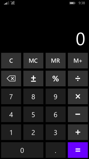
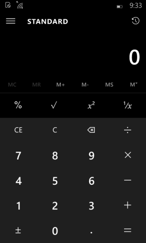
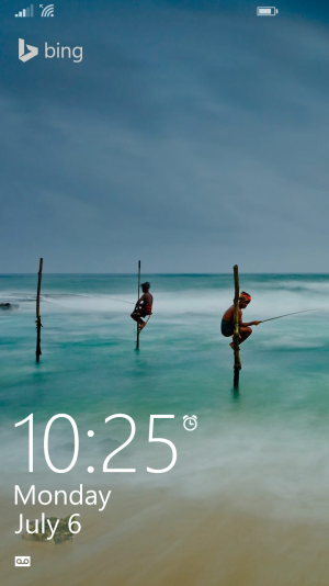
The only thing I've really noticed about the Lock Screen is a smaller, more center font and a keypad that has taken both a step forward and a step backward and has ended up in the same place. Although the font on the Windows 10 Mobile looks neater, and I quite like the way the date is presented now (a small but refreshing touch), I see no reason to make it smaller. This theme is reflected throughout Windows 10 Mobile, little places where Microsoft did nothing but make something smaller. It's as if they're trying to give the illusion of compactness without fully understanding what it means. As for the PIN-lock, I simply adore how it now slides over the Lock Screen background instead of shoving it out of the way. It looks wonderful, and gets rid of slightly skewed animations. However, it's not all good news. As is present in the rest of the OS, there's no longer a divide between numbers on keypads (like in the calculator), which is horrid in my opinion. There has to be some form of line (maybe not quite as defined) between numbers on all the keypads. Other than that, the Lock Screen really hasn't changed very much. Below I'm writing down all the feedback I've given to Microsoft about the Lock Screen.
Feedback:
1. Increase the size of the font.
2. Place some form of divide between numbers on the keypad.
3. Give us an option for aero transparency for the keypad.
4. Allow us to add full music controls to the top of the Lock Screen arrayed as such:
Song title
Artist
Progress bar
Repeat-Previous-Play/Pause-Skip-Shuffle
5. Allow us to add weather information to the center of the Lock Screen.
6. Give us the ability to add one or two Quick Launch buttons for our favorite apps to the bottom right of the Lock Screen (Camera, OneNote, Messaging, etc.).
7. Make the Quick Status icons more interactive. We choose a default Detailed Status, and every time we go to the Lock Screen it's the first one portrayed. However, if we press another Quick Status icon, we then get a Detailed Status of whatever it is. Next time we go back to the Lock Screen, it's back to the default Detailed Status. This could be completely turned off or customized.
Start Screen:
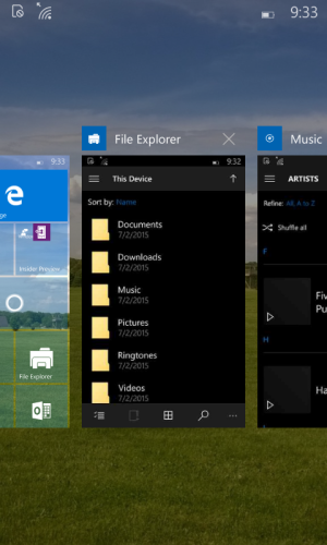
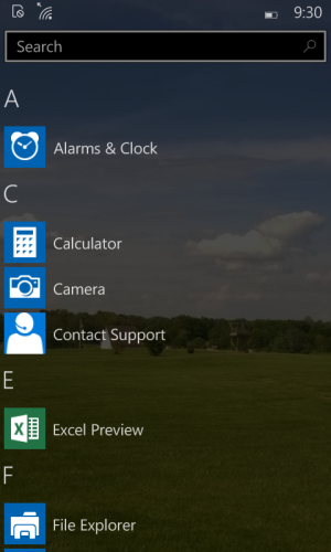
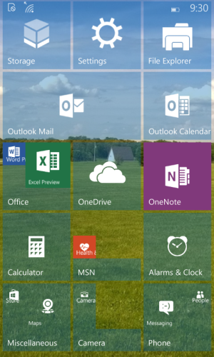
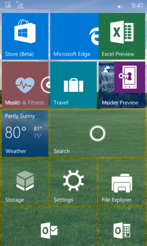
I'm a huge fan of the new Start Screen. Another option for how it looks is great, and when done right it looks great too. It just makes your Start Screen seem more alive. I'm definitely a fan. However, not everything is all fine and dandy. Tile sizes. I know it's not any different than Windows Phone 8.1 as of right now, but it should be. I see no reason we can't have 2x2 and 1x2 (large and tall) tiles for every single Microsoft app and any app where the developer supported those sizes. Next is the Live Folders. I'm glad they're there, but they face the same issue as the keypads, and that's the lack of any sort of divide. They look chaotic because of this. Also, sometimes there's just gaps in the Live Folder itself which looks extremely odd and not at all good. The Live Folders are a definite step back from the Live Folders in Windows Phone 8.1 (however, the thick gray bars being replaced by subtle white lines is a nice touch). Where Microsoft really made me happy was the addition of 24 new accent colors (one of which I'm using on my Lumia 520) and a transparency slider so we can decide just how see through our Start Screen is. Over all, the Start Screen is a step forward from Windows Phone 8.1, but it's not quite there yet. The Live Folders still need some work, as does tile sizes, rearranging tiles, and overall performance. The All Apps page is also an improvement for the most part, but it's not perfect. How your background picture carries over is great, but the effect Microsoft has placed over it depending on your theme color is just a tad too much. The effect of darkening makes it a tad abrupt to return to the Start Screen and the lighten effect almost looks like an Instagram filter. The Search bar is a great addition, one that I wholeheartedly approve of. The navigational menu reached by pressing a letter or number isn't quite perfect however, as it feels cramped and there's no divide between letters (just a thin grey line would do, Microsoft). The jump menus are also too thin, which is a theme found all over the OS. Microsoft, make use of screen real estate, please. Search bars and jump menus aren't terrible, but they're not great either. Just a tiny bit wider and I'd be perfectly happy with them. The Multitasking menu is another place where it's a visual improvement over Windows Phone 8.1, but hasn't quite reached "functional improvement" status yet. The most glaring flaw by far is how it handles landscape and portrait orientated apps. Great idea, not implemented well at all. I like how it remembers what apps are orientated in landscape and which are orientated in portrait, but it creates a gap in functionality between dismissing these two orientated apps. Microsoft, if I have a landscape orientated app, and I go into the Multitasking menu in portrait orientation, rearrange the title and "Dismiss" button in portrait, but keep the app in landscape. That simple. I'm sure I've forgotten some things about the Start Screen, as it's a pretty big part of the OS (obviously). If I remember any more I'll come back and edit it in along with any more feedback.
Feedback:
1. Give us all the tile sizes (small, medium, wide, large, tall) for all Microsoft apps and any apps where the developer supports it.
2. Give us the option to make all Microsoft apps transparent (like OneNote).
3. Divide the apps in the Live Folders more effectively.
4. Get rid of the strange, ugly gaps that Live Folders sometimes give.
5. Make the Settings icon on the Live Tile match the Settings icons throughout the OS.
6. Improve performance.
7. Give us more control over how often Live Tiles update and what they tell us.
8. Give us interactive Live Tiles.
9. Dial down the effects on the All Apps page just a tad.
10. Make the navigational menu a little wider.
11. Add a thin divide between letters on the navigational menu.
12. Increase the width of jump menus and search bars.
13. Improve the Multitasking menu and how you dismiss apps in different orientation.
14. Add a "Clear All" button in the Multitasking menu.
Action Center:
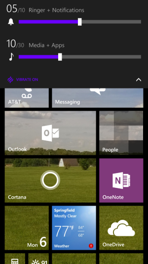
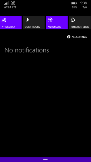
The Action Center was a fantastic addition to Windows Phone, but it still needed a lot of work. The short, wide Quick Actions looked a little awkward, and the Action Center itself was still a little iffy on the navigational front. Windows 10 Mobile takes a large step forward in improving the Action Center, even if it could still use a lot of improvements. The addition of more Quick Actions is a good one, but gestures could use more work, and it still looks a little awkward. Also, it seems oddly against the Windows credo to give us all those squares and not let us customize them. Notifications are massively improved, but they could still be more interactive. Additionally, the Action Center is another place where we see a smaller font. To put it in fewer words, the Action Center in Windows 10 Mobile is a massive improvement over Windows Phone 8.1, but it still has a long ways to go. I'm also talking about Volume Controls here as well, since I view them as the same general area of the OS (drop down menus). Volume Controls aren't great in Windows 10 Mobile. They look awkward, and the sliders are not at all good. I give them a thumb down.
Feedback:
1. Aero transparency. This is a big one, and one a lot of users want. I have a good feeling about getting this one before Windows 10 Mobile is released. It would give us these options:
Opaque theme-this is what we have now, either black or white.
Aero theme-this would add a transparent, blurred effect with our theme color.
Aero accent-this would add a transparent, blurred effect with our accent color.
2. Make the Quick Actions just a few pixels wider. They look less awkward than the wide rectangles of Windows Phone 8.1 but still look a little awkward as big, chunky squares.
3. Allow us to rearrange our Quick Actions, and move them around as we wish.
4. Let us customize what Quick Launch buttons are visible in the Action Center.
5. Move "All Settings" from a Quick Action to a permanent addition below the Quick Actions and center. To the left of "Expand/Collapse" and to the right of "Clear All."
6. Improve gestures. They're better than Windows Phone 8.1 but not quite there yet. We can swipe down to expand the Quick Actions, but it doesn't always work and we can't swipe up to collapse again.
7. Bring back the feedback we received when we closed the Action Center. The little bar at the bottom lit up when we pressed on it. It's a little thing but the little details are what make an operating system beautiful.
8. More interactive notifications. Let us answer text messages without opening the Messaging app, etc.
9. Now I'm not one hundred percent certain this isn't already a thing, so forgive me if it is. Allow us to dismiss a single notification at a time. Not just all notifications under "Messaging" but a single text message. If we swipe from "Messaging" we clear all under "Messaging," but if we swipe from one text we only clear that text.
10. Change the brightness toggle to a brightness slider that would look the same as the transparency slider in Settings and would sit below the Quick Actions.
11. Change the volume sliders in Volume Controls to the same slider as the transparency slider in Settings. It looks way nicer than the clunky, archaic slider we have now in Volume Controls.
12. Better gesture support for Volume Controls.
13. Either move the expand/collapse arrow to always sit below the volume controls or to always sit above. I'd like it more if the arrow always sat above the volume sliders, so it never moved. Having it jump around like it does not just requires unnecessary movement.
14. Sometimes the Action Center appears behind the keyboard or navigation bar. Fix it, haha.
Settings:
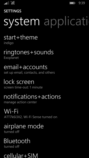
Here is one place that Microsoft has just about gotten perfect. I love the new Settings, they're such a massive improvement over Windows Phone 8.1's chaotic and confusing Settings. They look good, they're organized, they're slick. The only things I have to say about Windows 10 Mobile's Settings is about the "Extras" page and my idea for a unified Settings page.
Feedback:
1. Make the "Extras" page match the rest of Settings. It's endlessly frustrating how it deviates from the rest of Settings, it's such a glaring flaw.
2. Add a "Universal Settings" function where all the settings for all Microsoft apps (and possibly apps where the developer supports it) are collaborated into the Settings menu, where we can change any of them. This would be incredibly useful and a massive step up from any other OS out there, being able to edit the settings of all our apps from the main Settings page. Universal Settings.
General:
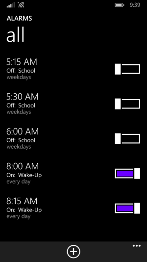
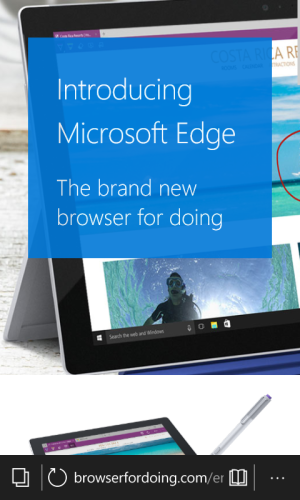
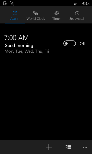
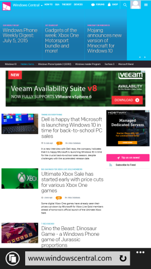
I've gotten to the point where it's difficult to decide what to talk about next, so I'm just grouping everything else (apps, store, etc.) into this section. It'll also be where I'll add more stuff if I remember it. I'm 100% certain I've forgotten at least one thing or one piece of feedback (probably more like thirty) as well, so please forgive me. Anyways, I'm not certain what I think about the new Universal Apps. I'm a huge fan of the design, but at the same time I don't know if it was the right way to go. Is it really where Microsoft wants to take it's "unified and cohesive OS?" Instead of going it's own, unique route Microsoft has gone the way of Hamburger menus. I'm okay with Hamburger menus, but I don't think it was the BEST decision. Just not the worse. I do love the new use of shading, the new icons (with the exception of Music...ew), and the new, fuller look. It just needs work. The Music apps looks great, but is it an improvement over the old Music app? I don't know yet. That's the biggest problem I have with the new app design, is that I don't know if it's better. In some cases, it's not as fast. It looks like Microsoft has taken a step forward in UI design, but a step backwards in functionality. I just hope Microsoft finds that functionality again. When the new apps looks nicer and are faster to move around it, I'll be happy. Right now I'm...neutral. They're not bad or good. The new Store app is definitely an improvement, but neither is that perfect. Again, it's not UI design but functionality. Microsoft Edge looks and feels really nice, but it feels a little short on features and...functionality. The new Outlook apps look great but they're short on a few features and...functionality. It's a consistent theme and I'm pretty sure it's not the consistency Microsoft was going after. The design itself is both the best part and the worst part of Windows 10 Mobile. It shows such potential for the perfect blend of beauty and functionality, but it's not there yet. Microsoft needs to step up their game in this department. For the most part, I like the new apps. Calculator is way better (except for the keypad...), as is Alarms, and Phone (mostly). They just all need more work. This is where Windows 10 Mobile feels most unfinished (hopefully because it is unfinished). The feedback below here will be way less focused and more everything in general. It's where I'm guaranteed to have forgotten some. I probably have about two hundred pieces of feedback, but I've only put down what you see here. I'll keep adding to this list.
Feedback:
1. Let us move through different pages by swiping again, like in Phone or Alarms.
2. Add the ability to convert currency in the Calculator.
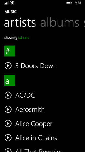
3. The Settings in Music is hidden next to Sign In, and gives us nearly no control over anything in the Music app. Move it to it's own slot and actually give us some power, especially the next feedback.
4. Add a "Refresh Library" button in Music! Windows Phone 8.1 is horrible with microSD cards because it never refreshes and there's no way to do it manually. I want to be able to force the Music app to update all it's information manually.
5. In the Store (Beta) app, make it so that when you press back from an app it doesn't go back to the first menu but to the "Show All" menu. It just adds another frustrating button press and it's annoyed me constantly.
6. The keyboard needs serious work. Autocorrect is far worse than in either Android and iOS and it's...the keyboard isn't all that good. Typing is better than most Android keyboards and the iOS keyboard, but when you make a mistake it gets frustrating. Or how it insists on constantly correcting "it" to "I." No phone, that's not what I wanted.
7. Allow us to access our dictionary and manually edit it by removing or adding words to it. Most of the words I've added to my dictionary were on accident and now misspelled words aren't corrected.
8. Some boxes throughout the OS have strange bars running through them (like in Storage Sense) that look horrible. Please fix those.
9. The menu in Alarms is beautiful, but too cramped. It should use it's space a little better.
10. This is me just nitpicking. The Battery Saver tile has the "s" lower cased and although it's okay in the Settings app it's not okay on my Start Screen. I can't even explain why. It just bugs me to hell. I've removed it from my Start Screen because of it.
11. There's no option to remove your PIN altogether instead of just changing. Add it please.
12. Some buttons/numbers/letters like in Calculator don't light up in your accent color. It seems against Windows credo. Things that are activated light up in your accent color when activated. Why is the calculator different?
13. Pressing the Start button doesn't actually return you to the top of the Start Screen, just very nearly the top.
14. In the Music app, the music controls are aligned too far to the left, leaving an ugly space on the far right. Just center them.
15. In the Store (Beta), there should be a filter for only Universal Apps.
16. Folders in the File Explorer look garish and out of place. The File Explorer is a great addition but it doesn't look quite right.
17. When you select a photo for the Start Screen or Lock Screen it should tell you if you don't have pictures. A little touch, but still important.
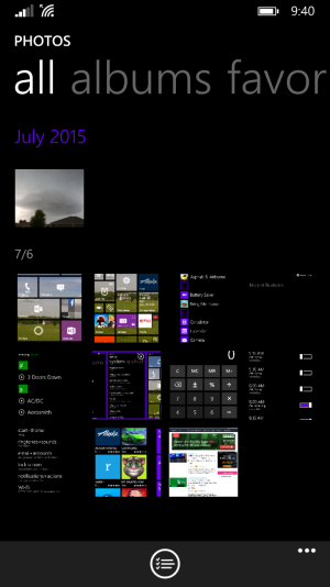
18. The Photos app doesn't refresh when you take or save a picture. It refreshes when you open the app. This feels really slow.
19. The battery icon is too small.
20. Add a "Stop" button to the Music app. Seriously, Microsoft, just a "Stop" button.
21. The pill toggles could look better. Make the circles within the pill toggles just a little bigger. As it is, it looks empty and honestly awkward.
To conclude, Windows 10 Mobile has a lot of...potential. That's what it has the most of. It's not quite there on performance, or efficiency, or UI consistency. The biggest gap is functionality. However, on every single one of these fronts it has the potential to be far greater than Windows Phone 8.1 ever was.
Trust me when I say there's way more, I've just been writing non stop and I'm starving so I'm a little brain dead now. I'll try and remember to add more later on. Below I'm putting all the screen shots. Or I'm going to try to. I don't think I've actually ever worked with pictures on this website so it may not go well. I can't post two of the Windows 10 Mobile screenshots (Calculator and Alarms) or any of the Windows Phone 8.1 screenshots (for comparison) so I'll add those later.
Attachments
-
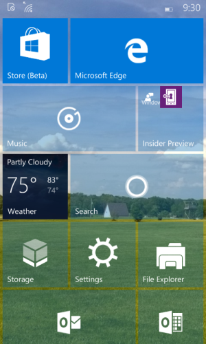 Windows 10 Mobile Start Screen.png416.5 KB · Views: 14
 -
![Windows 10 Mobile Settings [2].png](https://windowscentral-data.community.forum/attachments/71/71064-340f96c10e36471088416f2f4cc25ca3.jpg?hash=NA-WwQ42Rx) Windows 10 Mobile Settings [2].png32.3 KB · Views: 24
Windows 10 Mobile Settings [2].png32.3 KB · Views: 24 -
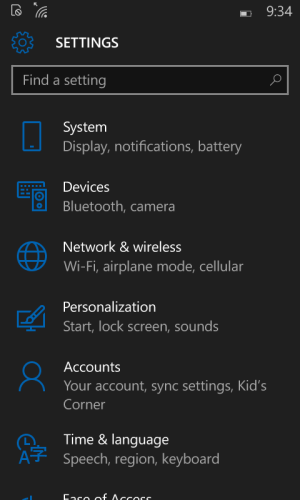 Windows 10 Mobile Settings.png65.6 KB · Views: 14
 -
![Windows 10 Mobile Action Center [2].png](https://windowscentral-data.community.forum/attachments/71/71043-d31b963b44b8ce0939140407ea94ceca.jpg?hash=0xuWO0S4zg) Windows 10 Mobile Action Center [2].png49.8 KB · Views: 24
Windows 10 Mobile Action Center [2].png49.8 KB · Views: 24 -
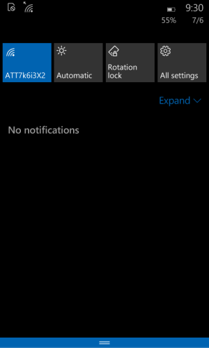 Windows 10 Mobile Action Center.png29.2 KB · Views: 14
 -
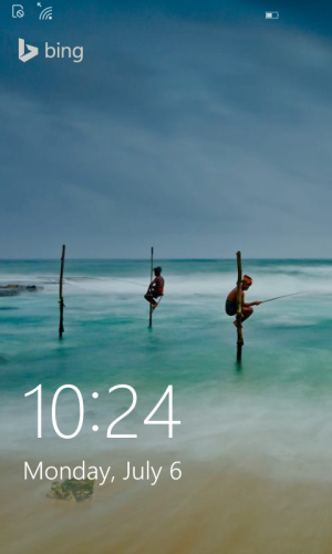 Windows 10 Mobile Lock Screen.png320.1 KB · Views: 14
 -
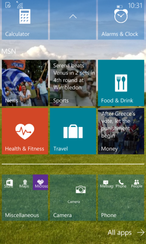 Windows 10 Mobile Live Folder.png524.2 KB · Views: 14
 -
 Windows 10 Mobile Multitasking.png365.7 KB · Views: 14
 -
 Windows 10 Mobile All Apps.png338.4 KB · Views: 14
 -
 Windows 10 Mobile Start Screen (2).png498.5 KB · Views: 14
 -
 Windows 10 Mobile Microsoft Edge.png326.3 KB · Views: 15
 -
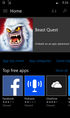 Windows 10 Mobile Store (Beta).png159.5 KB · Views: 14
 -
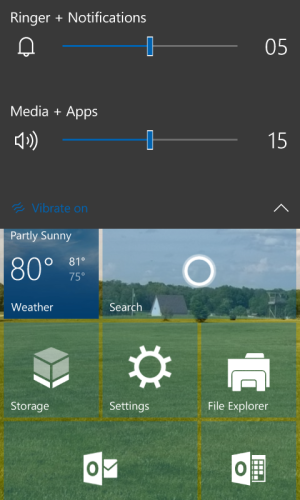 Windows 10 Mobile Volume.png311.6 KB · Views: 15
 -
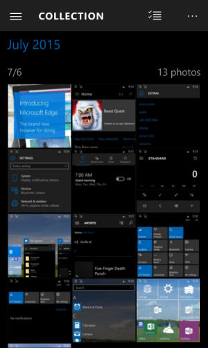 Windows 10 Mobile Photos.png267.4 KB · Views: 14
 -
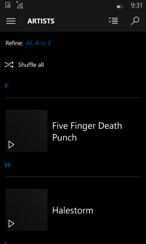 Windows 10 Mobile Music.png31.9 KB · Views: 14
Last edited:

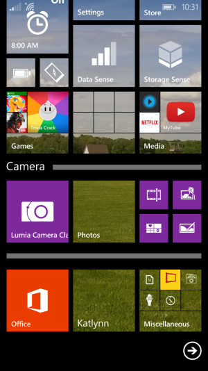
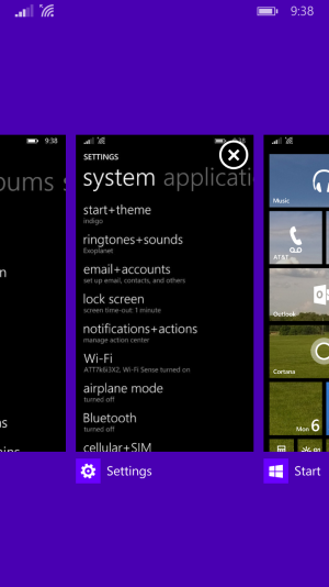
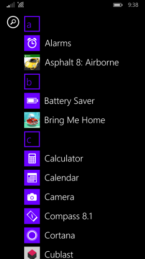
![Windows Phone 8.1 Start Screen [2].png](https://windowscentral-data.community.forum/attachments/71/71030-528a80462e8460bc62eaa9fa8587b865.jpg?hash=UoqARi6EYL)
![Windows Phone 8.1 Start Screen [1].png](https://windowscentral-data.community.forum/attachments/71/71025-219bc70a6a66db34fbc71dc7782eec89.jpg?hash=IZvHCmpm2z)
