What is the biggest flaw of Windows 10, you might ask.
In my opinion it's Microsoft all or nothing approach.
If you disagree, please share your thoughts as it's an open forum or if you have any ideas, share them too!
I'll explain, some of you may recall watching one of the Windows Central podcasts where Daniel Rubino confirms that the telemetry data shows Tile usage in the start menu is very, very. very low.
Now, there is a simple reason for that.
The tiles are now buried within an interaction method as opposed to being just there a classic case of Microsoft's approach of all or nothing approach.
1) You have to click the start button or press the windows button to launch the start menu to see your life tiles.
2) You can have live tiles at visible at a glance constantly (tablet mode) but that means you lose your desktop and the it's actually a inefficient method of interaction of a non touch display (I'll explain shortly). So the bigger the display, the greater the inefficiency as you have spend longer dragging the mouse towards a tile to launch it.
On a touch screen you can reach and tap the tile.
So I have a "40 inch TV that I use as a monitor, due to the use of the grid locking mechanism of the tiles i would have to go the top left hand corner to launch it.
In this scenario (a common) one for me - click on the notification centre icon on the system tray to launch it.
I have most frequently used application on the task bar, so I can slide my mouse across as it's more efficient.
However If I had my start screen full screen and had to launch an application this happens.
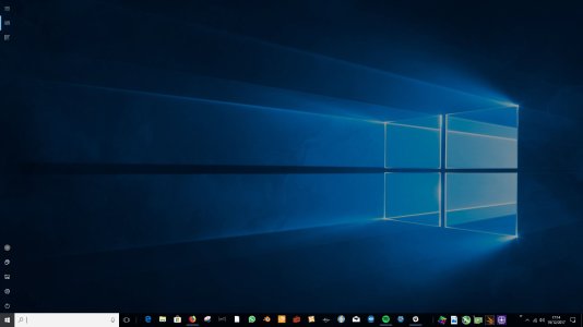
The app list is the very top left hand corner and it will take me a few more seconds then if If had my start screen set like this:
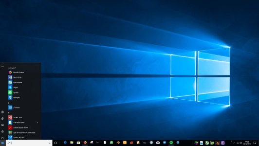
You may say big deal, but if you are an older user who is not techsavy it may take you longer than someone who is tech savy. Case in point, a few years ago I was being assessed for a work role and I was asked to demonstrate how I would prioritise my work flow and my desk. It took my assessor who was not tech savy a little longer to replicate what I did.
In addition through teaching others how to use a PC / Laptop I used my PC as teaching environment because if they can navigate on a large 40" screen then it would easier for them to navigate on a smaller screen.
People often remarked they found navigating the large 40" display tiresome.
Now we get to the heart of the matter.
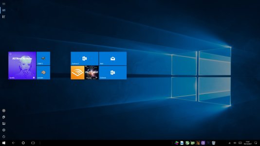
This is tablet mode on a 40" TV Screen.
From the top to first tile, there is enough space to pin 4 small tiles but you cannot pin 4 tiles as you are confined to the middle layer. Nor can you pin an tile between two the small tiles next to the large spotify tile and the mail wide tile and the small audible tile as that is a tile group boundary.
Now I want to use live tiles but it means:
1) I lose my custom taskbar with pinned applications except my custom toolbar unless I enable "show app icons". Which many users don't know about. But that exposes a flaw how the snipping tool is handled as you can't use window mode, rectangle mode and full screen mode with crashing back to the start screen and even then this occurs.
Snipping tool flaw:
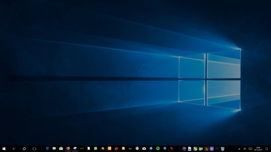
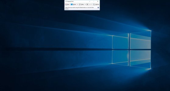
As you can see if you are quick enough you can get the snipping tool actually capture itself capturing the screen - albeit just the background. Sometimes instead of crashing you can take a screen grab including the task bar. But good luck with that, you have to pretty damn quick. (Yes, this is being abit overly pedantic but that's just me and my habits from testing CRMs and applicaitions. You notice all the little things... so if you're looking for work, stay away from testing applications. You'll have less agro to worry about :grin .
.
2) I have to use the applist icon to open up the app list where sometimes pressing esc doesn't work
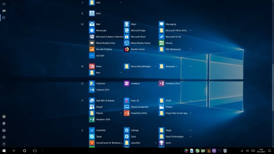
3) I have lost access to my desktop
4) I lose the ability to minimise the browser
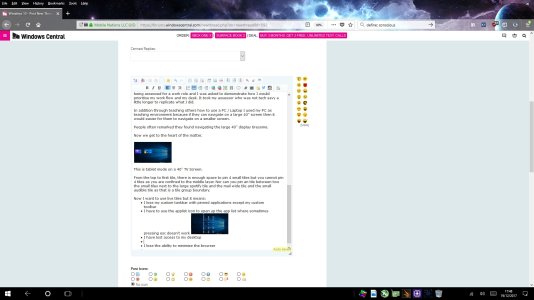
Unless I click the back button, where sometimes I cannot cycle back between the browser and desktop using the back button. So I need to click the task view button.
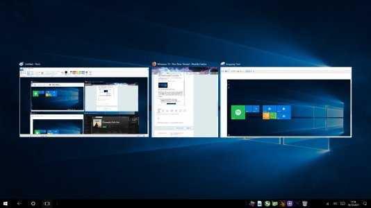
You can however minimise win32 applications.
View attachment 138382
5) I lose the ability to close an application opened in a virtual desktop as you cannot open a virtual desktop in tablet mode which is understandable as you wouldn't use tiny icons on a tablet. But to have live tiles enabled permanently as opposed to toggling back and forth by opening the start menu to see your live tiles you have to use tablet mode.
6) I lose the ability to snap applications into grids.
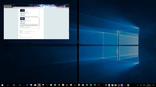
These just a few notables but they are all ecompassed under the biggest flaw with Windows 10 - Microsoft's all or nothing approach.
I want to lose live tiles, I really do but as a pro user I lose all the basic functionality that I use on a daily basis.
Now the simplest solution to all my above issues - don't use tablet mode BUT that means I cannot use live tiles to glance at information.
Solution:
The solution to this to enable users to pin tiles anywhere on the desktop and enable users to actually detach the tile portion of the start menu and pin it where ever they want.
So we would have something like this, where we have icons and pinned tiles:
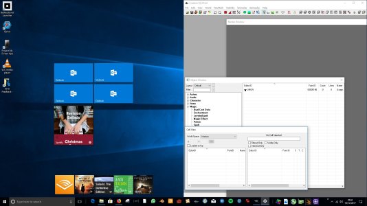
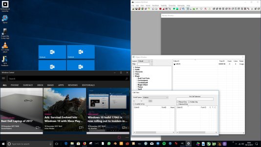
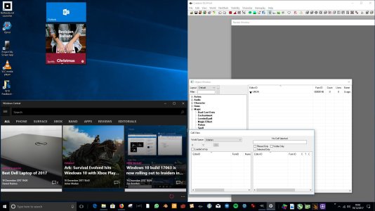
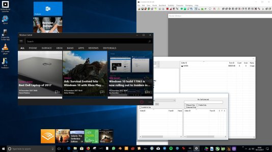
With virtual desktops we can have one desktop just for multimedia or social media use etc.
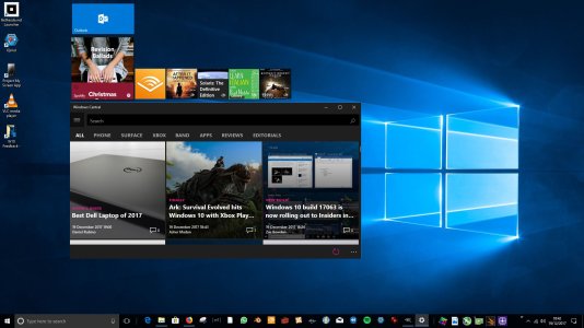
As you can see there is so much more flexibility with this approach as opposed to the all or nothing approach. The Mock ups are just the simplified form of how I work day to day, I have a virtual desktop just for virtual machines, one for my assignments, another for work and another for general web browsing.
With the pinned start menu approach, it doesn't offer that much flexibility by itself but it's better to have an option as it's the lazy approach and some just like the simple one click method. However with the combined approach...
This doesn't mean you can't extend
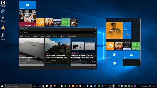
You have greater control and flexibility over your work flow.
In essence the detached tile portion of the start menu acts as a self contained window for your live tiles, therefore enabling you simple drag and drop tiles to your desktop or back on to the detached start menu or allow you to simply replicate the tile. To prevent a user getting confused a simple indicator at the bottom can show how many instances are pinned and which desktop(s). These will be customisable options via settings to allow the user to minimise visual clutter.
Over all this will result in a greater useage of live tiles.
In addition allowing users to replicate the tile allows for greater flexibility as for instance as heavy outlook.com user I can have all my emails pinned to the desktop on virtual desktop. I don't want to be in a scenario pinning all my email tiles in that desktop removed my pinned work email tile in my work virtual desktop.
I'm aware by allowing multiple instances of the detached portion of the tiles can result in more time debugging and more code. However at the cost of productivity, I would choose productivity and user efficiency over time saving during development.
Additionally when opening a new virtual desktop, you can have two use case scenarios. You have one case where opening an empty virtual desktop creates just that an empty slate, which means the user has to open the start menu, detach the tile portion and drag it where ever they want, in my view this inefficient - abhorrent interaction method as it's not intuitive either.
Or You have the start menu overlayed where it was last positioned in the previous virtual desktop. This is much more efficient and intuitive.
To prevent the tile portion moving you can have two global settings (on and off) - one snap and place in each individual virtual desktop (on) or reflect postion across each virtual desktop (off).
Conclusion:
Tablet mode needs a tonne of work, I understand why it's been left to the wayside - based on telemetry people are not using lives tiles as much. But basing design fundamentals on telemetry is the most flawed, naive and moronic approach. Case in point the dedicated bing button on smartphones devolved into a glorified QR scanner because that's what most people were doing with the scanning function and small percent were using it scan barcodes of products and books. Thus these users are now neglected and have lost use of function that they paid money to use by buying the product.
Plus it doesn't take into consideration all of the above variables involved as well as user emotion. That cannot be quanitified let alone collected without serious breach of individual space and privacy. As you would need to analyze a tonne of emotional data, facial data, speech patterns, contextual data through always on microphones, front facing cameras and geofencings through GPS usage
Therefore you will never the complete picture using the telemetry and data analytical approach.
You cannot simply say oh people don't use live tiles so we won't focus on them, when the interaction method is fundamentally flawed. Therefore your telemetry data is flawed and any design principles derived from that said data will be have very basic flaws.
As it doesn't take into account user engagement through muscle memory / habits -windows 95 to windows 7 - where the primary interaction method was the start menu for most people when it came to launching applications.
Because if that was taken into account, the very notion of clicking on the start menu or pressing the windows key to "glance" at information falls flat on the moronic idea pile.
As it simply does not work.
Ergo (in laymens ending) up with data that well is simply stupid.
TLDR, the biggest flaw in Windows 10 is the under utilisation of live tiles as they are buried within the start menu when there is a much better solution.
If anyone has any better ideas, please feel free to share your thoughts.
In my opinion it's Microsoft all or nothing approach.
If you disagree, please share your thoughts as it's an open forum or if you have any ideas, share them too!
I'll explain, some of you may recall watching one of the Windows Central podcasts where Daniel Rubino confirms that the telemetry data shows Tile usage in the start menu is very, very. very low.
Now, there is a simple reason for that.
The tiles are now buried within an interaction method as opposed to being just there a classic case of Microsoft's approach of all or nothing approach.
1) You have to click the start button or press the windows button to launch the start menu to see your life tiles.
2) You can have live tiles at visible at a glance constantly (tablet mode) but that means you lose your desktop and the it's actually a inefficient method of interaction of a non touch display (I'll explain shortly). So the bigger the display, the greater the inefficiency as you have spend longer dragging the mouse towards a tile to launch it.
On a touch screen you can reach and tap the tile.
So I have a "40 inch TV that I use as a monitor, due to the use of the grid locking mechanism of the tiles i would have to go the top left hand corner to launch it.
In this scenario (a common) one for me - click on the notification centre icon on the system tray to launch it.
I have most frequently used application on the task bar, so I can slide my mouse across as it's more efficient.
However If I had my start screen full screen and had to launch an application this happens.

The app list is the very top left hand corner and it will take me a few more seconds then if If had my start screen set like this:

You may say big deal, but if you are an older user who is not techsavy it may take you longer than someone who is tech savy. Case in point, a few years ago I was being assessed for a work role and I was asked to demonstrate how I would prioritise my work flow and my desk. It took my assessor who was not tech savy a little longer to replicate what I did.
In addition through teaching others how to use a PC / Laptop I used my PC as teaching environment because if they can navigate on a large 40" screen then it would easier for them to navigate on a smaller screen.
People often remarked they found navigating the large 40" display tiresome.
Now we get to the heart of the matter.

This is tablet mode on a 40" TV Screen.
From the top to first tile, there is enough space to pin 4 small tiles but you cannot pin 4 tiles as you are confined to the middle layer. Nor can you pin an tile between two the small tiles next to the large spotify tile and the mail wide tile and the small audible tile as that is a tile group boundary.
Now I want to use live tiles but it means:
1) I lose my custom taskbar with pinned applications except my custom toolbar unless I enable "show app icons". Which many users don't know about. But that exposes a flaw how the snipping tool is handled as you can't use window mode, rectangle mode and full screen mode with crashing back to the start screen and even then this occurs.
Snipping tool flaw:


As you can see if you are quick enough you can get the snipping tool actually capture itself capturing the screen - albeit just the background. Sometimes instead of crashing you can take a screen grab including the task bar. But good luck with that, you have to pretty damn quick. (Yes, this is being abit overly pedantic but that's just me and my habits from testing CRMs and applicaitions. You notice all the little things... so if you're looking for work, stay away from testing applications. You'll have less agro to worry about :grin
2) I have to use the applist icon to open up the app list where sometimes pressing esc doesn't work

3) I have lost access to my desktop
4) I lose the ability to minimise the browser

Unless I click the back button, where sometimes I cannot cycle back between the browser and desktop using the back button. So I need to click the task view button.

You can however minimise win32 applications.
View attachment 138382
5) I lose the ability to close an application opened in a virtual desktop as you cannot open a virtual desktop in tablet mode which is understandable as you wouldn't use tiny icons on a tablet. But to have live tiles enabled permanently as opposed to toggling back and forth by opening the start menu to see your live tiles you have to use tablet mode.
6) I lose the ability to snap applications into grids.

These just a few notables but they are all ecompassed under the biggest flaw with Windows 10 - Microsoft's all or nothing approach.
I want to lose live tiles, I really do but as a pro user I lose all the basic functionality that I use on a daily basis.
Now the simplest solution to all my above issues - don't use tablet mode BUT that means I cannot use live tiles to glance at information.
Solution:
The solution to this to enable users to pin tiles anywhere on the desktop and enable users to actually detach the tile portion of the start menu and pin it where ever they want.
So we would have something like this, where we have icons and pinned tiles:


With virtual desktops we can have one desktop just for multimedia or social media use etc.

As you can see there is so much more flexibility with this approach as opposed to the all or nothing approach. The Mock ups are just the simplified form of how I work day to day, I have a virtual desktop just for virtual machines, one for my assignments, another for work and another for general web browsing.
With the pinned start menu approach, it doesn't offer that much flexibility by itself but it's better to have an option as it's the lazy approach and some just like the simple one click method. However with the combined approach...
This doesn't mean you can't extend

You have greater control and flexibility over your work flow.
In essence the detached tile portion of the start menu acts as a self contained window for your live tiles, therefore enabling you simple drag and drop tiles to your desktop or back on to the detached start menu or allow you to simply replicate the tile. To prevent a user getting confused a simple indicator at the bottom can show how many instances are pinned and which desktop(s). These will be customisable options via settings to allow the user to minimise visual clutter.
Over all this will result in a greater useage of live tiles.
In addition allowing users to replicate the tile allows for greater flexibility as for instance as heavy outlook.com user I can have all my emails pinned to the desktop on virtual desktop. I don't want to be in a scenario pinning all my email tiles in that desktop removed my pinned work email tile in my work virtual desktop.
I'm aware by allowing multiple instances of the detached portion of the tiles can result in more time debugging and more code. However at the cost of productivity, I would choose productivity and user efficiency over time saving during development.
Additionally when opening a new virtual desktop, you can have two use case scenarios. You have one case where opening an empty virtual desktop creates just that an empty slate, which means the user has to open the start menu, detach the tile portion and drag it where ever they want, in my view this inefficient - abhorrent interaction method as it's not intuitive either.
Or You have the start menu overlayed where it was last positioned in the previous virtual desktop. This is much more efficient and intuitive.
To prevent the tile portion moving you can have two global settings (on and off) - one snap and place in each individual virtual desktop (on) or reflect postion across each virtual desktop (off).
Conclusion:
Tablet mode needs a tonne of work, I understand why it's been left to the wayside - based on telemetry people are not using lives tiles as much. But basing design fundamentals on telemetry is the most flawed, naive and moronic approach. Case in point the dedicated bing button on smartphones devolved into a glorified QR scanner because that's what most people were doing with the scanning function and small percent were using it scan barcodes of products and books. Thus these users are now neglected and have lost use of function that they paid money to use by buying the product.
Plus it doesn't take into consideration all of the above variables involved as well as user emotion. That cannot be quanitified let alone collected without serious breach of individual space and privacy. As you would need to analyze a tonne of emotional data, facial data, speech patterns, contextual data through always on microphones, front facing cameras and geofencings through GPS usage
Therefore you will never the complete picture using the telemetry and data analytical approach.
You cannot simply say oh people don't use live tiles so we won't focus on them, when the interaction method is fundamentally flawed. Therefore your telemetry data is flawed and any design principles derived from that said data will be have very basic flaws.
As it doesn't take into account user engagement through muscle memory / habits -windows 95 to windows 7 - where the primary interaction method was the start menu for most people when it came to launching applications.
Because if that was taken into account, the very notion of clicking on the start menu or pressing the windows key to "glance" at information falls flat on the moronic idea pile.
As it simply does not work.
Ergo (in laymens ending) up with data that well is simply stupid.
TLDR, the biggest flaw in Windows 10 is the under utilisation of live tiles as they are buried within the start menu when there is a much better solution.
If anyone has any better ideas, please feel free to share your thoughts.
Last edited:


