- Aug 3, 2012
- 193
- 0
- 16
Hey guys.
I get annoyed by the settings app on Windows 10, mostly because of:
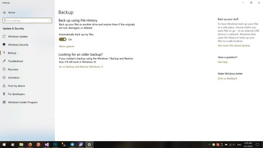
Main backup page:
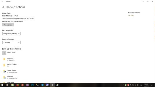
After clicking "more options" you go to this basically undesigned page:
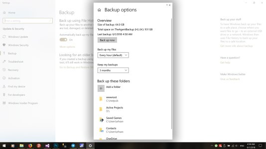
 And then there is my suggestion:
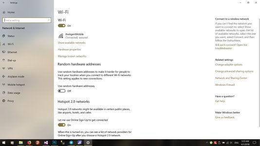
And now another example, from the Wifi settings page:
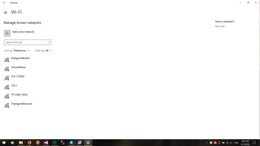
Clicking "manage known networks" gets you to:
And instead, you can have:
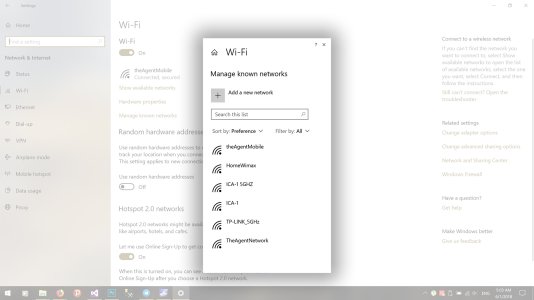
What do you think? It doesn't take much at all to introduce a simple tweak into the design of the Settings app (and others, like Mail and Calendar that sorely lack in design) seeing as Fluent already includes "Light" and shadows. Let me know in the comments.
P.S. for Tablet Mode you can have the dialog appear on the right side of screen instead of center, so the user can use their right thumb to operate within the dialog.
I get annoyed by the settings app on Windows 10, mostly because of:
- Too much wasted, barren space
- Lack of proper navigation in some areas that makes you lose the context of what you are doing
Main backup page:

After clicking "more options" you go to this basically undesigned page:
 And then there is my suggestion:
And now another example, from the Wifi settings page:

Clicking "manage known networks" gets you to:

And instead, you can have:

What do you think? It doesn't take much at all to introduce a simple tweak into the design of the Settings app (and others, like Mail and Calendar that sorely lack in design) seeing as Fluent already includes "Light" and shadows. Let me know in the comments.
P.S. for Tablet Mode you can have the dialog appear on the right side of screen instead of center, so the user can use their right thumb to operate within the dialog.
Last edited:

